Menus
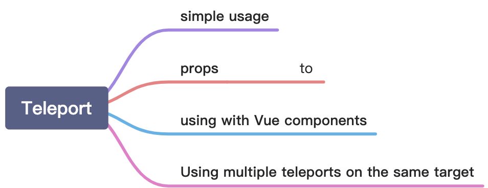
Teleport’s Simple Usage
We can use it to create a modal box component. Modal box can be rendered in body container with its logic code written internally.
<template><button @click="openNewWorld">点击这里打开新世界</button><teleport to="body"><div class="modal" v-show="showModal"><div class="modal__box"><div class="modal__box-content"><p>Hello, welcome to new world.</p><p>My name is Bill Ann.</p></div><button class="modal__box-close" @click="closeNewWorld">关闭</button></div></div></teleport></template><script>import { ref } from 'vue'export default {name: 'CompositionAPI',setup() {function openNewWorld() {showModal.value = true}function closeNewWorld() {showModal.value = false}let showModal = ref(false)return {showModal,openNewWorld,closeNewWorld}}}</script><style lang="scss">.modal {width: 100%;height: 100%;background: rgba(0, 0, 0, 0.8);position: fixed;left: 0;top: 0;}.modal__box {text-align: center;width: 400px;height: 200px;line-height: 200px;background: #ffffff;border-radius: 4px;position: absolute;left: 50%;top: 50%;transform: translate(-50%, -50%);}.modal__box-content {line-height: 1;display: inline-block;}.modal__box-close {position: absolute;top: 10px;right: 10px;}</style>
Tip: You should install sass before using it.
Props: to
to can specify which container we want to inject our template into it. Its value can be a tag name, an id name or a class name etc. It’s just an element selector.
Tips:
- The target element must exist before the component is mounted.
- The target cannot be rendered by the component itself, and ideally should be outside of the entire Vue component tree.
Using with Vue components
We can also use a vue component as the teleport template.
const app = Vue.createApp({template: `<h1>Root instance</h1><parent-component />`})app.component('parent-component', {template: `<h2>This is a parent component</h2><teleport to="#endofbody"><child-component name="John" /></teleport>`})app.component('child-component', {props: ['name'],template: `<div>Hello, {{ name }}</div>`})
Combined with the slot, we can encapsulate a modal box very easily.
Using multiple teleports on the same target
If we use multiple teleports on the same target, each teleport will rendered in order.
<teleport to="#modals"><div>A</div></teleport><teleport to="#modals"><div>B</div></teleport><!-- result--><div id="modals"><div>A</div><div>B</div></div>

若有收获,就点个赞吧
0 人点赞
