Menu
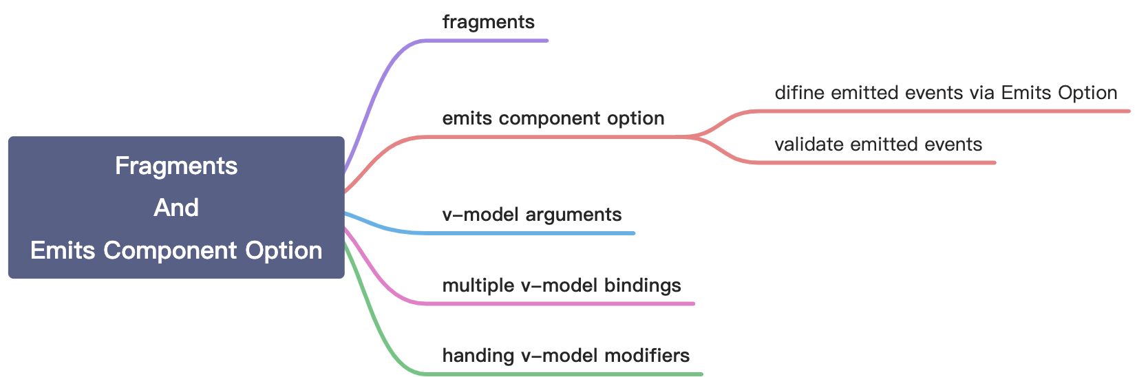
Fragments
In 2.x, multi-root components were not supported and would emit a warning when a user accidentally created one. As a result, many components are wrapped in a single <div> in order to fix this error.
<!-- Layout.vue --><template><div><header>...</header><main>...</main><footer>...</footer></div></template>
In Vue 3, components now have official support for multi-root node components, i.e., fragments!
<!-- Layout.vue --><template><header>...</header><main v-bind="$attrs">...</main><footer>...</footer></template>
Emits Components Option
Emitted events can be defined on the component via the emits option.
difine emitted events via Emits Option
If we emit a click event, callback will be excuted twice on the parent component. For solving this problem, we can set click via emits option. And then callback will be excuted normally.
app.component('custom-component', {emits: ['click']})
validate emitted events
Just similar to prop type validation, emitted events validation is used to determine whether the emitted process is in line with expectations.
for examples:
app.component('custom-form', {emits: {// No validationclick: null,// Validate submit eventsubmit: ({ email, password }) => {if (email && password) {return true} else {console.warn('Invalid submit event payload!')return false}}},methods: {submitForm() {this.$emit('submit', { email, password })}}})
v-model Arguments
By default, if we use v-model without arguments, v-model directive will use modelValue as prop and use update:modelValue as event name.
We can set an argument to target our prop name and event name. Like below:
<template><teleport to="body"><div class="modal" v-show="modal"><div class="modal__box"><div class="modal__box-content"><p>Hello, welcome to new world.</p><p>My name is Bill Ann.</p></div><button class="modal__box-close" @click="closeModal">关闭</button></div></div></teleport></template><script>export default {name: 'VModelModal',props: {modal: {type: Boolean,default: false}},emits: ['update:modal'],setup(props, { emit }) {function closeModal() {emit('update:modal', false)}return {closeModal}}}</script><style lang="scss">.modal {width: 100%;height: 100%;background: rgba(0, 0, 0, 0.8);position: fixed;left: 0;top: 0;}.modal__box {text-align: center;width: 400px;height: 200px;line-height: 200px;background: #ffffff;border-radius: 4px;position: absolute;left: 50%;top: 50%;transform: translate(-50%, -50%);}.modal__box-content {line-height: 1;display: inline-block;}.modal__box-close {position: absolute;top: 10px;right: 10px;}</style>
<template><button class="vmodel__btn" @click="openNewWorld">v-model: 点击这里打开新世界</button><VModelModal v-model:modal="showModal"></VModelModal></template><script>import { ref } from 'vue'// import componentsimport VModelModal from './VModelModal.vue'export default {name: 'VModel',components: {VModelModal},setup() {function openNewWorld() {showModal.value = true}let showModal = ref(false)return {showModal,openNewWorld}}}</script><style lang="scss">.vmodel__btn {margin-top: 20px;margin-bottom: 20px;}</style>
Multiple v-model Bindings
By setting arguments, we can create multiple v-model bindings on a single component instance.
<template><teleport to="body"><div class="modal" v-show="modal"><div class="modal__box"><div class="modal__box-content"><input type="text" :value="name" @input="changeName"><p>Hello, welcome to new world.</p><p>My name is Bill Ann.</p></div><button class="modal__box-close" @click="closeModal">关闭</button></div></div></teleport></template><script>export default {name: 'VModelModal',props: {modal: {type: Boolean,default: false},name: {type: String,default: ''}},emits: ['update:modal', 'update:name'],setup(props, { emit }) {function closeModal() {emit('update:modal', false)}function changeName(ev) {emit('update:name', ev.target.value)}return {closeModal,changeName}}}</script><style lang="scss">.modal {width: 100%;height: 100%;background: rgba(0, 0, 0, 0.8);position: fixed;left: 0;top: 0;}.modal__box {text-align: center;width: 400px;height: 200px;line-height: 200px;background: #ffffff;border-radius: 4px;position: absolute;left: 50%;top: 50%;transform: translate(-50%, -50%);}.modal__box-content {line-height: 1;display: inline-block;}.modal__box-close {position: absolute;top: 10px;right: 10px;}</style>
<template><button class="vmodel__btn" @click="openNewWorld">v-model: 点击这里打开新世界</button><VModelModal v-model:modal="showModal" v-model:name="name"></VModelModal></template><script>import { ref, watch } from 'vue'// import componentsimport VModelModal from './VModelModal.vue'export default {name: 'VModel',components: {VModelModal},setup() {function openNewWorld() {showModal.value = true}let showModal = ref(false)let name = ref('')watch(name, (val, oldVal) => {console.log(val)})return {showModal,openNewWorld,name}}}</script><style lang="scss">.vmodel__btn {margin-top: 20px;margin-bottom: 20px;}</style>
Handing v-model Modifiers
By default, v-model has some modifiers such as trim, number and lazy. We can set custom v-model modifiers by modelModifers prop.
<template><teleport to="body"><div class="modal" v-show="modal"><div class="modal__box"><div class="modal__box-content"><input type="text" :value="name" @input="changeName"><p>Hello, welcome to new world.</p><p>My name is Bill Ann.</p></div><button class="modal__box-close" @click="closeModal">关闭</button></div></div></teleport></template><script>export default {name: 'VModelModal',props: {modal: {type: Boolean,default: false},name: {type: String,default: ''},nameModifiers: {type: Object,default: () => {return {}}}},emits: ['update:modal', 'update:name'],setup(props, { emit }) {function closeModal() {emit('update:modal', false)}function changeName(ev) {let value = ev.target.valueif (props.nameModifiers.capitalize) {value = value.charAt(0).toUpperCase() + value.substring(1)}emit('update:name', value)}return {closeModal,changeName}}}</script><style lang="scss">.modal {width: 100%;height: 100%;background: rgba(0, 0, 0, 0.8);position: fixed;left: 0;top: 0;}.modal__box {text-align: center;width: 400px;height: 200px;line-height: 200px;background: #ffffff;border-radius: 4px;position: absolute;left: 50%;top: 50%;transform: translate(-50%, -50%);}.modal__box-content {line-height: 1;display: inline-block;}.modal__box-close {position: absolute;top: 10px;right: 10px;}</style>
<template><button class="vmodel__btn" @click="openNewWorld">v-model: 点击这里打开新世界</button><VModelModal v-model:modal="showModal" v-model:name.capitalize="name"></VModelModal></template><script>import { ref, watch } from 'vue'// import componentsimport VModelModal from './VModelModal.vue'export default {name: 'VModel',components: {VModelModal},setup() {function openNewWorld() {showModal.value = true}let showModal = ref(false)let name = ref('')watch(name, (val, oldVal) => {console.log(val)})return {showModal,openNewWorld,name}}}</script><style lang="scss">.vmodel__btn {margin-top: 20px;margin-bottom: 20px;}</style>
tips: By default, we should set a prop named modelModifiers. But if we want to set modifiers on custom v-model bindings, we should set a prop named [custom prop name]['Modifiers']. Just like above codes.

若有收获,就点个赞吧
0 人点赞
