DelayButton
属性
delay : int //延时时长,msprogress : real //实时进度 0-1
信号
activated() //当按钮延时进度到达1,且选中按钮的情况激活该信号
实例
DelayButton{width: 150height: 50delay: 200onProgressChanged:{console.log("progress: ", progress)}}
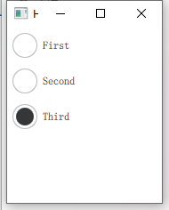
RadioButton
单选按钮,当多个单选按钮对象放到同一个父对象中,就会自动的实现排他性,不需要如勾选框那样放到一个Group中并设置exclusive或者设置单个按钮的排他属性autoExclusive
Column {RadioButton {checked: truetext: qsTr("First")}RadioButton {text: qsTr("Second")}RadioButton {text: qsTr("Third")}}
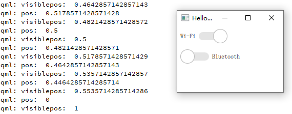
Switch
属性
position : realvisualPosition : real //mirred 镜像时才会有效
实例
ButtonGroup{id: btngrpexclusive: truebuttons: col.children}Column {id: colSwitch {LayoutMirroring.enabled: trueautoExclusive: truetext: qsTr("Wi-Fi")onPositionChanged: {console.log("pos: ", position)}onVisualPositionChanged: { //视觉上左到右的进度console.log("visiblepos: ", visualPosition)}}Switch {autoExclusive: truetext: qsTr("Bluetooth")}}
TabButton
表格按钮,自带排他性,主要是用于切换页面使用。
TabBar {TabButton {text: qsTr("Home")}TabButton {text: qsTr("Discover")}TabButton {text: qsTr("Activity")}}
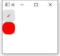
RoundButton
圆形按钮,继承与Button,增加radius属性
radius : real //边角弧度半径
RoundButton {id:rbtntext: "\u2713" // Unicode Character 'CHECK MARK'onClicked: textArea.readOnly = trueradius: 10 //边角弧度半径}Button{anchors.top: rbtn.bottomwidth: rbtn.widthheight: rbtn.heightbackground: Rectangle{radius: 15color: "red"}}
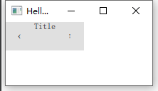
ToolButton
ToolBar {Row {anchors.fill: parentToolButton {text: qsTr("‹")onClicked: stack.pop()}Label {text: "Title"elide: Label.ElideRighthorizontalAlignment: Qt.AlignHCenterverticalAlignment: Qt.AlignVCenter}ToolButton {text: qsTr("⋮")onClicked: menu.open()}}}
自定义按钮
Button{id: controlwidth: 200height: 60padding: 0text: "button"// background:Rectangle{// }contentItem: Rectangle{ //对内容进行重绘//默认背景色白色// color: "transparent" //透明color: "red"opacity: 0.8Text{id: txttext: control.textfont.pointSize: 20color: "green"}Image {id: imgsource: "/2.jpg"width: 50height: 50anchors.right: parent.right}}}

若有收获,就点个赞吧
0 人点赞
