属性
acceptableInput : boolcount : intcurrentIndex : intcurrentText : stringcurrentValue : stringdelegate : ComponentdisplayText : stringdown : booleditText : stringeditable : boolflat : boolhighlightedIndex : intimplicitIndicatorHeight : realimplicitIndicatorWidth : realindicator : IteminputMethodComposing : boolinputMethodHints : flagsmodel : modelpopup : Popup //弹窗 下拉弹窗是popuppressed : boolselectTextByMouse : booltextRole : stringvalidator : ValidatorvalueRole : string//筛选editText输入格式validator : Validator//整数IntValidator:bottom : intlocale : stringtop : int//浮点数DoubleValidator:bottom : real最小值decimals : intThis property holds the validator's maximum number of digits after the decimal point. By default, this property contains a value of 1000.此属性保存验证器小数点后的最大位数。默认情况下,此属性包含1000的值。locale : stringnotation : enumerationtop : real最大值//正则RegExpValidator:regExp : regExp //正则表达式使用/括起来
信号
void accepted() //编辑框回车触发void activated(int index) //选中item就将这个index激活了并触发该信号void highlighted(int index) //鼠标浮动到index时item高亮并触发信号
方法
void decrementCurrentIndex()int find(string text, enumeration flags)void incrementCurrentIndex()int indexOfValue(object value)void selectAll()string textAt(int index)
属性使用
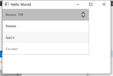
ComboBox{// model: 3textRole: "text"valueRole: "value"width: 300// editable: truemodel: [{value:100, text: "Banana", color: "Yellow" },{value:200, text: "Apple", color: "Green" },{value:300, text: "Coconut", color: "Brown" }]//使用displayText 时不可编辑,否则displayText报错,猜测是currentText获取是正在修改displayText: currentText + " "+currentValueonAccepted: {//eidtText 此属性指定用户为可编辑组合框操作的文本。if (find(editText) === -1) { //当不能找到当前显示框中的文本就追加listmodel中model.append({text: editText})currentIndex = find(editText)}}onCurrentIndexChanged: {console.log("index: ", currentIndex)}onCurrentTextChanged: {console.log("text: ", currentText)}onCurrentValueChanged: {console.log("value: ", currentValue)}// onHighlighted: {// console.log("onHighlighted: ", index)// }// onActivated: {// console.log("onActivated: ", index)// }// onAccepted:{// console.log("onAccepted: ")// }}
indicator
默认indicator: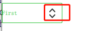
indicator:Image{id:imgwidth: 50height: 50anchors.right: parent.rightanchors.verticalCenter: parent.verticalCentersource:"/more3.png"}
background
background: Rectangle {implicitWidth: 120implicitHeight: 40border.color: control.pressed ? "#17a81a" : "#21be2b"border.width: control.visualFocus ? 2 : 1radius: 2}
ComboBox的background属性仅仅只设置显示下卡弹框这个可编辑框的显示样式,下拉弹出来的部分是需要单独设置的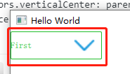
contentItem
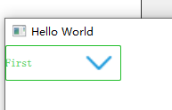
//控制当前控件的显示内容如何绘制contentItem: Text {leftPadding: 0rightPadding: control.indicator.width + control.spacingtext: control.displayTextfont: control.font// color: control.pressed ? "#17a81a" : "#21be2b"color: control.pressed ? "red" : "blue"verticalAlignment: Text.AlignVCenter //纵向居中elide: Text.ElideRight //右侧省略}
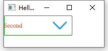 按下鼠标显示红色
delegate
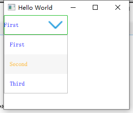
//针对model中每一项的具体绘制delegate: ItemDelegate {width: control.widthcontentItem: Text {text: modelData// color: "#21be2b"color: index % 2 ? "orange" : "blue"font: control.fontelide: Text.ElideRightverticalAlignment: Text.AlignVCenter}highlighted: control.highlightedIndex === index}
输入筛选器validator
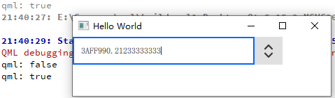
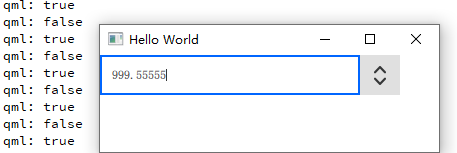
ComboBox{// model: 3// textRole: "text"// valueRole: "value"width: 300editable: true// validator: IntValidator{// top: 10// bottom: 1// }validator: RegExpValidator{// regExp: /^[0-9A-F]/regExp: /[0-9A-F]+[.][0-9]*/// regExp: /^\d{n}$/ //无效}// validator: DoubleValidator{// top:1000// bottom: 0// decimals: 5// }onAcceptableInputChanged: { //当前是否匹配validator验证器console.log(acceptableInput)}}
自定义
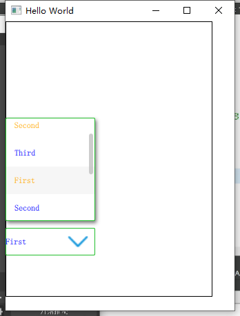
ComboBox {id: controlproperty bool bIsPopupShowDown: truemodel: ["First", "Second", "Third","First", "Second", "Third","First", "Second", "Third"]background: Rectangle {implicitWidth: 120implicitHeight: 40border.color: control.pressed ? "#17a81a" : "#21be2b"border.width: control.visualFocus ? 2 : 1radius: 2}//针对model中每一项的具体绘制delegate: ItemDelegate {width: control.widthcontentItem: Text {text: modelData// color: "#21be2b"color: index % 2 ? "orange" : "blue"font: control.fontelide: Text.ElideRightverticalAlignment: Text.AlignVCenter}highlighted: control.highlightedIndex === index}indicator:Image{id:imgwidth: 50height: 50anchors.right: parent.rightanchors.verticalCenter: parent.verticalCentersource:"/more3.png"}// indicator: Canvas {// id: canvas// x: control.width - width - control.rightPadding// y: control.topPadding + (control.availableHeight - height) / 2// width: 12// height: 8// contextType: "2d"// Connections {// target: control// function onPressedChanged() { canvas.requestPaint(); }// }// onPaint: {// context.reset();// context.moveTo(0, 0);// context.lineTo(width, 0);// context.lineTo(width / 2, height);// context.closePath();// context.fillStyle = control.pressed ? "#17a81a" : "#21be2b";// context.fill();// }// }//控制当前控件的显示内容如何绘制contentItem: Text {leftPadding: 0rightPadding: control.indicator.width + control.spacingtext: control.displayTextfont: control.font// color: control.pressed ? "#17a81a" : "#21be2b"color: control.pressed ? "red" : "blue"verticalAlignment: Text.AlignVCenter //纵向居中elide: Text.ElideRight //右侧省略}popup: Popup {//delegate绘制单个项 而popup绘制整个下来窗体// y: control.height - 1 //下拉窗体的位置y: bIsPopupShowDown ? control.height +10 : -control.height -80 //控制下拉窗体是向上或者向下width: control.widthimplicitHeight: contentItem.implicitHeightpadding: 1contentItem: ListView {clip: true// implicitHeight: contentHeightimplicitHeight:150interactive: true //设置拖动可回弹boundsBehavior: Flickable.StopAtBounds //拖动不会回弹脱离边界model: control.popup.visible ? control.delegateModel : nullcurrentIndex: control.highlightedIndex//下拉窗体中滚动时显示一个滚动条// ScrollIndicator.vertical: ScrollIndicator { }ScrollBar.vertical: ScrollBar{policy: ScrollBar.AlwaysOn}}background: Rectangle {border.color: "#21be2b"radius: 2// height: 100//阴影设置layer.enabled: truelayer.effect: DropShadow{horizontalOffset: 2 //向右偏移两个单位verticalOffset: 3 //向下便宜两个单位的阴影radius: 8.0samples: 17color: "#80000000"}}}}

若有收获,就点个赞吧
0 人点赞
