基本元素(Basic Elements)
元素可以被分为可视化元素与非可视化元素。一个可视化元素(例如矩形框Rectangle)有着几何形状并且可以在屏幕上显示。一个非可视化元素(例如计时器Timer)提供了常用的功能,通常用于操作可视化元素。
现在我们将专注于几个基础的可视化元素,例如Item(基础元素对象),Rectangle(矩形框),Text(文本),Image(图像)和MouseArea(鼠标区域)。
基础元素对象(Item Element)
Item(基础元素对象)是所有可视化元素的基础对象,所有其它的可视化元素都继承自Item。它自身不会有任何绘制操作,但是定义了所有可视化元素共有的属性:
| Group(分组) | Properties(属性) |
|---|---|
| Geometry(几何属性) | x,y(坐标)定义了元素左上角的位置,width,height(长和宽)定义元素的显示范围,z(堆叠次序)定义元素之间的重叠顺序。 |
| Layout handling(布局操作) | anchors(锚定),包括左(left),右(right),上(top),下(bottom),水平与垂直居中(vertical center,horizontal center),与margins(间距)一起定义了元素与其它元素之间的位置关系。 |
| Key handlikng(按键操作) | 附加属性key(按键)和keyNavigation(按键定位)属性来控制按键操作,处理输入焦点(focus)可用操作。 |
| Transformation(转换) | 缩放(scale)和rotate(旋转)转换,通用的x,y,z属性列表转换(transform),旋转基点设置(transformOrigin)。 |
| Visual(可视化) | 不透明度(opacity)控制透明度,visible(是否可见)控制元素是否显示,clip(裁剪)用来限制元素边界的绘制,smooth(平滑)用来提高渲染质量。 |
| State definition(状态定义) | states(状态列表属性)提供了元素当前所支持的状态列表,当前属性的改变也可以使用transitions(转变)属性列表来定义状态转变动画。 |
Properties:activeFocus : boolactiveFocusOnTab : boolanchorsanchors.alignWhenCentered : boolanchors.baseline : AnchorLineanchors.baselineOffset : realanchors.bottom : AnchorLineanchors.bottomMargin : realanchors.centerIn : Itemanchors.fill : Itemanchors.horizontalCenter : AnchorLineanchors.horizontalCenterOffset : realanchors.left : AnchorLineanchors.leftMargin : realanchors.margins : realanchors.right : AnchorLineanchors.rightMargin : realanchors.top : AnchorLineanchors.topMargin : realanchors.verticalCenter : AnchorLineanchors.verticalCenterOffset : realantialiasing : boolbaselineOffset : intchildren : list<Item>childrenRectchildrenRect.height : realchildrenRect.width : realchildrenRect.x : realchildrenRect.y : realclip : boolcontainmentMask : QObject*data : list<Object>enabled : boolfocus : boolheight : realimplicitHeight : realimplicitWidth : reallayer.effect : Componentlayer.enabled : boollayer.format : enumerationlayer.mipmap : boollayer.samplerName : stringlayer.samples : enumerationlayer.smooth : boollayer.sourceRect : rectlayer.textureMirroring : enumerationlayer.textureSize : sizelayer.wrapMode : enumerationopacity : realparent : Itemresources : list<Object>rotation : realscale : realsmooth : bool //平滑过渡,增加抗锯齿state : stringstates : list<State>transform : list<Transform>transformOrigin : enumerationtransitions : list<Transition>visible : boolvisibleChildren : list<Item>width : realx : realy : realz : realMethods:childAt(real x, real y)bool contains(point point)forceActiveFocus(Qt::FocusReason reason)forceActiveFocus()bool grabToImage(callback, targetSize)object mapFromGlobal(real x, real y)object mapFromItem(Item item, rect r)object mapFromItem(Item item, real x, real y, real width, real height)object mapFromItem(Item item, real x, real y)object mapFromItem(Item item, point p)object mapToGlobal(real x, real y)object mapToItem(Item item, rect r)object mapToItem(Item item, real x, real y, real width, real height)object mapToItem(Item item, real x, real y)object mapToItem(Item item, point p)nextItemInFocusChain(bool forward)
注意
Item(基本元素对象)通常被用来作为其它元素的容器使用,类似HTML语言中的div元素(div element)。
矩形框元素(Rectangle Element)
antialiasing : bool 是否启用抗锯齿,当线条显示效果出现锯齿像素时使用border 矩形边框,边框所占位置是在矩形内部的border.color : colorborder.width : intcolor : color 矩形填充颜色gradient : any 渐变radius : real 边角弧度focus:bool 当前元素是否会拥有焦点rotation : real 旋转opacity : real 透明度scale : real 缩放states : list<State> 状态列表//设置同级项目的堆叠顺序。默认情况下,堆叠顺序为0。//堆叠值较高的项目绘制在堆叠顺序较低的同级项目的顶部。具有相同堆叠值的项目按其显示顺序从下至上绘制。堆叠值为负值的项目在其父内容下绘制。z : real
注意
颜色的命名是来自SVG颜色的名称(查看http://www.w3.org/TR/css3-color/#svg-color可以获取更多的颜色名称)。你也可以使用其它的方法来指定颜色,比如RGB字符串(’#FF4444’),或者一个颜色名字(例如’white’)。
此外,填充的颜色与矩形的边框也支持自定义的渐变色。
Rectangle {y: 0; width: 80; height: 80color: "lightsteelblue" //淡钢蓝border.color: "orange"border.width: 2radius: 5}Rectangle {y: 100; width: 80; height: 80gradient: Gradient {GradientStop { position: 0.0; color: "lightsteelblue" }GradientStop { position: 1.0; color: "blue" }}opacity:0.5}Rectangle {y: 200; width: 80; height: 80rotation: 60gradient: Gradient {GradientStop { position: 0.0; color: "lightsteelblue" }GradientStop { position: 1.0; color: "blue" }}antialiasing:true}
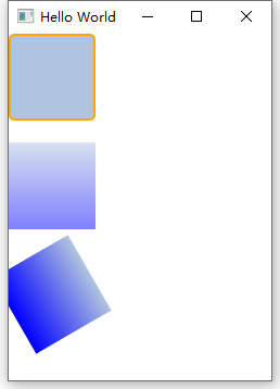 一个渐变色是由一系列的梯度值定义的。每一个值定义了一个位置与颜色。位置标记了y轴上的位置(0 = 顶,1 = 底)。GradientStop(倾斜点)的颜色标记了颜色的位置。
Rectangle {y: 0; width: 80; height: 80color: "lightsteelblue"border.color: "orange"border.width: 2radius: 5focus: trueMouseArea{anchors.fill: parentonClicked: { //在鼠标区域内进行点击操作即可触发,不需focus设置trueconsole.log("on clicked")}}Keys.onReturnPressed: { //需focus:true使得矩形获得焦点才可触发console.log("on Return Pressed")}}
Rectangle {id: rootwidth: 100; height: 100state: "normal"states: [State {name: "normal"PropertyChanges { target: root; color: "green" }},State {name: "red_color"PropertyChanges { target: root; color: "red" }},State {name: "blue_color"PropertyChanges { target: root; color: "blue" }}]MouseArea{anchors.fill: parent// onClicked: { //在鼠标区域内进行点击操作即可触发,不需focus设置true// console.log("on clicked")// root.state = "red_color"// }onPressed: { //在鼠标区域内进行点击操作即可触发,不需focus设置trueconsole.log("on Pressed")root.state = "red_color"}onReleased: {console.log("on Released")root.state = "blue_color"}}}
注意
一个矩形框如果没有width/height(宽度与高度)将不可见。如果你有几个相互关联width/height(宽度与高度)的矩形框,在你组合逻辑中出了错后可能就会发生矩形框不可见,请注意这一点。
注意
这个函数无法创建一个梯形,最好使用一个已有的图像来创建梯形。有一种可能是在旋转梯形时,旋转的矩形几何结构不会发生改变,但是这会导致几何元素相同的可见区域的混淆。从作者的观点来看类似的情况下最好使用设计好的梯形图形来完成绘制。

若有收获,就点个赞吧
0 人点赞
