Button 按钮
属性
action : ActionautoExclusive : boolautoRepeat : boolautoRepeatDelay : intautoRepeatInterval : intcheckable : boolchecked : booldisplay : enumerationdown : bool //按键是否按下,onDownChanged 当按键按下与弹开变化时可触发onDownChanged, 按下同时会触发pressed,松开会触发releasedicon//This property specifies whether the icon should be cached.此属性指定是否应缓存图标。icon.cache : boolicon.color : coloricon.height : inticon.name : stringicon.source : urlicon.width : intimplicitIndicatorHeight : realimplicitIndicatorWidth : realindicator : ItempressX : realpressY : realpressed : booltext : string
信号
canceled()clicked()doubleClicked()pressAndHold()pressed()released()toggled()
实例-按钮背景、图标、长按
Button{id: btnwidth: 50height: 40// checkable: true //按键是否可勾选(状态),按键会有按下与释放的不同状态展示checkable: trueautoExclusive: true //自动排它,同时只能一个按键按下,一个时刻只能check一个控件autoRepeat: true //按下后不释放是否会重复触发按下信号autoRepeatDelay: 1000 //按下时触发到稍后第一次触发时间间隔autoRepeatInterval: 300 //按下后第一次触发后时间间隔onAutoRepeatChanged: {console.log("onAutoRepeatChanged down: ", down,"pressed: ", pressed)}onAutoRepeatIntervalChanged: {console.log("onAutoRepeatIntervalChangeddown: ", down,"pressed: ", pressed)}onCheckableChanged: {console.log("onCheckableChanged: ", checkable)}onDownChanged: {console.log("onDownChanged: ", down)}onPressed: {console.log("onPressed: ", pressed)}}
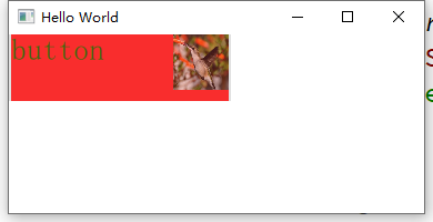
Button{id: btnwidth: 150height: 140// text: qsTr("Button")background: Rectangle {anchors.fill: btnopacity: enabled ? 1 : 0.3color: btn.down ? "blue" : "red"border.width: 3border.color: {if(btn.pressed){return "green"}else{return "blue"}}}// icon.source: "/2.jpg" 不能正常加载图片indicator:Image {id: iconsource: "/2.jpg" //鼠标点击有效区域只是btn定义区域,不是icon区域width: btn.widthheight: btn.height}onClicked: console.log ("onclicked")}
button 自定义
Button{id: controlwidth: 200height: 60padding: 0text: "button"// background:Rectangle{// }contentItem: Rectangle{ //对内容进行重绘//默认背景色白色// color: "transparent" //透明color: "red"opacity: 0.8Text{id: txttext: control.textfont.pointSize: 20color: "green"}Image {id: imgsource: "/2.jpg"width: 50height: 50anchors.right: parent.right}}}
CheckBox 勾选框
属性
checkState : enumerationnextCheckState : function //修改点击按钮 按钮勾选的状态顺序,参数为一个回调函数tristate : bool //三态使能 当开启的时候勾选框才会出现第三种状态checkState : enumerationQt.Unchecked //The checkbox is unchecked.Qt.PartiallyChecked //The checkbox is partially checked. This state is only used when tristate is enabled.Qt.Checked //The checkbox is checked.
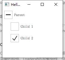
Column {ButtonGroup {id: childGroupexclusive: false //排他checkState: parentBox.checkState //按钮组的勾选状况和parentBox的勾选状态绑定}CheckBox {id: parentBoxtext: qsTr("Parent")checkState: childGroup.checkState //与按钮组勾选状态绑定}CheckBox {checked: truetext: qsTr("Child 1")leftPadding: indicator.widthButtonGroup.group: childGroup //指定所属组}CheckBox {text: qsTr("Child 2")leftPadding: indicator.widthButtonGroup.group: childGroup}}
CheckBox {tristate: true// checkState: allChildrenChecked ? Qt.Checked :// anyChildChecked ? Qt.PartiallyChecked : Qt.UncheckednextCheckState: function() {if (checkState === Qt.Unchecked)return Qt.Checkedelse if (checkState === Qt.Checked)return Qt.PartiallyCheckedelsereturn Qt.Unchecked}}
ButtonGroup
属性
buttons : list<AbstractButton> //管理的按钮checkedButton : AbstractButton //当组合是排他的且当前有选中按钮的时候返回当前选中的按钮,否则返回nullexclusive : bool //排他checkState : enumerationQt.Unchecked //None of the buttons are checked.Qt.PartiallyChecked //Some of the buttons are checked.Qt.Checked //All of the buttons are checked.

若有收获,就点个赞吧
0 人点赞
