属性
activeFocus : boolanchors.centerIn : ObjectavailableHeight : realavailableWidth : realbackground : ItembottomInset : realbottomMargin : realbottomPadding : realclip : boolclosePolicy : enumeration 关闭弹窗的方式contentChildren : list<Item>contentData : list<Object>contentHeight : real内容填充contentItem : ItemcontentWidth : realdim : bool 非模态状态下对话框外区域背景色是否需要设置,模态的时候其他区域是深色的(可通过Overlay对弹窗外的区域进行设置)enabled : bool打开时转变的效果enter : Transitionenter: Transition {NumberAnimation {property: "opacity";from: 0.0;to: 1.0duration: 1000}}关闭时的转变效果exit : Transitionenter: Transition {NumberAnimation {property: "opacity";from: 0.0;to: 1.0duration: 1000}}focus : boolfont : fontheight : realhorizontalPadding : realimplicitBackgroundHeight : realimplicitBackgroundWidth : realimplicitContentHeight : realimplicitContentWidth : realimplicitHeight : realimplicitWidth : realleftInset : realleftMargin : realleftPadding : reallocale : Localemargins : realmirrored : boolmodal : bool 模态true后不可操作其他窗口,只有关闭窗口后才可操作其他窗口,模态时Popup.NoAutoClose慎用opacity : realopened : boolpadding : realpalette : paletteparent : ItemrightInset : realrightMargin : realrightPadding : realscale : realspacing : realtopInset : realtopMargin : realtopPadding : realtransformOrigin : enumerationverticalPadding : realvisible : bool // 一个控件内套Popup 不会因为父控件是不可见的而子控件也不可见width : realx : realy : realz : real //popup作为一个弹窗,会覆盖其他类型的控件,该参数只是有效于相同类型的popup类弹窗
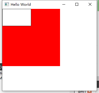
可见性
Rectangle{width: 200height: 200color: "red"visible: falsePopup{width: 100height: 60visible: true}}
 -》
-》
z轴顺序
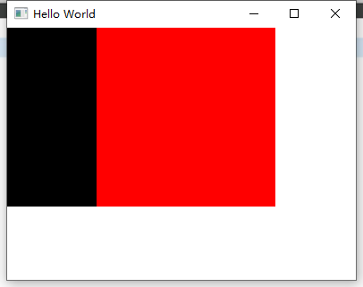
Popup 将其他类型的控件都进行遮盖,不管其z顺序,popup的z只是在不同得popup对象之间有效果
Rectangle{width: 200height: 200color: "red"visible: truez:1}Rectangle{width: 200height: 200x: 100color: "blue"visible: true}
默认后声明的控件z更大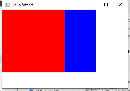
Popup{width: 200height: 200visible: truebackground: Rectangle{color: "black"}}Popup{width: 200height: 200x: 100visible: truebackground: Rectangle{color: "red"}z: 1}
关闭弹窗
Popup{id: popupx:100y: 100width: 200height: 300visible: trueclosePolicy: Popup.NoAutoClose //设置不能自动关闭弹框,只能手动调用接口关闭}/**默认点击esc 和 谈窗外空白区域可关闭,Popup.CloseOnEscape | Popup.CloseOnPressOutsidePopup.NoAutoCloseThe popup will only close when manually instructed to do so.Popup.CloseOnPressOutsideThe popup will close when the mouse is pressed outside of it.Popup.CloseOnPressOutsideParentThe popup will close when the mouse is pressed outside of its parent.Popup.CloseOnReleaseOutsideThe popup will close when the mouse is released outside of it.Popup.CloseOnReleaseOutsideParentThe popup will close when the mouse is released outside of its parent.Popup.CloseOnEscapeThe popup will close when the escape key is pressed while the popup has active focus.*/
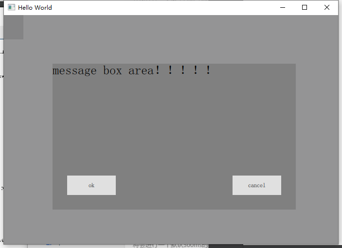
自定义弹窗内容
Popup{id: popupx:100y: 100width: 500height: 300visible: true// closePolicy: Popup.NoAutoClose //设置不能自动关闭弹框,只能手动调用接口关闭closePolicy: Popup.CloseOnEscapemodal: true// dim:trueenter: Transition {NumberAnimation {property: "opacity";from: 0.0;to: 1.0duration: 1000}}exit: Transition {NumberAnimation {property: "opacity";from: 1.0;to: 0.0duration: 1000}}contentItem: Rectangle{anchors.fill: parentcolor: "gray"Text{id: txtanchors.fill: parenttext: qsTr("message box area!!!!!")font{pixelSize: 26}wrapMode: Text.WordWrap //按字换行}Button{anchors.bottom: parent.bottomanchors.bottomMargin: 30anchors.right: parent.rightanchors.rightMargin: 30text: "cancel"}Button{anchors.bottom: parent.bottomanchors.bottomMargin: 30anchors.left: parent.leftanchors.leftMargin: 30text: "ok"}}}
Overlay
属性
modal : Component 模态的对话框modeless : Component 非模态的对话框overlay : Overlay
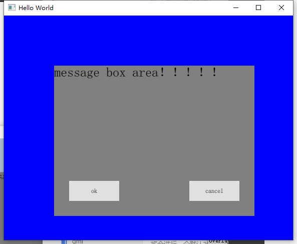
非模态
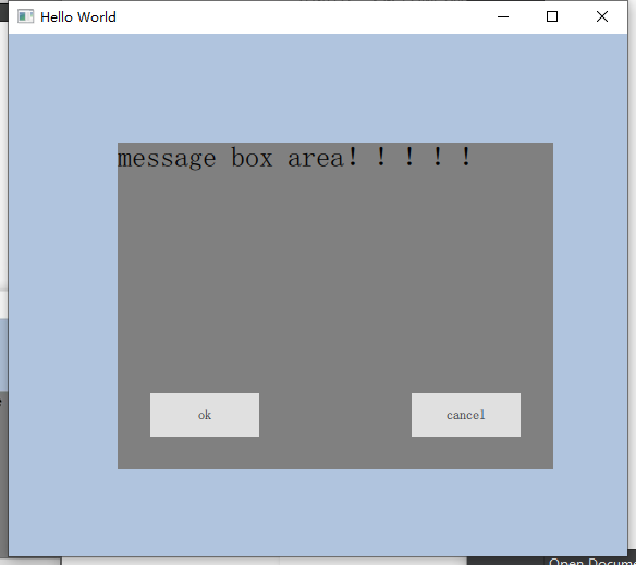
Popup{id: popupx:100y: 100width: 400height: 300visible: true// closePolicy: Popup.NoAutoClose //设置不能自动关闭弹框,只能手动调用接口关闭closePolicy: Popup.CloseOnEscapemodal: falsedim:trueenter: Transition {NumberAnimation {property: "opacity";from: 0.0;to: 1.0duration: 1000}}exit: Transition {NumberAnimation {property: "opacity";from: 1.0;to: 0.0duration: 1000}}contentItem: Rectangle{anchors.fill: parentcolor: "gray"Text{id: txtanchors.fill: parenttext: qsTr("message box area!!!!!")font{pixelSize: 26}wrapMode: Text.WordWrap //按字换行}Button{anchors.bottom: parent.bottomanchors.bottomMargin: 30anchors.right: parent.rightanchors.rightMargin: 30text: "cancel"}Button{anchors.bottom: parent.bottomanchors.bottomMargin: 30anchors.left: parent.leftanchors.leftMargin: 30text: "ok"}}Overlay.modal: Rectangle{anchors.fill: parentcolor: "lightsteelblue"}Overlay.modeless: Rectangle{anchors.fill: parentcolor: "blue"}}
模态
modal: true// dim:true
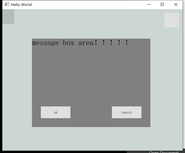
模态非弹窗区域点击
Popup{id: popupx:100y: 100width: 400height: 300visible: true// closePolicy: Popup.NoAutoClose //设置不能自动关闭弹框,只能手动调用接口关闭closePolicy: Popup.CloseOnEscapemodal: true// dim:trueenter: Transition {NumberAnimation {property: "opacity";from: 0.0;to: 1.0duration: 1000}}exit: Transition {NumberAnimation {property: "opacity";from: 1.0;to: 0.0duration: 1000}}contentItem: Rectangle{anchors.fill: parentcolor: "gray"Text{id: txtanchors.fill: parenttext: qsTr("message box area!!!!!")font{pixelSize: 26}wrapMode: Text.WordWrap //按字换行}Button{anchors.bottom: parent.bottomanchors.bottomMargin: 30anchors.right: parent.rightanchors.rightMargin: 30text: "cancel"onClicked: {console.log("cancel")}}Button{anchors.bottom: parent.bottomanchors.bottomMargin: 30anchors.left: parent.leftanchors.leftMargin: 30text: "ok"onClicked: {console.log("ok")}}}Overlay.modal: Rectangle{anchors.fill: parent// color: "lightsteelblue"color: "#33003322" //rgbaPopup{width: parent.width// height: parent.heightheight: 90visible: trueclosePolicy: Popup.NoAutoClosebackground: Rectangle{color: "transparent" //透明色 使得下层的Popup可见// color: "gray"}Button{width: 50height: 50anchors.right: parent.rightonClicked: {console.log("clicked")}}}}Overlay.modeless: Rectangle{anchors.fill: parent// color: "blue" //英文字符// color: "#202030" //rgbcolor: "#20323022" //rgba}}

若有收获,就点个赞吧
0 人点赞
