模块简介
面板 API 提供了面板扩展和管理的能力,如下图蓝色内容都是扩展出来的。
页面上可以扩展的区域共 5 个,具体如下: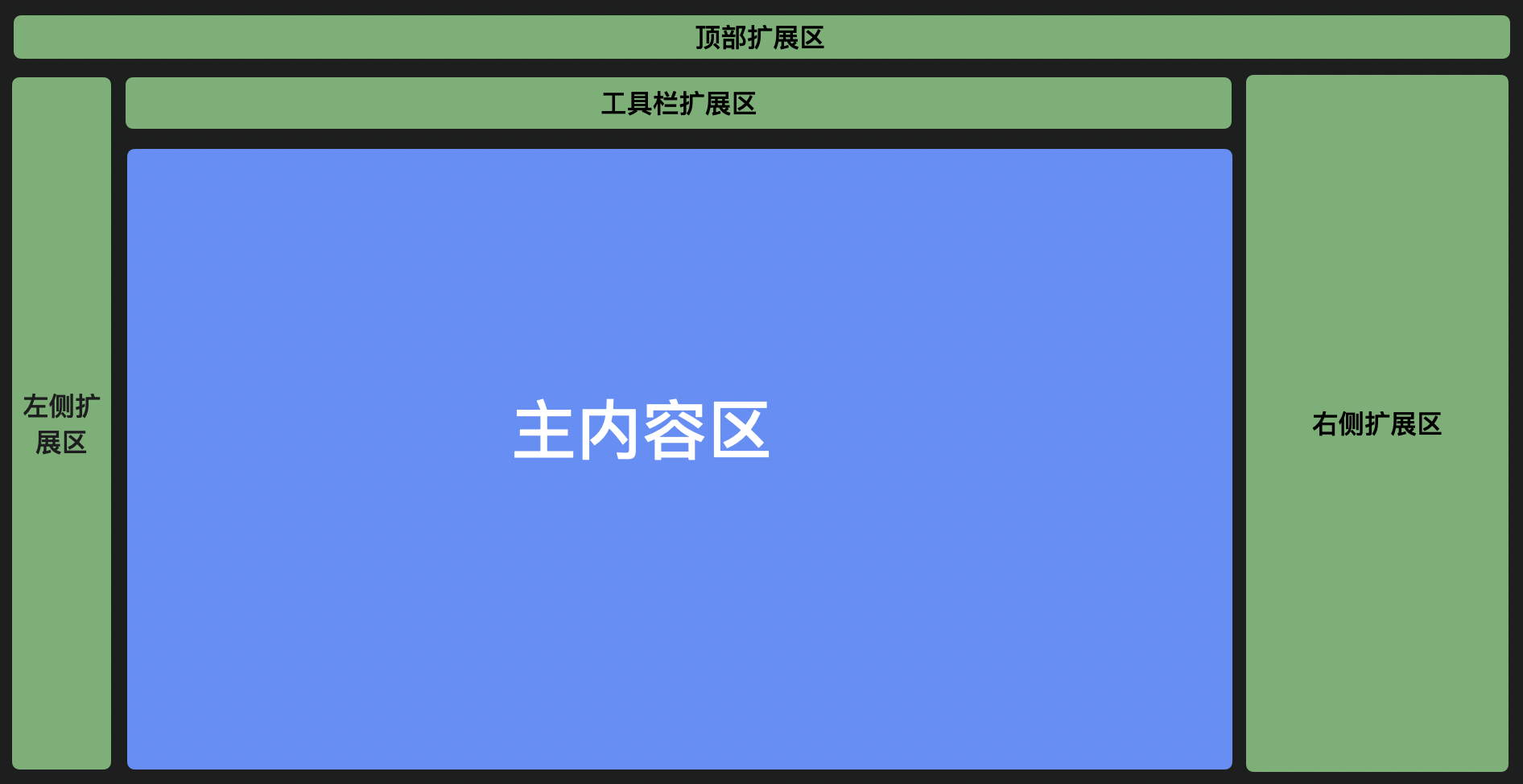
变量(variables)
方法签名(functions)
1. add
add(config: IWidgetBaseConfig & {area?: string;}, extraConfig?: object): IWidget | Panel;
往指定扩展区加入一块面板
IWidgetBaseConfig 定义如下:
| 属性名 | 含义 | 备注 |
|---|---|---|
| name | 面板名称 | |
| area | 扩展区位置,可选值:’topArea’ | ‘leftArea’ | ‘rightArea’ | ‘toolbar’ | ‘bottomArea’ | ‘mainArea’ | |
| type | 面板类型,可选值:’Widget’ | ‘PanelDock’ | ‘Panel’ | |
| content | 面板的实现类/节点,类型是 ReactClass | ReactElement | |
| props | 面板属性 | align: ‘top’ | ‘bottom’ | ‘left’ | ‘center’ | ‘right’; // 指定面板 icon 位置区域 icon: string | ReactElement; // icon 为字符串时,请确定当前 fusion 主题包中包含该 icon description: string; condition: Function; // 指定当前面板的显影状态 |
| contentProps | 面板的实现类/节点的参数 | |
| panelProps | 假如 type: ‘Panel’ | ‘PanelDock’ 时有效,传给 Panel 类的参数 | keepVisibleWhileDragging: boolean; // 当有元素在当前 panel 拖拽时,是否保持 panel 为展开状态,默认值:false area: ‘leftFloatArea’ | ‘leftFixedArea’ // 指定 panel 位于浮动面板还是钉住面板 |
| index | 面板的位置,不传默认按插件注册顺序 |
type 详细说明
PanelDock
PanelDock 是以面板的形式展示在设计器的左侧区域的。其中主要有两个部分组成,一个是图标,一个是面板。当点击图标时可以控制面板的显示和隐藏。
Widget
Widget 形式是直接渲染在当前编辑器上。渲染在设计器顶部,下图就是插件的渲染形式。

2. remove
remove(config: IWidgetBaseConfig)
移除一个面板实例
3. showPanel
showPanel(name: string)
展示指定 Panel 实例
4. hidePanel
hidePanel(name: string)
5. showWidget
showWidget(name: string)
展示指定 Widget 实例
6. hideWidget
hideWidget(name: string)
隐藏指定 widget 实例。
7. enableWidget
enableWidget(name: string)
将 widget 启用。
注:该函数将会触发全局事件 ‘skeleton.widget.enable’
8. disableWidget
disableWidget(name: string)
将 widget 禁用掉,禁用后,所有鼠标事件都会被禁止掉。
适用场景:在该面板还在进行初始化构造时,可以先禁止掉,防止用户点击报错,待初始化完成,重新启用。
事件(events)
1. onShowPanel
onShowPanel(listener: (…args: unknown[]) => void)
监听 Panel 实例显示事件
2. onHidePanel
onHidePanel(listener: (…args: unknown[]) => void)
监听 Panel 实例隐藏事件
3. onShowWidget
onShowWidget(listener: (…args: unknown[]) => void)
监听 Widget 实例显示事件
4. onHideWidget
onHideWidget(listener: (…args: unknown[]) => void)
使用示例
import { skeleton } from '@alilc/lowcode-engine';skeleton.add({name: 'logo',area: 'topArea',type: 'Widget',contentProps: {},content: LogoContent,});skeleton.add({name: 'sourceEditor',type: 'PanelDock',area: 'leftArea',props: {align: 'top',icon: 'wenjian',description: 'JS面板',},panelProps: {floatable: true,height: 300,help: undefined,hideTitleBar: false,maxHeight: 800,maxWidth: 1200,title: 'JS面板',width: 600,},content: SourceEditor,});// 显隐 panelskeleton.showPanel('sourceEditor');skeleton.hidePanel('sourceEditor');// 创建一个浮动的 widgetskeleton.add({name: 'floatingWidget',type: 'Widget',area: 'mainArea',props: {},content: React.createElement('div', {}, 'haha'),contentProps: {style: {position: 'fixed',top: '200px',bottom: 0,width: 'calc(100% - 46px)','background-color': 'lightblue'}}});// 显隐 widgetskeleton.showWidget('floatingWidget');skeleton.hideWidget('floatingWidget');// 控制 widget 的可点击态skeleton.enableWidget('sourceEditor');skeleton.disableWidget('sourceEditor');
bottomArea 示例
import { skeleton } from '@alilc/lowcode-engine';

skeleton.add({
    name: 'bottomAreaPanelName',
  area: 'bottomArea',
  type: 'Panel',
  content: () => 'demoText',
});


skeleton.showPanel('bottomAreaPanelName');
widget 示例
// 注册 logo 面板
skeleton.add({
  area: 'topArea',
  type: 'Widget',
  name: 'logo',
  content: Logo,
  contentProps: {
    logo: 'https://img.alicdn.com/imgextra/i4/O1CN013w2bmQ25WAIha4Hx9_!!6000000007533-55-tps-137-26.svg',
    href: 'https://lowcode-engine.cn',
  },
  props: {
    align: 'left',
  },
});

若有收获,就点个赞吧
0 人点赞
