与其说是文章不如说是笔记避免遗忘,最终实现的效果:点击这里
开启一个hello world
为了方便讲解,使用
flutter create hello-world命令,快速生成一个flutter项目
打开入口文件main.js,找到MyApp这个类,可以看到build函数里最上层Widget为MaterialApp,设置一些列默认配置,包括theme的设置
@overrideWidget build(BuildContext context) {return MaterialApp(title: 'Flutter Demo',theme: ThemeData(// This is the theme of your application.//// Try running your application with "flutter run". You'll see the// application has a blue toolbar. Then, without quitting the app, try// changing the primarySwatch below to Colors.green and then invoke// "hot reload" (press "r" in the console where you ran "flutter run",// or simply save your changes to "hot reload" in a Flutter IDE).// Notice that the counter didn't reset back to zero; the application// is not restarted.primarySwatch: Colors.blue,),home: MyHomePage(title: 'Flutter Demo Home Page'),);}
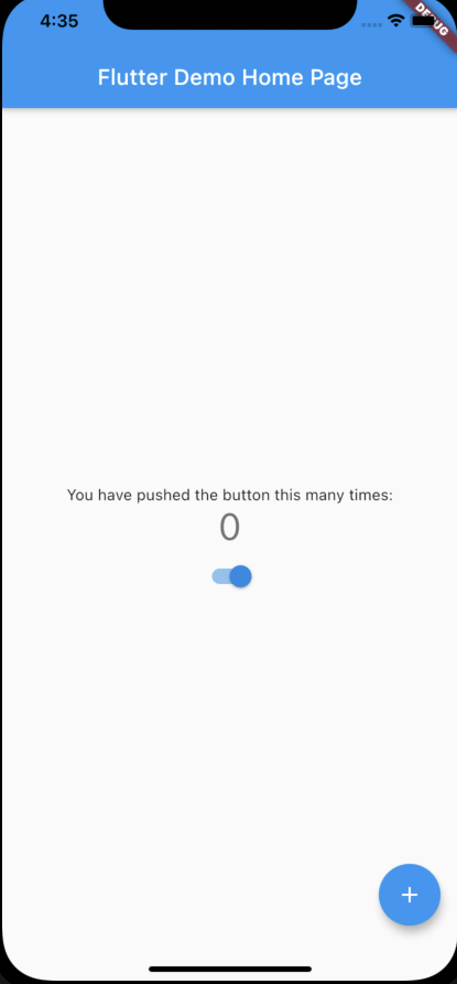
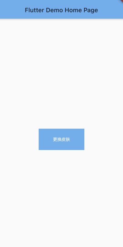
可以看到里面已经有了一个配置项primarySwatch,这里定义的是程序的主色调(默认就是蓝色),更改下值:
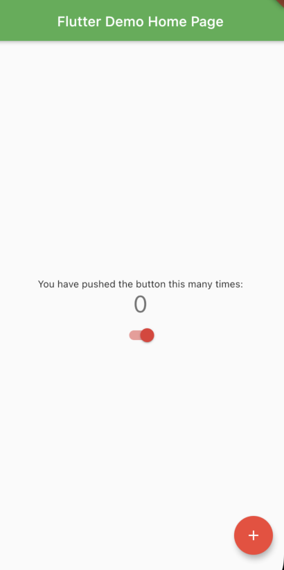
primarySwatch: Colors.red,
| before | after |
|---|---|
 |
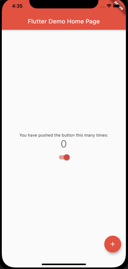 |
可以看到这就是最简单的换肤功能,我们只指定了primarySwatch,但实际上flutter会把各个组件的深浅变化自动算出来
关于主题
主色调primarySwatch
上一节发现更改primarySwatch会自动实现各个小组件的换肤,接下来扒一扒它的实现
MaterialColor的类型
primarySwatch实际上并不是Color类型(不是一个值),而是一个MaterialColor,查看Colors.red可以发现它是一组值,平时使用的Colors.red实际上是Colors.red[500]
static const MaterialColor red = MaterialColor(_redPrimaryValue,<int, Color>{50: Color(0xFFFFEBEE),100: Color(0xFFFFCDD2),200: Color(0xFFEF9A9A),300: Color(0xFFE57373),400: Color(0xFFEF5350),500: Color(_redPrimaryValue),600: Color(0xFFE53935),700: Color(0xFFD32F2F),800: Color(0xFFC62828),900: Color(0xFFB71C1C),},);
ThemeData对primarySwatch的使用
点击ThemeData进入theme_data.dart文件查看源码,找到实例化部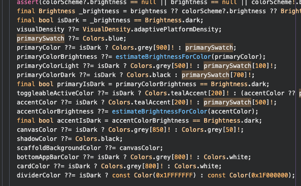
先忽略各个变量的意义,搜索primarySwatch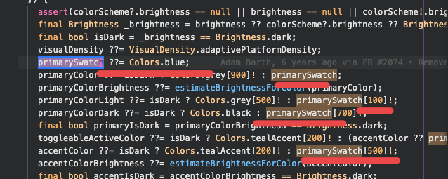
可以看到多个变量的默认值实际上是用的衍生值,例如:
- primaryColor,accentColor使用的为primarySwatch[500]
- textSelectionColor,backgroundColor使用的为primarySwatch[200]
- textSelectionHandleColor使用的为primarySwatch[200]
Material组件虽多,但都是通过primarySwatch进行设置的,十分的便于管理
修改组件的主题
虽然通过primarySwatch可以统一颜色,但是有些情况下我想更个性化一点,比如appbar我想用绿色而非主题色,那么就需要ThemeData里单独配置
ThemeData(...// appbarappBarTheme: AppBarTheme(backgroundColor: Colors.green,),)
| before | after |
|---|---|
 |
 |
修改交互组件的主题
Material除了静态组件外,还有带有交互的组件,例如:raido,elevatedButton,inputDecoration,flutter提供了一个MaterialState枚举值来表示,里面有几种状态:
enum MaterialState {hovered,focused,pressed,dragged,selected,disabled,error,}
以elevatedButton为例,我想实现一个默认是红色,点击是绿色的按钮
elevatedButtonTheme: ElevatedButtonThemeData(style: ButtonStyle(backgroundColor: MaterialStateProperty.resolveWith((states) {if (states.contains(MaterialState.pressed)) {return Colors.green;}return Colors.red;})),),
关于MaterialStateProperty:https://api.flutter-io.cn/flutter/material/MaterialStateProperty-class.html
关于字号
ThemeData里可以通过textTheme属性,修改字号的默认值
Material标准
TextTheme的标准:https://www.material.io/design/typography/the-type-system.html#type-scale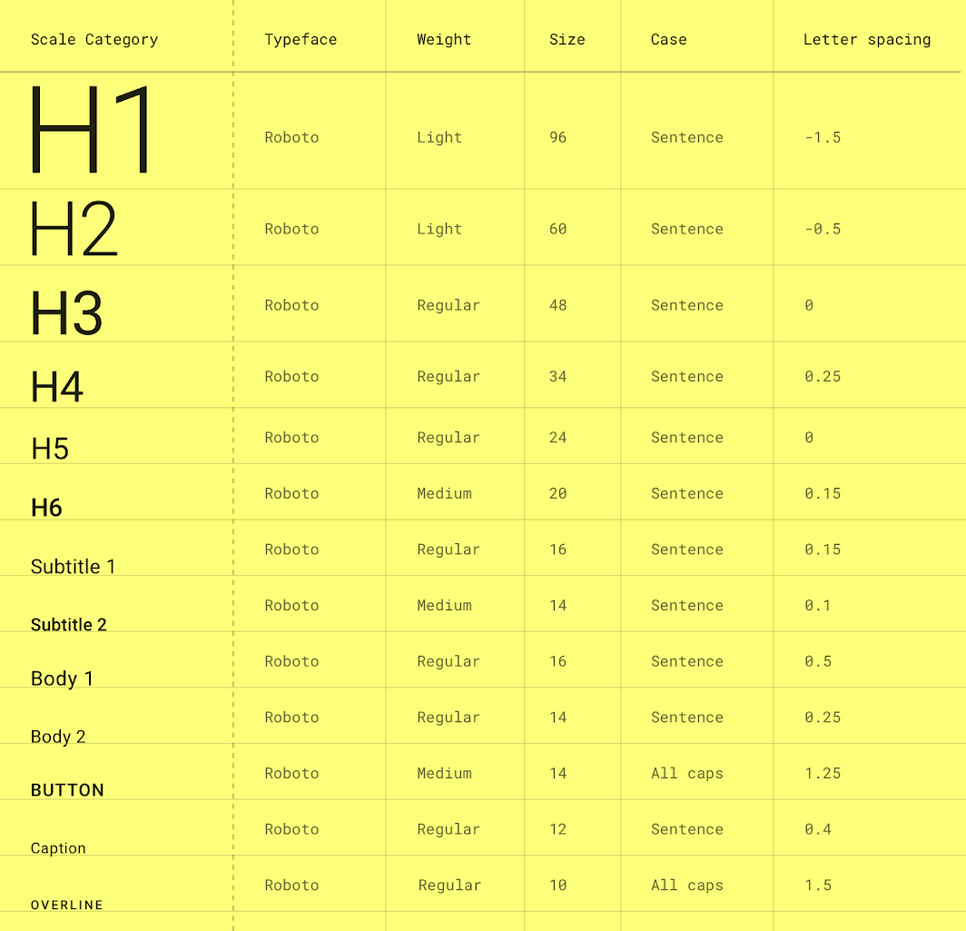
查找Material组件里的字号
可惜这里只标有字号,但不知道Material组件使用的哪个,比如ListTitle的title属性到底是使用的body1还是body2
我个人是通常是看Material的组件库,找到侧边栏的theme,里面有用到的字体/字号/颜色之类的一些东西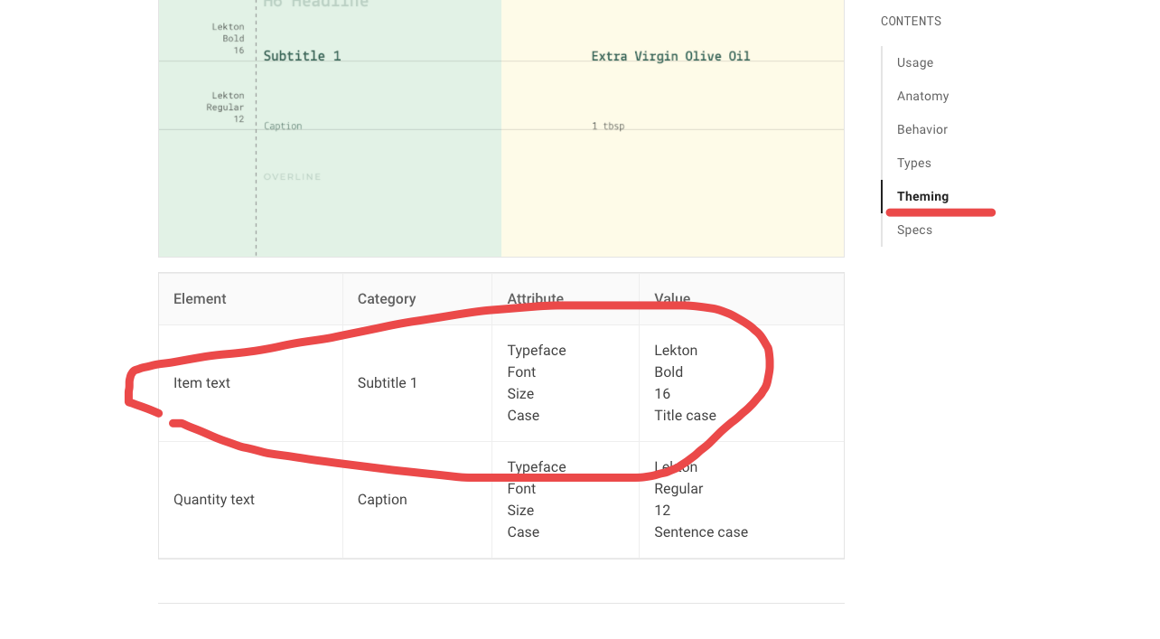
常用归纳
详细列表: https://api.flutter-io.cn/flutter/material/TextTheme-class.html
bodyText2
subtitle1
用于列表中的主要文本(例如ListTile.title)
headline6
标题 6 →文本样式?
用于应用栏和对话框中的主要文本(例如,AppBar.title 和AlertDialog.title)
headline5
用于对话框中的大文本(例如,showDatePicker显示的对话框中的月份和年份)
button
用于ElevatedButton、TextButton和OutlinedButton上的文本。
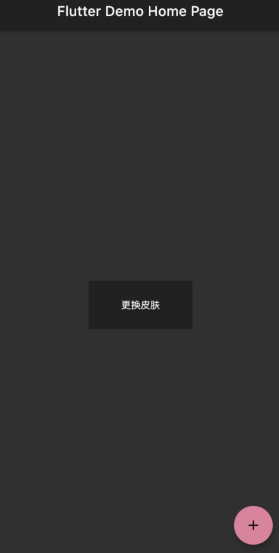
关于Dark Mode
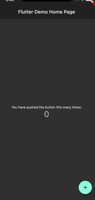
dark mode是ios提供的一个深色模式,flutter自身其实已经做了一定的适配,直接将brightness设置为dark
ThemeData(brightness: Brightness.dark,)
适配原理
打开darkmode模式发现之前设置的primarySwatch自动被替换为黑灰色,要知道怎么实现的还是得打开ThemeData的源码
可以看到当isDark为true时,primarySwatch将替换为Colors.grey,走的是另一套规则,所以想要自定义黑暗模式的配置,需要单独写一套配置项
大体可以不变(默认配色已经很好了),可以将accentColor,textSelectionHandleColor等使用tealAccent[200]颜色的小部件统一更换为主题色primarySwatch或其他
ThemeData(brightness: Brightness.dark,primarySwatch: Colors.red,accentColor: Colors.red,...),
效果: 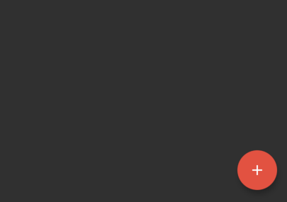
开发中如何使用主题
解决样式统一
虽然将Material ui修改为自己想要的设计,但是平时开发很多组件都是自己做的,比如自定义一个button
Container(width: 150,color: Colors.red,child: Center(child: Text('注册'),),)
Container默认情况下是没有颜色,这里的颜色是我们手写的,这种方式就没办法统一样式,例如我改主题色就需要每一个使用到的地方全部修改一遍
Theme.of方法
可以通过Theme.of来获取当前主题的ThemeData对象,当ThemeData对象发生改变时会rebuild,上文中的Colors.red可以替换为Theme.of(context).primaryColor
Container(width: 150,color: Theme.of(context).primaryColor,child: Center(child: Text('注册'),),)
该用什么?
ThemeData里包含的颜色多种多样,而且命名是Material自带的,很多时候在开发自定义空间的时候不太清楚什么时候用什么变量
例如,要设置页面的默认背景色,是用backgroundColor,还是scaffoldBackgroundColor?
使用规范
| 变量名 | 描述 | 是否随dark mode变化 |
|---|---|---|
| accentColor | 主题色 | false |
| scaffoldBackgroundColor | 页面背景色 | true |
| cardColor | 组件的背景色 | true |
| dividerTheme.color | 分割线颜色 | true |
案例
以feed-card为例,通过👇伪代码即可做出颜色分明的组件
# 页面颜色- scaffoldBackgroundColor# 卡片颜色- cardColor# 子空间颜色- scaffoldBackgroundColor
字体字号
这个没什么好说的,将Material这个库提供的配置和自己这边设计师的规范保持一致就是了,使用的时候直接Theme.of(context).textTheme.bodyText2就是了
配置案例
https://www.yuque.com/jinxuanzheng/mmxqgf/hm46oe#RbOzR
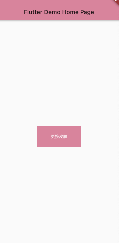
一键换肤功能
只换主题色的话就比较简单了,实际上就是修改primarySwatch颜色,并通知页面rebuild
颜色
先定义好几个预先设计的颜色,一定要是MaterialColor格式
List<MaterialColor> swatchCollect = [// B站粉MaterialColor(0xffe67e9C,const <int, Color>{50: const Color(0xfff7edf0),100: const Color(0xfff5e0e6),200: const Color(0xfff1c7d3),300: const Color(0xffeeb0c2),400: const Color(0xffea97af),500: const Color(0xffe67e9C),600: const Color(0xffe67e9C),700: const Color(0xffe67e9C),800: const Color(0xffe67e9C),900: const Color(0xffe67e9C),},),// 天空蓝MaterialColor(0xff62aef0,const <int, Color>{50: const Color(0xffeaf1f8),100: const Color(0xffdbeaf7),200: const Color(0xffbcbdf5),300: const Color(0xff9fccf4),400: const Color(0xff80bdf2),500: const Color(0xff62aef0),600: const Color(0xff62aef0),700: const Color(0xff62aef0),800: const Color(0xff62aef0),900: const Color(0xff62aef0),})];
Provider
更换皮肤需要重新rebuild,这时候需要一个状态管理,定义好之后用provider包裹一下根节点
# pubspec.yamldependencies:flutter:sdk: flutterprovider: ^5.0.0# The following adds the Cupertino Icons font to your application.# Use with the CupertinoIcons class for iOS style icons.cupertino_icons: ^1.0.2
# AppInfoProvider.dartclass AppInfoProvider with ChangeNotifier {// 初始值MaterialColor curPrimarySwatch = swatchCollect[0];// 修改颜色changePrimarySwatch(int idx) {curPrimarySwatch = swatchCollect[idx];notifyListeners();}}
应用
# main.dartrunApp(MultiProvider(providers: [ChangeNotifierProvider(create: (_) => AppInfoProvider())],child: MyApp(),),);class MyApp extends StatelessWidget {@overrideWidget build(BuildContext context) {return Consumer<AppInfoProvider>(builder: (context, appInfo, _) => MaterialApp(title: 'Flutter Demo',theme: ThemeData(brightness: Brightness.light,primarySwatch: appInfo.curPrimarySwatch,),home: MyHomePage(title: 'Flutter Demo Home Page'),),);}}
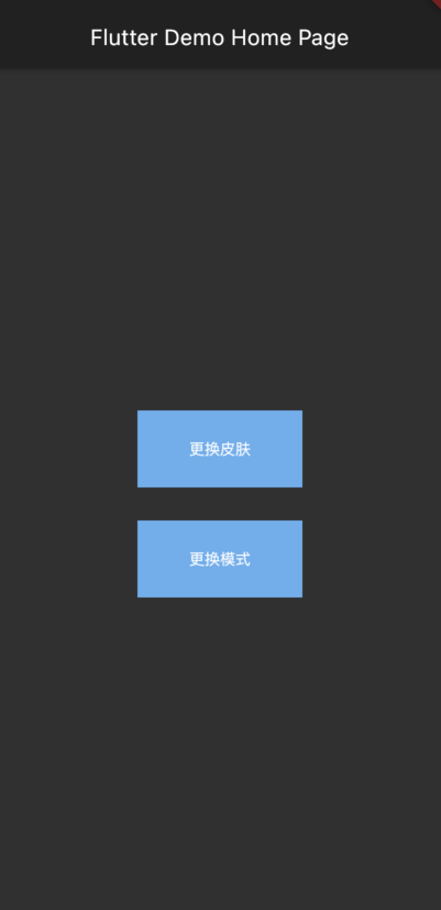
# home.dartclass MyHomePage extends StatefulWidget {MyHomePage({Key? key, required this.title}) : super(key: key);final String title;@override_MyHomePageState createState() => _MyHomePageState();}class _MyHomePageState extends State<MyHomePage> {@overrideWidget build(BuildContext context) {return Scaffold(appBar: AppBar(title: Text(widget.title),),body: Center(child: Column(mainAxisAlignment: MainAxisAlignment.center,children: <Widget>[GestureDetector(onTap: () {context.read<AppInfoProvider>().changePrimarySwatch(1);},child: Container(width: 150,height: 70,color: Theme.of(context).primaryColor,child: Center(child: Text('更换皮肤', style: TextStyle(color: Colors.white)),),),)],),),);}}
效果
扩展
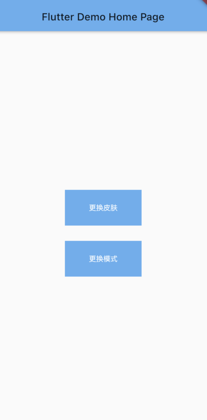
如果想定义更复杂的策略,而不仅仅是换颜色,自己定义一个ThemeDataList即可
return Consumer<AppInfoProvider>(builder: (context, appInfo, _) => MaterialApp(title: 'Flutter Demo',theme: appInfo.curTheme,home: MyHomePage(title: 'Flutter Demo Home Page'),),);
开启dark Mode
使用brightness: Brightness.dark即可打开暗色模式,不过有些小地方需要调整
配置项
暗色模式有些设置项和亮色模式在逻辑上(可能是我自己)不通用,比如accentColor并非在暗色下并非使用主题色,而是一个 Colors.tealAccent[200],所以如果需要继续使用主题色需要单独配置accentColor: appInfo.curPrimarySwatch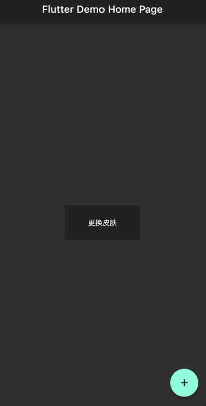
如果没有太多个性化需要,只需要把所有使用的Colors.tealAccent[200]的颜色覆盖一次就好(可以点击ThemeData找到源码,全文搜索)
class CustomThemeData {static ThemeData light(primarySwatch) {return ThemeData(brightness: Brightness.light,primaryColor: primarySwatch[500],//...);}static ThemeData dark(primarySwatch) {return ThemeData(brightness: Brightness.dark,primaryColor: primarySwatch[500],accentColor: primarySwatch[500],// appbar不希望用主题色设置appBarTheme: AppBarTheme(backgroundColor: Colors.grey[900],// titleTextStyle: TextStyle(color: Colors.white),textTheme: TextTheme(headline6: TextStyle(fontSize: 20, color: Colors.white),),),//...);}}
扩充Provider
根据暗色/亮色模式分别选择自己的配置项
class AppInfoProvider with ChangeNotifier {MaterialColor curPrimarySwatch = swatchCollect[0];ThemeData curTheme = CustomThemeData.light(swatchCollect[0]);bool mode = true; // true 亮色 false 暗色// todo:这个可以改一下与下面合并changePrimarySwatch(int idx) {curPrimarySwatch = swatchCollect[idx];notifyListeners();}changeTheme(bool isDark) {mode = isDark;if (mode != true) {curTheme = CustomThemeData.light(curPrimarySwatch);} else {curTheme = CustomThemeData.dark(curPrimarySwatch);}notifyListeners();}}
应用
class MyApp extends StatelessWidget {// This widget is the root of your application.@overrideWidget build(BuildContext context) {return Consumer<AppInfoProvider>(builder: (context, appInfo, _) => MaterialApp(title: 'Flutter Demo',theme: appInfo.curTheme,home: MyHomePage(title: 'Flutter Demo Home Page'),),);}}
class MyHomePage extends StatefulWidget {MyHomePage({Key? key, required this.title}) : super(key: key);final String title;@override_MyHomePageState createState() => _MyHomePageState();}class _MyHomePageState extends State<MyHomePage> {@overrideWidget build(BuildContext context) {return Scaffold(appBar: AppBar(title: Text(widget.title),),body: Center(child: Column(mainAxisAlignment: MainAxisAlignment.center,children: <Widget>[GestureDetector(onTap: () {context.read<AppInfoProvider>().changePrimarySwatch(1);},child: Container(width: 150,height: 70,color: Theme.of(context).primaryColor,child: Center(child: Text('更换皮肤', style: TextStyle(color: Colors.white)),),),),GestureDetector(onTap: () {print('object');var _curMode = context.read<AppInfoProvider>().mode;context.read<AppInfoProvider>().changeTheme(!_curMode);},child: Container(margin: EdgeInsets.only(top: 30),width: 150,height: 70,color: Theme.of(context).primaryColor,child: Center(child: Text('更换模式', style: TextStyle(color: Colors.white)),),),)],),),);}}
效果
ThemeData配置demo
官方文档: https://api.flutter-io.cn/flutter/material/ThemeData-class.html
除了主色调外,对于各个组件的不同表现还会有自定义需求,比如appBar,divider,bottomNavigationBar,errorColor等等,但这个类实在是太过于复杂,很多配置默认值其实就够用了
为了节约时间,下面枚举除了一下常用配置项,有更细致的需求再查文档就好了(里面有一些设置和默认值相同,为了方便小伙伴儿理解放出来重新覆盖下)
/** 浅色模式 */Color mainColor = primarySwatch[500];ThemeData(// 浅色模式brightness: Brightness.light,// 首要颜色primarySwatch: primarySwatch,// 小部件的前景色(旋钮、文本、覆盖边缘效果等)accentColor: mainColor,// 小部件背景色cardColor: Colors.white,// 主题弱化色backgroundColor: primarySwatch[200],// 页面默认色scaffoldBackgroundColor: Color.fromRGBO(244, 244, 244, 1),// appbarappBarTheme: AppBarTheme(backgroundColor: Colors.white,titleTextStyle: XdkFonts.normal,),// 分割线dividerTheme: DividerThemeData(color: Color.fromRGBO(236, 236, 236, 1),thickness: 1,space: 1,),// 底bar设置bottomNavigationBarTheme: BottomNavigationBarThemeData(selectedItemColor: Colors.black87,selectedLabelStyle: TextStyle(fontWeight: FontWeight.bold),type: BottomNavigationBarType.fixed,),// input框默认值inputDecorationTheme: InputDecorationTheme(fillColor: Color.fromRGBO(210, 210, 210, .2),),// elevatedButtonelevatedButtonTheme: ElevatedButtonThemeData(style: ButtonStyle(backgroundColor: MaterialStateProperty.all<Color>(mainColor)),),// icon默认颜色iconTheme: IconThemeData(color: Color.fromRGBO(51, 51, 51, 1),size: Adapt.px(40),),textTheme: TextTheme(headline6: 18,bodyText2: 16,subtitle2: 14,caption: 12,),colorScheme: ThemeData().colorScheme.copyWith(brightness: Brightness.light,primary: mainColor,error: XdkColors.errorColor,),// 警告色errorColor: XdkColors.errorColor,);}/** 深色模式 */Color mainColor = primarySwatch[500];TextTheme originTextTheme = ThemeData.dark().textTheme;ThemeData(brightness: Brightness.dark,// 首要颜色primaryColor: Colors.grey[900],primarySwatch: Colors.grey,primaryColorBrightness: Brightness.dark,// 主题弱化色backgroundColor: Colors.grey[200],// 页面默认色scaffoldBackgroundColor: Colors.grey[800],// 小部件的前景色(旋钮、文本、覆盖边缘效果等)accentColor: mainColor,// 小部件背景色cardColor: Colors.grey[850],// 对话框颜色dialogBackgroundColor: Colors.grey[850],// Meterial按钮颜色buttonColor: Colors.grey[600],// // 选中在泼墨动画期间使用的突出显示颜色,或用于指示菜单中的项// highlightColor: Colors.transparent,// // 定义由InkWell和InkResponse反应产生的墨溅的外观// splashFactory: NoSplashFactory(),// 底bar颜色bottomAppBarColor: Colors.grey[850],// icon默认颜色iconTheme: IconThemeData(color: Colors.grey[100],size: Adapt.px(40),),// 字体风格textTheme: TextTheme(headline6: originTextTheme.headline6.merge(XdkFonts.headline6),bodyText2: originTextTheme.bodyText2.merge(XdkFonts.normal),subtitle2: originTextTheme.subtitle2.merge(XdkFonts.subTitle),caption: originTextTheme.caption.merge(XdkFonts.caption),),// 颜色风格colorScheme: ThemeData().colorScheme.copyWith(brightness: Brightness.dark,primary: mainColor,error: XdkColors.errorColor,),// 警告色errorColor: XdkColors.errorColor,// 分割线风格dividerTheme: DividerThemeData(thickness: 1,space: 1,color: Colors.grey[800],),// appBarappBarTheme: AppBarTheme(backgroundColor: Colors.grey[900],titleTextStyle: XdkFonts.normal,),// 底bar风格bottomNavigationBarTheme: BottomNavigationBarThemeData(selectedItemColor: mainColor,selectedLabelStyle: TextStyle(fontWeight: FontWeight.bold),type: BottomNavigationBarType.fixed,),// 输入框风格inputDecorationTheme: InputDecorationTheme(fillColor: Color.fromRGBO(210, 210, 210, .2),),// 单选风格radioTheme: RadioThemeData(fillColor: MaterialStateProperty.resolveWith((states) {if (states.contains(MaterialState.selected)) {return mainColor;}return null;},),),// elevated按钮风格elevatedButtonTheme: ElevatedButtonThemeData(style: ButtonStyle(backgroundColor: MaterialStateProperty.all<Color>(mainColor),),),);
最终效果
dark mode
| light | dark |
|---|---|
 |
 |
colors
 |
 |
 |
|---|---|---|
相关资料
Material Design
flutter 的默认ui是基于google出品的Material Design,包括不限于配色/字号/基础组件/icon,想要自定义自己的主题,了解必不可少
ThemeData部分中文翻译
- brightness - Brightness类型,应用程序的整体主题亮度。用于按钮等小部件,以确定在不使用主色(primaryColor)或强调色(accentColor)时选择什么颜色。当亮度较暗时,画布、卡片和原色都较暗。当亮度为光时,画布和卡片的颜色是明亮的,原色的暗度根据原色亮度变化。当亮度较暗时,原色(primaryColor)与卡片和画布颜色的对比度较差;当亮度较暗时,用白色或亮蓝色来对比。
- primarySwatch - MaterialColor 类型,Material 主题中定义一种颜色,它具有十种颜色阴影的颜色样本。值越大颜色越深,10个有效的index分别为:50,100,200,…,900。默认是取中间值500。
- primaryColor - Color类型,App主要部分的背景色(ToolBar,Tabbar等)
- primaryColorBrightness - Brightness类型,primaryColor的亮度,用于确定设置在primaryColor上部的文本和图标颜色(如:工具栏文本(toolbar text))。
- primaryColorLight - Color类型,primaryColor的较浅版本
- primaryColorDark - Color类型,primaryColor的较深版本
- accentColor - Color类型,前景色(按钮、文本、覆盖边缘效果等)
- accentColorBrightness - Brightness类型,accentColor的亮度。用于确定位于accentColor上部的文本和图标颜色(例如,浮动操作按钮(FloatingButton)上的图标)
- canvasColor - Color类型,MaterialType.canvas Material的默认颜色。
- scaffoldBackgroundColor - Color类型,作为Scaffold下的Material默认颜色,用于materia应用程序或app内页面的背景色。
- bottomAppBarColor - Color类型,bottomAppBarColor的默认颜色。这可以通过指定BottomAppBar.color来覆盖。
- cardColor - Color类型,用在卡片(Card)上的Material的颜色。
- dividerColor - Color类型,分隔符(Dividers)和弹窗分隔符(PopupMenuDividers)的颜色,也用于ListTiles和DataTables的行之间。要创建使用这种颜色的合适的边界,请考虑Divider.createBorderSide。
- highlightColor - Color类型,用于墨水喷溅动画或指示菜单被选中时的高亮颜色
- splashColor - Color类型,墨水溅出的颜色
- splashFactory - InteractiveInkFeatureFactory类型,定义InkWall和InkResponse产成的墨水喷溅时的外观。
- selectedRowColor - Color类型,用于高亮选定行的颜色。
- unselectedWidgetColor - Color类型,小部件处于非活动(但启用)状态时使用的颜色。例如,未选中的复选框。通常与accentColor形成对比。
- disabledColor - Color类型,无效的部件(widget)的颜色,不管它们的状态如何。例如,一个禁用的复选框(可以选中或不选中)。
- buttonColor - Color类型,Material中RaisedButtons使用的默认填充色。
- buttonTheme - ButtonThemeData类型,定义按钮小部件的默认配置,如RaisedButton和FlatButton。
- secondaryHeaderColor - Color类型,有选定行时PaginatedDataTable标题的颜色
- textSelectionColor - Color类型,文本字段(如TextField)中文本被选中的颜色。
- cursorColor - Color类型,在 Material-style 文本字段(如TextField)中光标的颜色。
- textSelectionHandleColor - Color类型,用于调整当前选定文本部分的句柄的颜色。
- backgroundColor - Color类型,与primaryColor对比的颜色(例如 用作进度条的剩余部分)。
- dialogBackgroundColor - Color类型,Color类型,Dialog元素的背景色
- indicatorColor - Color类型,TabBar中选项选中的指示器颜色。
- hintColor - Color类型,用于提示文本或占位符文本的颜色,例如在TextField中。
- errorColor - Color类型,用于输入验证错误的颜色,例如在TextField中。
- toggleableActiveColor - Color类型,用于突出显示切换Widget(如Switch,Radio和Checkbox)的活动状态的颜色。
- fontFamily - String类型,字体类型
- textTheme - TextTheme类型,与卡片和画布对比的文本颜色
- primaryTextTheme - TextTheme类型,与primary color形成对比的文本主题。
- accentTextTheme - TextTheme类型,与accent color形成对比的文本主题。
- inputDecorationTheme - InputDecorationTheme类型,InputDecorator、TextField和TextFormField的默认InputDecoration值基于此主题
- iconTheme - IconThemeData类型,与卡片和画布颜色形成对比的图标主题。
- primaryIconTheme - IconThemeData类型,与原色(primary color)形成对比的图标主题。
- accentIconTheme - IconThemeData类型,与前景色(accent color)形成对比的图标主题。
- sliderTheme - SliderThemeData类型,SliderThemeData类型,用于渲染Slider的颜色和形状。
- tabBarTheme - TabBarTheme类型, 一个主题,用于自定义选项卡栏指示器的尺寸、形状和颜色。
- chipTheme - ChipThemeData类型,用于Chip的颜色和样式
- platform - TargetPlatform类型,widget应该适应目标的平台。
- materialTapTargetSize - MaterialTapTargetSize类型,配置特定材料部件的hit测试大小。
- pageTransitionsTheme - PageTransitionsTheme类型,每个目标平台的默认MaterialPageRoute转换。
- colorScheme
- ColorScheme类型,一组13种颜色,可用于配置大多数组件的颜色属性。
- typography - Typography类型,用于配置TextTheme、primaryTextTheme和accentTextTheme的颜色和几何文本主题值。
Dark Mode
DarkMode是一个iOS里全新的界面风格,官方翻译为「深色」和「浅色」外观,flutter的ThemeData里内置了切换选项brightness

若有收获,就点个赞吧
0 人点赞
