Introduction
Whenever I start a new project, the first order of business is to sand down some of the rough edges in the CSS language. I do this with a functional set of custom baseline styles.
For a long time, I used Eric Meyer’s famous CSS Reset. It’s a solid chunk of CSS, but it’s a bit long in the tooth at this point; it hasn’t been updated in more than a decade, and a lot has changed since then!
Recently, I’ve been using my own custom CSS reset. It includes all of the little tricks I’ve discovered to improve both the user experience and the CSS authoring experience.
Like other CSS resets, it’s unopinionated when it comes to design / cosmetics. You can use this reset for any project, no matter the aesthetic you’re going for.
In this tutorial, we’ll go on a tour of my custom CSS reset. We’ll dig into each rule, and you’ll learn what it does and why you might want to use it!
[
Link to this heading
](#the-css-reset)The CSS Reset
Without further ado, here it is:
css
/*
- Use a more-intuitive box-sizing model.
/
, ::before, ::after {box-sizing: border-box;}
/*
- Remove default margin
*/
- {margin: 0;}
/*
- Allow percentage-based heights in the application
*/
html, body {height: 100%;}
/*
Typographic tweaks!
- Add accessible line-height
- Improve text rendering
*/
body {
line-height: 1.5;
-webkit-font-smoothing: antialiased;
}
/*
- Improve media defaults
*/
img, picture, video, canvas, svg {
display: block;
max-width: 100%;
}
/*
- Remove built-in form typography styles
*/
input, button, textarea, select {font: inherit;}
/*
- Avoid text overflows
*/
p, h1, h2, h3, h4, h5, h6 {overflow-wrap: break-word;}
/*
/*
- Use a more-intuitive box-sizing model.
*/
, ::before, *::after {
box-sizing: border-box;
}
/*
- Remove default margin
*/
- {
margin: 0;
}
/*
- Allow percentage-based heights in the application
*/
html, body {
height: 100%;
}
/*
Typographic tweaks!
Add accessible line-height
Improve text rendering
*/
body {
line-height: 1.5;
-webkit-font-smoothing: antialiased;
}
/*
- Improve media defaults
*/
img, picture, video, canvas, svg {
display: block;
max-width: 100%;
}
/*
- Remove built-in form typography styles
*/
input, button, textarea, select {
font: inherit;
}
/*
- Avoid text overflows
*/
p, h1, h2, h3, h4, h5, h6 {
overflow-wrap: break-word;
}
/*
- Create a root stacking context
*/
root, #__next {
isolation: isolate;
}
/**
- Reset the text fill color so that placeholder is visible
*/
.npmreact-simple-code-editortextarea:empty {-webkit-text-fill-color: inherit !important;}
/**
- Hack to apply on some CSS on IE10 and IE11
/
@media all and (-ms-high-contrast: none), (-ms-high-contrast: active) {
/* - IE doesn’t support’-webkit-text-fill-color’
- So we use ‘color: transparent’ to make the text transparent on IE
- Unlike other browsers, it doesn’t affect caret color in IE
*/
.npmreact-simple-code-editortextarea {color: transparent !important;}
.npmreact-simple-code-editortextarea::selection {
background-color: #accef7 !important;
color: transparent !important;
}
}
It’s relatively short, but there’s a lot of stuff packed into this small stylesheet. Let’s get into it!
A pedantic note
Historically, the main goal of a CSS reset has been to ensure consistency between browsers, and to undo all default styles, creating a blank slate. My CSS reset doesn’t really do either of these things.
These days, browsers don’t have massive discrepancies when it comes to layout or spacing. By and large, browsers implement the CSS specification faithfully, and things behave as you’d expect. So it isn’t as necessary anymore.
I also don’t believe it’s necessary to strip away all of the browser defaults. I probably do want <em> tags to set font-style: italic, for example! I can always make different design decisions in the individual project styles, but I see no point in stripping away common-sense defaults.
My CSS reset may not fit the classical definition of a “CSS reset”, but I’m taking that creative liberty.
[
Link to this heading
](#digit-box-sizing-model)1. Box-sizing model
Pop quiz! Measuring by the visible pink border, how wide is the .box element in the following scenario, assuming no other CSS has been applied?
html
/ Reset the text fill color so that placeholder is visible / .npmreact-simple-code-editortextarea:empty {-webkit-text-fill-color: inherit !important;} / Hack to apply on some CSS on IE10 and IE11 / @media all and (-ms-high-contrast: none), (-ms-high-contrast: active) { /* IE doesn’t support’-webkit-text-fill-color’ So we use ‘color: transparent’ to make the text transparent on IE Unlike other browsers, it doesn’t affect caret color in IE */ .npmreact-simple-code-editortextarea {color: transparent !important;} .npmreact-simple-code-editortextarea::selection {background-color: #accef7 !important; color: transparent !important;} }
1
200px
2
240px
3
244px
4
0px
Submit
Our .box element has width: 100%. Because its parent is 200px wide, that 100% will resolve to 200px.
But where does it apply that 200px width? By default, it will apply that size to the content box.
If you’re not familiar, the “content box” is the rectangle in the box model that actually holds the content, inside the border and the padding:
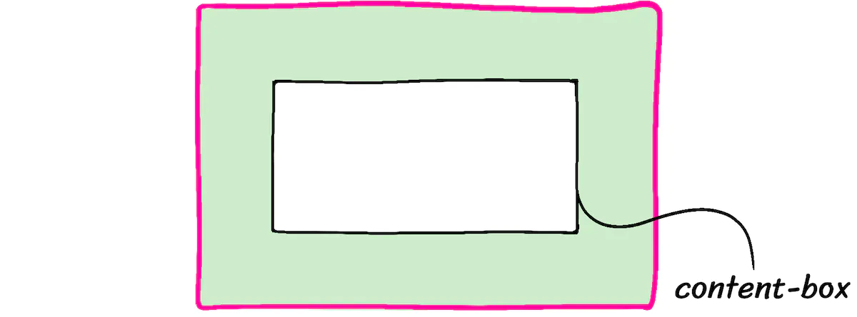
The width: 100% declaration will set the .box‘s content-box to 200px. The padding will add an extra 40px (20px on each side). The border adds a final 4px (2px on each side). When we do the math, the visible pink rectangle will be 244px wide.
When we try and cram a 244px box into a 200px-wide parent, it overflows:
Code Playground
Format code using Prettier
Reset code
HTMLCSS
/ Reset the text fill color so that placeholder is visible / .npmreact-simple-code-editortextarea:empty {-webkit-text-fill-color: inherit !important;} / Hack to apply on some CSS on IE10 and IE11 / @media all and (-ms-high-contrast: none), (-ms-high-contrast: active) { / IE doesn’t support’-webkit-text-fill-color’ So we use ‘color: transparent’ to make the text transparent on IE Unlike other browsers, it doesn’t affect caret color in IE / .npmreact-simple-code-editortextarea {color: transparent !important;} .npmreact-simple-code-editortextarea::selection {background-color: #accef7 !important; color: transparent !important;} }
Result
Refresh results pane
Enable ‘tab’ key
This behavior is weird, right? Fortunately, we can change it, by setting the following rule:
css
, ::before, ::after {box-sizing: border-box;}
, ::before, ::after {
box-sizing: border-box;
}
/
- Reset the text fill color so that placeholder is visible
/
.npmreact-simple-code-editortextarea:empty {-webkit-text-fill-color: inherit !important;}
/* - Hack to apply on some CSS on IE10 and IE11
/
@media all and (-ms-high-contrast: none), (-ms-high-contrast: active) {
/* - IE doesn’t support’-webkit-text-fill-color’
- So we use ‘color: transparent’ to make the text transparent on IE
- Unlike other browsers, it doesn’t affect caret color in IE
/
.npmreact-simple-code-editortextarea {color: transparent !important;}
.npmreact-simple-code-editortextarea::selection {
background-color: #accef7 !important;
color: transparent !important;
}
}
With this rule applied, percentages will resolve based on the border-box. In the example above, our pink box would be 200px, and the inner content-box would shrink down to 156px (200px - 40px - 4px).
This is a must-have rule, in my opinion. It makes CSS significantly nicer to work with.
We apply it to all elements and pseudo-elements using the wildcard selector (``). Contrary to popular belief, this is not bad for performance.
Inheriting box-sizing
I’ve seen some recommendations online to do this instead:
css
html {box-sizing: border-box;}
, :before, :after {box-sizing: inherit;}
html {
box-sizing: border-box;
}
, :before, :after {
box-sizing: inherit;
}
/** - Reset the text fill color so that placeholder is visible
/
.npmreact-simple-code-editortextarea:empty {-webkit-text-fill-color: inherit !important;}
/* - Hack to apply on some CSS on IE10 and IE11
/
@media all and (-ms-high-contrast: none), (-ms-high-contrast: active) {
/* - IE doesn’t support’-webkit-text-fill-color’
- So we use ‘color: transparent’ to make the text transparent on IE
- Unlike other browsers, it doesn’t affect caret color in IE
*/
.npmreact-simple-code-editortextarea {color: transparent !important;}
.npmreact-simple-code-editortextarea::selection {
background-color: #accef7 !important;
color: transparent !important;
}
}
This can be a helpful strategy if you’re trying to migrate a large pre-existing project to use border-box. It isn’t necessary if you’re starting a brand new project from scratch. To keep things simple, I’ve omitted it from my CSS reset.
Expand to see an example of when this might be helpful.
Show more[
Link to this heading
](#digit-remove-default-margin)2. Remove default margin
css
{margin: 0;}
{
margin: 0;
}
/** - Reset the text fill color so that placeholder is visible
/
.npmreact-simple-code-editortextarea:empty {-webkit-text-fill-color: inherit !important;}
/* - Hack to apply on some CSS on IE10 and IE11
/
@media all and (-ms-high-contrast: none), (-ms-high-contrast: active) {
/* - IE doesn’t support’-webkit-text-fill-color’
- So we use ‘color: transparent’ to make the text transparent on IE
- Unlike other browsers, it doesn’t affect caret color in IE
/
.npmreact-simple-code-editortextarea {color: transparent !important;}
.npmreact-simple-code-editortextarea::selection {
background-color: #accef7 !important;
color: transparent !important;
}
}
Browsers make common-sense assumptions around margin. For example, anh1will include more margin by default than a paragraph.
These assumptions are reasonable within the context of a word-processing document, but they might not be accurate for a modern web application.
Margin is a tricky devil, and more often than not, I find myself wishing elements didn’t have any by default. So I’ve decided to remove it all. 🔥
If/when I do want to add some margin to specific tags, I can do so in my custom project styles. The wildcard selector (``) has extremely low specificity, so it’ll be easy to override this rule.[
Link to this heading
](#digit-percentage-based-heights)3. Percentage-based heights
css
html, body {height: 100%;}
html, body {
height: 100%;
}
/** - Reset the text fill color so that placeholder is visible
/
.npmreact-simple-code-editortextarea:empty {-webkit-text-fill-color: inherit !important;}
/* - Hack to apply on some CSS on IE10 and IE11
/
@media all and (-ms-high-contrast: none), (-ms-high-contrast: active) {
/* - IE doesn’t support’-webkit-text-fill-color’
- So we use ‘color: transparent’ to make the text transparent on IE
- Unlike other browsers, it doesn’t affect caret color in IE
*/
.npmreact-simple-code-editortextarea {color: transparent !important;}
.npmreact-simple-code-editortextarea::selection {
background-color: #accef7 !important;
color: transparent !important;
}
}
Have you ever tried to use a percentage-based height in CSS, only to discover that it seems to have no effect?
Here’s an example:Code Playground
Format code using Prettier
Reset code
HTML
Hello WorldHello World
/ Reset the text fill color so that placeholder is visible / .npmreact-simple-code-editortextarea:empty {-webkit-text-fill-color: inherit !important;} / Hack to apply on some CSS on IE10 and IE11 / @media all and (-ms-high-contrast: none), (-ms-high-contrast: active) { /* IE doesn’t support’-webkit-text-fill-color’ So we use ‘color: transparent’ to make the text transparent on IE Unlike other browsers, it doesn’t affect caret color in IE */ .npmreact-simple-code-editortextarea {color: transparent !important;} .npmreact-simple-code-editortextarea::selection {background-color: #accef7 !important; color: transparent !important;} }
Result
Refresh results pane
Enable ‘tab’ key
Themainelement hasheight: 100%, but the element doesn’t grow at all!
This doesn’t work because in Flow layout (the primary layout mode in CSS),heightandwidthoperate on fundamentally different principles. The width of an element is calculated based on its parent, but the height of an element is calculated based on its children.
This is a complicated topic, and it’s way beyond the scope of this article. I plan on writing a blog post about it, but in the meantime, you can learn all about it in my CSS course, CSS for JavaScript Developers.
As a quick demo, here we see that ourmainelement can grow when we apply this rule:Code Playground
Format code using Prettier
Reset code
HTML
Hello WorldHello World
/ Reset the text fill color so that placeholder is visible / .npmreact-simple-code-editortextarea:empty {-webkit-text-fill-color: inherit !important;} / Hack to apply on some CSS on IE10 and IE11 / @media all and (-ms-high-contrast: none), (-ms-high-contrast: active) { / IE doesn’t support’-webkit-text-fill-color’ So we use ‘color: transparent’ to make the text transparent on IE Unlike other browsers, it doesn’t affect caret color in IE / .npmreact-simple-code-editortextarea {color: transparent !important;} .npmreact-simple-code-editortextarea::selection {background-color: #accef7 !important; color: transparent !important;} }
Result
Refresh results pane
Enable ‘tab’ key
If you’re using a JS framework like React, you might also wish to add a third selector to this rule: the root-level element used by the framework.
For example, in my Next.js projects, I update the rule as follows:
css
html, body, #next {height: 100%;}
html, body, #next {
height: 100%;
}
/ - Reset the text fill color so that placeholder is visible
/
.npmreact-simple-code-editortextarea:empty {-webkit-text-fill-color: inherit !important;}
/* - Hack to apply on some CSS on IE10 and IE11
/
@media all and (-ms-high-contrast: none), (-ms-high-contrast: active) {
/* - IE doesn’t support’-webkit-text-fill-color’
- So we use ‘color: transparent’ to make the text transparent on IE
- Unlike other browsers, it doesn’t affect caret color in IE
/
.npmreact-simple-code-editortextarea {color: transparent !important;}
.npmreact-simple-code-editortextarea::selection {
background-color: #accef7 !important;
color: transparent !important;
}
}
*Why not use vh?
You might be wondering: why fuss with percentage-based heights at all? Why not use thevhunit instead?
The problem is that thevhunit doesn’t work properly on mobile devices;100vhwill take up more than 100% of the screen real estate, because mobile browsers do that thing where the browser UI comes and goes.
In the future, new CSS units will solve for this. Until then, I continue using percentage-based heights.[
Link to this heading
](#digit-tweaking-line-height)4 Tweaking line-height
css
body {line-height: 1.5;}
body {
line-height: 1.5;
}
/** - Reset the text fill color so that placeholder is visible
/
.npmreact-simple-code-editortextarea:empty {-webkit-text-fill-color: inherit !important;}
/* - Hack to apply on some CSS on IE10 and IE11
/
@media all and (-ms-high-contrast: none), (-ms-high-contrast: active) {
/* - IE doesn’t support’-webkit-text-fill-color’
- So we use ‘color: transparent’ to make the text transparent on IE
- Unlike other browsers, it doesn’t affect caret color in IE
*/
.npmreact-simple-code-editortextarea {color: transparent !important;}
.npmreact-simple-code-editortextarea::selection {
background-color: #accef7 !important;
color: transparent !important;
}
}line-heightcontrols the vertical spacing between each line of text in a paragraph. The default value varies between browsers, but it tends to be around 1.2.
This unitless number is a ratio based on the font size. It functions just like theemunit. With aline-heightof 1.2, each line will be 20% larger than the element’s font size.
Here’s the problem: for those who are dyslexic, these lines are packed too closely together, making it harder to read. The WCAG criteria states that line-height should be at least 1.5.
Now, this number does tend to produce quite-large lines on headings and other elements with large type:Code Playground
Format code using Prettier
Reset code
HTMLCSS
This paragraph has a 1.5x ratio for line-height, and it feels pretty good, right? I think this text is legible and pleasant.But it’s a bit much on headings!
This paragraph has a 1.5x ratio
for line-height, and it feels
pretty good, right? I think
this text is legible and pleasant.
But it’s a bit much on headings!
/** Reset the text fill color so that placeholder is visible / .npmreact-simple-code-editortextarea:empty {-webkit-text-fill-color: inherit !important;} /** Hack to apply on some CSS on IE10 and IE11 / @media all and (-ms-high-contrast: none), (-ms-high-contrast: active) { /** IE doesn’t support’-webkit-text-fill-color’ So we use ‘color: transparent’ to make the text transparent on IE Unlike other browsers, it doesn’t affect caret color in IE / .npmreact-simple-code-editortextarea {color: transparent !important;} .npmreact-simple-code-editortextarea::selection {background-color: #accef7 !important; color: transparent !important;} }
Result
Refresh results pane
Enable ‘tab’ key
You may wish to override this value on headings. My understanding is that the WCAG criteria is meant for “body” text, not headings.
Smarter line-heights with “calc”
I’ve been experimenting with an alternative way to manage line-heights. Here it is:
css
{line-height: calc(1em + 0.5rem);
}
{
line-height: calc(1em + 0.5rem);
}
/* - Reset the text fill color so that placeholder is visible
/
.npmreact-simple-code-editortextarea:empty {-webkit-text-fill-color: inherit !important;}
/* - Hack to apply on some CSS on IE10 and IE11
/
@media all and (-ms-high-contrast: none), (-ms-high-contrast: active) {
/* - IE doesn’t support’-webkit-text-fill-color’
- So we use ‘color: transparent’ to make the text transparent on IE
- Unlike other browsers, it doesn’t affect caret color in IE
*/
.npmreact-simple-code-editortextarea {color: transparent !important;}
.npmreact-simple-code-editortextarea::selection {
background-color: #accef7 !important;
color: transparent !important;
}
}
This is a pretty advanced little snippet, and it’s beyond the scope of this blog post, but here’s a quick explanation.
Show more[
Link to this heading
](#digit-font-smoothing)5. Font smoothing
css
body {-webkit-font-smoothing: antialiased;}
body {
-webkit-font-smoothing: antialiased;
}
/** - Reset the text fill color so that placeholder is visible
/
.npmreact-simple-code-editortextarea:empty {-webkit-text-fill-color: inherit !important;}
/* - Hack to apply on some CSS on IE10 and IE11
/
@media all and (-ms-high-contrast: none), (-ms-high-contrast: active) {
/* - IE doesn’t support’-webkit-text-fill-color’
- So we use ‘color: transparent’ to make the text transparent on IE
- Unlike other browsers, it doesn’t affect caret color in IE
/
.npmreact-simple-code-editortextarea {color: transparent !important;}
.npmreact-simple-code-editortextarea::selection {
background-color: #accef7 !important;
color: transparent !important;
}
}
Alright, so this one is a bit controversial.
On MacOS computers, the browser will use “subpixel antialiasing” by default. This is a technique that aims to make text easier to read, by leveraging the R/G/B lights within each pixel.
In the past, this was seen as an accessibility win, because it improved text contrast. You may have read a popular blog post, Stop “Fixing” Font Smoothing, that advocates against switching to “antialiased”.
Here’s the problem: that article was written in 2012, before the era of high-DPI “retina” displays. Today’s pixels are much smaller, invisible to the naked eye.
The physical arrangement of pixel LEDs has changed as well. If you look at a modern monitor under a microscope, you won’t see an orderly grid of R/G/B lines anymore.
In MacOS Mojave, released in 2018, *Apple disabled subpixel antialiasing across the operating system. I’m guessing they realized that it was doing more harm than good on modern hardware.
Confusingly, MacOS browsers like Chrome and Safari still use subpixel antialiasing by default. We need to explicitly turn it off, by setting-webkit-font-smoothingtoantialiased.
Here’s the difference:Antialiasing
Subpixel Antialiasing

Toggle
Expand
MacOS is the only operating system to use subpixel-antialiasing, and so this rule has no effect on Windows, Linux, or mobile devices. If you’re on a MacOS computer, you can experiment with a live render:Code Playground
Format code using Prettier
Reset code
HTMLCSS
This paragraph uses the default subpixel antialiasing.
This paragraph does not use subpixel antialiasing.
This paragraph uses the default subpixel antialiasing.
This paragraph does not use subpixel antialiasing.
/ Reset the text fill color so that placeholder is visible / .npmreact-simple-code-editortextarea:empty {-webkit-text-fill-color: inherit !important;} / Hack to apply on some CSS on IE10 and IE11 / @media all and (-ms-high-contrast: none), (-ms-high-contrast: active) { /* IE doesn’t support’-webkit-text-fill-color’ So we use ‘color: transparent’ to make the text transparent on IE Unlike other browsers, it doesn’t affect caret color in IE */ .npmreact-simple-code-editortextarea {color: transparent !important;} .npmreact-simple-code-editortextarea::selection {background-color: #accef7 !important; color: transparent !important;} }
Result
Refresh results pane
Enable ‘tab’ key[
Link to this heading
](#digit-sensible-media-defaults)6. Sensible media defaults
css
img, picture, video, canvas, svg {
display: block;
max-width: 100%;
}
img, picture, video, canvas, svg {
display: block;
max-width: 100%;
}
/** - Reset the text fill color so that placeholder is visible
/
.npmreact-simple-code-editortextarea:empty {-webkit-text-fill-color: inherit !important;}
/* - Hack to apply on some CSS on IE10 and IE11
/
@media all and (-ms-high-contrast: none), (-ms-high-contrast: active) {
/* - IE doesn’t support’-webkit-text-fill-color’
- So we use ‘color: transparent’ to make the text transparent on IE
- Unlike other browsers, it doesn’t affect caret color in IE
*/
.npmreact-simple-code-editortextarea {color: transparent !important;}
.npmreact-simple-code-editortextarea::selection {
background-color: #accef7 !important;
color: transparent !important;
}
}
So here’s a weird thing: images are considered”inline” elements. This implies that they should be used in the middle of paragraphs, like<em>or<strong>.
This doesn’t jive with how I use images most of the time. Typically, I treat images the same way I treat paragraphs or headers or sidebars; they’re layout elements.
If we try to use an inline element in our layout, though, weird things happen. If you’ve ever had a mysterious 4px gap that wasn’t margin or padding or border, it was probably the “inline magic space” that browsers add withline-height.
By settingdisplay: blockon all images by default, we sidestep a whole category of funky issues.
I also setmax-width: 100%. This is done to keep large images from overflowing, if they’re placed in a container that isn’t wide enough to contain them.
Most block-level elements will automatically grow/shrink to fit their parent, but media elements like<img>are special: they’re known as replaced elements, and they don’t follow the same rules.
If an image has a “native” size of 800×600, the<img>element will also be 800px wide, even if we plop it into a 500px-wide parent.
This rule will prevent that image from growing beyond its container, which feels like much more sensible default behavior to me.[
Link to this heading
](#digit-inherit-fonts-for-form-controls)7. Inherit fonts for form controls
css
input, button, textarea, select {font: inherit;}
input, button, textarea, select {
font: inherit;
}
/** - Reset the text fill color so that placeholder is visible
/
.npmreact-simple-code-editortextarea:empty {-webkit-text-fill-color: inherit !important;}
/* - Hack to apply on some CSS on IE10 and IE11
/
@media all and (-ms-high-contrast: none), (-ms-high-contrast: active) {
/* - IE doesn’t support’-webkit-text-fill-color’
- So we use ‘color: transparent’ to make the text transparent on IE
- Unlike other browsers, it doesn’t affect caret color in IE
/
.npmreact-simple-code-editortextarea {color: transparent !important;}
.npmreact-simple-code-editortextarea::selection {
background-color: #accef7 !important;
color: transparent !important;
}
}
Here’s another weird thing: by default, buttons and inputs don’t inherit typographical styles from their parents. Instead, they have their own weird styles.
For example,<textarea>will use the system-default monospace font. Text inputs will use the system-default sans-serif font. And both will choose a microscopically-small font size (13.333px in Chrome).
As you might imagine, it’s very hard to read 13px text on a mobile device. When we focus an input with a small font size, the browser will automatically zoom in, so that the text is easier to read.
Unfortunately, this is not a good experience:
If we want to avoid this auto-zoom behavior, the inputs need to have a font-size of at least 1rem / 16px. Here’s one way to address the issue:
css
input, button, textarea, select {font-size: 1rem;}
input, button, textarea, select {
font-size: 1rem;
}
/* - Reset the text fill color so that placeholder is visible
/
.npmreact-simple-code-editortextarea:empty {-webkit-text-fill-color: inherit !important;}
/* - Hack to apply on some CSS on IE10 and IE11
/
@media all and (-ms-high-contrast: none), (-ms-high-contrast: active) {
/* - IE doesn’t support’-webkit-text-fill-color’
- So we use ‘color: transparent’ to make the text transparent on IE
- Unlike other browsers, it doesn’t affect caret color in IE
/
.npmreact-simple-code-editortextarea {color: transparent !important;}
.npmreact-simple-code-editortextarea::selection {
background-color: #accef7 !important;
color: transparent !important;
}
}
This fixes the auto-zoom issue, but it’s a band-aid. Let’s address the root cause instead: form inputs shouldn’t have their own typographical styles!
css
input, button, textarea, select {font: inherit;}
input, button, textarea, select {
font: inherit;
}
/* - Reset the text fill color so that placeholder is visible
/
.npmreact-simple-code-editortextarea:empty {-webkit-text-fill-color: inherit !important;}
/* - Hack to apply on some CSS on IE10 and IE11
/
@media all and (-ms-high-contrast: none), (-ms-high-contrast: active) {
/* - IE doesn’t support’-webkit-text-fill-color’
- So we use ‘color: transparent’ to make the text transparent on IE
- Unlike other browsers, it doesn’t affect caret color in IE
*/
.npmreact-simple-code-editortextarea {color: transparent !important;}
.npmreact-simple-code-editortextarea::selection {
background-color: #accef7 !important;
color: transparent !important;
}
}fontis a rarely-used shorthand that sets a bunch of font-related properties, likefont-size,font-weight, andfont-family. By setting it toinherit, we instruct these elements to match the typography in their surrounding environment.
As long as we don’t choose an obnoxiously small font size for our body text, this solves all of our issues at once. 🎉[
Link to this heading
](#digit-word-wrapping)8. Word wrapping
css
p, h1, h2, h3, h4, h5, h6 {overflow-wrap: break-word;}
p, h1, h2, h3, h4, h5, h6 {
overflow-wrap: break-word;
}
/** - Reset the text fill color so that placeholder is visible
/
.npmreact-simple-code-editortextarea:empty {-webkit-text-fill-color: inherit !important;}
/* - Hack to apply on some CSS on IE10 and IE11
/
@media all and (-ms-high-contrast: none), (-ms-high-contrast: active) {
/* - IE doesn’t support’-webkit-text-fill-color’
- So we use ‘color: transparent’ to make the text transparent on IE
- Unlike other browsers, it doesn’t affect caret color in IE
*/
.npmreact-simple-code-editortextarea {color: transparent !important;}
.npmreact-simple-code-editortextarea::selection {
background-color: #accef7 !important;
color: transparent !important;
}
}
In CSS, text will automatically line-wrap if there isn’t enough space to fit all of the characters on a single line.
By default, the algorithm will look for “soft wrap” opportunities; these are the characters that the algorithm can split on. In English, the only soft wrap opportunities are whitespace and hyphens, but this varies from language to language.
If a line doesn’t have any soft wrap opportunities, and it doesn’t fit, it will cause the text to overflow:Code Playground
Format code using Prettier
Reset code
HTMLCSS
This is a narrow column of text, with a very long word: antidisestablishmentarianism.
The same problem happens with URLs: https://www.somewebsite.com/articles/a1b2c3
This is a narrow column of text, with a very long word: antidisestablishmentarianism.
The same problem happens with URLs: https://www.somewebsite.com/articles/a1b2c3
/ Reset the text fill color so that placeholder is visible / .npmreact-simple-code-editortextarea:empty {-webkit-text-fill-color: inherit !important;} / Hack to apply on some CSS on IE10 and IE11 / @media all and (-ms-high-contrast: none), (-ms-high-contrast: active) { /* IE doesn’t support’-webkit-text-fill-color’ So we use ‘color: transparent’ to make the text transparent on IE Unlike other browsers, it doesn’t affect caret color in IE */ .npmreact-simple-code-editortextarea {color: transparent !important;} .npmreact-simple-code-editortextarea::selection {background-color: #accef7 !important; color: transparent !important;} }
Result
Refresh results pane
Enable ‘tab’ key
This can cause some annoying layout issues. Here, it adds a horizontal scrollbar. In other situations, it might cause text to overlap other elements, or slip behind an image/video.
Theoverflow-wrapproperty lets us tweak the line-wrapping algorithm, and give it permission to use hard wraps when no soft wrap opportunties can be found:Code Playground
Format code using Prettier
Reset code
HTMLCSS
This is a narrow column of text, with a very long word: antidisestablishmentarianism.
The same problem happens with URLs: https://www.somewebsite.com/articles/a1b2c3
This is a narrow column of text, with a very long word: antidisestablishmentarianism.
The same problem happens with URLs: https://www.somewebsite.com/articles/a1b2c3
/ Reset the text fill color so that placeholder is visible / .npmreact-simple-code-editortextarea:empty {-webkit-text-fill-color: inherit !important;} / Hack to apply on some CSS on IE10 and IE11 / @media all and (-ms-high-contrast: none), (-ms-high-contrast: active) { / IE doesn’t support’-webkit-text-fill-color’ So we use ‘color: transparent’ to make the text transparent on IE Unlike other browsers, it doesn’t affect caret color in IE / .npmreact-simple-code-editortextarea {color: transparent !important;} .npmreact-simple-code-editortextarea::selection {background-color: #accef7 !important; color: transparent !important;} }
Result
Refresh results pane
Enable ‘tab’ key
Neither solution is perfect, but at least hard wrapping won’t mess with the layout!
Thanks to Sophie Alpert for suggesting a similar rule! She suggests applying it to all elements, which is probably a good idea, but not something I’ve personally tested.
You can also try adding thehyphensproperty:
css
p {
overflow-wrap: break-word;
hyphens: auto;
}
p {
overflow-wrap: break-word;
hyphens: auto;
}
/ - Reset the text fill color so that placeholder is visible
/
.npmreact-simple-code-editortextarea:empty {-webkit-text-fill-color: inherit !important;}
/* - Hack to apply on some CSS on IE10 and IE11
/
@media all and (-ms-high-contrast: none), (-ms-high-contrast: active) {
/* - IE doesn’t support’-webkit-text-fill-color’
- So we use ‘color: transparent’ to make the text transparent on IE
- Unlike other browsers, it doesn’t affect caret color in IE
*/
.npmreact-simple-code-editortextarea {color: transparent !important;}
.npmreact-simple-code-editortextarea::selection {
background-color: #accef7 !important;
color: transparent !important;
}
}hyphens: autouses hyphens (in languages that support them) to indicate hard wraps. It also makes hard wraps much more common.
It can be worthwhile if you have very-narrow columns of text, but it can also be a bit distracting. I chose not to include it in the reset, but it’s worth experimenting with9. Root stacking context
css
#root, #next {isolation: isolate;}
#root, #next {
isolation: isolate;
}
/** - Reset the text fill color so that placeholder is visible
/
.npmreact-simple-code-editortextarea:empty {-webkit-text-fill-color: inherit !important;}
/* - Hack to apply on some CSS on IE10 and IE11
/
@media all and (-ms-high-contrast: none), (-ms-high-contrast: active) {
/* - IE doesn’t support’-webkit-text-fill-color’
- So we use ‘color: transparent’ to make the text transparent on IE
- Unlike other browsers, it doesn’t affect caret color in IE
*/
.npmreact-simple-code-editortextarea {color: transparent !important;}
.npmreact-simple-code-editortextarea::selection {
background-color: #accef7 !important;
color: transparent !important;
}
}
This last one is optional. It’s generally only needed if you use a JS framework like React.
As we saw in “What The Heck, z-index??”, theisolationproperty allows us to create a new stacking context without needing to set az-index.
This is beneficial since it allows us to guarantee that certain high-priority elements (modals, dropdowns, tooltips) will always show up above the other elements in our application. No weird stacking context bugs, no z-index arms race.
You should tweak the selector to match your framework. We want to select the top-level element that your application is rendered within. For example, create-react-app uses a<div id="root">, so the correct selector is#root.
[
Link to this heading](#our-finished-product)Our finished product
Here’s the CSS reset again, in a condensed copy-friendly format:
css
/
Josh’s Custom CSS Reset
https://www.joshwcomeau.com/css/custom-css-reset/
/
, ::before, ::after {box-sizing: border-box;}
{margin: 0;}
html, body {height: 100%;}
body {
line-height: 1.5;
-webkit-font-smoothing: antialiased;
}
img, picture, video, canvas, svg {
display: block;
max-width: 100%;
}
input, button, textarea, select {font: inherit;}
p, h1, h2, h3, h4, h5, h6 {overflow-wrap: break-word;}
#root, #next {isolation: isolate;}
/
Josh’s Custom CSS Reset
https://www.joshwcomeau.com/css/custom-css-reset/
/
, ::before, ::after {
box-sizing: border-box;
}
{
margin: 0;
}
html, body {
height: 100%;
}
body {
line-height: 1.5;
-webkit-font-smoothing: antialiased;
}
img, picture, video, canvas, svg {
display: block;
max-width: 100%;
}
input, button, textarea, select {
font: inherit;
}
p, h1, h2, h3, h4, h5, h6 {
overflow-wrap: break-word;
}
#root, #next {
isolation: isolate;
}
/** - Reset the text fill color so that placeholder is visible
/
.npmreact-simple-code-editortextarea:empty {-webkit-text-fill-color: inherit !important;}
/* - Hack to apply on some CSS on IE10 and IE11
/
@media all and (-ms-high-contrast: none), (-ms-high-contrast: active) {
/* - IE doesn’t support’-webkit-text-fill-color’
- So we use ‘color: transparent’ to make the text transparent on IE
- Unlike other browsers, it doesn’t affect caret color in IE
/
.npmreact-simple-code-editortextarea {color: transparent !important;}
.npmreact-simple-code-editortextarea::selection {
background-color: #accef7 !important;
color: transparent !important;
}
}
Feel free to copy/paste this into your own projects! It’s released without any restrictions, into the public domain (though if you wanted to keep the link to this blog post, I’d appreciate it!).
I chose not to release this CSS reset as an NPM package because I feel like you should own your reset. Bring this into your project, and tweak it over time as you learn new things or discover new tricks. You can always make your own NPM package to facilitate reuse across your projects, if you want. Just keep in mind: *you own this code, and it should grow along with you.
Thanks to Andy Bell for sharing his Modern CSS Reset. It helped tune some of my thinking, and inspired this blog post!
[
Link to this heading](#going-deeper)Going deeper
My CSS reset is quite short (only 11 declarations!), and yet I’ve managed to spend an entire blog post talking about them. And honestly, there’s so much more I want to say! We only scratched the surface in a bunch of places.
CSS is a deceptively complex language. Unless you pop the hood and learn what’s really going on under there, the language will always feel a bit unpredictable and inconsistent. When your mental model is incomplete, you’re bound to run into some problems.
If you take a bit of time to learn how the language really works, though, everything becomes so much more intuitive and predictable. I love writing CSS these days!
For the past year and a half, I’ve been focused on helping JS developers change their relationship with CSS. I recently launched a comprehensive, interactive online course called CSS for JavaScript Developers.
If you wish you were one of those people who liked/understood CSS, I made this course specifically for you! You can learn all about it on the course homepage:
https://css-for-js.devLast Updated
November 23rd, 2021Hits
https://www.joshwcomeau.com/css/custom-css-reset/

若有收获,就点个赞吧
0 人点赞
