援引文章:https://mp.weixin.qq.com/s/XC9lJVyEh8e2anQbRaqzJA
源数据地址:https://github.com/PlantNutrition/Liyu
改写后的 Python 代码:
figure2e.ipynb
原文用的是 R 语言进行绘制,本文用 Python 语言配合Matplotlib库进行绘制。
使用原始数据画出来折线图长这个样:
Python 绘制原始折线图
经过平滑后画出来的是这个样:
Python 绘制平滑后的曲线图
实际上平滑是通过插值进行的。原文使用的是 spline 样条插值,在 Python 中可以使用scipy模块下interpolate包的make_interp_spline即可:
import numpy as npfrom scipy.interpolate import make_interp_splineimport matplotlib.pyplot as pltx=np.array([1,2,3,4,5,6,7])y=np.array([100,50,25,12.5,6.25,3.125,1.5625])model=make_interp_spline(x, y)xs=np.linspace(1,7,500)ys=model(xs)plt.plot(xs, ys)plt.title("Smooth Spline Curve")plt.xlabel("X")plt.ylabel("Y")plt.show()
代码和结果图直接摘自以为 CSDN 博主的文章。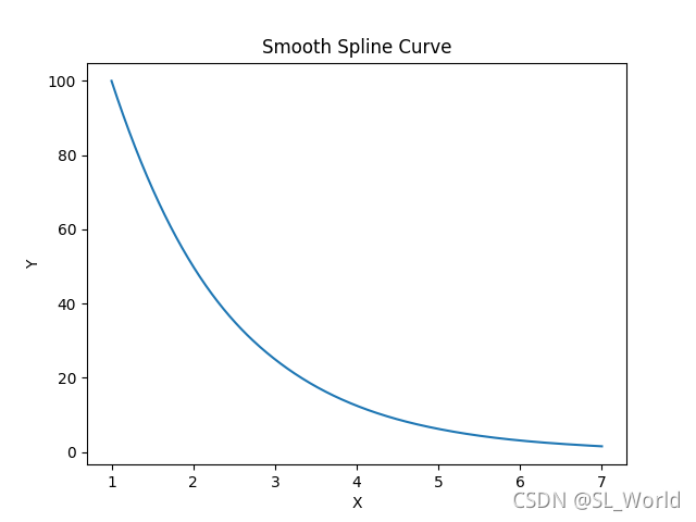
scipy 模块插值示例图
其余部分,详见本文开头的 jupyter notebook 代码。

若有收获,就点个赞吧
0 人点赞
