
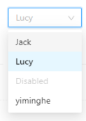
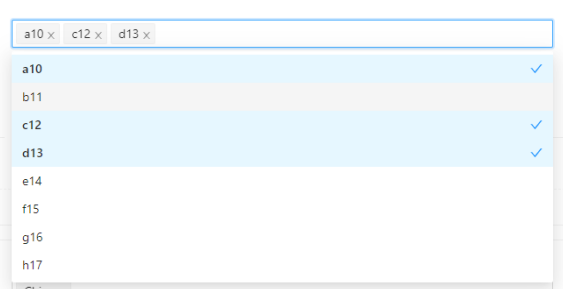
ant官网示例
import { Select } from 'antd';const { Option } = Select;function handleChange(value) {console.log(value);}//单选<Select defaultValue="lucy" style={{ width: 120 }} onChange={handleChange}><Option value="jack">Jack</Option><Option value="lucy">Lucy</Option><Option value="disabled" disabled>Disabled</Option><Option value="Yiminghe">yiminghe</Option></Select>//多选<Select mode="multiple" defaultValue={["a10","b11"]} clearable onChange={(val:string)=>valueChange(val)}><Option value="a10" label="a10">a10</Option><Option value="b11">b11</Option><Option value="c12">c12</Option><Option value="d13">d13</Option><Option value="e14">e14</Option></Select>
单选功能
需求分析
组件可传入的属性有:
和
为了实现预览中的效果,我们需要管理三个状态,先给他们起个名字:列表展开收起 isShowOptions,输入框展示的值 selectedText, 回调给onChange的值 selectedValue。*这个地方可以优化后面mode = multiple时再谈
它的结构分为两部分:展示选中项 & 下拉选项框。
展示选中项点击只需要设置 isShowOptions = true 即可。
下拉选项框中点击某个选项有以下变化:
selectedValue = value
selectedText = label
isShowOptions = false
动手制作
option组件
option组件什么都不需要做,后面再Select组件中会使用props.children获取里面所有属性。
import React from 'react';interface IOption{value:any;label?:any;children:any;}const Option:React.FC<IOption>=(props:IOption)=>{return ("")}
Select组件
基础功能:点击切换展示值,触发onChange回调
遍历一下children属性,渲染列表项。点击某一个列表项的时候修改一些状态,并触发onchange事件
import React,{useState, useEffect} from 'react';interface ISelect{defaultValue?:any;children:any;onChange?:any;}interface IOption{value:any;label?:any;children:any;}const Select:React.FC<ISelect>=(props:ISelect)=>{const { children, onChange } = props;const [isShowOption,setShowStatus] = useState(false)const [selectedValue,setSelectedValue] = useState(null)const [selectedText,setselectedText] = useState(null)return (<div className="select"><div className="selectedText">展示值:{selectedText}</div><div className="selectOptions">{children.map((item: any, index: number)=>{const optionComponentProps:IOption = item.propsreturn (<div key={index} onClick={()=>{setSelectedValue(optionComponentProps.value || "")setselectedText(optionComponentProps.label || optionComponentProps.children || '')onChange(optionComponentProps.value)}}>{optionComponentProps.label || optionComponentProps.children || ''}</div>)})}</div></div>)}export {Select}
增加功能: 收起展开状态
const OptionList = ()=>{// 仅当isShowOptions === true且select有子元素时渲染,没有则显示空状态if(isShowOption){if(children&&children.length>0){return (<div className="selectOptions">{children.map((item:any,index:number)=>{const optionComponentProps:IOption = item.propsreturn (<div className="optionsClasses" key={index} onClick={()=>{setSelectedValue(optionComponentProps.value || "")setselectedText(optionComponentProps.label || optionComponentProps.children || '')onChange(optionComponentProps.value)setShowStatus(false)}}>{optionComponentProps.label || optionComponentProps.children || ''}</div>)})}</div>)}else{return (<div className="selectOptions"><div>no data</div></div>)}}return ""}return (<div className="select"><div className="selectedText" onClick={()=>setShowStatus(!isShowOption)}>展示值:{selectedText}</div>{OptionList()}</div>)
新增功能:在 select 组件外任何地方点击时,一律收起 select 组件。
列表展开时无论再次点击哪里都隐藏列表,元素内点击只需要setShowStatus(false)即可,那节点外的地方呢?
我们引入useRef,给select绑定ref。在点击展示框的时候添加监听事件,判断e.target和ref元素之间的关系确定是否隐藏列表,并在收起列表时取消监听事件
import React,{useState, useEffect, useRef} from 'react';const selectRef:any = useRef();const fn = (e:any)=>{if(selectRef.current !== e.target && !selectRef.current.contains(e.target)){setShowStatus(false)}}const addListener = ()=>{document.addEventListener('click', fn, true);}const removeListener = ()=>{document.removeEventListener('click', fn, true);}useEffect(()=>{if(!isShowOption){removeListener()}},[isShowOption])//输出<div className="select" ref={selectRef}><div className="selectedText" onClick={()=>{addListener();setShowStatus(!isShowOption)}}>展示值:{selectedText}</div>{OptionList()}</div>
下拉列表直接展示每个option的children, 展示区域则需要做一些判断。
增加Option组件的 label属性,如果没有传入label属性,就使用option的children,考虑到option的children不一定是纯文本,可能像是这样《span》123《/span》。所以要再做一层判断,如果是纯文本使用纯文本,如果不是,使用option的value属性。
interface IOption{value?:any;label?:any;children:any;}const getInnerText = (child:any)=>{if(typeof child.props.children==='string'){return child.props.children}else{return child.props.value}}const OptionList = ()=>{if(isShowOption){if(children&&children.length>0){return (<div className="selectOptions">{children.map((item:any,index:number)=>{let label = item.props.label || getInnerText(item)return (<div className="optionsClasses" key={index} onClick={()=>{onChange(item.props.value)setSelectedValue(item.props.value||"")setselectedText(label || "")setShowStatus(false)}}>{item.props.children}</div>)})}</div>)}else{return (<div className="selectOptions"><div>no data</div></div>)}}return ""}
基础的功能已经完成了,接下来增加CSS样式,以及完善:初始值,清空,禁用项等功能
完整代码
import React,{useState, useEffect, useRef} from 'react';import classNames from 'classnames';import {ThemeContext} from '../../App';import Icon from '../Icon'interface ISelect{defaultValue?:any;children?:any;onChange?:any;}interface IOption{children:any;value?:any;label?:any;}const Option:React.FC<IOption>=(props:IOption)=>{return ("")}const Select:React.FC<ISelect> = (props)=>{const { children, onChange, defaultValue } = props;const getInnerText = (child:any)=>{if(typeof child.props.children==='string'){return child.props.children}else{return child.props.value}}const getDefaultText = (dv:any)=>{if(!children || children.length<1){return null}for(let i=0;i<children.length;i++){if(children[i].props.value === dv){return children[i].props.label || getInnerText(children[i])}}}//usestateconst [isShowOption,setShowStatus] = useState(false)const [iconRotate,setIconRotate] = useState({ transform:"rotate(0deg)" })const [selectedValue,setSelectedValue] = useState( defaultValue )const [selectedText,setselectedText] = useState( getDefaultText(defaultValue) )//eventlistenerconst selectRef:any = useRef();const fn = (e:any)=>{if(selectRef.current!==e.target && !selectRef.current.contains(e.target)){setShowStatus(false)}}const addListener = ()=>{document.addEventListener('click', fn, true);}const removeListener = ()=>{document.removeEventListener('click', fn, true);}//useeffectuseEffect(()=>{if(!isShowOption){setIconRotate({transform:"rotate(0deg)"})removeListener()}else{setIconRotate({transform:"rotate(-180deg)"})}},[isShowOption])//列表const OptionList = ()=>{if(isShowOption){if(children && children.length>0){return (<div className="selectOptions">{children.map((item:any)=>{const optionsClasses = classNames("optionItem",{"optionItem-selected":selectedValue===item.props.value})let label = item.props.label || getInnerText(item)return (<div className={optionsClasses} key={item.props.value} onClick={()=>{onChange(item.props.value)setSelectedValue(item.props.value||"")setselectedText(label || "")setShowStatus(false)}}><div style={{flex:"auto"}}>{item.props.children}</div><div><Icon style={{color:"#1890ff"}} icon="icon-select"/></div></div>)})}</div>)}else{return (<div className="selectOptions"><div>no data</div></div>)}}return ""}//展示const displayArea = ()=>{const selectedClass=classNames("selectedText",{"selectedText-focus":isShowOption})return (<div className={selectedClass} onClick={()=>{addListener();setShowStatus(!isShowOption)}}><div style={{paddingRight:"12px"}}>{selectedText}</div><span className="suffixIcon" style={iconRotate}><Icon style={{fontSize:"16px"}} icon="icon-arrow-down-bold"></Icon></span></div>)}return (<div className="select" ref={selectRef}>{displayArea()}{OptionList()}</div>)}export {Select,Option}
.select{position: relative;width:200px;height: 32px;line-height: 32px;}.suffixIcon{display: inline-block;font-size:16px;position: absolute;height: 100%;right: 10px;top: 0;text-align: center;color: #c0c4cc;-webkit-transition: all .3s cubic-bezier(.645,.045,.355,1);transition: all .3s cubic-bezier(.645,.045,.355,1);transform-origin: center;cursor:pointer;}.selectedText{position: relative;height: 100%;line-height: inherit;padding: 0 8px;width:inherit;border: 1px solid #d9d9d9;box-sizing: content-box;border-radius: 2px;background-color:#fff;display: inline-block;cursor: pointer;-webkit-transition: all .3s cubic-bezier(.645,.045,.355,1);transition: all .3s cubic-bezier(.645,.045,.355,1);.multipleBox{padding-right:12px;display: flex;align-items: center;height: inherit;.multipleItem{background: #f5f5f5;border: 1px solid #f0f0f0;border-radius: 2px;margin-right:8px;display:inline-block;height: calc(100% - 4px);display: flex;align-items: center;padding:0 4px 0 8px;//line-height: 28px;.item-label{color:rgba(0,0,0,.85);margin-right: 4px;}.item-icon{font-size: 12px;-webkit-transition: all .3s cubic-bezier(.645,.045,.355,1);transition: all .3s cubic-bezier(.645,.045,.355,1);color:rgba(0,0,0,.45);}.item-icon:hover{color:rgba(0,0,0,.85);}}}}.selectedText:hover{border-color: #40a9ff;}.selectedText-focus{border-color: #40a9ff;border-right-width: 1px!important;outline: 0;-webkit-box-shadow: 0 0 0 2px rgba(24,144,255,.2);box-shadow: 0 0 0 2px rgba(24,144,255,.2)}.selectOptions{position: absolute;z-index:9;top:45px;left:0;//overflow-y: scroll;width:inherit;max-height: 274px;border: 1px solid #e4e7ed;border-radius: 4px;background-color: #fff;box-shadow: 0 2px 12px 0 rgba(0,0,0,.1);box-sizing: content-box;margin: 5px 0;height:auto;.optionItem{display: flex;cursor: pointer;font-size: 14px;padding:0 20px;height:34px;line-height:34px;color:black;}.optionItem-selected{font-weight: bold;}.optionItem:hover{background-color: #f5f7fa;}.optionItem-selected, .optionItem-selected:hover{background-color:#e6f7ff}}
多选功能
需求分析
多选功能 select传入mode=”multiple” 列出与单选的区别点:
(1)defaultValue是数组的形式[‘a10’, ‘c12’];
(2)onchange返回值也是数组形式value=[‘a10’, ‘c12’];
(3)输入区域 每点击一个项都会展示该项的小标签,可删除
(4)展示列表
1。只有点击列表外区域才会收起,点击列表内不收起。
2。点击列表内某个项目时更改背景色,屁股后面加个钩。
3。输入框清除标签时,也要清除列表项的样式和钩
思路分析
输出值和展示值都为数组的情况下 那么selectedValue和selectedText也一定是一个数组。selectedText:我们点击列表项“a10”的时候,涉及到一次遍历:如果selectedText没有“a10”元素:添加一个元素,如果有:filter过滤掉该元素,selectedValue 也是一样。
每点击一次列表项的时候,我都要遍历两次数组,麻烦,而且代码有点冗余,我需要一个优化的方案,把他们统一放在一起管理。把selectedText和selectedValue的每一项放进一个对象里,这时候再加一个isSelect字段来管理是否被选中,
这样一来,每次点击列表项只需要遍历一次修改isSelect取反即可,是不是一下子方便了很多。
新增option的key属性,如果没有使用option的value属性。一起存放在对象里,遍历的时候设置key,避免重复。
我们看一下数据结构,在开始的时候需要遍历children处理,输出initData。
const data=[{key:"1",isSelect:false,label:"Jack",value:"value",},{key:"2",isSelect:false,label:"label2",value:"value2",},]
开始动手
展示框区域
const getInnerText = (child:any)=>{if(typeof child.props.children==='string'){return child.props.children}else{return child.props.value}}const setInitData = ()=>{if(!children || children.length<1){return []}let initData=[]for(let i=0;i<children.length;i++){initData.push({key:children[i].props.key || children[i].props.value,//通过defaultValue默认值初始化选中状态isSelect:defaultValue.indexOf(children[i].props.value) > -1 ? true : false,label:children[i].props.label || getInnerText(children[i]) || "",value:children[i].props.value,})}return initData}const [selectedInfo,setselectedInfo] = useState<any[]>( setInitData() )//点击列表项的事件const multipleClick = (item:any)=>{setselectedInfo(selectedInfo.map((info:any)=>{if(info.key===(item.key || item.value)){return {...info,isSelect:!info.isSelect}}return info}))}//展示框区域 只要遍历出isSelect为true的对象渲染即可//每一个项目是一个小标签,有删除按钮可以删除{selectedInfo.map((item:any)=>{if(item.isSelect){return (<div className="multipleItem" key={item.key}><span className="item-label">{item.label}</span><span onClick={()=>{multipleClick(item)}}><Icon className="item-icon" icon="icon-close-bold"/></span></div>)}return ""})}
此处有一个问题,点击小标签的删除,会触发外部输入框的下拉事件,我们不想点击删除的时候还顺便展示或者收起菜单,这是典型的事件冒泡,只要在小标签的事件上取消冒泡即可event.stopPropagation()
const multipleClick = (item:any,e:any)=>{e.stopPropagation()setselectedInfo(selectedInfo.map((info:any)=>{if(info.key===(item.key || item.value)){return {...info,isSelect:!info.isSelect}}return info}))}//元素上加上参数别忘了onClick={(e)=>multipleClick(item,e)}
标签长度超出了输入框长度时我们希望他能自动换行,我们使用css实现即可
.autoBreak{min-height: 32px;-webkit-box-flex: 1;-ms-flex: auto;flex: auto;-ms-flex-wrap: wrap;flex-wrap: wrap;max-width: 100%;}
由于列表使用绝对定位,当输入框高度发生变化时,列表的top值也要发生变化。新增一个状态管理列表top值,绑定在列表的style属性上。使用useEffect每次selectinfo状态发生变化时,获得输入框的高度,如果变高增加相应的top值。
const [top,setTop] = useState(40) //初始高度40useEffect(()=>{let height = document.getElementsByClassName("multipleBox")[0].clientHeight //30setTop(10+height)},[selectedInfo])//绑定在绝对定位的元素上 style={{top:top+'px'}}//顺便把其top属性删除
下拉列表区域
输入框搞定了,再来看看展示列表吧,之前我们直接循环select.children,很不优雅,现在我们循环selectedInfo即可,isSelect为true增加打钩的icon
{selectedInfo.map((info:any)=>{const optionsClasses = classNames("optionItem",{"optionItem-selected":info.isSelect})const iconArea = info.isSelect?(<div><Icon style={{color:"#1890ff"}} icon="icon-select"/></div>):""return (<div className={optionsClasses} key={info.key} onClick={()=>multipleClick(info)}><div style={{flex:"auto"}}>{info.label}</div>{iconArea}</div>)})}
当子元素太多,展示列表长度会把遮住页面上的信息很不友好,所以我们给他一个最大高度,超出时用滚动条。用 overflow-y:scroll 加上设置 max-height。
onchange事件:
触发select上的onchange事件上的参数,单选返回字符串格式,mode=”multiple” 返回数组形式,默认值也是如此
一开始我想在列表元素点击的事件中触发onchange事件的,后来发现在事件绑定中修改state是异步的。
//错误示例const multipleClick = (item:any,e:any)=>{e.stopPropagation()if(mode==="multiple"){//此处更新为异步setselectedInfo(selectedInfo.map((info:ISelectInfo)=>{if(info.key===(item.key || item.value)){return {...info,isSelect:!info.isSelect}}return info}))//把选中元素回调到onChange//这里并不能获取最新的selectInfoonChange(selectedInfo.filter((item:any)=>item.isSelect))}}
只能根据selectinfo的变化在effect中触发onchange了。
let flag=useRef(true)useEffect(()=>{//为了让他第一次进来不调用if(flag.current){flag.current=falsereturn}if(mode==="multiple"){let emitVal:any[]=[]selectedInfo.map((item:any)=>{if(item.isSelect) emitVal.push(item.value)})onChange(emitVal)}},[selectedInfo])
在页面中使用多个select组件对应会生成多个className为”multipleBox”,document.getElementsByClassName(“multipleBox”)[0]会有错误
在”multipleBox”上再加个id根据isshowoption判断。true的话id为calcHeight,否则为空,再使用document.getElementById(“calcHeight”)
let doc:HTMLElement | null = document.getElementById("calcHeight")let height:number = doc?doc.clientHeight:32<div className="multipleBox" id={isShowOption?"calcHeight":""} >
完整代码
兼容单选和多选
import React,{useState, useEffect, useRef} from 'react';import classNames from 'classnames';import Icon from '../Icon'interface ISelect{mode?:string;defaultValue?:any;clearable?:boolean;children:any;onChange?:any;}interface IOption{children:any;value?:any;label?:any;}interface ISelectInfo{key:string;isSelect:boolean;value:any;label:any;}//util工具方法const getInnerText = (child:any)=>{if(typeof child.props.children==='string'){return child.props.children}else{return child.props.value}}const isSelect = (dv:any,cv:any)=>{if(typeof dv==="string"){return dv===cv}else if(typeof dv==="object"){return dv.indexOf(cv)>-1}return false}const Option:React.FC<IOption>=(props:IOption)=>{return (<div><p>{props.children}</p></div>)}const Select:React.FC<ISelect> = (props)=>{const { children, onChange, clearable, defaultValue=[], mode } = props;// initconst setInitData = ()=>{if(!children || children.length<1){return []}let initData:ISelectInfo[]=[]for(let i=0;i<children.length;i++){initData.push({key:children[i].props.key || children[i].props.value,isSelect:isSelect(defaultValue,children[i].props.value),label:children[i].props.label || getInnerText(children[i]) || "",value:children[i].props.value,})}return initData}//usestateconst [isShowOption,setShowStatus] = useState(false)const [iconRotate,setIconRotate] = useState({ transform:"rotate(0deg)" })const [top,setTop] = useState(40)const [selectedInfo,setselectedInfo] = useState<ISelectInfo[]>( setInitData() )//点击事件监听const selectRef:any = useRef();const fn = (e:any)=>{if(selectRef.current!==e.target && !selectRef.current.contains(e.target)){setShowStatus(false)}}const addListener = ()=>{document.addEventListener('click', fn, true);}const removeListener = ()=>{document.removeEventListener('click', fn, true);}//useeffectuseEffect(()=>{if(!isShowOption){setIconRotate({transform:"rotate(0deg)"})removeListener()}else{setIconRotate({transform:"rotate(-180deg)"})}},[isShowOption])let flag=useRef(true)useEffect(()=>{let doc:HTMLElement | null = document.getElementById("calcHeight")let height:number = doc?doc.clientHeight:32setTop(10+height)if(flag.current){flag.current=falsereturn}if(mode==="multiple"){let emitVal:any[]=[]selectedInfo.map((item:ISelectInfo)=>{if(item.isSelect) emitVal.push(item.value)})onChange(emitVal)}else{selectedInfo.map((item:ISelectInfo)=>{if(item.isSelect) onChange(item.value)})setShowStatus(false)}},[selectedInfo])//onclick事件: 清空,下拉,选择const handleClear = (e:any)=>{e.stopPropagation();setselectedInfo(selectedInfo.map((info:ISelectInfo)=>{return {...info,isSelect:false}}))}const dropDown = ()=>{addListener();setShowStatus(!isShowOption)}const multipleClick = (item:any,e:any)=>{e.stopPropagation()if(mode==="multiple"){//此处更新为异步setselectedInfo(selectedInfo.map((info:ISelectInfo)=>{if(info.key===(item.key || item.value)){return {...info,isSelect:!info.isSelect}}return info}))}else{setselectedInfo(selectedInfo.map((info:ISelectInfo)=>{if(info.key===(item.key || item.value)){return {...info,isSelect:true}}return {...info,isSelect:false}}))}}//展示框const displayArea = ()=>{const selectedClass=classNames("selectedText",{"selectedText-focus":isShowOption})const dropDownIcon = mode!=="multiple"?(<Icon className="suffixIcon" style={iconRotate} icon="icon-arrow-down-bold"/>):"";const clearIcon = clearable && selectedInfo.some((item:ISelectInfo)=>item.isSelect)?(<span className="clearIcon" onClick={(e)=>handleClear(e)}><Icon style={{fontSize:"14px"}} icon="icon-close-bold"/></span>):"";const displayInline =(item:any)=>{if(item.isSelect){return mode==="multiple"?(<div className="multipleItem" key={item.key}><span className="item-label">{item.label}</span><span onClick={(e)=>multipleClick(item,e)}><Icon className="item-icon" icon="icon-close-bold"/></span></div>):(<div style={{paddingRight:"12px"}} key={item.key}>{item.label}</div>)}return ""}return (<div className={selectedClass} onClick={()=>dropDown()}><div className="multipleBox" id={isShowOption?"calcHeight":""}>{selectedInfo.map((item:ISelectInfo)=>{return displayInline(item)})}</div>{dropDownIcon}{clearIcon}</div>)}//列表const OptionList = ()=>{if(isShowOption){if(children && children.length>0){const row = (info:any)=>{const optionsClasses = classNames("optionItem",{"optionItem-selected":info.isSelect})const iconArea = info.isSelect?(<div><Icon style={{color:"#1890ff"}} icon="icon-select"/></div>):""return mode==="multiple"?(<div className={optionsClasses} key={info.key} onClick={(e)=>multipleClick(info,e)}><div style={{flex:"auto",userSelect: "none"}}>{info.label}</div>{iconArea}</div>):(<div className={optionsClasses} key={info.key} onClick={(e)=>multipleClick(info,e)}>{info.label}</div>)}return (<div className="selectOptions" style={{top:top+'px'}}>{selectedInfo.map((info:ISelectInfo)=>{{return row(info)}})}</div>)}else{return (<div className="selectOptions"><div>no data</div></div>)}}return ""}return (<div className="select" ref={selectRef}>{displayArea()}{OptionList()}</div>)}export {Select,Option}
样式代码
.select{position: relative;width:220px;min-height: 32px;}.suffixIcon{display: inline-block;font-size:14px;line-height: 32px;position: absolute;z-index: 2020;height: 100%;right: 9px;top: 0;text-align: center;color: #c0c4cc;-webkit-transition: all .3s cubic-bezier(.645,.045,.355,1);transition: all .3s cubic-bezier(.645,.045,.355,1);cursor:pointer;}.selectedText{position: relative;height: 100%;line-height: inherit;padding: 0 8px;width:inherit;border: 1px solid #d9d9d9;box-sizing: content-box;border-radius: 2px;background-color:#fff;cursor: pointer;-webkit-transition: all .3s cubic-bezier(.645,.045,.355,1);transition: all .3s cubic-bezier(.645,.045,.355,1);.multipleBox{padding-right:12px;display: flex;align-items: center;height: inherit;/********* 高度自动撑开 **************/min-height: 32px;-webkit-box-flex: 1;-ms-flex: auto;flex: auto;-ms-flex-wrap: wrap;flex-wrap: wrap;max-width: 100%;.multipleItem{background: #f5f5f5;border: 1px solid #f0f0f0;border-radius: 2px;margin:2px 8px 2px 0;display:inline-block;display: flex;align-items: center;padding:0 4px 0 8px;//line-height: 28px;.item-label{color:rgba(0,0,0,.85);margin-right: 4px;user-select: none;}.item-icon{font-size: 12px;-webkit-transition: all .3s cubic-bezier(.645,.045,.355,1);transition: all .3s cubic-bezier(.645,.045,.355,1);color:rgba(0,0,0,.45);}.item-icon:hover{color:rgba(0,0,0,.85);}}}.clearIcon{position: absolute;top: 50%;right: 11px;z-index: 2021;display: inline-block;width: 12px;height: 12px;margin-top: -6px;color: rgba(0,0,0,.25);font-size: 12px;font-style: normal;line-height: 1;text-align: center;text-transform: none;background: #fff;cursor: pointer;opacity: 0;-webkit-transition: color .3s ease,opacity .15s ease;transition: color .3s ease,opacity .15s ease;text-rendering: auto;&:hover{color: rgba(0,0,0,.65);}}}.selectedText:hover{border-color: #40a9ff;}.selectedText:hover .clearIcon{opacity: 1;}.selectedText-focus{border-color: #40a9ff;border-right-width: 1px!important;outline: 0;-webkit-box-shadow: 0 0 0 2px rgba(24,144,255,.2);box-shadow: 0 0 0 2px rgba(24,144,255,.2)}.selectOptions{position: absolute;z-index:9;//top:45px; 通过js设置left:0;overflow-y: scroll;width:inherit;max-height: 274px;border: 1px solid #e4e7ed;border-radius: 4px;background-color: #fff;box-shadow: 0 2px 12px 0 rgba(0,0,0,.1);box-sizing: content-box;margin: 5px 0;height:auto;.optionItem{display: flex;cursor: pointer;font-size: 14px;padding:0 20px;height:34px;line-height:34px;color:black;user-select: none;}.optionItem-selected{font-weight: bold;}.optionItem:hover{background-color: #f5f7fa;}.optionItem-selected, .optionItem-selected:hover{background-color:#e6f7ff}}

若有收获,就点个赞吧
0 人点赞
