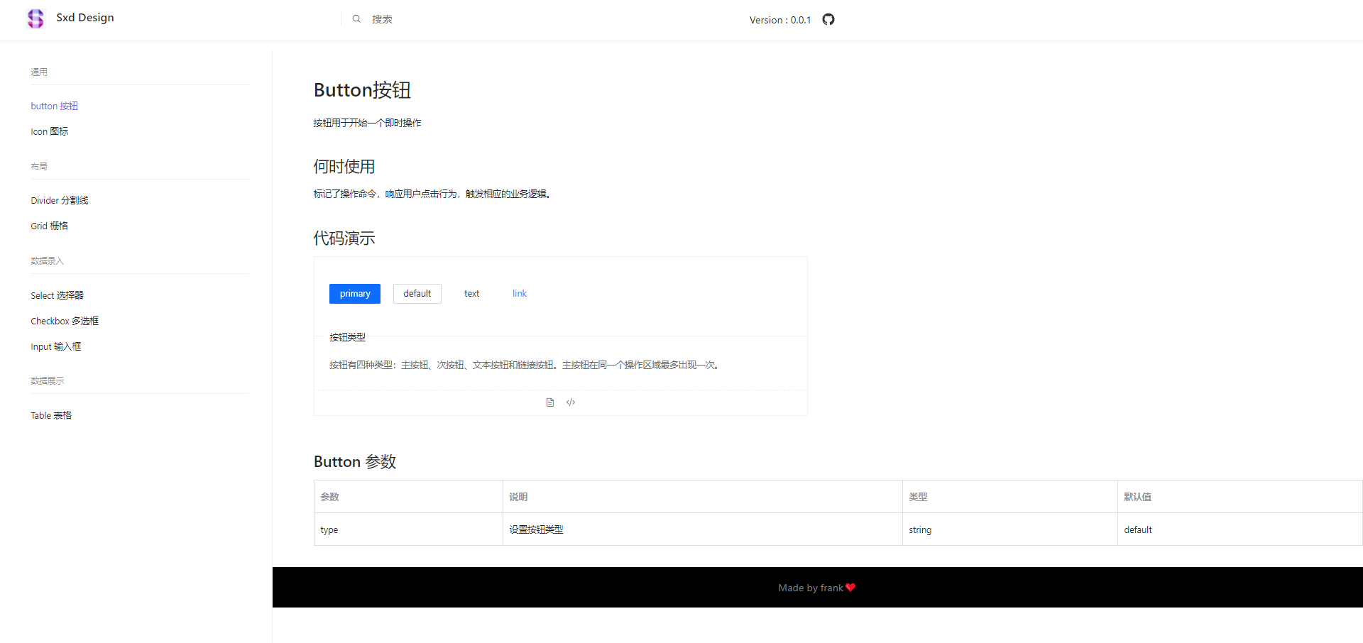
预览
页面结构
这是我的布局方式,也可根据你自己的喜好布局,效果如下图所示
html结构大概如下:
-Header
-Body
-SiderBar
-ContentBar
-ContentInner
- **Brief**- **CodePreview**- **Api**
-Footer
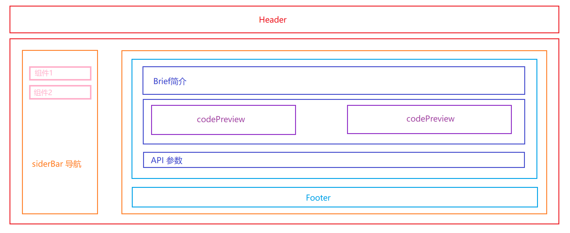
看起来复杂,我们将网站分为两部分:一部分是静态的Layout,一部分是动态的Route,下面将重点介绍这两部分。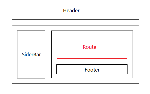
理一下思路:
黑色边框里的内容是静态的,也就是Layout部分,红色边框里的内容是动态的,也就是router-view。整个页面由Layout+router-view组成。
在src目录下新建site文件夹,存放整个网站。site下新建index.tsx作为你的页面的入口文件。猜也能猜到,它差不多长成这样。
import Layout from './layout'import {Route} from 'react-router-dom'<Layout><Route exact path='/button' component={ButtonPage} /><Route exact path='/icon' component={IconPage} />......</Layout>
Layout
在整个页面中,Header,Footer,SideBar的内容是静态的,只有content会随着组件的切换发生变化。
site下新建layout文件夹 Header,Footer,SideBar 以及入口文件index.tsx。
-site
-layout
SiderBar.tsx
Header.tsx
Footer.tsx
index.tsx
Header.tsx
import React from 'react';//这里的Icon现学现卖从ICON组件直接调用,可以先用png代替import Icon from "../../components/Icon"import logo from "../../logo.png"const Header:React.FC = ()=>{return (<header id="header"><div className="header-row"><a id="logoBox"><img className="logo_img" src={logo}/><span>Sxd Design</span></a><div id="searchBox"><Icon icon="icon-search" style={{paddingRight:"16px"}}/><input type="text" placeholder="搜索"/></div><div id="otherBox"><div className="version">Version : 0.0.1</div><div className="git"> </div></div></div></header>)}export default Header
Footer.tsx
import React from 'react';const Footer:React.FC = ()=>{return (<div id="footer"><span>Made by frank</span></div>)}export default Footer
SiderBar
-基础功能
- 切换组件时,使url能切换到对应的路由。
- 当前选中项的字体颜色要和未选中的区分开。 在点击组件时,为其添加额外样式。
-附加功能 (可选)
- 屏幕过小时,收起菜单SiderBar。屏幕宽度足够时,展开菜单SideBar。
页面布局 & 数据结构
我封装组件的时候都是先把最基本的html结构搭起来,再根据html确定数据结构是什么样的。根据图上所示,看到有二级菜单两次循环肯定是逃不掉了。
这里当初有个不合理的地方:我把路由数据在里又定义了一遍,每次新页面加进来要多改一个地方。就是因为当初测试的数据是在这里写的,结果后面每次都懒得改,我们发现错误要立马改正,长痛不如短痛。//页面布局<div className="sidebar"><ul><li><div>蔬菜组件</div><div><a href="/qc">青菜</a></div><div><a href="/qc">茄子</a></div></li><li>...</li></ul></div>//数据结构const sidebar = [{text:"蔬菜组件",children:[{id:1,text:"青菜",path:"/qc",},{id:2,text:"茄子",path:"/qz",}]},{...}]//最终<div className="sidebar"><ul>{sidebar.map(item=>{return (<li key={item.text}><div>{item.text}</div>{item.children.map(item2=>{return (<div key={item2.id}><a href={item2.path}>{item2.text}</a></div>)})}</li>)})}</ul></div>
切换组件时,使url能切换到对应的路由。
引入react-router-dom 4.x版本的。
用字符串的形式表示链接位置,创建可访问的导航。
- to: string
链接到的路径名或位置。
- to: object<Link to="/About"/>
要链接的位置。
- replace: bool<Link to={{pathname: '/courses',search: '?sort=name',hash: '#the-hash',state: { fromDashboard: true }}}/>
如果为true,单击链接将替换历史堆栈中的当前条目,而不是添加新条目。
把a标签替换成link组件改造一下,需求完成!SiderBar关键代码如下。<Link to="/About" replace />
interface ISideData{text:string,children:{id:number,text:string,path:string,}[]}const sidebar:ISideData[]=[{text:"通用",children:[{id:1,text:"button 按钮",path:"/button",},{id:2,text:"Icon 图标",path:"/icon",},]}]<div className="sidebar"><ul className="firstUl">{sidebar.map((item,index)=>{return (<li className="firstLi" key={index}><div className="firstTit">{item.text}</div>{item.children.map(item2=>{return (<div key={item2.id}><Link className="thirdTit" to={item2.path}>{item2.text}</Link></div>)})}</li>)})}</ul></div>
为当前文字添加active样式。
一开始还在使用Link组件,没有引入NavLink这个组件。手动地判断active的逻辑。我在组件里监听url的变化,根据当前url和path做对比,相同则为当前菜单添加active类。比较麻烦,实现起来很不优雅。下面先看一下react-router-dom 4.x版本的的介绍。
一种特殊版本的,给定链接的位置与当前URL匹配时,将向渲染元素添加样式或者类。
- activeClassName: string
与当前URL匹配时,给元素添加的类。默认值是 active。如果设置了className,会与其合并。
- activeStyle: object
与当前URL匹配时,应用于元素的样式。
- exact: bool
当为true时,仅当位置匹配完全时才会应用class/style。
- isActive: func
增加用于确定链接是否活动的额外逻辑的功能。如果您想要更多地验证链接的路径名与当前URL的路径名匹配,可以使用它。
它能完美地解决我们的需求,我使用默认类名——active,等会要在样式中编写 .active 的样式,所有layout样式在此小节的最后。SiderBar完整代码如下
import React from 'react';import { ISideProps,ISideData } from '../interface/sideBar'import { NavLink } from 'react-router-dom'const SideBar:React.FC<ISideProps> = (props:ISideProps)=>{const sidebar:ISideData[]=[{text:"通用",children:[{id:1,text:"button 按钮",path:"/button"},{id:2,text:"Icon 图标",path:"/icon"},]},]return (<div className="sidebar" style={props.style}><ul className="firstUl">{sidebar.map((item,index)=>{return (<li className="firstLi" key={index}><div className="firstTit">{item.text}</div>{item.children.map(item2=>{return (<div key={item2.id}><NavLink className="thirdTit" to={item2.path}>{item2.text}</NavLink></div>)})}</li>)})}</ul></div>)}//插播一条样式.sidebar .active{color:#7763e9 !important}
展开收起菜单SiderBar
SiderBar需要一个参数控制收起展开状态,这个状态放在layout/index.tsx中统一管理。
index.tsx
这里需要监听整个屏幕的宽度,小于等于750px时收起SiderBar,同时取消菜单和内容的边距,边距是在内容ContentBar设置的的padding-left。大于750px展开SiderBar,同样地,增加菜单和内容的边距。
我把监听屏幕宽度封装成了一个hook,小于750输出false,大于等于750输出true,你在哪都可以使用它。
import React,{useState} from 'react';import { connect } from 'react-redux';import useScreenWidth from './hooks/useScreenWidth'import Header from './header'import SiderBar from './SiderBar'import Footer from './footer'import {ISiteProps,ISiteState} from '../interface/site'const Site:React.FC<ISiteProps> = (props:ISiteProps)=>{const { children } = props//监听屏幕宽度的hook。小于750输出false,大于等于750输出trueconst showSiderBar = useScreenWidth()const hide = {display:"none",padding:"50px 0 50px 0"}const show = {display:"block",padding:"50px 0 50px 20%"}//true就用show样式,false就用hide样式const dynStyle = showSiderBar?show:hidereturn (<div className="wrapper"><Header/><div className="main container"><SiderBar style={{display:dynStyle.display}}/><div className="contentbar" style={{padding:dynStyle.padding}}>{children}<Footer/></div></div></div>)}export default Site
useScreenWidth.tsx 完整代码如下
有一个点需要注意就是,如果添加了监听事件,一定要在不需要的时候取消监听,不然大大影响浏览器性能!!!
import {useState,useEffect} from 'react'const useScreenWidth = ():any=>{const [width,setWidth] = useState(window.innerWidth)const [moreThan750,isMoreThan750] = useState(true)/* screen size change */const resizeHandle = ()=>{removeEventListener()setWidth(window.innerWidth)}const addEventListener=()=>{window.addEventListener("resize",resizeHandle,false);}const removeEventListener=()=>{window.removeEventListener("resize",resizeHandle);}addEventListener()/* end */useEffect(()=>{if(width<=750){isMoreThan750(false)}else{isMoreThan750(true)}},[width])return moreThan750}export default useScreenWidth
最后样式文件 style.scss
h1,h2,h3,h4{margin:0;padding:0}a{text-decoration: none;outline:none;border:none}a:-webkit-any-link:focus {outline:none !important;outline-offset: 0px !important;}a:focus {outline:none !important;outline-offset: 0px !important;}.container{margin:0 auto;}#header{position: sticky;top:0;z-index: 10;max-width: 100%;background: #fff;box-shadow: 0 2px 8px #f0f1f2;.header-row{display: flex;align-items: center;height: 64px;#logoBox{padding-left: 40px;overflow: hidden;color: rgba(0,0,0,0.85);font-size: 18px;font-weight: 500;width:25%;.logo_img{height: 32px;width:32px;margin-right: 16px;}}#searchBox{width:30%;position: relative;display: flex;flex: auto !important;align-items: center;height: 22px;margin: 0 auto 0 0 !important;padding-left: 16px;line-height: 22px;white-space: nowrap;border-left: 1px solid #f0f0f0;input{background: transparent;border: 0;box-shadow: none;outline: none;}input:focus{background: transparent;border: 0;outline: none;box-shadow: none;}}#otherBox{width:45%;display: flex;align-items: center;.version{display: inline-block;height: 20px;line-height: 20px;margin-right:16px;}.git{display: inline-block;width: 20px;height: 20px;margin: 0;background-image: url(data:image/svg+xml;base64,PHN2ZyB4bWxucz0iaHR0cDovL3d3dy53My5vcmcvMjAwMC9zdmciIHdpZHRoPSI0MCIgaGVpZ2h0PSI0MCIgdmlld0JveD0iMTIgMTIgNDAgNDAiPjxwYXRoIGZpbGw9IiMzMzMiIGQ9Ik0zMiAxMy40Yy0xMC41IDAtMTkgOC41LTE5IDE5IDAgOC40IDUuNSAxNS41IDEzIDE4IDEgLjIgMS4zLS40IDEuMy0uOXYtMy4yYy01LjMgMS4xLTYuNC0yLjYtNi40LTIuNi0uOS0yLjEtMi4xLTIuNy0yLjEtMi43LTEuNy0xLjIuMS0xLjEuMS0xLjEgMS45LjEgMi45IDIgMi45IDIgMS43IDIuOSA0LjUgMi4xIDUuNSAxLjYuMi0xLjIuNy0yLjEgMS4yLTIuNi00LjItLjUtOC43LTIuMS04LjctOS40IDAtMi4xLjctMy43IDItNS4xLS4yLS41LS44LTIuNC4yLTUgMCAwIDEuNi0uNSA1LjIgMiAxLjUtLjQgMy4xLS43IDQuOC0uNyAxLjYgMCAzLjMuMiA0LjcuNyAzLjYtMi40IDUuMi0yIDUuMi0yIDEgMi42LjQgNC42LjIgNSAxLjIgMS4zIDIgMyAyIDUuMSAwIDcuMy00LjUgOC45LTguNyA5LjQuNy42IDEuMyAxLjcgMS4zIDMuNXY1LjJjMCAuNS40IDEuMSAxLjMuOSA3LjUtMi42IDEzLTkuNyAxMy0xOC4xIDAtMTAuNS04LjUtMTktMTktMTl6Ii8+PC9zdmc+);background-size: 100% 100%;background-repeat: no-repeat;}}}}.sxdTitle{height:100%;display: flex;align-items: center;justify-content: space-between;border-bottom:1px solid #7763e9;}.sxdTitle h1{color:#7763e9;text-align: left;font-size: 24px;font-weight: bold;margin:0;}.main{display: flex;align-content: center;}.sidebar{padding-left:8px;width:20%;border-right:1px solid #f0f0f0;position: fixed;top:80px;height: 100%;overflow: hidden;}.sidebar:hover {overflow-y: auto;}.sidebar .active, .thirdTit:hover{color:#7763e9 !important}.sidebar .firstUl{padding:0 0 190px 0;list-style-type:none;margin:0;}.firstLi{padding:0 16px 0 40px}.sidebar .firstTit{font-size: 13px;color: rgba(0,0,0,.45);line-height: 40px;height: 40px;margin: 0;padding: 0;text-decoration: none;display: block;position: relative;transition: .15s ease-out;margin-top: 14px;margin-bottom: 14px;}.sidebar .firstTit:after{position: relative;display: block;width: calc(100% - 20px);height: 1px;background: #f0f0f0;content: "";}.sidebar .thirdTit{display: block;height: 40px;color: rgba(0,0,0,.85);line-height: 40px;font-size: 14px;overflow: hidden;white-space: nowrap;text-overflow: ellipsis;font-weight: 400;}.sidebar .thirdTit:hover{text-decoration: none;}.codeSize{font-size: 16px;}.contentbar{width:100%;padding:50px 0 50px 20%;.contentInner{padding: 0 0px 32px 64px;width:100%;.brief{font-size: 14px;line-height: 2;h1{margin-top: 8px;margin-bottom: 20px;color: rgba(0,0,0,.85);font-weight: 500;font-size: 30px;line-height: 38px;}h2{font-size: 24px;line-height: 32px;clear: both;margin: 1.6em 0 .6em;color: rgba(0,0,0,.85);font-weight: 500;}p{margin:1em 0}li{list-style-type: circle;}li p{margin: .2em 0;}}.codeWrap{padding-right:16px;display: inline-block;width: calc(50% - 32px);vertical-align: top;}.codeBox{border: 1px solid #f0f0f0;border-radius: 2px;margin: 0 0 16px;.demo{padding: 42px 24px 50px;color: rgba(0,0,0,.85);border-bottom: 1px solid #f0f0f0;}.markdown{width: 100%;font-size: 14px;border-radius: 0 0 2px 2px;position: relative;.title{position: absolute;top: -13px;margin-left: 16px;padding: 1px 8px;color: rgba(0,0,0,.85);background: #fff;}.description{padding: 18px 24px 12px;}.actions{display: flex;align-items: center;justify-content: center;padding: 12px 0;border-top: 1px dashed #f0f0f0;}}.code{border-top: 1px dashed #f0f0f0;padding: 16px 32px;color: rgba(0,0,0,.85);font-size: 14px;line-height: 2;background: #fff;}}}}#footer{border-top:1px solid #f0f0f0;background-color:black;color:gray;margin: 0 auto;padding: 16px 0;text-align: center;span{font-size: 16px;line-height: 32px;margin:0}}/* transition */.star-enter {opacity: 0;transform: translateX(100px);}.star-enter-active {opacity: 1;transform: translateX(0px);transition: all 700ms}.star-exit {opacity: 1;transform: translateX(-100px);}.star-exit-active {opacity: 0;transform: translateX(0px);transition: all 700ms}
路由部分 ContentBar
在这里我意识到了在siderBar中去定义路由数据造成了冗余,思路不够清晰需要反思优化,应该定义路由表文件统一存取(第二个版本优化的)。在index.js用当前的url作为
Router目录
-router
index.js
routes.js //路由表
routes.js
import ButtonPage from '../pages/Button'import IconPage from '../pages/Icon'export default [{text:"通用",children:[{id:1,text:"button 按钮",path:"/button",component:ButtonPage},{id:2,text:"Icon 图标",path:"/icon",component:IconPage},]}]
路由切换时,我们希望右边的content出现和隐藏能有一个动画效果。 故引入第三方组件 react-transition-group。CSSTransition的key属性是过渡生效的关键,useLocation()可以获取当前url的信息,key会随着url的变化而变化,满足我们的需求。参考了这篇,我没有用withroute包裹起来使其获得location,而是直接使用useLocation()获取。
index.js
import {Switch,Route,Redirect,useLocation} from 'react-router-dom'import sidebar from './routes'import { TransitionGroup, CSSTransition } from 'react-transition-group'function AppRouter() {let location = useLocation()return (<TransitionGroup className={'router-wrapper'}><CSSTransition timeout={700} classNames="star" key={location.pathname}><Switch>{ sidebar.map((item)=>{return item.children.map(item2=>{return ( <Route exact path={item2.path} component={item2.component}/> )})}) }<Redirect to="button"/></Switch></CSSTransition></TransitionGroup>);}export default AppRouter;
过渡样式
/* transition */.star-enter {opacity: 0;transform: translateX(100px);}.star-enter-active {opacity: 1;transform: translateX(0px);transition: all 700ms}.star-exit {opacity: 1;transform: translateX(-100px);}.star-exit-active {opacity: 0;transform: translateX(0px);transition: all 700ms}
路由已经完成了他该完成的任务,要添加组件的话只需要引入该组件并在路由表中添加一条数据即可。
Components目录
-components
-Content
demoList.tsx
index.tsx
-demo
Code.tsx
Preview.tsx
Introduce.tsx
index.tsx
结构如图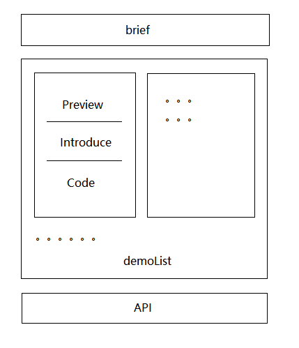
我们要开始封装page页面的组件。ButtonPage里定义好参数直接调用即可。数据参考如下
import Document from '../components/content'import React from 'react'const ButtonPage:React.FC = ()=>{const document:Iprops = {brief:(<><h1>Button</h1><p>Button Brief</p><h2>代码演示</h2></>),content:[{id:1,demo:<div>//demo here</div>,title:"this is title",description:"this is description",code:`code here`},{...}],api:(<div><h2>Button 参数</h2></div>)}return (<Document document={document}/>)}export default ButtonPage
components下index.tsx是入口文件,接收一个参数document。document有三个对象brief、content数组、api。分别是简介、演示区、底部api接口。
Content
入口文件
接收document参数,简介和API没有封装成组件直接调用,只有演示区域封装成demoList组件。
import React from 'react';import DemoList from './demoList'import {IDoc} from '../../interface/document'const Document:React.FC<IDoc> = (props:IDoc)=>{const {document} = propsreturn (<div className="contentInner"><section className="brief">{document.brief}</section><DemoList content={document.content}/><section className="brief">{document.api}</section></div>)}export default Document
DemoList.tsx
接收一个数组content,代表所有的demoList。
demoList 长度要是小于1就不展示。再来考虑长度大于大于1的情况:由于 demoList 左右分布,我做了一个伪瀑布流,定义两个空数组,长度一半的内容给左边,长度另一半的内容给右边。
import React from 'react';import Demo from './demo'import { IDemo } from './interface'interface IDemoList{content:IDemo[];}const DemoList:React.FC<IDemoList> = (props:IDemoList)=>{const {content}=propsconst cLength = content.lengthif(cLength<1) return (<div></div>)let left:IDemo[]=[];let right:IDemo[]=[];const middle = cLength % 2 ==0 ? cLength/2 : Math.floor(cLength/2) + 1for(let i=0;i<middle;i++){left=[...left,content[i]]}for(let i=0;i<cLength-middle;i++){right=[...right,content[i+middle]]}return (<div><div className="codeWrap">{left.map((item:IDemo)=>{return (<Demo key={item.id} {...item}/>)})}</div><div className="codeWrap" style={{paddingRight:"0px"}}>{right.map((item:IDemo)=>{return (<Demo key={item.id} {...item}/>)})}</div></div>)}
这里需要用到demo下的入口文件,一个demo我把它分成了三部分都比较简单,我一部分一部分说。
Demo
Preview.tsx
接收一个参数demo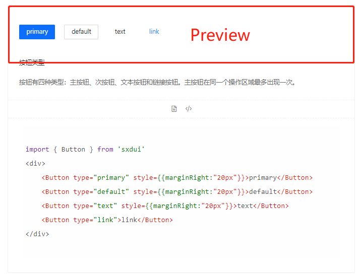
import React from 'react';import { IPreview } from "../interface";const Preview:React.FC<IPreview> = (props:IPreview)=>{const { demo } = propsreturn (<section className="demo">{demo}</section>)}export default Preview
Introduce.tsx
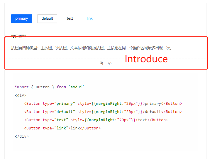
接收两个字符串参数,展示标题和描述title, description,接收一个函数switch_code_display,切换代码的展开收起
import React from 'react';import Icon from "../../../../components/Icon"import { IIntroduce } from "../interface";const Introduce:React.FC<IIntroduce> = (props:IIntroduce)=>{const { title, description, switch_code_display } = propsreturn (<section className="markdown"><div className="title"><span>{title}</span></div><div className="description"><p>{description}</p></div><div className="actions"><Icon icon="icon-file" style={{fontSize:"16px",lineHeight:"16px",cursor:"pointer"}}/><Icon icon="icon-code" onClick={()=>switch_code_display()} style={{fontSize:"16px",lineHeight:"16px",cursor:"pointer",marginLeft:"16px"}}/></div></section>)}export default Introduce
Code.tsx
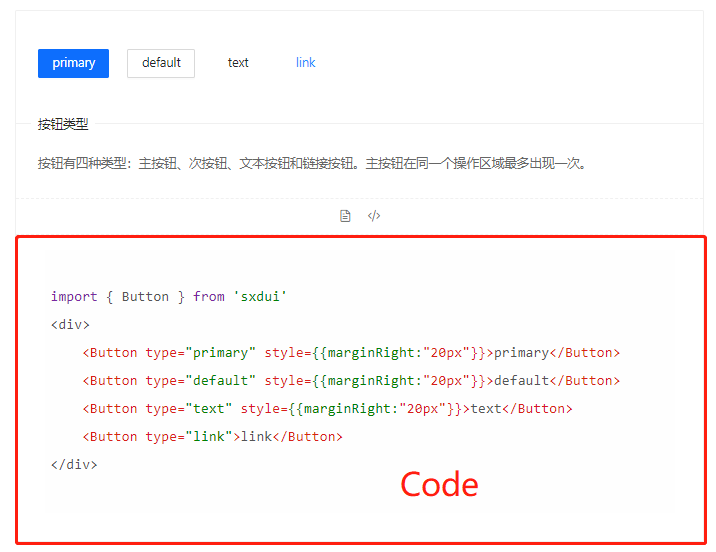
接收两个参数,一个展示代码code,一个管理收起和展开的状态hideStyle
引入 react-syntax-highlighter 代码高亮组件
样式无需安装,可以直接从react-syntax-highlighter/dist/esm/styles/hljs引入进来,这里使用 a11yLight,语言选择javascript
import SyntaxHighlighter from 'react-syntax-highlighter';import { a11yLight } from 'react-syntax-highlighter/dist/esm/styles/hljs';import React from 'react';import { ICode } from "../interface";const Code:React.FC<ICode> = (props:ICode)=>{const { code, hideStyle } =propsreturn (<section className="code" style={hideStyle}><SyntaxHighlighter language="javascript" style={a11yLight} codeTagProps={{className:"codeSize"}}>{code}</SyntaxHighlighter></section>)}export default Code
index.tsx
像乐高玩具一样把所有组件拼起来,加入切换代码展示隐藏的状态,分发给需要的组件。
import React,{useState} from 'react';import { IDemo } from '../interface'import Code from './Code';import Preview from './Preview';import Introduce from './Introduce';const Demo:React.FC<IDemo> = (props:IDemo)=>{const { demo, title="", description="", code="" } = propsconst [hideStyle,setHideStyle] = useState({display:"none"})const switch_code_display = ()=>{if(hideStyle.display==="none"){setHideStyle({display:"block"})}else{setHideStyle({display:"none"})}}return (<div className="codeBox"><Preview demo={demo}/><Introduce title={title} description={description} switch_code_display={switch_code_display}/><Code code={code} hideStyle={hideStyle}/></div>)}export default Demo
Pages
新建pages文件夹
-site
-pages
ButtonPage.tsx
IconPage.tsx
……
组件都写好了,现在只要把数据定义好,传给他们就行了,举一个写好的ButtonPage的例子。
import Document from '../components/content'import React from 'react'import { Icontent, Iprops} from '../interface/document'import Button from '../../components/Button/button'const ButtonPage:React.FC = ()=>{const brief=(<><h1>Button按钮</h1><p>按钮用于开始一个即时操作</p><h2>何时使用</h2><div><p>标记了操作命令,响应用户点击行为,触发相应的业务逻辑。</p><ul><li><p>主按钮:用于主行动点,一个操作区域只能有一个主按钮。</p></li><li><p>默认按钮:用于没有主次之分的一组行动点。</p></li><li><p>文本按钮:用于最次级的行动点。</p></li><li><p>链接按钮:用于作为外链的行动点。</p></li></ul></div><h2>代码演示</h2></>)const items:Icontent[]=[{id:1,demo:<div><Button type="primary" style={{marginRight:"20px"}}>primary</Button><Button type="default" style={{marginRight:"20px"}}>default</Button><Button type="text" style={{marginRight:"20px"}}>text</Button><Button type="link">link</Button></div>,title:"按钮类型",description:"按钮有四种类型:主按钮、次按钮、文本按钮和链接按钮。主按钮在同一个操作区域最多出现一次。",code:`import { Button } from 'sxdui'<div><Button type="primary" style={{marginRight:"20px"}}>primary</Button><Button type="default" style={{marginRight:"20px"}}>default</Button><Button type="text" style={{marginRight:"20px"}}>text</Button><Button type="link">link</Button></div>`},{id:2,demo:<div><Button type="primary" size="large" style={{marginRight:"20px"}}>large</Button><Button type="default" style={{marginRight:"20px"}}>middle</Button><Button type="text" size="small" style={{marginRight:"20px"}}>small</Button><div style={{marginTop:"16px"}}/><Button type="primary" size="large" shape="round" style={{marginRight:"20px"}}>large round</Button><Button type="default" shape="round" style={{marginRight:"20px"}}>middle round</Button><Button type="text" shape="round" size="small" style={{marginRight:"20px"}}>small round</Button></div>,title:"按钮尺寸",description:"通过设置 size 为 large small 分别把按钮设为大、小尺寸。若不设置 size,则尺寸为中",code:`import { Button } from 'sxdui'<div><Button type="primary" size="large" style={{marginRight:"20px"}}>large</Button><Button type="default" style={{marginRight:"20px"}}>middle</Button><Button type="text" size="small" style={{marginRight:"20px"}}>small</Button><div style={{marginTop:"16px"}}/><Button type="primary" size="large" shape="round" style={{marginRight:"20px"}}>large round</Button><Button type="default" shape="round" style={{marginRight:"20px"}}>middle round</Button><Button type="text" shape="round" size="small" style={{marginRight:"20px"}}>small round</Button></div>`}]const api =<div><h2>Button 参数</h2></div>const document:Iprops = {brief:brief,content:items,api:api}return (<Document document={document}/>)}export default ButtonPage
先把site的入口文件的坑填上,最后在项目的入口文件引入Site即可
// site/index.tsximport React from 'react';import AppRouter from './router'import Layout from './layout'const Site:React.FC = (props)=>{return (<div className="App" style={{overflow:"hidden"}}><Layout><AppRouter /></Layout></div>)}export default Site
结束
接下来,接下来就可以在pages下新建文件,开始封装组件啦!
封装一个Select组件

若有收获,就点个赞吧
0 人点赞
