showDialog基本属性
Future<T> showDialog<T>({@required BuildContext context, // 在当前应用程序内容上方显示一个材质对话框,包含材质入口和退出动画、bool barrierDismissible = true,@Deprecated('Instead of using the "child" argument, return the child from a closure ''provided to the "builder" argument. This will ensure that the BuildContext ''is appropriate for widgets built in the dialog. ''This feature was deprecated after v0.2.3.')Widget child, // 用不是,用了会出现崩溃效果WidgetBuilder builder, // 不能和child共存bool useRootNavigator = true, // AlertDialogRouteSettings routeSettings,})
- 一般我们使用context 和 builder就行了。
showDialog基本用法
showDialog(context: context,builder: (context) {return Text('333')});
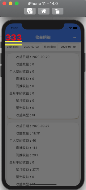
这样的弹框太丑陋了,所以需要用到下面的弹框提示,只是用showDialog做一个跳板。
AlertDialog 提示框(Material风格)
当应用程序进行重要操作时,经常需要用户进行2次确认,以免避免用户的误操作。
AlertDialog基本属性
const AlertDialog({Key key,this.title,this.titlePadding,this.titleTextStyle,this.content,this.contentPadding = const EdgeInsets.fromLTRB(24.0, 20.0, 24.0, 24.0),this.contentTextStyle,this.actions,this.actionsPadding = EdgeInsets.zero,this.actionsOverflowDirection,this.actionsOverflowButtonSpacing,this.buttonPadding,this.backgroundColor,this.elevation,this.semanticLabel,this.insetPadding = _defaultInsetPadding,this.clipBehavior = Clip.none,this.shape,this.scrollable = false,}) : assert(contentPadding != null),assert(clipBehavior != null),super(key: key);
- 属性中都是见名知意的就不多说了
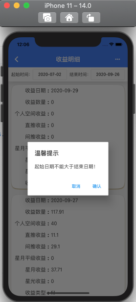
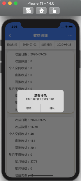
CupertinoAlertDialog 提示框(Cupertino ios风格)
showDialog(context: context,builder: (context) {return CupertinoAlertDialog(title: Text('温馨提示'),content: Text(title),actions: <Widget>[FlatButton(child: Text('取消'),onPressed: (){Navigator.of(context).pop('no');},),FlatButton(child: Text('确认'),onPressed: (){Navigator.of(context).pop('ok');},),],);});

若有收获,就点个赞吧
0 人点赞
