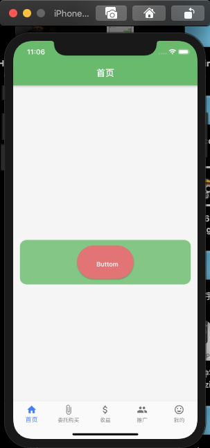
基本用法
Container(width: _width,height: 100,alignment: Alignment.center,margin: EdgeInsets.fromLTRB(15, (_height / 2 ) - 100, 15, 0),decoration: BoxDecoration(color: Colors.green[300],borderRadius: BorderRadius.circular(15)),child: RaisedButton(onPressed : (){print("onPressed"); // 按下触发。//可以通过这个设置禁用或启用控件},onLongPress: (){print("onLongPress"); // 长按触发。},onHighlightChanged: (e){ //水波纹高亮变化回调,按下返回true,抬起返回falseprint("onHighlightChanged, $e");},textTheme: ButtonTextTheme.primary,textColor: Colors.white, // 按钮不在禁用状态的颜色。disabledTextColor : Colors.yellow[200], // 按钮禁用的时候字体文字的颜色。color: Colors.red[300], // 按钮的背景颜色disabledColor: Color(0xffff9800), // 禁用状态的背景色。focusColor : Colors.black,hoverColor : Colors.white,// highlightColor : Colors.white, // 长按的背景色。splashColor : Colors.yellow[300], // 水波的颜色。colorBrightness : Brightness.dark,elevation : 8.0, // 按钮 阴影 高度focusElevation : 2.0, // 按钮 的背景阴影hoverElevation : 2.0,highlightElevation : 2.0, // 按钮长按 时阴影高度。disabledElevation : 6.0, // 禁用状态的阴影高度。padding : EdgeInsets.only( left : 30.0, top : 30.0, right : 20.0, bottom : 20.0),visualDensity : VisualDensity(horizontal: 3.4, vertical: 1.0), // 视觉密度shape : RoundedRectangleBorder(borderRadius: BorderRadius.circular(50.0)), // 外观。// materialTapTargetSize : MaterialTapTargetSize.padded,child: Text("Buttom"),))
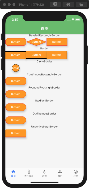
关于 shape 设置外观【形状】
BeveledRectangleBorder 长方形设置边框
Row(children: <Widget>[// 斜角巨型_Buttom(BeveledRectangleBorder(side: BorderSide(width: 1, color: Colors.red),borderRadius: BorderRadius.circular(10))),_Buttom(BeveledRectangleBorder(side: BorderSide(width: 1, color: Colors.red),borderRadius: BorderRadius.circular(60))),_Buttom(BeveledRectangleBorder(side: BorderSide(width: 1, color: Colors.red),borderRadius: BorderRadius.circular(0)))],),
Border 设置边框
Row(children: <Widget>[_Buttom(Border(top : BorderSide(color : Colors.black, width: 3))),_Buttom(Border(bottom : BorderSide(color : Colors.black, width: 3))),_Buttom(Border(right : BorderSide(color : Colors.black, width: 3))),],)
CircleBorder 圆形设置边框
Row(children: <Widget>[_Buttom(CircleBorder(side: BorderSide(color: Colors.black)),)],),
ContinuousRectangleBorder 椭圆边框
Row(children: <Widget>[_Buttom(ContinuousRectangleBorder(side: BorderSide(color: Colors.red),borderRadius: BorderRadius.circular(30)),)],),
RoundedRectangleBorder 圆角边框
Row(children: <Widget>[_Buttom(RoundedRectangleBorder(side: BorderSide(color: Colors.red),borderRadius: BorderRadius.circular(30)),)],),
StadiumBorder 运动场边框 和 圆角边框差不多
Row(children: <Widget>[_Buttom(StadiumBorder(side: BorderSide(color: Colors.red),),)],),
OutLineInputBorder 圆角边框。
Row(children: <Widget>[_Buttom(OutlineInputBorder(borderSide: BorderSide(color: Colors.red),borderRadius: BorderRadius.circular(30),),)],)
UnderlineInputBorder 底下边框 上边圆角
Row(children: <Widget>[_Buttom(UnderlineInputBorder(borderSide: BorderSide(color: Colors.red, width: 4),),)],)
基础代码
Widget _Buttom(_shape) {return RaisedButton(onPressed: () {print("onPressed"); // 按下触发。//可以通过这个设置禁用或启用控件},onLongPress: () {print("onLongPress"); // 长按触发。},onHighlightChanged: (e) {//水波纹高亮变化回调,按下返回true,抬起返回falseprint("onHighlightChanged, $e");},textColor: Colors.white, // 按钮不在禁用状态的颜色。disabledTextColor: Colors.yellow[200], // 按钮禁用的时候字体文字的颜色。color: Color(0xffff9800), // 按钮的背景颜色disabledColor: Color(0xffff9800), // 禁用状态的背景色。focusColor: Colors.black,hoverColor: Colors.white,// highlightColor : Colors.white, // 长按的背景色。splashColor: Colors.yellow[300], // 水波的颜色。colorBrightness: Brightness.dark,elevation: 8.0, // 按钮 阴影 高度focusElevation: 2.0, // 按钮 的背景阴影hoverElevation: 2.0,highlightElevation: 2.0, // 按钮长按 时阴影高度。disabledElevation: 6.0, // 禁用状态的阴影高度。// padding:// EdgeInsets.only(left: 30.0, top: 30.0, right: 20.0, bottom: 20.0),visualDensity: VisualDensity(horizontal: 3.4, vertical: 1.0), // 视觉密度shape:_shape, // 外观。// materialTapTargetSize : MaterialTapTargetSize.padded,child: Text("Buttom"),);}}

若有收获,就点个赞吧
0 人点赞
