使用border-images注意点
一定要设置border属性 (有边框,才能设置边框背景图)
/ 边框背景图资源 /
border-image-source: url(./images/border.jpg);
/ 边框背景图剪裁 是边框的 上 右 下 左宽度 注意点:这个属性不能写单位 要写数字/
border-image-slice: 167 167 167 167;
/ 背景图平铺、均匀平铺/
border-image-repeat: repeat; //// round;
/ 注意点1:不规则边框背景图,需要根据每一个边单独设置border宽度 /
border: 48px solid transparent;
border-width: 51px 38px 21px 132px; //width 与 slice 背景图剪裁尺寸对应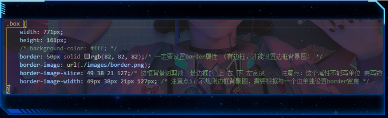
简写: 不简写 内容会被border挤到里面border:1px solid transparent;border-image: url(../image/border.png ) 50 40 25 130/50px 40px 25px 130px;// 面板默认内边距padding: 20px 30px;.box {width: 350px;height: 160px;background-color: #222;margin: 30px;}.box {/* *** 一定要在border-image之前就设置盒子的边框属性。 要有边框才可以使用边框背景图 */border: 20pxsolid#222;/* 边框背景图border-image复合属性 */border-image: url(./images/border.png) 554025130stretch;/* 注意点1: 如果不规则图形, 盒子的边框宽度也要设置成不规则宽度 */border-width: 55px40px25px130px;/* 注意点2: 如果给元素设置了border,则会把盒子宽高撑开默认 box-sizing: content-box 外扩盒子 = content + padding + border解决方案,设置内减盒子 box-sizing: border-box 总宽度不变,有了padding和border之后,盒子content会自动内减*/box-sizing: border-box;/* 注意点3:设置内减盒子之后,由于content自动内减。影响盒子内容布局解决方案: 给盒子添加一个子元素,采用子绝父相定位来把内容撑开*/position: relative;}.inner {/* 子绝父相 */position: absolute;left: -130px;top: -55px;right: -40px;bottom: -25px;padding: 20px30px}.box2 {width: 400px;height: 300px;}.box3 {width: 500px;height: 200px;}</style></head><body><divclass="box box1"><divclass="inner">111</div></div><divclass="box box2"></div><divclass="box box3"></div></body>
https://echarts.apache.org/handbook/zh/get-started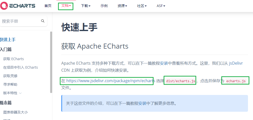
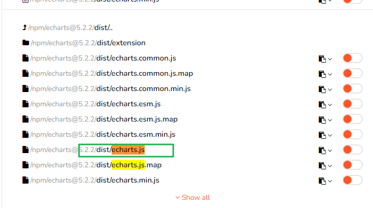
使用步骤:
- 引入echarts 插件文件到html页面中
3.js初始化图表 *
// 3.1 创建echarts实例
let myChart = echarts.init(document.querySelector(‘#main’));
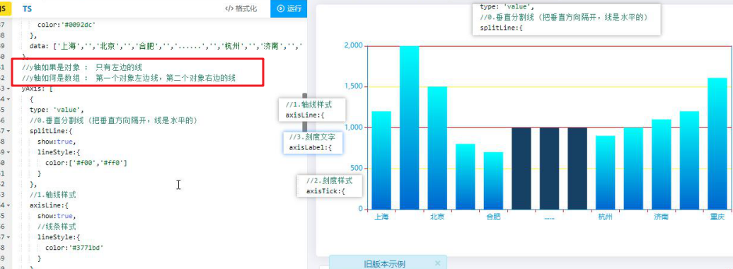
4.指定配置项和数据(option)
let option = {xAxis: {type: 'category',//坐标轴旁边文字提示name: '城市',//0.水平分割线 (把水平方向隔开,线是垂直的)splitLine: {show: false,lineStyle: {color: ['#f00']}},//1.轴线样式axisLine: {//线条样式lineStyle: {color: '#3771bd'}},//2.刻度样式axisTick: {show: true,//刻度样式lineStyle: {color: '#f00'}},//3.刻度文字axisLabel: {color: '#0092dc'},data: ['上海', '', '北京', '', '合肥', '', '......', '', '杭州', '', '济南', '', '重庆']},//y轴如果是对象 : 只有左边的线//y轴如何是数组 : 第一个对象左边线,第二个对象右边的线yAxis: [{type: 'value',//0.垂直分割线 (把垂直方向隔开,线是水平的)splitLine: {show: true,lineStyle: {color: ['#f00', '#ff0']}},//1.轴线样式axisLine: {show: true,//线条样式lineStyle: {color: '#3771bd'}},//2.刻度样式axisTick: {show: true,//刻度样式lineStyle: {color: '#f00'}},//3.刻度文字axisLabel: {color: '#0092dc'},}, {type: 'value',//1.轴线样式axisLine: {show: true,//线条样式lineStyle: {color: '#3771bd'}},//2.刻度样式axisTick: {show: true,//刻度样式lineStyle: {color: '#f00'}},//3.刻度文字axisLabel: {color: '#0092dc'},}],series: [{//设置所有柱子的样式itemStyle: {//渐变颜色color: new echarts.graphic.LinearGradient(0, 0, 0, 1, [{ offset: 0, color: '#00faf9' },{ offset: 1, color: '#0065cf' }])},data: [1200,2000,1500,800,700,item,item,item,900,1000,1101,1200,1608],type: 'bar'}]};
5.渲染图表到页面
myChart.setOption(option);
需要了解的主要配置:series xAxis yAxis grid tooltip title legend color
series:图表内容
- 系列列表。每个系列通过 type 决定自己的图表类型
大白话:图标数据,指定什么类型的图标,可以多个图表重叠。
//设置所有柱子的样式( 柱形图可用)
// 单个柱子设定宽度<br /> barWidth:'30%',<br /> itemStyle: {<br /> //渐变颜色<br /> color: new echarts.graphic.LinearGradient(0, 0, 0, 1, [<br /> { offset: 0, color: '#00faf9' },<br /> { offset: 1, color: '#0065cf' }<br /> ])<br /> },
// 折线图
//平滑线
smooth: true,
//线条样式
itemStyle: {
color: ‘#00b7bf’
},
//小圈圈大小
symbolSize: 4,
//小圈圈形状
symbol: ‘emptyCircle’,
//最大值最小值大头针标记
// markPoint: {
// data: [
// { type: ‘max’, name: ‘Max’ },
// { type: ‘min’, name: ‘Min’ }
// ]
// },
//平均值标记虚线
// markLine: {
// data: [{ type: ‘average’, name: ‘Avg’ }]
// }
//饼图
{<br /> name: '点位分布',<br /> type: 'pie',<br /> //两个圆大小<br /> radius: [20, '80%'],<br /> //圆心位置<br /> center: ['50%', '50%'],<br /> //南丁格尔图:通过半径区分数据大小(半径越大数据越大)<br /> // radius : 数据越大,角度越大<br /> // area : 圆心角相同<br /> roseType: 'radius',<br /> //设置所有文字颜色<br /> // label:{<br /> // color:'#f00'<br /> // },<br /> itemStyle: {<br /> //数据圆角<br /> borderRadius: 0<br /> },<br /> data: [<br /> { value: 38, name: '云南', label: { color: '#f00' }, },<br /> { value: 32, name: '北京' },
//圆环
data: [
{ value: 100, itemStyle: { color: ‘#12274d’ } },
{ value: 100, itemStyle: { color: ‘transparent’ } },
{ value: 100, itemStyle: { color: ‘transparent’ } },
{
value: 100, itemStyle: {
color: new echarts.graphic.LinearGradient(0, 0, 0, 1, [
{
offset: 0,
color: ‘#00c1dd’
},
{
offset: 1,
color: ‘#006ac4’
}
])
}
},
]
]
- xAxis:直角坐标系 grid 中的 x 轴
- boundaryGap: 坐标轴两边留白策略 true,这时候刻度只是作为分隔线,标签和数据点都会在两个刻度之间的带(band)中间。
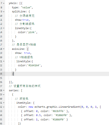
yAxis:直角坐标系 grid 中的 y 轴
//y轴如果是对象 : 只有左边的线 yAxis:{ },
//y轴如何是数组 : 第一个对象左边线,第二个对象右边的线 yAxis: [{ },{ }],
yAxis: {
type: ‘value’,
//0.垂直分割线 (把垂直方向隔开,线是水平的)
splitLine: {
show: true,
lineStyle: {
color: [‘#f00’, ‘#ff0’]
}
},
//1.轴线样式
axisLine: {
show: true,
//线条样式
lineStyle: {
color: ‘#3771bd’
}
},
//2.刻度样式
axisTick: {
show: true,
//刻度样式
lineStyle: {
color: ‘#f00’
}
},
//3.刻度文字
axisLabel: {
color: ‘#0092dc’
},
},
grid:直角坐标系内绘图网格。 //调整图表的位置 内边距
// 网格配置 grid可以控制线形图 柱状图 图表大小
grid: {
left: ‘3%’,
right: ‘4%’,
bottom: ‘3%’,
// 是否显示刻度标签 如果是true 就显示 否则反之
containLabel: true
},
title:标题组件
title: {<br /> text: '单位:万',<br /> left: '40',<br /> textStyle: {<br /> color: '#204b84'<br /> }<br /> },
tooltip:提示框组件
//鼠标移入提示框
tooltip: {
trigger: ‘axis’
},
legend:图例组件
//上方小提示图标: 文字必须与name保持一致
legend: {
top: ‘top’,
left: ‘center’,
//文字样式
textStyle: {
color: ‘#1d4175’
}
},
color:调色盘颜色列表数据堆叠,同个类目轴上系列配置相同的stack值后 后一个系列的值会在前一个系列的值上相加。
// color设置我们线条的颜色 注意后面是个数组
color: [‘pink’, ‘red’, ‘green’, ‘skyblue’],
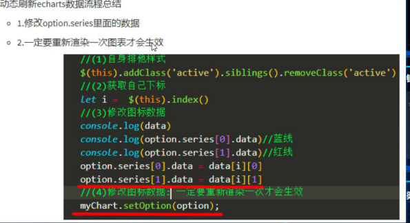

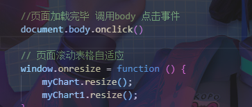
// 页面滚动表格自适应
window.onresize = function () {<br /> myChart.resize();<br /> myChart1.resize();<br /> }

参考1月6号 数据可视化实战 案例
// 格式: 当前时间:2020年3月17-0时54分14秒<script>let t = null;t = setTimeout(time, 1000);//開始运行function time() {clearTimeout(t);//清除定时器dt = new Date();var y = dt.getFullYear();var mt = dt.getMonth() + 1;var day = dt.getDate();var h = dt.getHours();//获取时var m = dt.getMinutes();//获取分var s = dt.getSeconds();//获取秒document.querySelector(".showTime").innerHTML = '当前时间:' + y + "年" + mt + "月" + day + "-" + h + "时" + m + "分" + s + "秒";t = setTimeout(time, 1000); //设定定时器,循环运行}</script>

若有收获,就点个赞吧
0 人点赞
