- 什么是 CSS?
- 重置样式1
- 重置样式2
- css中的选择器
- 打字效果
- 图片非透明区域添加投影
- 平滑滚动
- 图片光标
- 文本保留特定行数其余内容省略
::selectionCSS 伪元素- 万物皆可伸缩
- CSS 模态框
- 您可以创建自定义样式滚动条
- position: sticky 吸顶效果
- CSS 滚动捕捉优化滚动体验
- CSS 动态文字提示
- 输入框光标颜色
::in-range和::out-of-range伪类- 花里胡哨的文字
- 保持宽高比
- 文本溢出
- 居中对齐
- 隐藏滚动条
- video/audio隐藏控件 — chrome 58+
- 禁止用户选择页面中的文字或者图片
- 清除输入框内阴影- iOS
- 禁止保存或拷贝图像
- placeholder字体颜色
- 字体禁止缩放
- 旋转动画
- 过渡
什么是 CSS?
级联样式表 (CSS) 是一种样式表语言,用于描述以 HTML 等标记语言编写的文档的样式。CSS 是万维网的主要技术之一,与 HTML 和 JavaScript 并驾齐驱。
CSS 旨在实现样式和内容的分离,包括布局、颜色和字体。这种分离可以提高内容的可访问性,在样式特性的规范中提供更多的灵活性和控制,通过在单独的 .css 文件中指定相关的 CSS 使多个网页能够共享样式,并降低结构内容的复杂性和重复性。
重置样式1
html ,body ,div ,span ,applet ,object ,iframe ,p ,blockquote ,pre ,a ,abbr ,acronym ,address ,big ,cite ,code ,del ,dfn ,em ,img ,ins ,kbd ,q ,s ,samp ,small ,strike ,strong ,sub ,sup ,tt ,var ,b ,u ,i ,center ,dl ,dt ,dd ,ol ,ul ,li ,fieldset ,form ,label ,legend ,table ,caption ,tbody ,tfoot ,thead ,tr ,th ,td ,article ,aside ,canvas ,details ,embed ,figure ,figcaption ,footer ,header ,hgroup ,main ,menu ,nav ,output ,ruby ,section ,summary ,time ,mark ,audio ,video {margin: 0;padding: 0;vertical-align: baseline;border: none;}body ,textarea ,input ,button ,select ,keygen ,legend {font: 14px/1.5 'Microsoft YaHei UI','Microsoft YaHei',Roboto,Helvetica,Arial,Verdana,sans-serif;outline: none;}article ,aside ,details ,figcaption ,figure ,footer ,header ,hgroup ,main ,menu ,nav ,section {display: block;}blockquote:before ,blockquote:after ,q:before ,q:after {content: none;}table {width: 100%;border-spacing: 0;border-collapse: collapse;}input ,select {outline: none;appearance: none;}h1 ,h2 ,h3 ,h4 ,h5 ,h6 ,em ,strong ,b {font-weight: bold;}del ,ins ,u ,s ,a ,a:hover {text-decoration: none;}* ,:after ,:before {box-sizing: border-box;-webkit-tap-highlight-color: transparent;}textarea {overflow: auto;resize: none;}blockquote ,q {quotes: none;}a ,button {cursor: pointer;}*[hidden] {display: none;}ol ,ul ,li {list-style: none;}html ,body {width: 100%;height: 100%;}/* 滚动条 */::-webkit-scrollbar-track {border-radius: 10px;background-color: #fff;box-shadow: inset 0 0 6px rgba(0,0,0,.3);}::-webkit-scrollbar-thumb {border-radius: 10px;background-color: #999;box-shadow: inset 0 0 6px rgba(0,0,0,.3);}::-webkit-scrollbar {width: 6px;height: 6px;background-color: #f5f5f5;}
重置样式2
html, body, div, span, applet, object, iframe,h1, h2, h3, h4, h5, h6, p, blockquote, pre,a, abbr, acronym, address, big, cite, code,del, dfn, em, img, ins, kbd, q, s, samp,small, strike, strong, sub, sup, tt, var,b, u, i, center,dl, dt, dd, menu, ol, ul, li,fieldset, form, label, legend,table, caption, tbody, tfoot, thead, tr, th, td,article, aside, canvas, details, embed,figure, figcaption, footer, header, hgroup,main, menu, nav, output, ruby, section, summary,time, mark, audio, video {margin: 0;padding: 0;border: 0;font-size: 100%;font: inherit;vertical-align: baseline;}/* HTML5 display-role reset for older browsers */article, aside, details, figcaption, figure,footer, header, hgroup, main, menu, nav, section {display: block;}/* HTML5 hidden-attribute fix for newer browsers */*[hidden] {display: none;}body {line-height: 1;}menu, ol, ul {list-style: none;}blockquote, q {quotes: none;}blockquote:before, blockquote:after,q:before, q:after {content: '';content: none;}table {border-collapse: collapse;border-spacing: 0;}
css中的选择器
~(波浪号)
p~ul选择器 p之后出现的所有ul。
两种元素必须拥有相同的父元素,但是 ul不必直接紧随 p。
+(加号)
- 二者有相同的父元素,
- 选择紧接在另一个元素后的元素
>(大于号)
是css3特有的选择器,
A>B 表示选择A元素的所有子B元素。
打字效果
您知道吗?其实您可以使用零 JavaScript 来创建打字效果。
<!DOCTYPE html><html lang="en"><head><meta charset="UTF-8" /><meta http-equiv="X-UA-Compatible" content="IE=edge" /><meta name="viewport" content="width=device-width, initial-scale=1.0" /><title>Document</title><style>.wrapper {height: 100vh;/*This part is important for centering*/display: flex;align-items: center;justify-content: center;}.typing-demo {width: 22ch;animation: typing 2s steps(22), blink 0.5s step-end infinite alternate;white-space: nowrap;overflow: hidden;border-right: 3px solid;font-family: monospace;font-size: 2em;}@keyframes typing {from {width: 0;}}@keyframes blink {50% {border-color: transparent;}}</style></head><body><div class="wrapper"><div class="typing-demo">这是一个打字演示。</div></div></body></html>
图片非透明区域添加投影
当您使用透明图像时,您可以使用 drop-shadow() 过滤器函数在图像内容上创建阴影,而不是使用 box-shadow 属性在元素的整个框后面创建矩形阴影:filter: drop-shadow(2px 4px 8px #585858);
<!DOCTYPE html><html lang="en"><head><meta charset="UTF-8" /><meta http-equiv="X-UA-Compatible" content="IE=edge" /><meta name="viewport" content="width=device-width, initial-scale=1.0" /><title>Document</title><style>.wrapper {height: 100vh;display: flex;align-items: center;justify-content: center;}.mr-2 {margin-right: 2em;}.mb-1 {margin-bottom: 1em;}.text-center {text-align: center;}.box-shadow {box-shadow: 2px 4px 8px #585858;}.drop-shadow {filter: drop-shadow(2px 4px 8px #585858);}</style></head><body><div class="wrapper"><div class="mr-2"><div class="mb-1 text-center">box-shadow</div><imgclass="box-shadow"src="https://markodenic.com/man_working.png"alt="Image with box-shadow"/></div><div><div class="mb-1 text-center">drop-shadow</div><imgclass="drop-shadow"src="https://markodenic.com/man_working.png"alt="Image with drop-shadow"/></div></div></body></html>
平滑滚动
不需要 JavaScript 就可以实现平滑滚动,只需一行 CSS。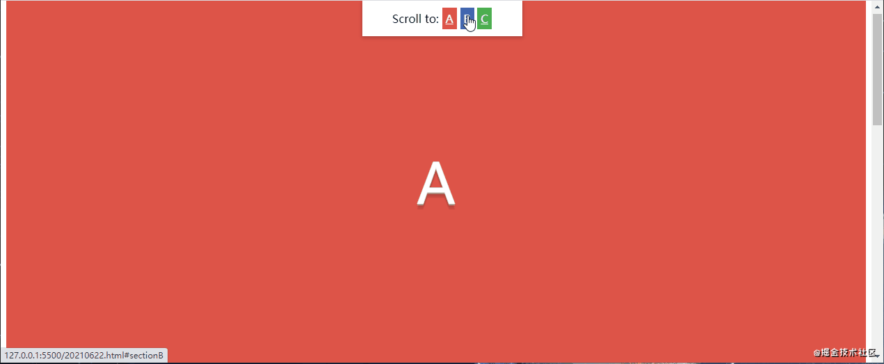
/* 喜欢的同学一定要点赞、转发、收藏啊! */<!DOCTYPE html><html lang="en"><head><meta charset="UTF-8" /><meta http-equiv="X-UA-Compatible" content="IE=edge" /><meta name="viewport" content="width=device-width, initial-scale=1.0" /><title>Document</title><style>html {scroll-behavior: smooth;}nav {position: fixed;left: calc(50vw - 115px);top: 0;width: 200px;text-align: center;padding: 15px;background: #fff;box-shadow: 0 2px 5px 1px rgba(0, 0, 0, 0.2);}nav .link {padding: 5px;color: white;}.section {height: 100vh;display: flex;align-items: center;justify-content: center;color: #fff;font-size: 5em;text-shadow: 0px 2px 0px #b2a98f, 0px 4px 3px rgba(0, 0, 0, 0.15),0px 8px 1px rgba(0, 0, 0, 0.1);}.bg-red {background: #de5448;}.bg-blue {background: #4267b2;}.bg-green {background: #4caf50;}</style></head><body><nav>Scroll to:<a href="#sectionA" class="link bg-red">A</a><a href="#sectionB" class="link bg-blue">B</a><a href="#sectionC" class="link bg-green">C</a></nav><div class="wrapper"><div id="sectionA" class="section bg-red">A</div><div id="sectionB" class="section bg-blue">B</div><div id="sectionC" class="section bg-green">C</div></div></body></html>
图片光标
您知道如何使用自己的图像,甚至是表情符号作为光标吗?
/* 喜欢的同学一定要点赞、转发、收藏啊! */<!DOCTYPE html><html lang="en"><head><meta charset="UTF-8" /><meta http-equiv="X-UA-Compatible" content="IE=edge" /><meta name="viewport" content="width=device-width, initial-scale=1.0" /><title>Document</title><style>.wrapper {display: flex;height: 100vh;align-items: center;justify-content: center;background: #4776e6;background: -webkit-linear-gradient(to right, #4776e6, #8e54e9);background: linear-gradient(to right, #4776e6, #8e54e9);padding: 0 10px;}.tile {width: 200px;height: 200px;display: flex;align-items: center;justify-content: center;background-color: #de5448;margin-right: 10px;color: #fff;font-size: 1.4em;text-align: center;}.tile--image-cursor {background-color: #1da1f2;cursor: url(https://picsum.photos/20/20), auto;}.tile--emoji-cursor {background-color: #4267b2;cursor: url("data:image/svg+xml;utf8,<svg xmlns='http://www.w3.org/2000/svg' width='40' height='48' viewport='0 0 100 100' style='fill:black;font-size:24px;'><text y='50%'>🚀</text></svg>"),auto;}</style></head><body><div class="wrapper"><div class="tile">Default</div><div class="tile tile--image-cursor">Image Cursor</div><div class="tile tile--emoji-cursor">Emoji Cursor</div></div></body></html>
文本保留特定行数其余内容省略
您可以使用“-webkit-line-clamp”属性将文本截断为特定的行数。文本被夹住的点将显示一个省略号。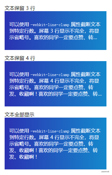
<!DOCTYPE html><html lang="en"><head><meta charset="UTF-8" /><meta http-equiv="X-UA-Compatible" content="IE=edge" /><meta name="viewport" content="width=device-width, initial-scale=1.0" /><title>Document</title><style>body {padding: 20px;font-family: "Open Sans", sans-serif;}.tile {background: linear-gradient(to right, #2b32b2, #1488cc);padding: 15px;margin-bottom: 15px;padding: 15px;width: 300px;color: #fff;}.line-clamp {display: -webkit-box;-webkit-box-orient: vertical;-webkit-line-clamp: 3; /* Change this line if you want. In this case it trimmed the text to 3 lines. */overflow: hidden;}.line-clamp--four {-webkit-line-clamp: 4; /* Trimmed the second tile to four lines. */}</style></head><body>文本保留 3 行<div class="tile"><p class="line-clamp">可以使用 <code>-webkit-line-clamp</code> 属性截断文本到特定行数。屏幕 3行显示不完全,将显示省略号。喜欢的同学一定要点赞、转发、收藏啊 !喜欢的同学一定要点赞、转发、收藏啊 !</p></div>文本保留 4 行<div class="tile"><p class="line-clamp line-clamp--four">可以使用 <code>-webkit-line-clamp</code> 属性截断文本到特定行数。屏幕 4行显示不完全,将显示省略号。喜欢的同学一定要点赞、转发、收藏啊 !喜欢的同学一定要点赞、转发、收藏啊 !</p></div>文本全部显示<div class="tile"><p>可以使用 <code>-webkit-line-clamp</code> 属性截断文本到特定行数。屏幕 4行显示不完全,将显示省略号。喜欢的同学一定要点赞、转发、收藏啊 !喜欢的同学一定要点赞、转发、收藏啊 !</p></div></body></html>
::selection CSS 伪元素
::selection CSS 伪元素可以自定义控制鼠标选中部分内容的样式。
<!DOCTYPE html><html lang="en"><head><meta charset="UTF-8" /><meta http-equiv="X-UA-Compatible" content="IE=edge" /><meta name="viewport" content="width=device-width, initial-scale=1.0" /><title>Document</title><style>.wrapper {height: 100vh;display: flex;align-items: center;justify-content: center;}p {font-size: 2rem;font-family: sans-serif;}.custom-highlighting::selection {background-color: #8e44ad;color: #fff;}</style></head><body><div class="wrapper"><div><p>这是默认高亮显示。鼠标选中试试看。</p><p class="custom-highlighting">这是自定义高亮显示。鼠标选中试试看。</p></div></div></body></html>
万物皆可伸缩
你知道任何元素调整大小,都可以像 <textarea> 一样吗?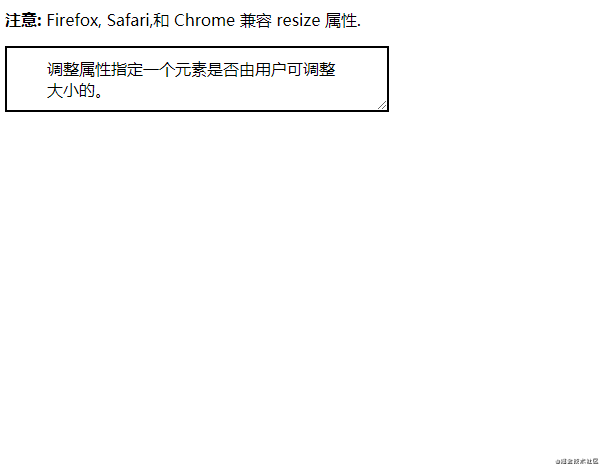
<!DOCTYPE html><html><head><meta charset="utf-8" /><title>Document</title><style>div {border: 2px solid;padding: 10px 40px;width: 300px;/* 核心代码 */resize: both;overflow: auto;}</style></head><body><p><b>注意:</b> Firefox, Safari,和 Chrome 兼容 resize 属性.</p><div>调整属性指定一个元素是否由用户可调整大小的。</div></body></html>
CSS 模态框
你可以使用 :target 伪类来创建零 JavaScript 的模态。
<!DOCTYPE html><html><head><meta charset="utf-8" /><title>Document</title><style>.wrapper {height: 100vh;/* This part is important for centering the content */display: flex;align-items: center;justify-content: center;/* End center */background: -webkit-linear-gradient(to right, #834d9b, #d04ed6);background: linear-gradient(to right, #834d9b, #d04ed6);}.wrapper a {display: inline-block;text-decoration: none;padding: 15px;background-color: #fff;border-radius: 3px;text-transform: uppercase;color: #585858;font-family: "Roboto", sans-serif;}.modal {visibility: hidden;opacity: 0;position: absolute;top: 0;right: 0;bottom: 0;left: 0;display: flex;align-items: center;justify-content: center;background: rgba(77, 77, 77, 0.7);transition: all 0.4s;}.modal:target {visibility: visible;opacity: 1;}.modal__content {border-radius: 4px;position: relative;width: 500px;max-width: 90%;background: #fff;padding: 1em 2em;}.modal__footer {text-align: right;}.modal__close {position: absolute;top: 10px;right: 10px;color: #585858;text-decoration: none;}</style></head><body><div class="wrapper"><a href="#demo-modal">打开模态框</a></div><div id="demo-modal" class="modal"><div class="modal__content"><h1>CSS 实现模态框</h1><p>您可以使用 :target 伪类创建零 JavaScript 的模态框。赶紧一起玩一玩啊!</p><div class="modal__footer">Made with <i class="fa fa-heart"></i>, by<a href="https://juejin.cn/user/958429872534056/posts" target="_blank">@gyx_这个杀手不太冷静</a></div><a href="#" class="modal__close">×</a></div></div></body></html>
您可以创建自定义样式滚动条
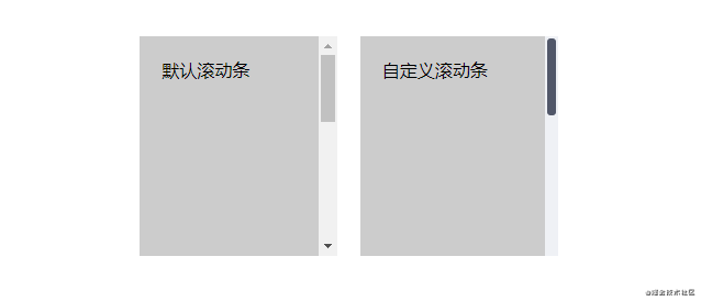
<!DOCTYPE html><html><head><meta charset="utf-8" /><title>Document</title><style>.wrapper {height: 100vh;/*This part is important for centering*/display: flex;align-items: center;justify-content: center;}.mr-1 {margin-right: 1em;}.tile {overflow: auto;display: inline-block;background-color: #ccc;height: 200px;width: 180px;}.tile--custom-scrollbar::-webkit-scrollbar {width: 12px;background-color: #eff1f5;}.tile--custom-scrollbar::-webkit-scrollbar-track {border-radius: 3px;background-color: transparent;}.tile--custom-scrollbar::-webkit-scrollbar-thumb {border-radius: 5px;background-color: #515769;border: 2px solid #eff1f5;}.tile-content {padding: 20px;height: 500px;}</style></head><body><div class="wrapper"><div><div class="tile mr-1"><div class="tile-content">默认滚动条</div></div><div class="tile tile--custom-scrollbar"><div class="tile-content">自定义滚动条</div></div></div></div></body></html>
position: sticky 吸顶效果
您可以使用 2 行 CSS 实现导航栏吸顶效果。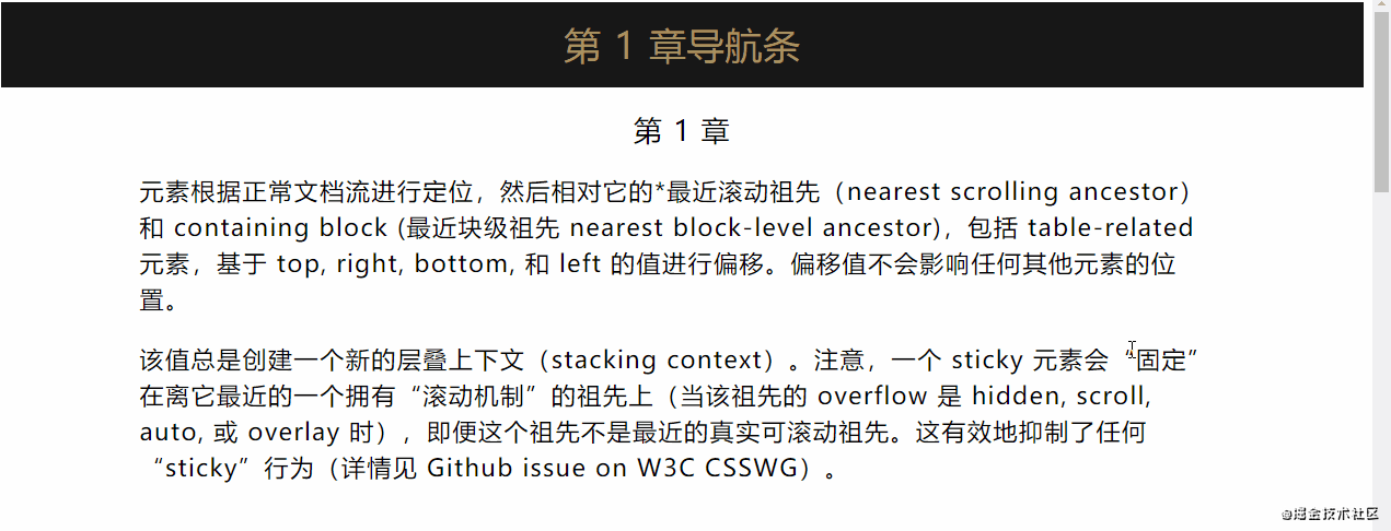
<!DOCTYPE html><html><head><meta charset="utf-8" /><title>Document</title><style>.section {font-size: 1.4em;letter-spacing: 0.05em;line-height: 1.5em;}.section h2,.section h3 {text-align: center;margin: 0;font-weight: normal;}.section__header {position: sticky;top: 0;padding: 1em;color: #a99160;background: #171717;}.section__content {padding: 1em;display: flex;justify-content: center;}.section__content > div {max-width: 992px;}</style></head><body><section class="section"><div class="section__header"><h2>第 1 章导航条</h2></div><div class="section__content"><div><h3>第 1 章</h3><p>元素根据正常文档流进行定位,然后相对它的*最近滚动祖先(nearestscrolling ancestor)和 containing block (最近块级祖先 nearestblock-level ancestor),包括 table-related 元素,基于 top, right,bottom, 和 left 的值进行偏移。偏移值不会影响任何其他元素的位置。</p><p>该值总是创建一个新的层叠上下文(stacking context)。注意,一个sticky元素会“固定”在离它最近的一个拥有“滚动机制”的祖先上(当该祖先的overflow 是 hidden, scroll, auto, 或 overlay时),即便这个祖先不是最近的真实可滚动祖先。这有效地抑制了任何“sticky”行为(详情见Github issue on W3C CSSWG)。</p></div></div></section><section class="section"><div class="section__header"><h2>第 2 章导航条</h2></div><div class="section__content"><div><h3>第 2 章</h3><p>元素根据正常文档流进行定位,然后相对它的*最近滚动祖先(nearestscrolling ancestor)和 containing block (最近块级祖先 nearestblock-level ancestor),包括 table-related 元素,基于 top, right,bottom, 和 left 的值进行偏移。偏移值不会影响任何其他元素的位置。</p><p>该值总是创建一个新的层叠上下文(stacking context)。注意,一个sticky元素会“固定”在离它最近的一个拥有“滚动机制”的祖先上(当该祖先的overflow 是 hidden, scroll, auto, 或 overlay时),即便这个祖先不是最近的真实可滚动祖先。这有效地抑制了任何“sticky”行为(详情见Github issue on W3C CSSWG)。</p></div></div></section><section class="section"><div class="section__header"><h2>第 3 章导航条</h2></div><div class="section__content"><div><h3>第 3 章</h3><p>元素根据正常文档流进行定位,然后相对它的*最近滚动祖先(nearestscrolling ancestor)和 containing block (最近块级祖先 nearestblock-level ancestor),包括 table-related 元素,基于 top, right,bottom, 和 left 的值进行偏移。偏移值不会影响任何其他元素的位置。</p><p>该值总是创建一个新的层叠上下文(stacking context)。注意,一个sticky元素会“固定”在离它最近的一个拥有“滚动机制”的祖先上(当该祖先的overflow 是 hidden, scroll, auto, 或 overlay时),即便这个祖先不是最近的真实可滚动祖先。这有效地抑制了任何“sticky”行为(详情见Github issue on W3C CSSWG)。</p></div></div></section><section class="section"><div class="section__header"><h2>第 4 章导航条</h2></div><div class="section__content"><div><h3>第 4 章</h3><p>元素根据正常文档流进行定位,然后相对它的*最近滚动祖先(nearestscrolling ancestor)和 containing block (最近块级祖先 nearestblock-level ancestor),包括 table-related 元素,基于 top, right,bottom, 和 left 的值进行偏移。偏移值不会影响任何其他元素的位置。</p><p>该值总是创建一个新的层叠上下文(stacking context)。注意,一个sticky元素会“固定”在离它最近的一个拥有“滚动机制”的祖先上(当该祖先的overflow 是 hidden, scroll, auto, 或 overlay时),即便这个祖先不是最近的真实可滚动祖先。这有效地抑制了任何“sticky”行为(详情见Github issue on W3C CSSWG)。</p></div></div></section></body></html>
CSS 滚动捕捉优化滚动体验
您可以控制 scroll-snap-type 值来获取良好的滚动体验:
这个可能要亲自体验,滚动鼠标,才可以感受到效果!
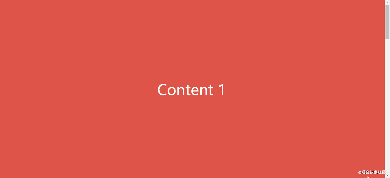
<!DOCTYPE html><html><head><meta charset="utf-8" /><title>Document</title><style>body {margin: 0;padding: 0;}.wrapper {height: 100vh;overflow: auto;scroll-snap-type: y mandatory;}.section {scroll-snap-align: center;height: 100vh;display: flex;justify-content: center;align-items: center;background-color: #de5448;color: #fff;font-size: 3em;}.bg-blue {background: #4267b2;}.bg-green {background: #4caf50;}</style></head><body><div class="wrapper"><div class="section">Content 1</div><div class="section bg-blue">Content 2</div><div class="section bg-green">Content 3</div><div class="section">Content 4</div><div class="section bg-blue">Content 5</div></div></body></html>
CSS 动态文字提示
使用 attr() CSS 函数创建动态的仅用 CSS 实现文字提示。
<!DOCTYPE html><html><head><meta charset="utf-8" /><title>Document</title><style>body {padding: 20px;}.tooltip {position: relative;border-bottom: 1px dotted black;}/* Tooltip box */.tooltip:before {content: attr(data-tooltip);position: absolute;width: 100px;background-color: #062b45;color: #fff;text-align: center;padding: 10px;line-height: 1.2;border-radius: 6px;z-index: 1;opacity: 0;transition: opacity 0.6s;bottom: 125%;left: 50%;margin-left: -60px;font-size: 0.75em;visibility: hidden;}/* Tooltip arrow */.tooltip:after {content: "";position: absolute;bottom: 75%;left: 50%;margin-left: -5px;border-width: 5px;border-style: solid;opacity: 0;transition: opacity 0.6s;border-color: #062b45 transparent transparent transparent;visibility: hidden;}.tooltip:hover:before,.tooltip:hover:after {opacity: 1;visibility: visible;}</style></head><body><h1>HTML/CSS 文字提示</h1><p>鼠标移入<span class="tooltip" data-tooltip="这是一个文字提示">这里</span>显示文字提示。</p><p>你也可以移入<span class="tooltip" data-tooltip="这是另一个文字提示">这里</span>显示另一个文字提示。</p></body></html>
输入框光标颜色
您可以更改文本输入框光标的颜色。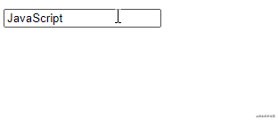
<!DOCTYPE html><html><head><meta charset="utf-8" /><title>Document</title><style>input {caret-color: red;}</style></head><body><input type="text" /></body></html>
::in-range 和 ::out-of-range 伪类
使用 ::in-range 和 ::out-of-range 伪类来设置当前值超出 min 和 max 属性指定的范围限制的输入的样式。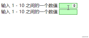
<!DOCTYPE html><html><head><meta charset="utf-8" /><title>Document</title><style>input:in-range {background-color: rgba(0, 255, 0, 0.25);border: 1px solid green;}input:out-of-range {background-color: rgba(255, 0, 0, 0.25);border: 1px solid red;}</style></head><body><form><label for="one">输入 1 - 10 之间的一个数值</label><input type="number" id="one" name="one" min="1" max="10" /><br /><label for="two">输入 1 - 10 之间的一个数值</label><input type="number" id="two" name="two" min="1" max="10" /></form></body></html>
花里胡哨的文字
使用 background-clip 属性创建漂亮的标题。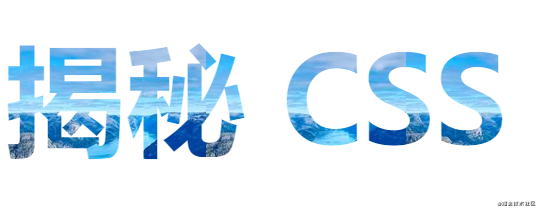
<!DOCTYPE html><html><head><meta charset="utf-8" /><title>Document</title><style>h1 {background: blue url("https://picsum.photos/id/1015/200/300");background-clip: text;-webkit-background-clip: text;color: transparent;margin-top: 20px;font-size: 120px;}@media (max-width: 600px) {h1 {font-size: 45px;}}</style></head><body><h1>揭秘 CSS</h1></body></html>
保持宽高比
在响应式网页设计中,保持一致的宽高比,即所谓的长宽比
使用padding-top
解决方案需要一个父容器和一个绝对放置的子容器。然后,可以将宽高比计算为百分比以设置为 padding-top。例如:
1:1长宽比 = 1/1 = 1 = padding-top: 100%
4:3的长宽比 = 3/4 = 0.75 = padding-top: 75%
3:2的长宽比 = 2 / 3 = 0.66666 = padding-top: 66.67%
16:9的长宽比 = 9 / 16 = 0.5625 = padding-top: 56.25%
<div class="container"><img class="media" src="..." alt="..."></div>
.container {position: relative;width: 100%;padding-top: 56.25%; /* 16:9 宽高比 */}.media {position: absolute;top: 0;}
aspect-ratio CSS属性
aspect-ratio: 16 / 9 代替:padding-top: 56.25%,将 aspect-ratio 设置为指定的 width / height比例
使用padding-top
.container {width: 100%;padding-top: 56.25%;}
使用aspect-ratio
.container {width: 100%;aspect-ratio: 16 / 9;}
文本溢出
单行
{overflow: hidden;white-space: nowrap;text-overflow: ellipsis;}
多行
只有-webkit内核才有作用
{display: -webkit-box;overflow: hidden;text-overflow: ellipsis;-webkit-box-orient: vertical;-webkit-line-clamp: 2;}
居中对齐
{position: absolute;top: 50%;left: 50%;transform: translate(-50%, -50%);}
隐藏滚动条
::-webkit-scrollbar {display: none;}
video/audio隐藏控件 — chrome 58+
// 全屏video::-webkit-media-controls-fullscreen-button {display: none;}
禁止用户选择页面中的文字或者图片
div {user-select: none;}
清除输入框内阴影- iOS
div {-webkit-appearance: none;}
禁止保存或拷贝图像
img {-webkit-touch-callout: none;}
placeholder字体颜色
input::-webkit-input-placeholder,textarea::-webkit-input-placeholder {color: #c7c7c7;}input:-moz-placeholder,textarea:-moz-placeholder {color: #c7c7c7;}input:-ms-input-placeholder,textarea:-ms-input-placeholder {color: #c7c7c7;}
字体禁止缩放
body {text-size-adjust: 100% !important;}
旋转动画
.demo { animation: rotateTurn 5s infinite linear; }@keyframes rotateTurn {0% {transform: translate3d(0, 0, 0) rotate(0);}to {// 1turn从左往右// -1turn从右往左transform: translate3d(0, 0, 0) rotate(1turn);}}
过渡
position: relative;touch-action: none;transform: translate3d(0px, -3810px, 0px);transition: all 700ms ease;
position: fixed依据父元素定位
transform: scale(1);

若有收获,就点个赞吧
0 人点赞
