html:
代码:
<!DOCTYPE html><html lang="en"><head><meta charset="UTF-8"><meta name="viewport" content="width=device-width, initial-scale=1.0"><title>Document</title><link rel="stylesheet" href="../css/reset.css"><link rel="stylesheet" href="../css/72粘滞定位.css"></head><body><div class="nav"><ul><li><a href="#">HTML/CSS</a></li><li><a href="#">Browser Side</a></li><li><a href="#">Server Side</a></li><li><a href="#">Programming</a></li><li><a href="#">XML</a></li><li><a href="#">Web Building</a></li><li><a href="#">Reference</a></li></ul></div></body></html>
css:
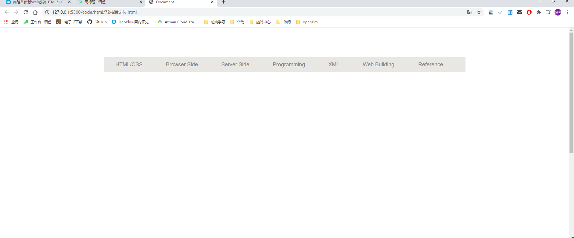
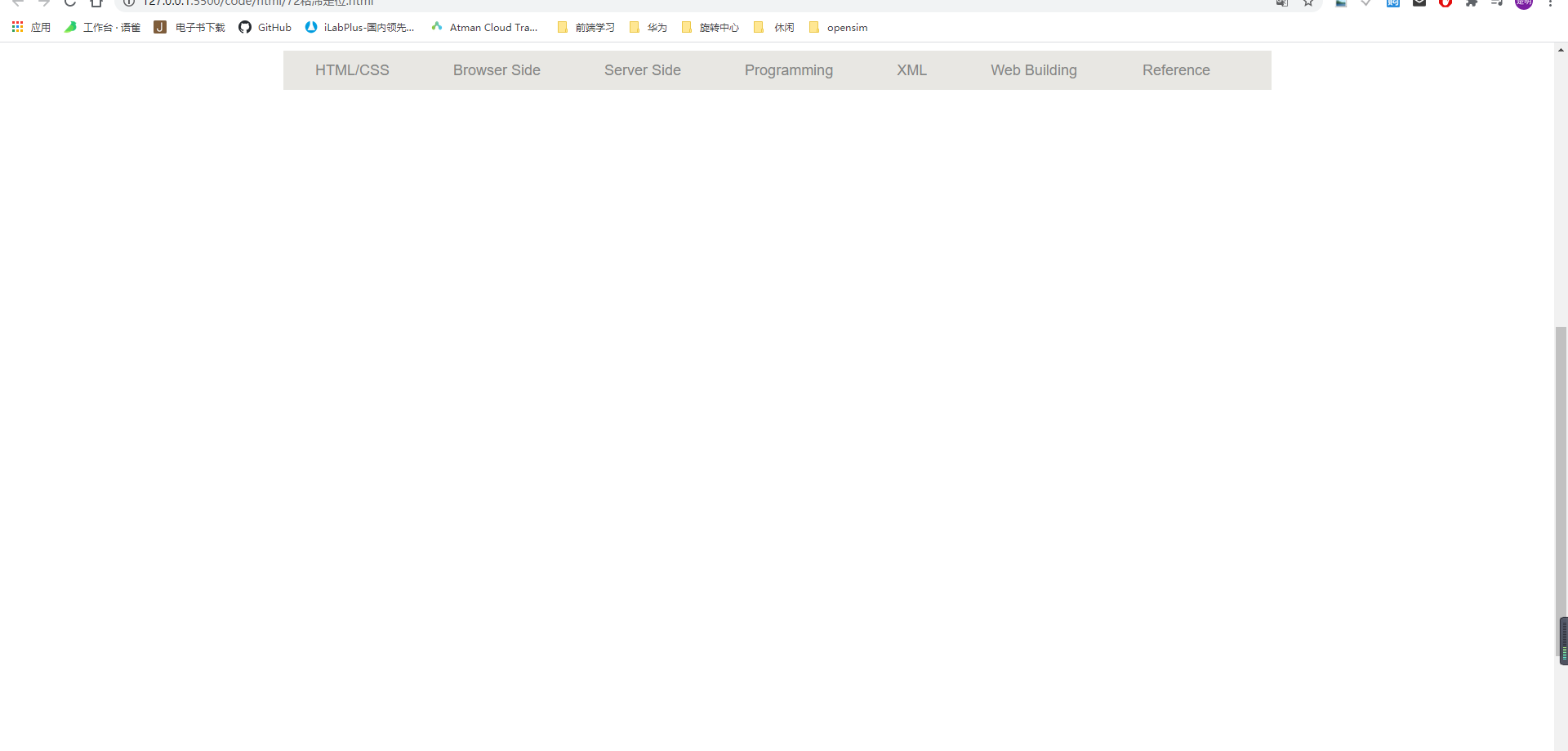
(1)粘滞定位,就像一个胶水一样,把某个元素粘在某个位置,即使拖动滚动条也不会使得该元素移出浏览器
(2)用法:
position: sticky;
top: x; / 或者其他的三个方位/
代码:
body {
    height: 2000px;
}

.nav {
    width: 1210px;
    height: 48px;
    background-color: hsl(48, 10%, 90%);
    margin: 100px auto;
    position: sticky;
    top:10px;
}

.nav li a{
    display: block;
    float: left;
    padding: 0 39px;
}

/* .nav li:lastchild a {
    padding: 0 42px 0 42px;
} */
.nav li:last-child a{
    padding: 0 41px 0 41px;
}

.nav li a:hover {
    background-color: #DEDDD9;
}
.nav li a{
    text-decoration: none;
    color: #868685;
    font-size: 18px;
    height: 48px;
    line-height: 48px;
}

若有收获,就点个赞吧
0 人点赞
