实验2.1要求:
- 参考任务1.2有关鸢尾花数据的相关介绍,了解数据各列的含义。
- 对每种类型的鸢尾花的四个属性进行可视化绘图,观察各属性在不同类型间的相关性及区分度。
注:
- 数据可以选择使用任务1.2步骤3清理之后的数据,也可使用sklearn包自带的载入数据方式,参考代码如下:
from sklearn import datasets
iris = datasets.load_iris() - 画图可以使用matplotlib包。
- 可依次选取每项特征绘制,例如,以萼片长度为x轴、萼片宽度为y轴作散点图进行观察。完成后继续观察下一组特征。
- 结果可参见下图示例。
2.1上机实现:
导入需要用到的包
import pandas as pdimport numpy as npnp.seterr(divide='ignore', invalid='ignore')import matplotlib.pyplot as pltfrom mpl_toolkits.mplot3d import Axes3D
导入数据集
file_path = r"D:\DataAnalysis\data2.csv" # r对路径进行转义,windows需要data = pd.read_csv(file_path, header=0) # header=0表示第一行是表头,就自动去除了data
| Unnamed: 0 | Sepal Length | Sepal Width | Petal Length | Petal Width | Class | Normalization | |
|---|---|---|---|---|---|---|---|
| 0 | 1 | 5.1 | 3.5 | 1.4 | 0.2 | 0.0 | 0.800285 |
| 1 | 2 | 4.9 | 3.0 | 1.4 | 0.2 | 0.0 | 0.932836 |
| 2 | 4 | 4.7 | 3.2 | 1.3 | 0.2 | 0.0 | 0.585938 |
| 3 | 5 | 4.6 | 3.1 | 1.5 | 0.2 | 0.0 | 0.520833 |
| 4 | 6 | 5.0 | 3.6 | 1.4 | 0.2 | 0.0 | 0.000000 |
| … | … | … | … | … | … | … | … |
| 143 | 151 | 6.7 | 3.3 | 5.7 | 2.5 | 2.0 | 0.520833 |
| 144 | 152 | 6.7 | 3.0 | 5.2 | 2.3 | 2.0 | 0.000000 |
| 145 | 153 | 6.3 | 2.5 | 5.0 | 1.9 | 2.0 | 0.807418 |
| 146 | 155 | 6.2 | 3.4 | 5.4 | 2.3 | 2.0 | 0.925373 |
| 147 | 156 | 5.9 | 3.0 | 5.1 | 1.8 | 2.0 | 0.585938 |
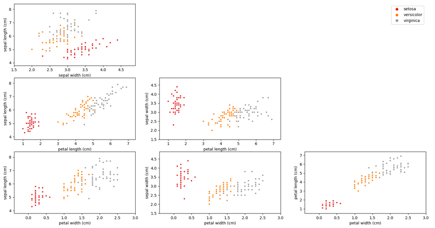
绘制散点图
预处理
df = datafrom pylab import mplmpl.rcParams['font.sans-serif'] = ['STZhongsong'] # 指定默认字体:解决plot不能显示中文问题mpl.rcParams['axes.unicode_minus'] = False # 解决保存图像是负号'-'显示为方块的问题plt.style.use('fivethirtyeight')Sepal_Length_Setosa = df.loc[0:48,'Sepal Length']Sepal_Length_Versicolour= df.loc[49:96,'Sepal Length']Sepal_Length_Virginica= df.loc[97:142,'Sepal Length']Sepal_Width_Setosa= df.loc[0:48,'Sepal Width']Sepal_Width__Versicolour= df.loc[49:96,'Sepal Width']Sepal_Width__Virginica= df.loc[97:142,'Sepal Width']Petal_Length_Setosa = df.loc[0:48,'Petal Length']Petal_Length_Versicolour= df.loc[49:96,'Petal Length']Petal_Length_Virginica= df.loc[97:142,'Petal Length']Petal_Width_Setosa = df.loc[0:48,'Petal Width']Petal_Width_Versicolour= df.loc[49:96,'Petal Width']Petal_Width_Virginica= df.loc[97:142,'Petal Width']
Sepal Length和Sepal Width的关系
plt.scatter(Sepal_Length_Setosa,Sepal_Width_Setosa,label = 'Setosa',c='r')plt.scatter(Sepal_Length_Versicolour,Sepal_Width__Versicolour,label = 'Versicolour',c='y')plt.scatter(Sepal_Length_Virginica,Sepal_Width__Virginica,label = 'Virginica',c='g')plt.title('Sepal Length和Sepal Width的关系')plt.xlabel('Sepal Length')plt.ylabel('Sepal Width')plt.legend()plt.show()
Sepal Length和Petal Length的关系
plt.scatter(Sepal_Length_Setosa,Petal_Length_Setosa,label = 'Setosa',c='r')plt.scatter(Sepal_Length_Versicolour,Petal_Length_Versicolour,label = 'Versicolour',c='y')plt.scatter(Sepal_Length_Virginica,Petal_Length_Virginica,label = 'Virginica',c='g')plt.title('Sepal Length和Petal Length的关系')plt.xlabel('Sepal Length')plt.ylabel('Petal Length')plt.legend()plt.show()
Sepal Length和Petal Width的关系
plt.scatter(Sepal_Length_Setosa,Petal_Width_Setosa,label = 'Setosa',c='r')plt.scatter(Sepal_Length_Versicolour,Petal_Width_Versicolour,label = 'Versicolour',c='y')plt.scatter(Sepal_Length_Virginica,Petal_Width_Virginica,label = 'Virginica',c='g')plt.title('Sepal Length和Petal Width的关系')plt.xlabel('Sepal Length')plt.ylabel('Petal Width')plt.legend()plt.show()#
Sepal Width和Petal Length的关系
plt.scatter(Sepal_Width_Setosa,Petal_Length_Setosa,label = 'Setosa',c='r')plt.scatter(Sepal_Width__Versicolour,Petal_Length_Versicolour,label = 'Versicolour',c='y')plt.scatter(Sepal_Width__Virginica,Petal_Length_Virginica,label = 'Virginica',c='g')plt.title('Sepal Width和Petal Length的关系')plt.xlabel('Sepal Width')plt.ylabel('Petal Length')plt.legend()plt.show()
Sepal Width和Petal Width的关系
plt.scatter(Sepal_Width_Setosa,Petal_Width_Setosa,label = 'Setosa',c='r')plt.scatter(Sepal_Width__Versicolour,Petal_Width_Versicolour,label = 'Versicolour',c='y')plt.scatter(Sepal_Width__Virginica,Petal_Width_Virginica,label = 'Virginica',c='g')plt.title('Sepal Width和Petal Width的关系')plt.xlabel('Sepal Width')plt.ylabel('Petal Width')plt.legend()plt.show()
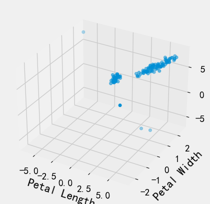
绘制三维图
import matplotlib.pyplot as pltfrom mpl_toolkits.mplot3d import Axes3Dimport numpy as np# 随机种子np.random.seed(1)def randrange(n, vmin, vmax):'''使数据分布均匀(vmin, vmax).'''return (vmax - vmin)*np.random.rand(n) + vminfig = plt.figure()ax = fig.add_subplot(111, projection='3d') # 可进行多图绘制n = 500# 对于每一组样式和范围设置,在由x在[23,32]、y在[0,100]、# z在[zlow,zhigh]中定义的框中绘制n个随机点'''for m, zlow, zhigh in [('o', -50, -25), ('^', -30, -5)]:xs = randrange(n, 23, 32)ys = randrange(n, 0, 100)zs = randrange(n, zlow, zhigh)ax.scatter(xs, ys, zs, marker=m) # 绘图'''xs = data['Petal Length']ys = data['Petal Width']zs = data['Sepal Length']ax.scatter(xs,ys,zs)# X、Y、Z的标签ax.set_xlabel('Petal Length')ax.set_ylabel('Petal Width')ax.set_zlabel('Sepal Length')plt.show()

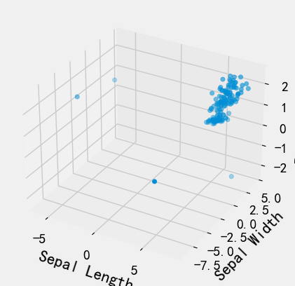
# 随机种子np.random.seed(1)def randrange(n, vmin, vmax):'''使数据分布均匀(vmin, vmax).'''return (vmax - vmin)*np.random.rand(n) + vminfig = plt.figure()ax = fig.add_subplot(111, projection='3d') # 可进行多图绘制n = 500# 对于每一组样式和范围设置,在由x在[23,32]、y在[0,100]、# z在[zlow,zhigh]中定义的框中绘制n个随机点'''for m, zlow, zhigh in [('o', -50, -25), ('^', -30, -5)]:xs = randrange(n, 23, 32)ys = randrange(n, 0, 100)zs = randrange(n, zlow, zhigh)ax.scatter(xs, ys, zs, marker=m) # 绘图'''xs = data['Sepal Length']ys = data['Sepal Width']zs = data['Petal Width']ax.scatter(xs,ys,zs)# X、Y、Z的标签ax.set_xlabel('Sepal Length')ax.set_ylabel('Sepal Width')ax.set_zlabel('Petal Width')plt.show()
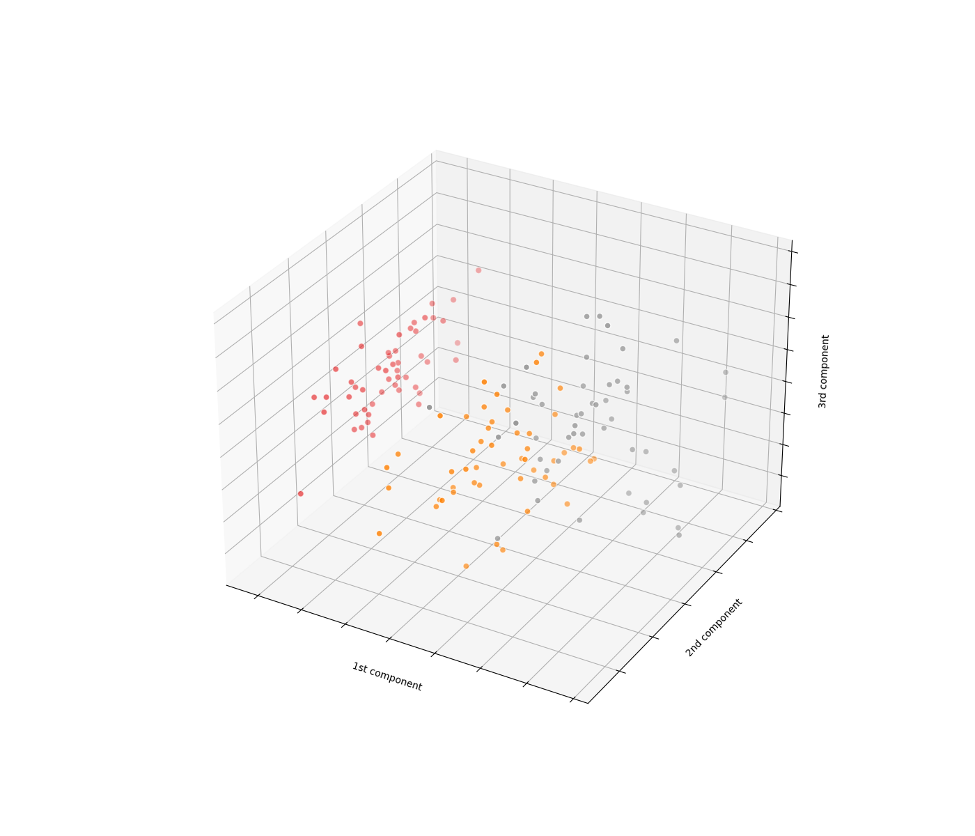
PCA主成分分析实现
'''以下为对鸢尾花四维数据进行主成分分析将四维降为三维后进行可视化的实现代码'''fig = plt.figure(1, figsize=(14, 12))ax = plt.axes(projection='3d')X = PCA(n_components=3).fit_transform(iris.data)# n_components 是 PCA 算法中所要保留的主成分个数 n, 即保留下来的特征个数 n, 这里四维降三维, 所以 n_components=3# fit_transform 对数据先拟合 fit, 找到数据的整体指标, 如均值、方差、最大值最小值等, 然后对数据集进行转换 transform, 从而实现数据的标准化、归一化操作ax.scatter(X[:, 0], X[:, 1], X[:, 2], c=iris.target, cmap=plt.cm.Set1, edgecolor='w', s=40)# 绘制坐标轴ax.set_xlabel('1st component')ax.set_ylabel('2nd component')ax.set_zlabel('3rd component')ax.w_xaxis.set_ticklabels([])ax.w_yaxis.set_ticklabels([])ax.w_zaxis.set_ticklabels([])plt.show()


若有收获,就点个赞吧
0 人点赞
