1. PyWaffle

图片来源:https://appsource.microsoft.com
TODO: 做一个与此相近的图作为练习
2. 擅长表达类型
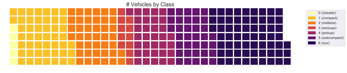
华夫饼图(Waffle Chart),有的人也会叫它“Square Pie Chart”,是饼图的一种变形,擅长展示部分在整体中的占比关系。一般来说,华夫饼图是由100个格子组成,一个格子代表“1%”。用不同颜色的格子区分不同的分类数据,以展示各部分在整体中的占比。
3. 代码实例
#! pip install pywaffle# Reference: https://stackoverflow.com/questions/41400136/how-to-do-waffle-charts-in-python-square-piechartfrom pywaffle import Waffle# Importdf_raw = pd.read_csv("https://github.com/selva86/datasets/raw/master/mpg_ggplot2.csv")# Prepare Datadf = df_raw.groupby('class').size().reset_index(name='counts')n_categories = df.shape[0]colors = [plt.cm.inferno_r(i/float(n_categories)) for i in range(n_categories)]# Draw Plot and Decoratefig = plt.figure(FigureClass=Waffle,plots={'111': {'values': df['counts'],'labels': ["{0} ({1})".format(n[0], n[1]) for n in df[['class', 'counts']].itertuples()],'legend': {'loc': 'upper left', 'bbox_to_anchor': (1.05, 1), 'fontsize': 12},'title': {'label': '# Vehicles by Class', 'loc': 'center', 'fontsize':18}},},rows=7,colors=colors,figsize=(16, 9))
4. 好资源
4.1 官方教程

若有收获,就点个赞吧
0 人点赞
