flex布局方式
小程序样式控制是通过wxss文件来控制,实现复杂布局一般都是通过flex布局方式来实现,要使用 flex 布局的话需要显式的声明:display:flex;
flex-direction属性
首先我们不管是横向布局和竖向布局,要设置属性 flex-direction ,它有4个可选值:
- row:从左到右的水平方向为主轴
- row-reverse:从右到左的水平方向为主轴
- column:从上到下的垂直方向为主轴
- column-reverse:从下到上的垂直方向为主轴
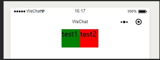
row
```java index.wxss: .page{ display: flex; flex-direction: row; } index.wxml:
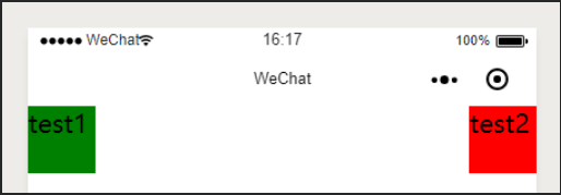
效果图:<br /><a name="mVX7k"></a>#### row-reverse```java.page{display: flex;flex-direction: row-reverse;}

column
.page{
  display: flex;
  flex-direction: column;
}
column-reverse
.page{
  display: flex;
  flex-direction: column-reverse;
}
justify-content属性
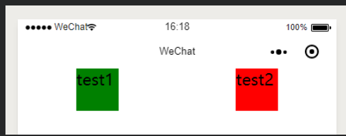
这个属性指的是主轴方向上的子元素的布局方式,它有5个可选值:
- flex-start:主轴起点对齐(默认值)
- flex-end:主轴结束点对齐
- center:在主轴中居中对齐
- space-between:两端对齐,除了两端的子元素分别靠向两端的容器之外,其他子元素之间的间隔都相等
- space-around:每个子元素之间的距离相等,两端的子元素距离容器的距离也和其它子元素之间的距离相同
这里的主轴指的是父元素中的flex-direction属性指定的元素
flex-start:

flex-end:
center:
space-between:
space-around:
align-items属性
这个属性指的是侧轴方向上的子元素的布局方式,它有5个可选值:
- stretch 填充整个容器,当元素未设置侧轴方向的长度时,充满父元素,如设置了侧轴方向长度,则以子元素设置的长度为准(默认值)
- flex-start 侧轴的起点对齐 (这里我们手动设置下子 view 的高度,来看的明显一些)
- flex-end 侧轴的终点对齐
- center 在侧轴中居中对齐
- baseline 以子元素的第一行文字对齐
这里的侧轴指的是父元素中的flex-direction属性指定的元素方向的垂直的方向
stretch
flex-start
flex-end
center
baseline
效果图:

若有收获,就点个赞吧
0 人点赞
