Matplotlib 可用于创建条形图。 您可能喜欢 Matplotlib 图库。
条形图代码
下面的代码创建一个条形图:
import matplotlib.pyplot as plt; plt.rcdefaults()import numpy as npimport matplotlib.pyplot as pltobjects = ('Python', 'C++', 'Java', 'Perl', 'Scala', 'Lisp')y_pos = np.arange(len(objects))performance = [10,8,6,4,2,1]plt.bar(y_pos, performance, align='center', alpha=0.5)plt.xticks(y_pos, objects)plt.ylabel('Usage')plt.title('Programming language usage')plt.show()
输出:

Python 条形图
Matplotlib 图表可以是水平的,以创建水平条形图:
import matplotlib.pyplot as plt; plt.rcdefaults()import numpy as npimport matplotlib.pyplot as pltobjects = ('Python', 'C++', 'Java', 'Perl', 'Scala', 'Lisp')y_pos = np.arange(len(objects))performance = [10,8,6,4,2,1]plt.barh(y_pos, performance, align='center', alpha=0.5)plt.yticks(y_pos, objects)plt.xlabel('Usage')plt.title('Programming language usage')plt.show()
输出:

水平条形图
有关条形图的更多信息
您可以使用以下 Matplotlib 代码比较两个数据系列:
import numpy as npimport matplotlib.pyplot as plt# data to plotn_groups = 4means_frank = (90, 55, 40, 65)means_guido = (85, 62, 54, 20)# create plotfig, ax = plt.subplots()index = np.arange(n_groups)bar_width = 0.35opacity = 0.8rects1 = plt.bar(index, means_frank, bar_width,alpha=opacity,color='b',label='Frank')rects2 = plt.bar(index + bar_width, means_guido, bar_width,alpha=opacity,color='g',label='Guido')plt.xlabel('Person')plt.ylabel('Scores')plt.title('Scores by person')plt.xticks(index + bar_width, ('A', 'B', 'C', 'D'))plt.legend()plt.tight_layout()plt.show()
输出:
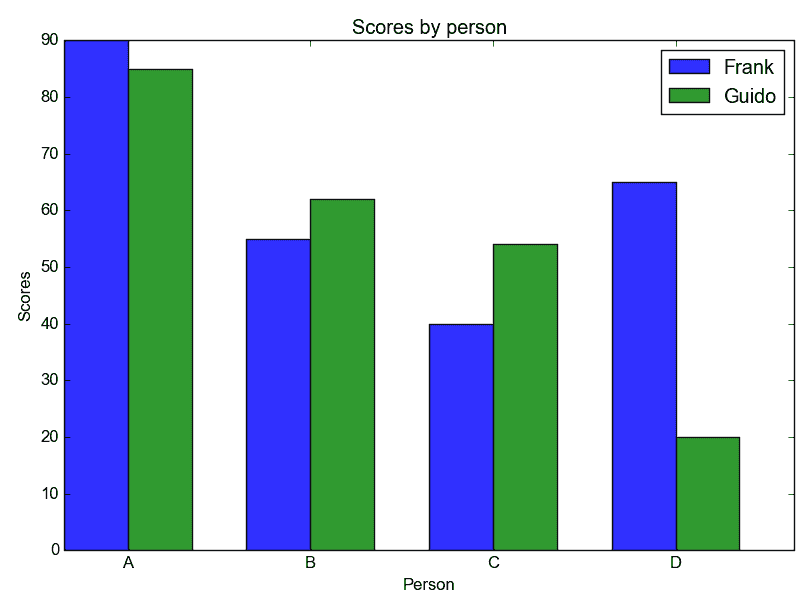
Python 条形图比较

若有收获,就点个赞吧
0 人点赞
