- 1.Clustering cells based on top PCs (metagenes)
- 2.Exploration of quality control metrics
2.Exploring known cell type markers
zhuang xioajin
6月-26-2021
# Single-cell RNA-seq analysis - clustering analysis# Load librariesrm(list = ls())library(Seurat)library(tidyverse)library(RCurl)library(cowplot)## 加载整合过的数据seurat_integrated <- readRDS("results/integrated_seurat.rds")# Run PCAseurat_integrated <- RunPCA(object = seurat_integrated)# Plot PCAPCAPlot(seurat_integrated,split.by = "sample")

目标:产生 generate cell type-specific clusters 群,并使用已知的细胞类型 marker genes 来确定集群的身份。
- 确定集群是代表真正的细胞类型,还是由于生物或技术差异造成的集群,如细胞周期S期的细胞集群,特定批次的集群,或线粒体含量高的细胞。
挑战:
- 识别可能由于无趣的生物或技术变异而造成的质量差的细胞簇
- 识别每个簇的细胞类型
- 保持耐心,因为这可能是一个在聚类和标记物识别之间高度反复的过程(有时甚至回到质量控制过滤)。
建议:
- 在进行聚类之前,对你期望出现的细胞类型有一个好的想法。了解你期望的细胞类型是低复杂度还是高线粒体含量,以及细胞是否在分化。
- 如果你有一个以上的条件,进行整合以对齐细胞往往是有帮助的。
- 如果需要并适合于实验,Regress out UMI的数量(默认使用sctransform)、线粒体含量和细胞周期,以避免驱动聚类。
- 识别任何垃圾集群,以便删除或重新进行QC过滤。可能的垃圾集群可能包括那些线粒体含量高、UMIs/基因低的集群。如果由很多细胞组成,那么回到质控中心过滤掉,然后重新整合/聚类可能会有帮助。
- 如果不能将所有的细胞类型检测为独立的聚类,可以尝试改变分辨率或用于聚类的PC数量。
1.Clustering cells based on top PCs (metagenes)
1.1识别重要的PC
为了克服scRNA-seq数据中任何单一基因表达的广泛技术噪音,Seurat根据它们的PCA分数将细胞分配到集群中,PCA分数来自于整合的most variable genes的表达,每个PC本质上代表一个 “metagene”,它结合了整个相关基因组的信息。因此,确定在聚类步骤中包括多少个PC是很重要的,以确保我们能捕捉到数据集中存在的大部分变异或细胞类型。
在决定在下游聚类分析中包括哪些PC之前,探索PC是非常有用的。
探索PC的一种方法是使用热图来可视化选择PC的most variant genes,基因和细胞按PCA scores排序。这里的想法是查看PC,并确定驱动它们的基因对于区分不同的细胞类型是否有意义。cells参数指定了具有最消极或积极的PCA分数的细胞数量,以用于绘图。我们的想法是,我们正在寻找热图开始看起来更 “fuzzy”的PC,即基因组之间的区别不是那么明显。# Explore heatmap of PCs DimHeatmap(seurat_integrated, dims = 1:9, cells = 500, balanced = TRUE)
如果我们想探索大量的PC,这种方法可能会很慢,而且很难将单个基因可视化。同样,为了探索大量的PC,我们可以通过驱动PC的PCA得分,打印出前10个(或更多)正负基因。# Printing out the most variable genes driving PCs print(x = seurat_integrated[["pca"]], dims = 1:10, nfeatures = 5)
elbow plot 是另一种有帮助的方法,可以确定使用多少个PC进行聚类,以使我们能够捕捉到数据中的大部分变化。elbow plot直观地显示了每个PC的标准差,我们正在寻找标准差开始趋于平稳的地方。Essentially, where the elbow appears is usually the threshold for identifying the majority of the variation. 然而,这种方法可能是相当主观的。## PC_ 1 ## Positive: FTL, TIMP1, FTH1, C15orf48, CXCL8 ## Negative: RPL3, RPL13, RPS18, RPS6, RPL21 ## PC_ 2 ## Positive: GNLY, CCL5, NKG7, GZMB, FGFBP2 ## Negative: CD74, IGHM, IGKC, HLA-DRA, CD79A ## PC_ 3 ## Positive: TRAC, PABPC1, CCL2, GIMAP7, S100A8 ## Negative: CD74, IGKC, IGHM, HLA-DRA, HLA-DRB1 ## PC_ 4 ## Positive: RPL3, RPL10, RPL13, RPS2, RPS4X ## Negative: HSPB1, CACYBP, HSP90AB1, HSPH1, HSPA8 ## PC_ 5 ## Positive: CCL2, CXCL8, S100A8, S100A9, CCL7 ## Negative: VMO1, FCGR3A, MS4A7, TIMP1, TNFSF10 ## PC_ 6 ## Positive: IGHM, IGKC, CD79A, CCL2, CD79B ## Negative: HLA-DQA1, HLA-DRA, TXN, HLA-DPA1, HLA-DRB1 ## PC_ 7 ## Positive: TIMP1, S100A8, LYZ, MARCKSL1, IGHM ## Negative: CCL3, CCL4, CCL2, CCL4L2, CCL3L1 ## PC_ 8 ## Positive: CCL2, LGALS3, FTL, CTSL, ISG15 ## Negative: CCL3, CCL4, CXCL8, IL1B, S100A8 ## PC_ 9 ## Positive: GNLY, TIMP1, S100A8, CLIC3, FTL ## Negative: CCL5, PPBP, CCL2, GNG11, ANXA1 ## PC_ 10 ## Positive: PPBP, GNG11, PF4, CAVIN2, TUBB1 ## Negative: CCL2, CREM, CXCR4, LGALS3, DUSP2
让我们用前40名的PC画一个elbow plot。# Plot the elbow plot ElbowPlot(object = seurat_integrated, ndims = 40)
根据这个图,我们可以通过PC8-PC10左右的肘部发生的地方大致确定大部分的变化,或者可以说应该是数据点开始接近X轴的时候,PC30左右。这给了我们一个非常粗略的想法,即需要包括的PC数量,我们可以以more quantitative manner提取这里的可视化信息,这可能更可靠一点。
虽然上述2种方法在修拉的老方法中使用得比较多,用于规范化和识别可变基因,但它们不再像以前那样重要。这是因为SCTransform方法比老方法更准确。
为什么选择PC对老方法来说更重要?
较早的方法将一些技术性的变异来源纳入了一些较高的PC中,所以PC的选择更为重要。SCTransform可以更好地估计方差,并且不经常将这些技术性变异源纳入较高的PC中。
从理论上讲,在SCTransform中,我们选择的PC越多,在进行聚类时就会考虑到更多的变化,但进行聚类需要花费更多的时间。因此,在这次分析中,我们将使用前40个PC来生成聚类。1.2 Cluster the cells
Seurat使用基于图形的聚类方法,将细胞嵌入图形结构中,使用K-近邻(KNN)图(默认),在具有类似基因表达模式的细胞之间画出边。然后,它试图将这个图划分为高度相互关联的 “quasi-cliques”或 “communities” Seurat - Guided Clustering Tutorial。
我们将使用FindClusters()函数来进行基于图形的聚类。resolution是一个重要的参数,它设定了下游聚类的 “granularity”,需要为每个实验进行优化。对于3,000-5,000个细胞的数据集,resolution设置在0.4-1.4之间通常会产生良好的聚类。增加分辨率值会导致更多的聚类,这对于更大的数据集来说往往是必需的。FindClusters()函数允许我们输入一系列的resolutions,并将计算出聚类的 “granularity”。这对于测试哪种分辨率适合前进非常有帮助,而不必为每个分辨率运行该函数。 ```Determine the K-nearest neighbor graph
seurat_integrated <- FindNeighbors(object = seurat_integrated,dims = 1:40)
Determine the clusters for various resolutions
seurat_integrated <- FindClusters(object = seurat_integrated, resolution = c(0.4, 0.6, 0.8, 1.0, 1.4))
```
## Modularity Optimizer version 1.3.0 by Ludo Waltman and Nees Jan van Eck
##
## Number of nodes: 29629
## Number of edges: 1110705
##
## Running Louvain algorithm...
## Maximum modularity in 10 random starts: 0.9183
## Number of communities: 14
## Elapsed time: 8 seconds
## Modularity Optimizer version 1.3.0 by Ludo Waltman and Nees Jan van Eck
##
## Number of nodes: 29629
## Number of edges: 1110705
##
## Running Louvain algorithm...
## Maximum modularity in 10 random starts: 0.8990
## Number of communities: 18
## Elapsed time: 8 seconds
## Modularity Optimizer version 1.3.0 by Ludo Waltman and Nees Jan van Eck
##
## Number of nodes: 29629
## Number of edges: 1110705
##
## Running Louvain algorithm...
## Maximum modularity in 10 random starts: 0.8828
## Number of communities: 19
## Elapsed time: 8 seconds
## Modularity Optimizer version 1.3.0 by Ludo Waltman and Nees Jan van Eck
##
## Number of nodes: 29629
## Number of edges: 1110705
##
## Running Louvain algorithm...
## Maximum modularity in 10 random starts: 0.8688
## Number of communities: 22
## Elapsed time: 8 seconds
## Modularity Optimizer version 1.3.0 by Ludo Waltman and Nees Jan van Eck
##
## Number of nodes: 29629
## Number of edges: 1110705
##
## Running Louvain algorithm...
## Maximum modularity in 10 random starts: 0.8450
## Number of communities: 27
## Elapsed time: 7 seconds
如果我们看一下我们的Seurat对象的metadata(seurat_integrated@metadata),有一个单独的列用于计算不同的 resolutions。
# Explore resolutions
seurat_integrated@meta.data %>%
        View()
为了选择一个开始的分辨率,我们通常会选择一些中间的范围,如0.6或0.8。我们将从0.8的分辨率开始,通过使用Idents()函数分配群集的身份。
# Assign identity of clusters
Idents(object = seurat_integrated) <- "integrated_snn_res.0.8"
为了使细胞集群可视化,有一些不同的降维技术可以提供帮助。最流行的方法包括 t-distributed stochastic neighbor embedding (t-SNE)和 Uniform Manifold Approximation and Projection (UMAP)技术。
这两种方法都是为了将高维空间中具有相似局部邻域的细胞放在低维空间中。这些方法需要你输入用于可视化的PCA维数,我们建议使用相同数量的PC作为聚类分析的输入。在这里,我们将继续使用UMAP方法来实现聚类的可视化。
## Calculation of UMAP
## DO NOT RUN (calculated in the last lesson)
seurat_integrated <- RunUMAP(seurat_integrated,
                 reduction = "pca",
                 dims = 1:40)
# Plot the UMAP
DimPlot(seurat_integrated,
        reduction = "umap",
        label = TRUE,
        label.size = 6)

它对于探索其他分辨率也是很有用的。它可以让你快速了解到集群将如何根据分辨率参数而变化。例如,让我们切换到一个0.4的分辨率。
# Assign identity of clusters
Idents(object = seurat_integrated) <- "integrated_snn_res.0.4"
# Plot the UMAP
DimPlot(seurat_integrated,
        reduction = "umap",
        label = TRUE,
        label.size = 6)

与本课中的图像相比,你的簇的样子有可能存在一些差异。特别是你可能会看到集群的标签有差异。这是一个不幸的结果,因为软件包的版本(主要是Seurat的依赖)有轻微的变化。
如果你的集群看起来与课文中的内容相同,请直接进入下一节,不需要任何下载。
如果你的集群看起来确实与我们在课上的不同,请右击并下载这个Rdata文件到数据文件夹。它包含了我们为本课创建的seurat_integrated对象。
一旦这个大文件下载完毕,你将需要。
- 通过双击来解压该文件
- 将该对象载入你的R会话,并覆盖现有的对象。
现在我们将继续用0.8的分辨率来检查质量控制指标和预期细胞类型的已知标记。再次绘制UMAP图,以确保你的图像现在(或仍然)与你在课上看到的一致。# Assign identity of clusters Idents(object = seurat_integrated) <- "integrated_snn_res.0.8" # Plot the UMAP DimPlot(seurat_integrated, reduction = "umap", label = TRUE, label.size = 6)
2.Exploration of quality control metrics
为了确定我们的聚类是否可能是由细胞周期阶段或线粒体表达等人为因素造成的,从视觉上探索这些指标,看是否有聚类表现出富集或与其他聚类不同,是很有用的。然而,如果观察到特定集群的富集或差异,如果可以用细胞类型来解释,可能并不令人担忧。
为了探索和可视化各种质量指标,我们将使用Seurat的多功能DimPlot()和FeaturePlot()函数。2.1 Segregation of clusters by sample
我们可以从探索每个样本中每个簇的细胞分布开始。
我们可以用UMAP可视化每个样本的每个簇的细胞。# Extract identity and sample information from seurat object to determine the number of cells per cluster per sample n_cells <- FetchData(seurat_integrated, vars = c("ident", "orig.ident")) %>% dplyr::count(ident, orig.ident) %>% tidyr::spread(ident, n) # View table View(n_cells)# UMAP of cells in each cluster by sample DimPlot(seurat_integrated, label = TRUE, split.by = "sample") + NoLegend()
2.2Segregation of clusters by cell cycle phase
接下来,我们可以探讨细胞是否按不同的细胞周期阶段聚集。当我们进行SCTransform归一化和回归无意义的变异来源时,我们没有regress out细胞周期阶段引起的变异。如果我们的细胞集群在线粒体表达方面表现出较大的差异,这将表明我们要重新运行SCTransform,并将S.Score和G2M.Score加入到我们的变量中进行 regress,然后重新运行其余步骤。# Explore whether clusters segregate by cell cycle phase DimPlot(seurat_integrated, label = TRUE, split.by = "Phase") + NoLegend()
我们没有看到按细胞周期得分进行的聚类,所以我们可以继续进行质量控制。2.3Segregation of clusters by various sources of uninteresting variation
接下来我们将探索更多的指标,如每个细胞的UMI和基因的数量,S期和G2M期的标志物,以及通过UMAP的线粒体基因表达。观察单个S和G2M的分数可以给我们提供额外的信息来检查阶段,就像我们之前做的那样。# Determine metrics to plot present in seurat_integrated@meta.data metrics <- c("nUMI", "nGene", "S.Score", "G2M.Score", "mitoRatio") FeaturePlot(seurat_integrated, reduction = "umap", features = metrics, pt.size = 0.4, sort.cell = TRUE, min.cutoff = 'q10', label = TRUE)
注意:
sort.cell参数将把阳性细胞绘制在阴性细胞之上,而min.cutoff参数将决定阴影的阈值。min.cutoff为q10,意味着基因表达量最低的10%的细胞将不显示任何紫色阴影(完全灰色)。
各个集群的指标似乎相对均匀,除了nUMIs和nGene在集群3、9、14和15,也许还有集群17表现出较高的数值。我们将继续关注这些群组,看看细胞类型是否可以解释这种增加。
2.4Exploration of the PCs driving the different clusters
我们还可以探索我们的集群在不同PC上的分离程度;我们希望定义的PC能很好地分离细胞类型。为了使这一信息可视化,我们需要提取细胞的UMAP坐标信息,以及它们在每个PC上的相应分数,以便通过UMAP查看。
首先,我们确定我们想从Seurat对象中提取的信息,然后,我们可以使用FetchData()函数来提取这些信息。
# Defining the information in the seurat object of interest
columns <- c(paste0("PC_", 1:16),
            "ident",
            "UMAP_1", "UMAP_2")
columns
##  [1] "PC_1"   "PC_2"   "PC_3"   "PC_4"   "PC_5"   "PC_6"   "PC_7"   "PC_8"
##  [9] "PC_9"   "PC_10"  "PC_11"  "PC_12"  "PC_13"  "PC_14"  "PC_15"  "PC_16"
## [17] "ident"  "UMAP_1" "UMAP_2"
# Extracting this data from the seurat object
pc_data <- FetchData(seurat_integrated,
                     vars = columns)
pc_data %>% as.tibble()
## # A tibble: 29,629 x 19
##      PC_1   PC_2    PC_3    PC_4   PC_5    PC_6    PC_7    PC_8   PC_9  PC_10
##     <dbl>  <dbl>   <dbl>   <dbl>  <dbl>   <dbl>   <dbl>   <dbl>  <dbl>  <dbl>
##  1 -15.6  -3.35    6.93    0.439 -0.253  -1.37    0.244   0.136  0.281 -0.441
##  2  21.5  -5.87   -4.74    2.78  -1.74   -7.84    2.11    5.59   1.33  -2.06
##  3  28.1   3.24    5.74   -0.334  7.95    6.55  -13.2   -16.2   -3.89   2.95
##  4  18.2   4.07    5.78   -1.89  11.7     1.33   -5.06    2.15  -4.25  -3.13
##  5  -1.43  0.204   0.160 -23.5    1.71    0.543  -0.484   7.37   4.58   1.08
##  6  21.8  -2.51   -0.324   3.69   1.85   -4.09    5.00   -1.02   1.21   0.417
##  7   2.11 -9.49  -17.9     2.79  -1.16  -17.4    -1.54    2.16  -1.60  -2.19
##  8 -12.6  -3.83    6.18    1.15  -0.680  -0.446   1.84   -1.70  -1.04  -1.46
##  9  16.7  -0.834   2.27    1.45   1.35    1.70    5.14   -5.36   2.76   0.340
## 10  -3.56 -2.98    6.09    0.618 -0.423  -0.739   0.216   0.824  1.11   1.18
## # ... with 29,619 more rows, and 9 more variables: PC_11 <dbl>, PC_12 <dbl>,
## #   PC_13 <dbl>, PC_14 <dbl>, PC_15 <dbl>, PC_16 <dbl>, ident <fct>,
## #   UMAP_1 <dbl>, UMAP_2 <dbl>
注意:我们怎么知道在
FetchData()函数中要包括UMAP_1来获得UMAP坐标?Seurat cheatsheet描述该函数能够从the expression matrices, cell embeddings, or metadata.
例如,如果你探索seurat_integrated@reductions列表对象,第一个组件是用于PCA的,并包括一个cell.embeddings的槽。我们可以使用列名(PC_1、PC_2、PC_3等)来拉出每个单元格对应的坐标或PC分数,以获得每一个PC。
我们可以为UMAP做同样的事情。
# Extract the UMAP coordinates for the first 10 cells
seurat_integrated@reductions$umap@cell.embeddings[1:10, 1:2]
##                          UMAP_1     UMAP_2
## ctrl_AAACATACAATGCC-1 -7.559065 -1.5083970
## ctrl_AAACATACATTTCC-1 10.615205 -2.2495150
## ctrl_AAACATACCAGAAA-1  8.099918 -0.5690309
## ctrl_AAACATACCAGCTA-1  8.649922  0.8060347
## ctrl_AAACATACCATGCA-1 -6.047595  4.4099475
## ctrl_AAACATACCTCGCT-1 11.128484 -1.0707372
## ctrl_AAACATACCTGGTA-1  9.595908  6.3130194
## ctrl_AAACATACGATGAA-1 -6.022096 -2.3336223
## ctrl_AAACATACGCCAAT-1 10.229417 -0.2970559
## ctrl_AAACATACGCTTCC-1 -8.708784 -4.0658642
FetchData()函数只是让我们更容易提取数据。
在下面的UMAP图中,单元格按照每个主成分的PC得分来标示。让我们快速浏览一下前16个PC。
# Adding cluster label to center of cluster on UMAP
umap_label <- FetchData(seurat_integrated,
                        vars = c("ident", "UMAP_1", "UMAP_2"))  %>%
  group_by(ident) %>%
  summarise(x=mean(UMAP_1), y=mean(UMAP_2))

# Plotting a UMAP plot for each of the PCs
map(paste0("PC_", 1:16), function(pc){
        ggplot(pc_data,
               aes(UMAP_1, UMAP_2)) +
                geom_point(aes_string(color=pc),
                           alpha = 0.7) +
                scale_color_gradient(guide = FALSE,
                                     low = "grey90",
                                     high = "blue")  +
                geom_text(data=umap_label,
                          aes(label=ident, x, y)) +
                ggtitle(pc)
}) %>%
        plot_grid(plotlist = .)

我们可以看到不同的PC是如何代表集群的。例如,驱动PC_2的基因在集群6、11和17中表现出较高的表达量(也许在15中也有点高)。我们可以回头看看我们驱动这个PC的基因,以了解细胞类型可能是什么。
# Examine PCA results
print(seurat_integrated[["pca"]], dims = 1:5, nfeatures = 5)
## PC_ 1
## Positive:  FTL, TIMP1, FTH1, C15orf48, CXCL8
## Negative:  RPL3, RPL13, RPS18, RPS6, RPL21
## PC_ 2
## Positive:  GNLY, CCL5, NKG7, GZMB, FGFBP2
## Negative:  CD74, IGHM, IGKC, HLA-DRA, CD79A
## PC_ 3
## Positive:  TRAC, PABPC1, CCL2, GIMAP7, S100A8
## Negative:  CD74, IGKC, IGHM, HLA-DRA, HLA-DRB1
## PC_ 4
## Positive:  RPL3, RPL10, RPL13, RPS2, RPS4X
## Negative:  HSPB1, CACYBP, HSP90AB1, HSPH1, HSPA8
## PC_ 5
## Positive:  CCL2, CXCL8, S100A8, S100A9, CCL7
## Negative:  VMO1, FCGR3A, MS4A7, TIMP1, TNFSF10
以CD79A基因和HLA基因作为PC_2的阳性标记,我们可以假设第6、11和17集群对应于B细胞。这只是暗示了集群的身份可能是什么,集群的身份是通过PC的组合来确定的。
为了真正确定集群的身份以及分辨率是否合适,探索少数预期的细胞类型的已知标志物是很有帮助的。
2.Exploring known cell type markers
随着细胞的聚类,我们可以通过寻找已知的标记物来探索细胞类型的特性。标有集群的UMAP图被显示出来,然后是预期的不同细胞类型。
DimPlot(object = seurat_integrated,
        reduction = "umap",
        label = TRUE) + NoLegend()

来自seurat的FeaturePlot()函数使我们很容易使用存储在Seurat对象中的基因ID对少数基因进行可视化。例如,如果我们对探索已知的免疫细胞标志物感兴趣,如:
| Cell Type | Marker |
|---|---|
| CD14+ monocytes | CD14, LYZ |
| FCGR3A+ monocytes | FCGR3A, MS4A7 |
| Conventional dendritic cells | FCER1A, CST3 |
| Plasmacytoid dendritic cells | IL3RA, GZMB, SERPINF1, ITM2C |
| B cells | CD79A, MS4A1 |
| T cells | CD3D |
| CD4+ T cells | CD3D, IL7R, CCR7 |
| CD8+ T cells | CD3D, CD8A |
| NK cells | GNLY, NKG7 |
| Megakaryocytes | PPBP |
| Erythrocytes | HBB, HBA2 |
| CD4+ T cells | CD3D, IL7R, CCR7 |
| CD8+ T cells | CD3D, CD8A |
| NK cells | GNLY, NKG7 |
| Megakaryocytes | PPBP |
| Erythrocytes | HBB, HBA2 |
Seurat的FeaturePlot()函数让我们很容易地在UMAP可视化的基础上探索已知的标记物。让我们去确定这些集群的身份。为了获取所有基因的表达水平,而不仅仅是3000个变化最大的基因,我们可以使用存储在RNA检测槽中的归一化计数数据。
# Select the RNA counts slot to be the default assay
DefaultAssay(seurat_integrated) <- "RNA"
# Normalize RNA data for visualization purposes
seurat_integrated <- NormalizeData(seurat_integrated, verbose = FALSE)
我们正在寻找标记物在各群组中表达的一致性。例如,如果一个细胞类型有两个标记物,而在一个簇中只有一个标记物表达,那么我们就不能可靠地将该簇分配给该细胞类型。
2.1CD14+ monocyte markers
FeaturePlot(seurat_integrated,
            reduction = "umap",
            features = c("CD14", "LYZ"),
            sort.cell = TRUE,
            min.cutoff = 'q10',
            label = TRUE)

CD14+单核细胞似乎对应于0和5群。我们不会将集群9和14包括在内,因为它们并不高度表达这两种标记物。
2.2 FCGR3A+ monocyte markers
FeaturePlot(seurat_integrated,
            reduction = "umap",
            features = c("FCGR3A", "MS4A7"),
            sort.cell = TRUE,
            min.cutoff = 'q10',
            label = TRUE)

2.3 Macrophages
FeaturePlot(seurat_integrated,
            reduction = "umap",
            features = c("MARCO", "ITGAM", "ADGRE1"),
            sort.cell = TRUE,
            min.cutoff = 'q10',
            label = TRUE)
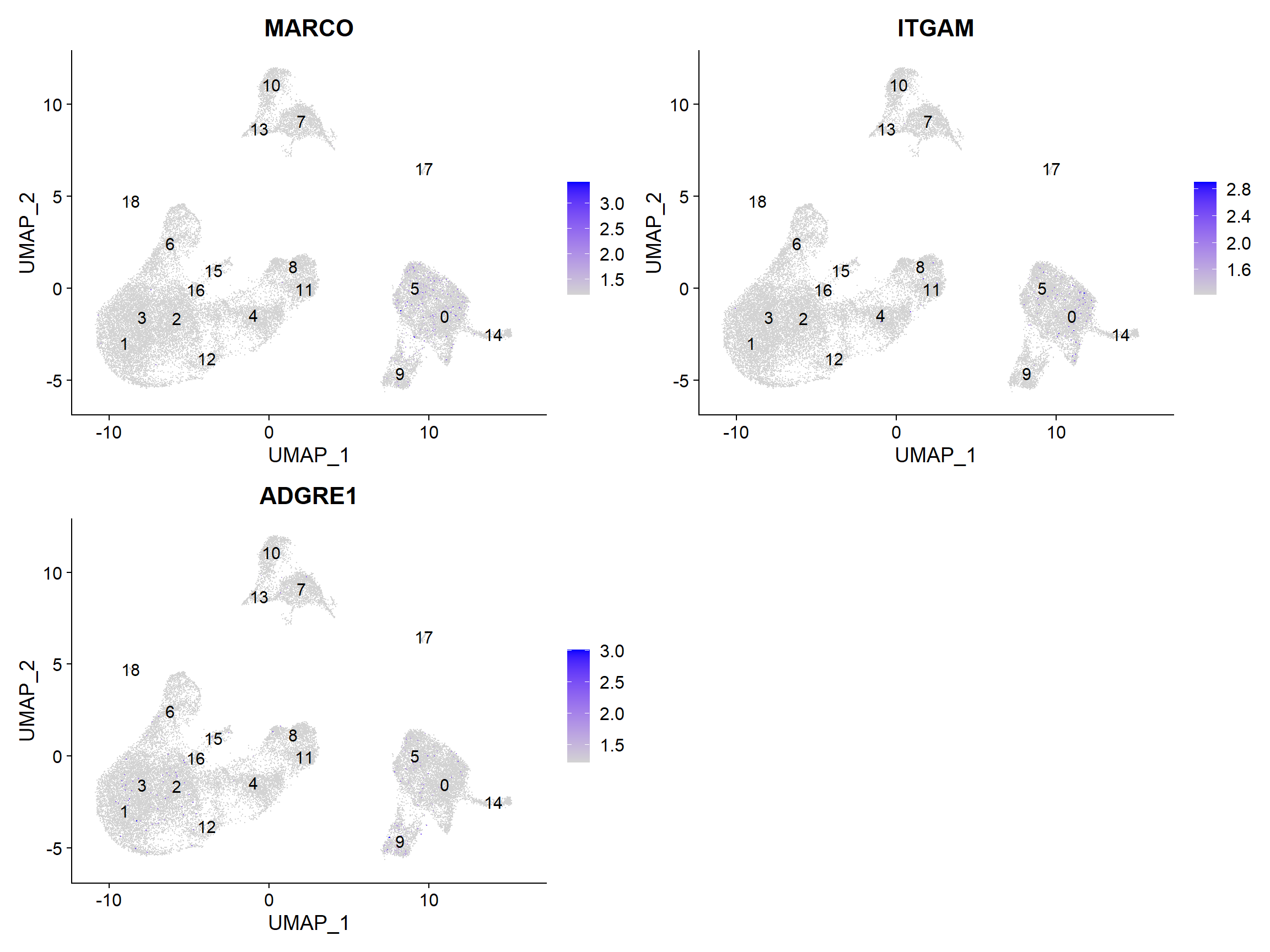
没有集群似乎与巨噬细胞相对应;也许细胞培养条件对巨噬细胞有负面选择(更高的粘附性)。
2.4 Conventional dendritic cell markers
FeaturePlot(seurat_integrated,
            reduction = "umap",
            features = c("FCER1A", "CST3"),
            sort.cell = TRUE,
            min.cutoff = 'q10',
            label = TRUE)

与传统树突状细胞相对应的标记物确定了第14组(两个标记物都持续显示表达)。
2.5 Plasmacytoid dendritic cell markers
FeaturePlot(seurat_integrated,
            reduction = "umap",
            features = c("IL3RA", "GZMB", "SERPINF1", "ITM2C"),
            sort.cell = TRUE,
            min.cutoff = 'q10',
            label = TRUE)

浆细胞树突状细胞代表第17群。虽然这些标记物的表达有很多差异,但我们看到第17群是持续表达的。
注意:如果任何聚类似乎包含两种不同的细胞类型,那么提高clustering resolution 以正确细分聚类是很有帮助的。另外,如果我们在提高分辨率的情况下仍然无法分离出这些聚类,那么可能是我们使用的主成分太少,以至于我们无法分离出这些感兴趣的细胞类型。为了告知我们对主成分的选择,我们可以看一下我们的主成分基因表达与UMAP图的重叠情况,并确定我们的细胞群是否被所包含的主成分所分离。
现在我们对大多数集群所对应的细胞类型有了一个体面的概念,但仍有一些问题。
- 第7群和第20群的细胞类型特征是什么?
- 对应于相同细胞类型的集群是否有生物学意义上的差异?是否存在这些细胞类型的亚群?
- 我们能否通过识别这些簇的其他标记基因来获得对这些细胞类型身份的更高信心?
Marker identification analysis可以帮助我们解决所有这些问题!!
下一步将是进行标记识别分析,这将输出在集群之间表达量有显著差异的基因。利用这些基因,我们可以确定或提高对聚类/亚聚类身份的信心。
These materials have been developed by members of the teaching team at the Harvard Chan Bioinformatics Core (HBC). These are open access materials distributed under the terms of the Creative Commons Attribution license (CC BY 4.0), which permits unrestricted use, distribution, and reproduction in any medium, provided the original author and source are credited.

若有收获,就点个赞吧
0 人点赞
