<div class="chopsticks"></div>.chopsticks{position: absolute;width: 10px;height: 250px;background-color: #bb8855;left: 50%;border-radius: 3px;box-shadow: 0 0 2px 1px rgba(0,0,0,0.1), 0 -5px 1px 0 rgba(0,0,0,0.1) inset;}.chopsticks::before{content: '';position: absolute;width: 10px;height: 250px;background-color: #bb8855;left: 15px;border-radius: 3px;box-shadow: 0 0 2px 1px rgba(0,0,0,0.1), 0 -5px 1px 0 rgba(0,0,0,0.1) inset;}
鸡蛋css
<div class="egg"></div>.egg{position: absolute;top: 20px;left: 35px;width: 80px;height: 100px;z-index: 7;background-color: #fff;transform:rotate(20deg);border-radius: 50%/60% 60% 40% 40%;}.egg::before{content: '';position: absolute;top: 30%;left: 21%;width: 57%;height: 51%;background: #FC0;border-radius: 50%/56% 60% 41% 44%;box-shadow: 0 0 1px 1px #f90,0 0 1px 1px rgba(255, 153, 0, 0.5) inset;}
勺子css
<div class="scoop"></div>.scoop{position: absolute;height: 200px;width: 20px;background-color: #bb8855;left: 50%;border-radius: 8px;box-shadow: 0 0 1px 1px rgba(0,0,0,0.1),0 -5px 1px 1px rgba(0,0,0,0.1) inset;top: 10%}.scoop::before{content: '';position: absolute;height: 70px;width: 59px;background-color: #bb8855;left: -94%;top: -2%;border-radius: 50%/60% 60% 40% 40%;box-shadow: 0 0 1px 1px rgba(0,0,0,0.1), 0 -3px 3px 2px rgba(0,0,0,0.1) inset;}.scoop::after{content: '';position: absolute;height: 14px;width: 6px;background-color: rgba(0,0,0,0.1);left: 49%;top: 17%;border-radius: 50%/68% 53% 40% 40%;box-shadow: 0 0 10px 8px rgba(0,0,0,0.1);}
爱心css
<div class="love">LOVE</div>.love{position: absolute;width: 100px;height: 100px;background-color: #c03;left: 40%;top: 30%;transform: translate(-50%,-50%) rotate(45deg);transform: rotate(45deg);text-align: center;line-height: 100px;}.love::before,.love::after{content: '';position: absolute;width: 100px;height: 100px;background-color: #c03;border-radius: 50%;left: -50%;z-index: -1;}.love::after{top: -50%;left: 0;}
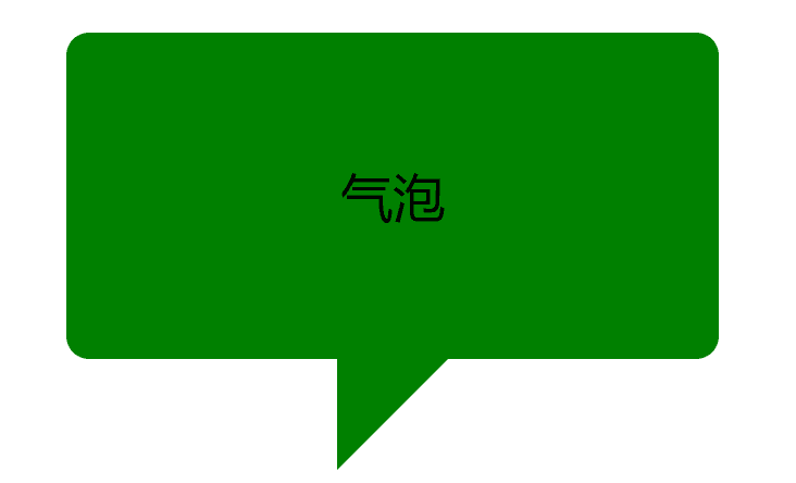
气泡css
<div class="qipao">气泡</div>.qipao{position: absolute;width: 200px;height: 100px;background-color: green;border-radius: 7px;top: 20%;left: 40%;text-align: center;line-height: 100px;}.qipao::before{content: '';position: absolute;bottom: 0;left: 50%;border: 34px solid transparent;border-top-color: green;border-bottom: 0;border-left: 0;margin: 0 0 -34px -17px;}
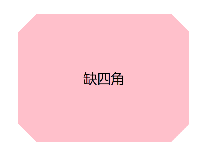
缺四角css
<div class="angle">缺四角</div>.angle{position: absolute;width: 200px;height: 150px;left: 40%;top: 20%;background-color: pink;text-align: center;line-height: 150px;}.angle{background:linear-gradient(45deg,transparent 15px, pink 0) left bottom,linear-gradient(-45deg,transparent 15px,pink 0) right bottom,linear-gradient(135deg,transparent 15px,pink 0) left top,linear-gradient(-135deg,transparent 15px,pink 0) right top;background-size: 50% 50%;background-repeat: no-repeat;}
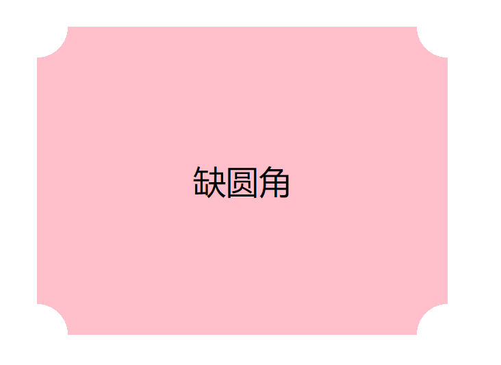
缺圆角css
<div class="arc">缺圆角</div>.arc{position: absolute;transform: translate(-50%,-50%);top: 50%;left: 50%;width: 200px;height: 150px;background-color: pink;text-align: center;line-height: 150px;}.arc{background:radial-gradient(circle at left bottom,transparent 15px,pink 0) left bottom,radial-gradient(circle at right bottom,transparent 15px,pink 0) right bottom,radial-gradient(circle at left top,transparent 15px,pink 0) left top,radial-gradient(circle at right top,transparent 15px,pink 0) right top;background-size: 50% 50%;background-repeat: no-repeat;}
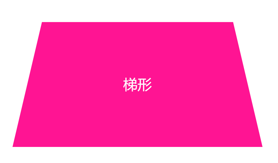
梯形css
<div class="tixing">梯形</div>.tixing{position: absolute;top:50%;left: 50%;transform:translate(-50%,-50%);width: 160px;padding: 60px;text-align: center;color: white;}.tixing::before{content:"";position: absolute;top: 0; right: 0; bottom: 0; left: 0;transform:perspective(40px) scaleY(1.3) rotateX(5deg);transform-origin: bottom;background:deeppink;z-index:-1;}
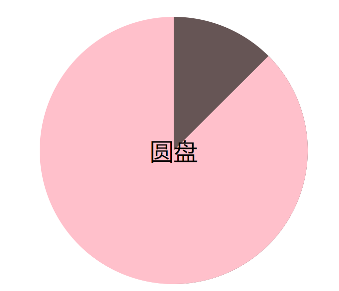
圆盘css
<div class="pie">圆盘</div>.pie{position: absolute;transform: translate(-50%,-50%);top: 50%;left: 50%;width: 180px;height: 180px;text-align: center;line-height: 180px;background-color: pink;background-image: linear-gradient(to right, transparent 50%, #655 0);border-radius: 50%;cursor: pointer;overflow: hidden;}.pie::before{position: absolute;content: '';background-color: inherit;width: 50%;height: 100%;left: 50%;top: 0;z-index: -1;transform-origin: left;transform: rotate(45deg);}.pie:hover::before{transform: rotate(1000deg);transition: transform 5s;}
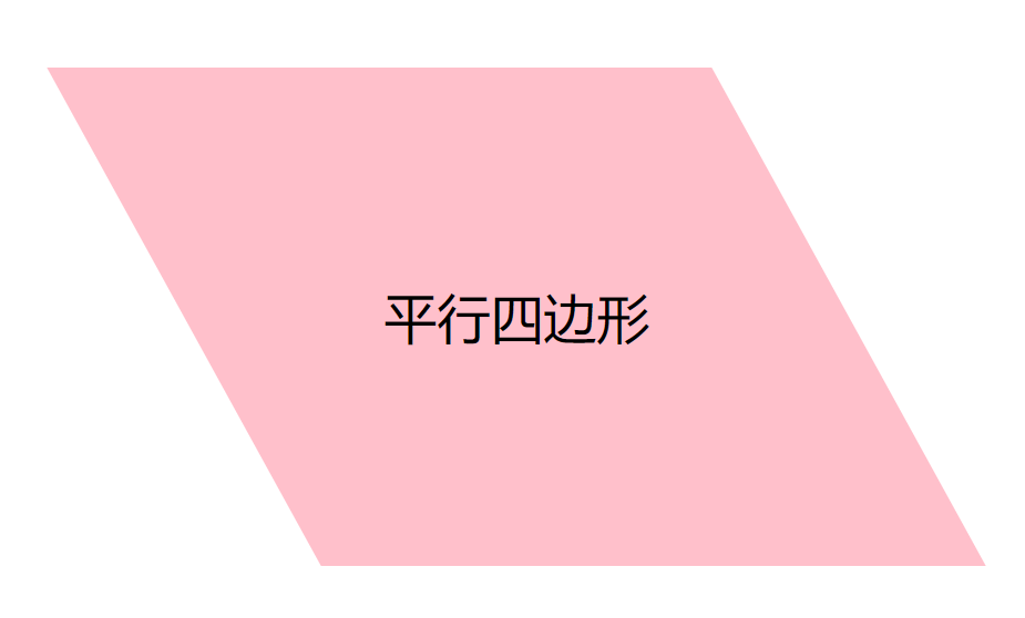
平行四边形css
<div class="sibianxing">平行四边形</div>.sibianxing{position: absolute;top: 50%;left: 50%;transform: translate(-50%,-50%);width: 200px;height: 150px;line-height: 150px;text-align: center;}.sibianxing::before{content: '';position: absolute;z-index: -1;background-color: pink;left: 0;right: 0;top: 0;bottom: 0;transform: skew(.08turn);}
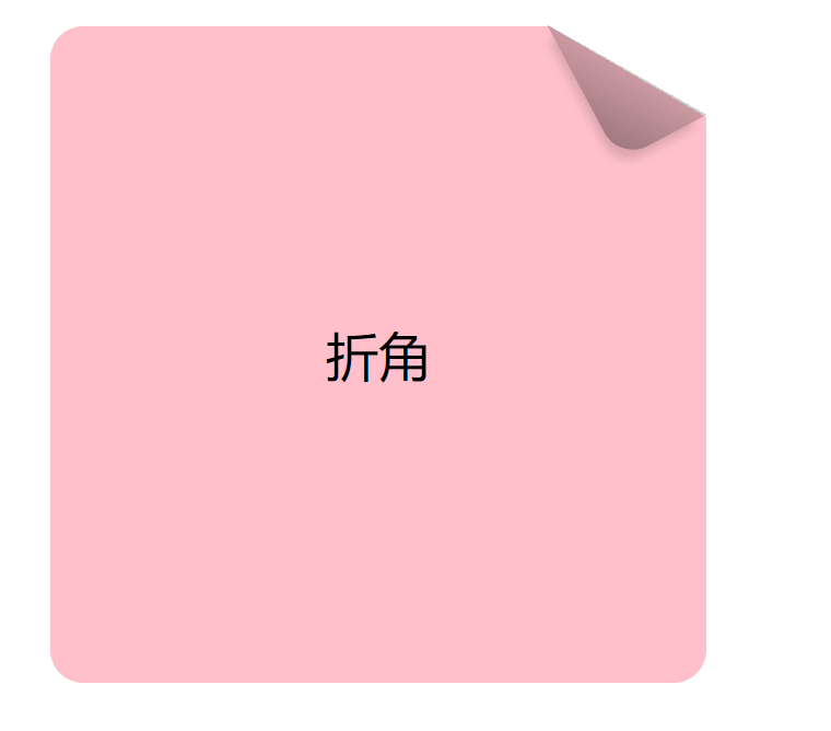
折角css
<div class="zhejiao">折角</div>.zhejiao{position: absolute;width: 200px;height: 200px;transform: translate(-50%,-50%);top: 50%;left: 50%;text-align: center;line-height: 200px;background-color: pink;border-radius: 10px;background:linear-gradient(-150deg,transparent 1.5em, pink 0);}.zhejiao::before{content: '';position: absolute;background: linear-gradient(to left bottom,transparent 50%, rgba(0,0,0,.2) 0, rgba(0,0,0,.4)) 100% 0 no-repeat;top: 0;right: 0;width: 30px;height: 47px;border-bottom-left-radius: 10px;transform: translateY(-20px) rotate(-28deg);transform-origin: bottom right;box-shadow: -.2em .2em .3em -.1em rgba(0,0,0,.15);}
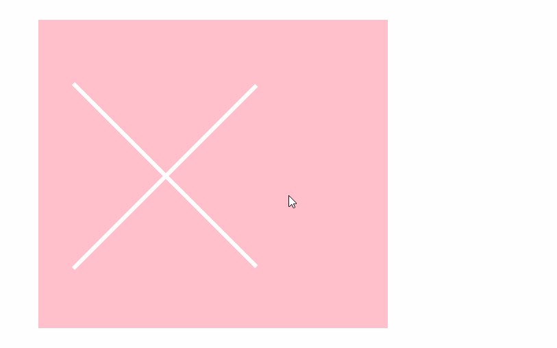
三根线css
<div class="warp"><div class="one"></div><div class="two"></div><div class="three"></div></div>.warp{width: 170px;height: 150px;position: relative; margin-left: 50%; margin-top: -15%; transform: translate(-50%,-50%);background-color: pink;}.one, .two, .three{width: 130px;height: 2px;margin: 0 auto; background-color: white; position: absolute;top: 20%;left: 10%;transition:all 1s;}.two{top: 50%;}.three{top: 80%;}.warp:hover .one{top: 80%;opacity: 0;}.warp:hover .two{top: 20%;transform: rotate(45deg); transform-origin: left; width: 126px}.warp:hover .three{transform: rotate(-45deg);transform-origin: left; width: 126px;}
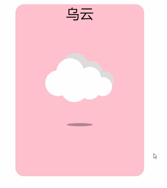
漂浮的云css
<div class="cloud">乌云</div>.cloud{position: absolute;top: 50%;left: 50%;transform: translate(-50%,-50%);width: 150px;height: 200px;text-align: center;background-color: pink;border-radius: 10px;}.cloud::before{position: absolute;content: '';background-color: white;width: 30px;height: 30px;top: 40%;left: 33%;z-index: 2;border-radius: 50%;transform: translate(-50%,-50%);box-shadow: 19px 6px 0px 1px white, 14px -13px 0 1px white, 37px -6px 0px -2px white, 52px 4px 0 -4px white, 37px 7px 0 -3px white, 20px -20px #ddd, 38px -12px 0 -1px #ddd, 54px -3px 0 -4px #DDD;animation: cloud-move 3s ease-in-out infinite;}.cloud::after{content: '';background-color: rgba(0,0,0,0.6);position: absolute;top: 70%;left: 50%;width: 50px;height: 6px;border-radius: 50%;transform: translate(-50%,-50%);animation: shadow 3s ease-in-out infinite;}@keyframes cloud-move{50%{transform: translate(-50%,-10%)};100%{transform: translate(-50%,-50%);};}@keyframes shadow{50%{transform: translate(-50%,-50%) scale(0.6);background-color: rgba(0,0,0,0.3)}100%{transform: translate(-50%,-50%) scale(1);background-color: rgba(0,0,0,0.6)}}
chrome css
<div class="chrome"></div>.chrome{position: absolute;top: 50%;left: 50%;width: 180px;height: 180px;transform: translate(-50%, -50%);box-shadow:0 0px 4px #999,0 0 2px #ddd inset;border-radius:50%;background-image:radial-gradient(#4FACF5 0%,#2196F3 28%, transparent 28%),radial-gradient(#fff 33%,transparent 33%),linear-gradient(-50deg,yellow 34%, transparent 34%),linear-gradient(60deg,green 34%,transparent 34%),linear-gradient(176deg,red 34%,transparent 34%),linear-gradient(360deg,green 34%,transparent 34%),linear-gradient(261deg,yellow 34%,transparent 34%),linear-gradient(98deg,red 34%,transparent 34%);background-position:0 0;}

乱码的字css
<div class="text-magic" data-word="CSSTextMagic">CSSTextMagic<div class="white"></div><div>.text-magic{position: absolute;top: 50%;left: 50%;transform: translate(-50%, -50%);width:300px;font-size:36px;font-family:Raleway, Verdana , Arial;}.white{position:absolute;left:0;top:15px;width:100%;height:3px;background:#fff;z-index:4;animation:whiteMove 3s ease-out infinite;}.text-magic:before{content:attr(data-word);position:absolute;top:0;left:0.5px;height:0px;color:rgba(0,0,0,.9);overflow:hidden;z-index:2;animation:redShadow 1s ease-in infinite;-webkit-filter:contrast(200%);text-shadow:0.1px 0 0 red;}.text-magic:after{content:attr(data-word);position:absolute;top:0;left:-3px;height:36px;color:rgba(0,0,0,.8);overflow:hidden;z-index:3;background:rgba(255,255,255,.9);animation:redHeight 1.5s ease-out infinite;-webkit-filter:contrast(200%);}@keyframes redShadow{20%{height:32px;}60%{height:6px;}100%{height:42px;}}@keyframes redHeight{20%{height:42px;}35%{height:12px;}50%{height:40px;}60%{height:20px;}70%{height:34px;}80%{height:22px;}100%{height:0px;}}@keyframes whiteMove{8%{top:38px;}10%{top:8px;}12%{top:42px;}99%{top:36px;}}

Infinity
#infinity {position: relative;width: 212px;height: 100px;box-sizing: content-box;}#infinity:before,#infinity:after {content: "";box-sizing: content-box;position: absolute;top: 0;left: 0;width: 60px;height: 60px;border: 20px solid red;border-radius: 50px 50px 0 50px;transform: rotate(-45deg);}#infinity:after {left: auto;right: 0;border-radius: 50px 50px 50px 0;transform: rotate(45deg);}
RSS Feed
#rss {width: 20em;height: 20em;border-radius: 3em;background-color: #ff0000;font-size: 14px;}#rss:before {content: '';z-index: 1;display: block;height: 5em;width: 5em;background: #fff;border-radius: 50%;position: relative;top: 11.5em;left: 3.5em;}#rss:after {content: '';display: block;background: #ff0000;width: 13em;height: 13em;top: -2em;left: 3.8em;border-radius: 2.5em;position: relative;box-shadow:-2em 2em 0 0 #fff inset,-4em 4em 0 0 #ff0000 inset,-6em 6em 0 0 #fff inset}

奖章
#badge-ribbon {position: relative;background: red;height: 100px;width: 100px;border-radius: 50px;}#badge-ribbon:before,#badge-ribbon:after {content: '';position: absolute;border-bottom: 70px solid red;border-left: 40px solid transparent;border-right: 40px solid transparent;top: 70px;left: -10px;transform: rotate(-140deg);}#badge-ribbon:after {left: auto;right: -10px;transform: rotate(140deg);}

像素怪
#space-invader {box-shadow: 0 0 0 1em red,0 1em 0 1em red,-2.5em 1.5em 0 .5em red,2.5em 1.5em 0 .5em red,-3em -3em 0 0 red,3em -3em 0 0 red,-2em -2em 0 0 red,2em -2em 0 0 red,-3em -1em 0 0 red,-2em -1em 0 0 red,2em -1em 0 0 red,3em -1em 0 0 red,-4em 0 0 0 red,-3em 0 0 0 red,3em 0 0 0 red,4em 0 0 0 red,-5em 1em 0 0 red,-4em 1em 0 0 red,4em 1em 0 0 red,5em 1em 0 0 red,-5em 2em 0 0 red,5em 2em 0 0 red,-5em 3em 0 0 red,-3em 3em 0 0 red,3em 3em 0 0 red,5em 3em 0 0 red,-2em 4em 0 0 red,-1em 4em 0 0 red,1em 4em 0 0 red,2em 4em 0 0 red;background: red;width: 1em;height: 1em;overflow: hidden;margin: 50px 0 70px 65px;}
搜索
#magnifying-glass {font-size: 10em;display: inline-block;width: 0.4em;box-sizing: content-box;height: 0.4em;border: 0.1em solid red;position: relative;border-radius: 0.35em;}#magnifying-glass:before {content: "";display: inline-block;position: absolute;right: -0.25em;bottom: -0.1em;border-width: 0;background: red;width: 0.35em;height: 0.08em;transform: rotate(45deg);}

#facebook-icon {background: red;text-indent: -999em;width: 100px;height: 110px;box-sizing: content-box;border-radius: 5px;position: relative;overflow: hidden;border: 15px solid red;border-bottom: 0;}#facebook-icon:before {content: "/20";position: absolute;background: red;width: 40px;height: 90px;bottom: -30px;right: -37px;border: 20px solid #eee;border-radius: 25px;box-sizing: content-box;}#facebook-icon:after {content: "/20";position: absolute;width: 55px;top: 50px;height: 20px;background: #eee;right: 5px;box-sizing: content-box;}

月亮
#moon {width: 80px;height: 80px;border-radius: 50%;box-shadow: 15px 15px 0 0 red;}

锁
#lock {font-size: 8px;position: relative;width: 18em;height: 13em;border-radius: 2em;top: 10em;box-sizing: border-box;border: 3.5em solid red;border-right-width: 7.5em;border-left-width: 7.5em;margin: 0 0 6rem 0;}#lock:before {content: "";box-sizing: border-box;position: absolute;border: 2.5em solid red;width: 14em;height: 12em;left: 50%;margin-left: -7em;top: -12em;border-top-left-radius: 7em;border-top-right-radius: 7em;}#lock:after {content: "";box-sizing: border-box;position: absolute;border: 1em solid red;width: 5em;height: 8em;border-radius: 2.5em;left: 50%;top: -1em;margin-left: -2.5em;}


若有收获,就点个赞吧
0 人点赞
