一个炫酷的环形占比组件
效果图: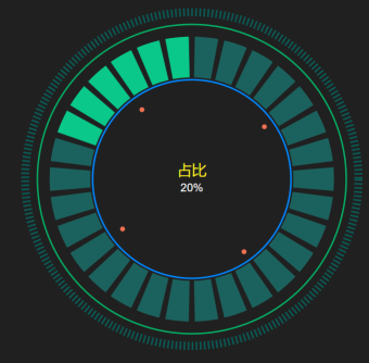
环形占比组件使用
组件引入
import Vue from 'vue'import {RingChart} from 'special-ui'Vue.use(RingChart)
组件使用
<template><div class="container"><ring-chart :r="500" :num="20" :total="100" :title="'占比'" :subTitle="'20%'" :config="config"/></div></template><script>export default {name: 'App',data () {return {config: {ring: {outDash: {height: 10},progress: {num: 60}},text: {title: {fontSize: '28px',color: '#ffffff'}}}}}}</script><style>.container {height: 100%;}</style>
组件参数
| 属性 | 说明 | 默认值 |
|---|---|---|
| r | 半径(控制宽高) | 300 |
| total | 总数 | 0 |
| num | 占比数 | 0 |
| title | 内部大标题 | ‘’ |
| subTitle | 内部小标题 | ‘’ |
| config | 环形参数对象 | {} |
config对象参数说明:
| 属性 | 说明 | 默认值 |
|---|---|---|
| text | 文本对象 | {} |
| ring | 环形图对象 | {} |
text参数说明:
color: 标题颜色;
fontSize: 标题字体;
dx: 标题x偏移量(默认居中);
dy: 标题y偏移量(默认居中);
| 属性 | 说明 | 默认值 |
|---|---|---|
| title | 大标题 | { color: ‘#ffffff’, fontSize: ‘18px’, dx: 0, dy: -5) } |
| subTitle | 小标题 | { color: ‘#ffffff’, fontSize: ‘14px’, dx: 0, dy: 15 } |
ring参数说明:
outDash: 设置最外层虚线参数;
outRing:设置外层实线参数;
innerRing:设置内层实线参数;
progress:设置进度条参数;
anniCircle:设置内层动画参数;
| 属性 | 说明 | 默认值 |
|---|---|---|
| title | 大标题 | { color: ‘#ffffff’, fontSize: ‘18px’, dx: 0, dy: -5) } |
| subTitle | 小标题 | { color: ‘#ffffff’, fontSize: ‘14px’, dx: 0, dy: 15 } |
outDash参数说明:
| 属性 | 说明 | 默认值 |
|---|---|---|
| height | 高度 | 5 |
| dash | 虚线宽度及间隔 | ‘2, 3’ |
| color | 颜色 | ‘2, 3’ |
outRing|innerRing参数说明:
| 属性 | 说明 | 默认值 |
|---|---|---|
| height | 高度 | 5 |
| color | 颜色 | ‘2, 3’ |
progress参数说明:
| 属性 | 说明 | 默认值 |
|---|---|---|
| color | 颜色 | ‘rgba(18,253,240,0.30)’ |
| activeColor | 高亮颜色 | ‘#09C889’ |
anniCircle参数说明:
| 属性 | 说明 | 默认值 |
|---|---|---|
| color | 颜色 | ‘#F47153’ |
| radius | 半径 | 3 |

若有收获,就点个赞吧
0 人点赞
