📃 Echarts简介
Apache ECharts 是一个基于 JavaScript 的开源可视化图表库。
Echarts官网:
📃 Echarts使用
首先,在 https://www.jsdelivr.com/package/npm/echarts 选择 dist/echarts.js,点击并保存为 echarts.js 文件。
基础示例:
<!DOCTYPE html><html><head><meta charset="utf-8" /><title>ECharts</title><script src="https://cdn.jsdelivr.net/npm/echarts@5.3.2/dist/echarts.js"></script></head><body><!-- 为 ECharts 准备一个定义了宽高的 DOM --><div id="main" style="width: 600px;height:400px;"></div><script type="text/javascript">// 基于准备好的dom,初始化echarts实例let myChart = echarts.init(document.getElementById('main'));// 指定图表的配置项和数据let option = {title: {text: '国家人口与GDP'},tooltip: {},legend: {data: ['GDP', '人口']},xAxis: {data: ['中国', '美国', '印度', '英国', '日本', '韩国']},yAxis: {},series: [{name: 'GDP',type: 'bar',data: [20, 30, 15, 10, 16, 18]},{name: '人口',type: 'bar',data: [50, 40, 45, 10, 8, 5]}]};// 使用刚指定的配置项和数据显示图表。myChart.setOption(option);</script></body></html>
通过npm的方式安装:
yarn add echarts
使用:
import * as echarts from 'echarts';// 基于准备好的dom,初始化echarts实例let myChart = echarts.init(document.getElementById('main'));// 绘制图表myChart.setOption({title: {text: 'ECharts 入门示例'},tooltip: {},xAxis: {data: ['衬衫', '羊毛衫', '雪纺衫', '裤子', '高跟鞋', '袜子']},yAxis: {},series: [{name: '销量',type: 'bar',data: [5, 20, 36, 10, 10, 20]}]});
如果在DOM中没有定义容器的宽高,可以在初始化的时候指定其宽高:
let myChart = echarts.init(document.getElementById('main'), null, {width: 600,height: 400});
📃 Echarts基本概念
✨ 主题
可以在初始化的时候,指定echarts的主题,默认支持深色主题:
let chart = echarts.init(dom, 'dark');
加载外部主题
如果默认主题不满足用户使用,可以到以下链接创建自己的主题,导出为json
导出json后,如果是通过包管理工具加载,可以直接引入:
import vintage from 'vintage.json'echarts.registerTheme('vintage', vintage);let chart = echarts.init(dom, 'vintage');
如果没有使用打包工具,则可以通过网络请求的方式获取并加载:
// 假设主题名称是 "vintage"$.getJSON('vintage.json', function(themeJSON) {echarts.registerTheme('vintage', JSON.parse(themeJSON));let chart = echarts.init(dom, 'vintage');});
✨ 数据集
数据集有两种设置方式:dataset.source和series.data。
dataset.source
一种是通过dataset.source设置:
option = {legend: {},tooltip: {},dataset: {// 提供一份数据。source: [['product', '2015', '2016', '2017'],['Matcha Latte', 43.3, 85.8, 93.7],['Milk Tea', 83.1, 73.4, 55.1],['Cheese Cocoa', 86.4, 65.2, 82.5],['Walnut Brownie', 72.4, 53.9, 39.1]]},// 声明一个 X 轴,类目轴(category)。默认情况下,类目轴对应到 dataset 第一列。xAxis: { type: 'category' },// 声明一个 Y 轴,数值轴。yAxis: {},// 声明多个 bar 系列,默认情况下,每个系列会自动对应到 dataset 的每一列。series: [{ type: 'bar' }, { type: 'bar' }, { type: 'bar' }]};
可以为对象数组形式:
option = {legend: {},tooltip: {},dataset: {// 用 dimensions 指定了维度的顺序。直角坐标系中,如果 X 轴 type 为 category,// 默认把第一个维度映射到 X 轴上,后面维度映射到 Y 轴上。// 如果不指定 dimensions,也可以通过指定 series.encode 完成映射。dimensions: ['product', '2015', '2016', '2017'],source: [{ product: 'Matcha Latte', '2015': 43.3, '2016': 85.8, '2017': 93.7 },{ product: 'Milk Tea', '2015': 83.1, '2016': 73.4, '2017': 55.1 },{ product: 'Cheese Cocoa', '2015': 86.4, '2016': 65.2, '2017': 82.5 },{ product: 'Walnut Brownie', '2015': 72.4, '2016': 53.9, '2017': 39.1 }]},xAxis: { type: 'category' },yAxis: {},series: [{ type: 'bar' }, { type: 'bar' }, { type: 'bar' }]};
也可以按维度的形式展开:
option = {legend: {},tooltip: {},dataset: {dimensions: ['product', '2015', '2016', '2017'],source: {product: ['Matcha Latte', 'Milk Tea', 'Cheese Cocoa', 'Walnut Brownie'],2015: [43.3, 83.1, 86.4, 72.4],2016: [85.8, 73.4, 65.2, 53.9],2017: [93.7, 55.1, 82.5, 39.1]}},xAxis: { type: 'category' },yAxis: {},series: [{ type: 'bar' }, { type: 'bar' }, { type: 'bar' }]};
series.data
另一种是通过series.data设置:
option = {xAxis: {type: 'category',data: ['Matcha Latte', 'Milk Tea', 'Cheese Cocoa', 'Walnut Brownie']},yAxis: {},series: [{type: 'bar',name: '2015',data: [89.3, 92.1, 94.4, 85.4]},{type: 'bar',name: '2016',data: [95.8, 89.4, 91.2, 76.9]},{type: 'bar',name: '2017',data: [97.7, 83.1, 92.5, 78.1]}]};
✨ 数据转换
在dataset中可以定义多个数据集,通过transform指定数据转换方法。
过滤器
将transform的type设置为filter,可以指定数据转换器为过滤器;dimension为要筛选的维度;value为筛选维度的值。
option = {dataset: [{// 这个 dataset 的 index 是 `0`。source: [['Product', 'Sales', 'Price', 'Year'],['Cake', 123, 32, 2011],['Cereal', 231, 14, 2011],['Tofu', 235, 5, 2011],['Dumpling', 341, 25, 2011],['Biscuit', 122, 29, 2011],['Cake', 143, 30, 2012],['Cereal', 201, 19, 2012],['Tofu', 255, 7, 2012],['Dumpling', 241, 27, 2012],['Biscuit', 102, 34, 2012],['Cake', 153, 28, 2013],['Cereal', 181, 21, 2013],['Tofu', 395, 4, 2013],['Dumpling', 281, 31, 2013],['Biscuit', 92, 39, 2013],['Cake', 223, 29, 2014],['Cereal', 211, 17, 2014],['Tofu', 345, 3, 2014],['Dumpling', 211, 35, 2014],['Biscuit', 72, 24, 2014]]// id: 'a'},{// 这个 dataset 的 index 是 `1`。// 这个 `transform` 配置,表示,此 dataset 的数据,来自于此 transform 的结果。transform: {type: 'filter',config: { dimension: 'Year', value: 2011 }}// 我们还可以设置这些可选的属性: `fromDatasetIndex` 或 `fromDatasetId`。// 这些属性,指定了,transform 的输入,来自于哪个 dataset。例如,// `fromDatasetIndex: 0` 表示输入来自于 index 为 `0` 的 dataset 。又例如,// `fromDatasetId: 'a'` 表示输入来自于 `id: 'a'` 的 dataset。// 当这些属性都不指定时,默认认为,输入来自于 index 为 `0` 的 dataset 。},{// 这个 dataset 的 index 是 `2`。// 同样,这里因为 `fromDatasetIndex` 和 `fromDatasetId` 都没有被指定,// 那么输入默认来自于 index 为 `0` 的 dataset 。transform: {// 这个类型为 "filter" 的 transform 能够遍历并筛选出满足条件的数据项。type: 'filter',// 每个 transform 如果需要有配置参数的话,都须配置在 `config` 里。// 在这个 "filter" transform 中,`config` 用于指定筛选条件。// 下面这个筛选条件是:选出维度( dimension )'Year' 中值为 2012 的所有// 数据项。config: { dimension: 'Year', value: 2012 }}},{// 这个 dataset 的 index 是 `3`。transform: {type: 'filter',config: { dimension: 'Year', value: 2013 }}}],series: [{type: 'pie',radius: 50,center: ['25%', '50%'],// 这个饼图系列,引用了 index 为 `1` 的 dataset 。也就是,引用了上述// 2011 年那个 "filter" transform 的结果。datasetIndex: 1},{type: 'pie',radius: 50,center: ['50%', '50%'],datasetIndex: 2},{type: 'pie',radius: 50,center: ['75%', '50%'],datasetIndex: 3}]};
排序
将transform的type设置为sort,可以为指定的维度进行排序;其中 asc升序,desc降序。
option = {dataset: [{source: [// 原始数据]},{transform: {type: 'sort',config: { dimension: 'Year', order: 'desc' }}}],series: {type: 'pie',// 这个系列引用上述 transform 的结果。datasetIndex: 1}};
链式操作
transform可以是一个数组,多个转换器可以进行链式操作,上一个的输出是下一个的输入。
option = {dataset: [{source: [// 原始数据]},{// 几个 transform 被声明成 array ,他们构成了一个链,// 前一个 transform 的输出是后一个 transform 的输入。transform: [{type: 'filter',config: { dimension: 'Product', value: 'Tofu' }},{type: 'sort',config: { dimension: 'Year', order: 'desc' }}]}],series: {type: 'pie',// 这个系列引用上述 transform 的结果。datasetIndex: 1}};
✨ 坐标轴
x 轴和 y 轴都由轴线、刻度、刻度标签、轴标题四个部分组成。部分图表中还会有网格线来帮助查看和计算数据。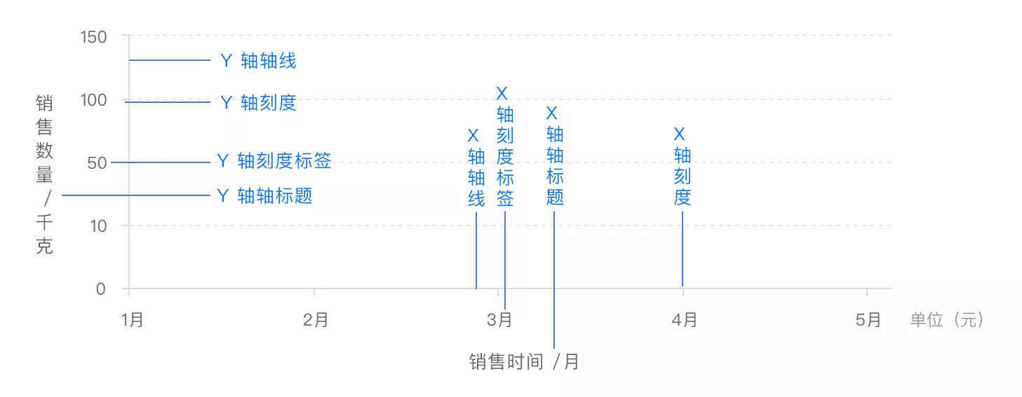
通过 xAxis``yAxis设置两条坐标轴信息:
option = {xAxis: {type: 'time',name: '销售时间'},yAxis: {type: 'value',name: '销售数量'}};
多条轴线
可以为X、Y两个方向设置多个轴线(数组形式),两个 Y 轴显示在上下,两个 Y 轴显示在左右两侧。
option = {xAxis: {type: 'time',name: '销售时间'},yAxis: [{type: 'value',name: '销售数量'},{type: 'value',name: '销售金额'}]};
多于两个 x/y 轴需要通过配置 offset 属性防止同个位置多个轴的重叠。
轴线样式
通过 axisLine 为轴线设置样式。比如轴线带箭头,并设置为虚线:
option = {xAxis: {type: 'time',name: '销售时间',axisLine: {symbol: 'arrow',lineStyle: {type: 'dashed'}}},yAxis: {type: 'value',name: '销售数量',axisLine: {symbol: 'arrow',lineStyle: {type: 'dashed'}}}};
通过 axisTick 为刻度线设置样式。比如刻度线宽度、刻度线样式等:
option = {xAxis: {axisTick: {length: 30,lineStyle: {type: 'dashed'}}},yAxis: {axisTick: {length: 30,lineStyle: {type: 'dashed'}}}};
刻度标签
通过 axisLabel 设置相应坐标轴标签,例如文字对齐方式,自定义刻度标签内容等:
option = {xAxis: {axisLabel: {formatter: '{value} kg',align: 'center'}},yAxis: {axisLabel: {formatter: '{value} 元',align: 'center'}}};
✨ 图例
通说legend设置图例,包括其排列方向、位置信息:
option = {legend: {type: 'scroll', // 可滚动翻页的图例orient: 'vertical', // or 'horizontal'right: 'center',top: 'top',data: ['Evaporation', 'Precipitation', 'Temperature'], // 若省略,则显示所有图例},}
一个复杂一点的图例示例:
let option = {legend: {type: 'scroll', // 可滚动翻页的图例orient: 'vertical', // or 'horizontal'right: 'center',top: 'top',data: [{name: 'Evaporation',icon: 'rect', // 图例样式}, {name: 'Precipitation',icon: 'roundRect',}, {name: 'Temperature',icon: 'pin',}],// 图例背景backgroundColor: '#000',// 图例样式textStyle: {color: '#fff'// ...},// 设置默认显示隐藏的图例selected: {Evaporation: true,Precipitation: true,Temperature: false}},}
其中:
orient设置图例方向data可以设置显示的图例,不设置此项则显示全部图例data.icon设置图例图标,可选circle,rect,roundRect,triangle,diamond,pin,arrow,noneselected设置默认选中的图例
示例:
点击查看【codepen】
以上示例,设置了轴线和刻度线的样式,Y轴设置了两条轴线,图例垂直方向排布。
📃 Echarts应用
Echarts示例参考:
✨ 柱状图
在 series中将type设置为bar即可添加柱状图。
示例:
option = {xAxis: {data: ['Mon', 'Tue', 'Wed', 'Thu', 'Fri', 'Sat', 'Sun']},yAxis: {},series: [{type: 'bar',data: [23, 24, 18, 25, 27, 28, 25]}]};
横向柱状图
将 yAxis设置为 { type: 'category' },在 series中将encode的x轴和y轴分别设置为source中的维度。
let option = {dataset: {source: [['score', 'amount', 'product'],[89.3, 58212, 'Matcha Latte'],[57.1, 78254, 'Milk Tea'],[74.4, 41032, 'Cheese Cocoa'],[50.1, 12755, 'Cheese Brownie'],[89.7, 20145, 'Matcha Cocoa'],[68.1, 79146, 'Tea'],[19.6, 91852, 'Orange Juice'],[10.6, 101852, 'Lemon Juice'],[32.7, 20112, 'Walnut Brownie']]},xAxis: {},// 将 类目轴(category) 映射到y轴yAxis: { type: 'category' },series: [{type: 'bar',encode: {// 将 "amount" 列映射到 X 轴。x: 'amount',// 将 "product" 列映射到 Y 轴。y: 'product'}}]};
堆叠柱状图
通过stack可将柱状图分组,只要名称一致即可。
option = {xAxis: {data: ['<20', '20-30', '30-40', '40-50', '>50']},yAxis: {},series: [// 男性{data: [10, 22, 28, 43, 49],type: 'bar',stack: 'sex'},// 女性{data: [5, 4, 3, 5, 10],type: 'bar',stack: 'sex'}]};
动态排序柱状图
动态设置数据,可以在图标中看到动效;添加realtimeSort选项,可以进行实时排序:
let myChart = echarts.init(document.getElementById('main'));let option = {};let data = [];for (let i = 0; i < 5; ++i) {data.push(Math.round(Math.random() * 200));}option = {xAxis: {max: 'dataMax'},yAxis: {type: 'category',data: ['A', 'B', 'C', 'D', 'E'],inverse: true,animationDuration: 300,animationDurationUpdate: 300,max: 2 // only the largest 3 bars will be displayed},series: [{realtimeSort: true,name: 'X',type: 'bar',data: data,label: {show: true,position: 'right',valueAnimation: true}}],legend: {show: true},animationDuration: 3000,animationDurationUpdate: 3000,animationEasing: 'linear',animationEasingUpdate: 'linear'};myChart.setOption(option);function update() {let data = option.series[0].data;for (let i = 0; i < data.length; ++i) {if (Math.random() > 0.9) {data[i] += Math.round(Math.random() * 2000);} else {data[i] += Math.round(Math.random() * 200);}}myChart.setOption(option);}setInterval(function () {update();}, 3000);
阶梯瀑布流
阶梯瀑布流的原理,是将堆叠柱状图的颜色设置为透明(关注代码高亮部分)。注意,这里使用了一个help数组以存放颜色透明的数据。
let myChart = echarts.init(document.getElementById('main'));let option = {};var data = [900, 345, 393, -108, -154, 135, 178, 286, -119, -361, -203];var help = [];var positive = [];var negative = [];for (var i = 0, sum = 0; i < data.length; ++i) {if (data[i] >= 0) {positive.push(data[i]);negative.push('-');} else {positive.push('-');negative.push(-data[i]);}if (i === 0) {help.push(0);} else {sum += data[i - 1];if (data[i] < 0) {help.push(sum + data[i]);} else {help.push(sum);}}}option = {title: {text: 'Waterfall'},grid: {left: '3%',right: '4%',bottom: '3%',containLabel: true},xAxis: {type: 'category',splitLine: { show: false },data: (function () {var list = [];for (var i = 1; i <= 11; i++) {list.push('Oct/' + i);}return list;})()},yAxis: {type: 'value'},series: [{type: 'bar',stack: 'all',itemStyle: {normal: {barBorderColor: 'rgba(200,0,0,0)',color: 'rgba(200,0,0,0)'},emphasis: {barBorderColor: 'rgba(0,0,0,0)',color: 'rgba(0,0,0,0)'}},data: help},{name: 'positive',type: 'bar',stack: 'all',data: positive},{name: 'negative',type: 'bar',stack: 'all',data: negative,itemStyle: {color: '#f33'}}]};myChart.setOption(option);
✨ 折线图
在 series中将type设置为line即可添加折线图。
示例:
option = {xAxis: {type: 'category',data: ['A', 'B', 'C']},yAxis: {type: 'value'},series: [{data: [120, 200, 150],type: 'line',lineStyle: {normal: {color: 'green',width: 4,type: 'dashed'}}}]};
其中:
[lineStyle](https://echarts.apache.org/zh/option.html#series-line.lineStyle)设置线条样式,type可以为:solid、dashed、dotted
在图表中添加折线
折线图可以和柱状图在同一个图表中,指定series为数组,可以创建多序列柱状图/折线图。
- 可以自定义Y轴坐标,通过
{value}指定Y轴刻度; - 通过
tooltip的valueFormatter指定弹出工具箱格式化数值显示;
比如有如下配置:
let option = {tooltip: {trigger: 'axis'},legend: {},xAxis: [{type: 'category',data: ['Mon', 'Tue', 'Wed', 'Thu', 'Fri', 'Sat', 'Sun'],axisPointer: {type: 'shadow'}}],yAxis: [{type: 'value',name: 'Precipitation',alignTicks: true,axisLabel: {formatter: '{value} ml'}},{type: 'value',name: 'Temperature',axisLabel: {formatter: '{value} °C'}}],series: [{name: 'Evaporation',type: 'bar',tooltip: {valueFormatter: value => value + ' ml'},data: [2.0, 4.9, 7.0, 23.2, 25.6, 76.7, 135.6, 162.2, 32.6, 20.0, 6.4, 3.3]},{name: 'Precipitation',type: 'bar',tooltip: {valueFormatter: value => value + ' ml'},data: [2.6, 5.9, 9.0, 26.4, 28.7, 70.7, 175.6, 182.2, 48.7, 18.8, 6.0, 2.3]},{name: 'Temperature',type: 'line',yAxisIndex: 1,tooltip: {valueFormatter: value => value + ' °C'},data: [2.0, 2.2, 3.3, 4.5, 6.3, 10.2, 20.3, 23.4, 23.0, 16.5, 12.0, 6.2]}]};
笛卡尔坐标系中的折线图
将数据设置为二维数组,每一项即可表示一个坐标点,折线将在笛卡尔坐标系中连接这些坐标点:
option = {xAxis: {},yAxis: {},series: [{data: [[20, 120],[50, 200],[40, 50]],type: 'line'}]};
空数据
使用 -表示空数据
option = {xAxis: {data: ['A', 'B', 'C', 'D', 'E']},yAxis: {},series: [{data: [0, 22, '-', 23, 19],type: 'line'}]};
堆叠折线图
跟堆叠柱状图类似,只需要指定相同的stack即可,可以使用areaStyle参数添加区域填充色:
option = {xAxis: {data: ['A', 'B', 'C', 'D', 'E']},yAxis: {},series: [{data: [10, 22, 28, 43, 49],type: 'line',stack: 'x',areaStyle: {}},{data: [5, 4, 3, 5, 10],type: 'line',stack: 'x',areaStyle: {}}]};
区域面积图
跟堆叠折线图不同的是,区域面积图不需要指定stack,而是将areaStyle设置为透明,这样就可以直观得看出各块区域的面积区别。
option = {xAxis: {data: ['A', 'B', 'C', 'D', 'E']},yAxis: {},series: [{data: [10, 22, 28, 23, 19],type: 'line',areaStyle: {}},{data: [25, 14, 23, 35, 10],type: 'line',areaStyle: {color: '#ff0',opacity: 0.5}}]};
平滑曲线图
添加smooth: true选项,可以创建平滑曲线图:
option = {xAxis: {data: ['A', 'B', 'C', 'D', 'E']},yAxis: {},series: [{data: [10, 22, 28, 23, 19],type: 'line',smooth: true}]};
阶梯线图
指定step参数,可以创建阶梯线图,可取值start``middle``end
option = {xAxis: {type: 'category',data: ['Mon', 'Tue', 'Wed', 'Thu', 'Fri', 'Sat', 'Sun']},yAxis: {type: 'value'},series: [{name: 'Step Start',type: 'line',step: 'start',data: [120, 132, 101, 134, 90, 230, 210]},{name: 'Step Middle',type: 'line',step: 'middle',data: [220, 282, 201, 234, 290, 430, 410]},{name: 'Step End',type: 'line',step: 'end',data: [450, 432, 401, 454, 590, 530, 510]}]};
✨ 饼图
将 series的 type设置为 pie即可创建饼图。
基础饼图
通过dataset.source设置数据:
let option = {dataset: {source: [['Product', 'Sales'],['Cake', 123],['Cereal', 231],['Tofu', 235],['Dumpling', 341],['Biscuit', 122],]},series: [{type: 'pie',radius: 100,},]};
通过series.data设置数据:
option = {series: [{type: 'pie',// label: {// show: false// },data: [{value: 335,name: '直接访问'},{value: 234,name: '联盟广告'},{value: 1548,name: '搜索引擎'}]}]};
对一些设置的说明:
radius指定饼图半径- 当
label.show设置为false的时候,不显示饼图标签
平分饼图
如果一个饼图的各项数据value都相同,即便为0,则这个饼图被平分:
option = {series: [{type: 'pie',// stillShowZeroSum: false,data: [{value: 0,name: '直接访问'},{value: 0,name: '联盟广告'},{value: 0,name: '搜索引擎'}]}]};
如果设置了stillShowZeroSum: false选项,则数据和为0的时候不会显示饼图。
圆环图
将radius设置为数组,分别代表内外半径,即可表示一个圆环图
option = {title: {text: '圆环图',left: 'center',top: 'center'},series: [{type: 'pie',data: [{value: 335,name: 'A'},{value: 234,name: 'B'},{value: 1548,name: 'C'}],radius: ['40%', '70%']}]};
如果想要在鼠标划上去的时候,高亮显示选中部分信息,实现思路为:将label.show默认设置为false,在label.emphasis.show将其设置为true,将label.position设置为center。
option = {legend: {orient: 'vertical',x: 'left',data: ['A', 'B', 'C', 'D', 'E']},series: [{type: 'pie',radius: ['50%', '70%'],avoidLabelOverlap: false,label: {show: false,position: 'center',emphasis: {show: true,fontSize: '50',fontWeight: 'bold'}},labelLine: {show: false},data: [{ value: 335, name: 'A' },{ value: 310, name: 'B' },{ value: 234, name: 'C' },{ value: 135, name: 'D' },{ value: 1548, name: 'E' }]}]};
玫瑰图(南丁格尔图)
设置roseType: 'area',即可表现为玫瑰图:
option = {series: [{type: 'pie',data: [{value: 100,name: 'A'},{value: 200,name: 'B'},{value: 300,name: 'C'},{value: 400,name: 'D'},{value: 500,name: 'E'}],roseType: 'area'}]};
✨ 散点图
将 series的 type设置为 scatter 即可创建散点图。
option = {xAxis: {data: ['Sun', 'Mon', 'Tue', 'Wed', 'Thu', 'Fri', 'Sat']},yAxis: {},series: [{type: 'scatter',data: [220, 182, 191, 234, 290, 330, 310]}]};
笛卡尔坐标系下的散点图
将数据设置为二维数组,每一项即可表示一个坐标点,散点图将标记这些点:
option = {xAxis: {},yAxis: {},series: [{type: 'scatter',data: [[10, 5],[0, 8],[6, 10],[2, 12],[8, 9]]}]};
设置散点图形
使用 symbol可以指定SVG图形为散点图形,使用symbolSize指定图形大小:
option = {xAxis: {data: ['Sun', 'Mon', 'Tue', 'Wed', 'Thu', 'Fri', 'Sat']},yAxis: {},series: [{type: 'scatter',data: [220, 182, 191, 234, 290, 330, 310],symbol: 'path://M51.911,16.242C51.152,7.888,45.239,1.827,37.839,1.827c-4.93,0-9.444,2.653-11.984,6.905 c-2.517-4.307-6.846-6.906-11.697-6.906c-7.399,0-13.313,6.061-14.071,14.415c-0.06,0.369-0.306,2.311,0.442,5.478 c1.078,4.568,3.568,8.723,7.199,12.013l18.115,16.439l18.426-16.438c3.631-3.291,6.121-7.445,7.199-12.014 C52.216,18.553,51.97,16.611,51.911,16.242z',symbolSize: function (value) {return value / 10;}}]};
symbol除了设置为svg的path路径之外,还可以从本地加载图片或从网络加载图片。
示例:使用svg的path作为散点图形:
symbol: 'path://M51.911,16.242C51.152,7.888,45.239,1.827,37.839,1.827c-4.93,0-9.444,2.653-11.984,6.905 c-2.517-4.307-6.846-6.906-11.697-6.906c-7.399,0-13.313,6.061-14.071,14.415c-0.06,0.369-0.306,2.311,0.442,5.478 c1.078,4.568,3.568,8.723,7.199,12.013l18.115,16.439l18.426-16.438c3.631-3.291,6.121-7.445,7.199-12.014 C52.216,18.553,51.97,16.611,51.911,16.242z'
示例:从本地加载图片作为散点图形:
symbol: 'image://../image/love.svg'
示例:从网络加载图片作为散点图形:
symbol: 'image://https://iconfont.alicdn.com/t/122897f9-f664-4e46-82d8-07e7144ff003.png'
✨ 地图
地图数据可以到阿里数据可视化平台DataV.GeoAtlas中获取:
📃 图表样式配置
✨ 标签
通过label可以设置标签样式,将其show设置为true,显示数值:
option = {xAxis: {data: ['A', 'B', 'C', 'D', 'E']},yAxis: {},series: [{data: [10, 22, 28, 23, 19],type: 'bar',label: {show: true,position: 'top',textStyle: {fontSize: 20}}}]};
label常见的参数配置如下:
| 选项 | 类型 | 说明 | 取值说明 |
|---|---|---|---|
show
position
| string Array | 标签的位置。 | 字符串示例:
top / left / right / bottom / inside / insideLeft / insideRight / insideTop / insideBottom / insideTopLeft / insideBottomLeft / insideTopRight / insideBottomRight
数组示例:
[10, 10] / [‘50%’, ‘50%’] |
|
distance
| number | 距离图形元素的距离。 | 当 position 为字符描述值(如 ‘top’、’insideRight’)时候有效。 | |
rotate
| number | 标签旋转。 | 从 -90 度到 90 度。正值是逆时针。 | |
formatter
| string Function | 标签内容格式器。 | 支持字符串模板和回调函数两种形式,字符串模板与回调函数返回的字符串均支持用 \n 换行。 | |
color
| Color | 如果设置为 ‘inherit’,则为视觉映射得到的颜色,如系列色。 | | |
fontStyle
| string | 文字字体的风格。 | normal / italic / oblique | |
fontWeight
| string number | 文字字体的粗细。 | normal / bold / bolder / lighter
100 | 200 | 300 | 400 … |
|
fontFamily
| string | 文字的字体系列。 | ‘serif’ , ‘monospace’, ‘Arial’, ‘Courier New’, ‘Microsoft YaHei’, … |
label配置项包括:位置、偏移、宽高、字体、大小、颜色、边框、描边、阴影、溢出隐藏、富文本标签等。
label更多的配置项详见文档:
- series-line.label
- series-bar.label
- series-pie.label
- series-scatter.label
- series-effectScatter.label
- series-map.label
示例:bar-label-rotation
点击查看【codepen】
示例:label-position
点击查看【codepen】
📃 一些有趣的特性
✨ 富文本标签
参考:富文本标签
✨ 异步加载图表
如果数据为异步获取,可以先渲染一个空的坐标系,待数据响应后,再填充数据。在数据获取期间,可以显示loading图以表示数据获取中。
示例:使用setTimeout模拟数据获取的过程
let myChart = echarts.init(document.getElementById('main'));// 显示loading占位myChart.showLoading();// 显示标题,图例和空的坐标轴等myChart.setOption({title: {text: '异步数据加载示例'},tooltip: {},xAxis: {data: ['Sun', 'Mon', 'Tue', 'Wed', 'Thu', 'Fri', 'Sat']},yAxis: {},series: [{type: 'scatter',data: []}]});setTimeout(() => {// 隐藏loadingmyChart.hideLoading();// 设置数据myChart.setOption({series: [{type: 'scatter',data: [220, 182, 191, 234, 290, 330, 310],symbol: 'image://https://iconfont.alicdn.com/t/122897f9-f664-4e46-82d8-07e7144ff003.png',symbolSize: function (value) {return value / 10;}}]});}, 3000)
📃 在微信小程序中使用echarts
使用 echarts-for-weixin 可以在微信小程序中使用echarts
📃 服务器端渲染echarts图表
服务器端渲染只需要将ssr设置为true,选择渲染模式renderer为svg或canvas即可。
示例:通过node.js开启服务,服务器端创建图表,通过svg渲染并返回数据:
var http = require("http");var echarts = require("echarts");function renderChart() {const chart = echarts.init(null, null, {renderer: "svg",ssr: true,width: 400,height: 300});chart.setOption({legend: {orient: "vertical",x: "left",data: ["A", "B", "C", "D", "E"]},series: [{type: "pie",radius: ["50%", "70%"],avoidLabelOverlap: false,label: {show: false,position: "center",emphasis: {show: true,fontSize: "50",fontWeight: "bold"}},labelLine: {show: false},data: [{ value: 335, name: "A" },{ value: 310, name: "B" },{ value: 234, name: "C" },{ value: 135, name: "D" },{ value: 1548, name: "E" }]}]});return chart.renderToSVGString();}http.createServer(function (req, res) {res.writeHead(200, {"Content-Type": "application/xml"});res.write(renderChart());res.end();}).listen(8000);
现在已知的问题是:使用服务器端渲染,用户交互不生效。
📃 图表示例站点
📃 大屏展示项目

若有收获,就点个赞吧
0 人点赞
