AppBar属性概要
Material Design风格的顶部导航栏。
AppBar({// 键Key key,// 左侧按钮(默认为返回按钮、左侧抽屉按钮)this.leading,// 与leading、actions相关,用于自动推断leading的值(如返回按钮,打开draw的按钮等,或空缺)this.automaticallyImplyLeading = true,// 顶部导航栏标题this.title,// 顶部导航栏右侧菜单按钮this.actions,// 灵活空间this.flexibleSpace,// toolbar下面固定的空间(常用于设置TabBar)this.bottom,// AppBar的海拔高度和阴影有关,值为0时无投影,值越大投影范围越大且颜色越浅this.elevation,// AppBar的形状this.shape,// 整个AppBar的背景颜色this.backgroundColor,// 设置状态栏图标为暗色还是亮色this.brightness,// 设置Icons的样式(透明度、颜色及大小)this.iconTheme,// 顶部右侧按钮主题(颜色、透明度、大小)this.actionsIconTheme,// 设置标题字体样式this.textTheme,// 设置是否有状态栏高度this.primary = true,// 设置标题是否居中this.centerTitle,// 设置在没有leading和actions时是否留出空间,入围0.0则全部为title的空间this.titleSpacing = NavigationToolbar.kMiddleSpacing,// 设置AppBar的透明度this.toolbarOpacity = 1.0,// 设置bottom的透明度this.bottomOpacity = 1.0,})
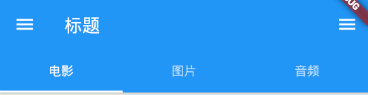
下图为AppBar的样图
TabBar(bottom属性)使用示例
class MyTabbedPage extends StatefulWidget {const MyTabbedPage({ Key key }) : super(key: key);@override_MyTabbedPageState createState() => _MyTabbedPageState();}// 混合 SingleTickerProviderStateMixin 类的特性class _MyTabbedPageState extends State<MyTabbedPage> with SingleTickerProviderStateMixin {// TabBar的子项final List<Tab> myTabs = <Tab>[Tab(text: 'LEFT'),Tab(text: 'RIGHT'),];// TabBar控制器TabController _tabController;@overridevoid initState() {super.initState();// 在initState中初始化TabController_tabController = TabController(vsync: this, length: myTabs.length);}@overridevoid dispose() {// 在dispose中解除回收TabController_tabController.dispose();super.dispose();}@overrideWidget build(BuildContext context) {return Scaffold(appBar: AppBar(// 在AppBar.bottom属性中使用TabBarbottom: TabBar(controller: _tabController,tabs: myTabs,),),// 与TabBar联动的TabBarView设置body: TabBarView(controller: _tabController,children: myTabs.map((Tab tab) {return Center(child: Text('This is the ${tab.text.toLowerCase()} tab',style: const TextStyle(fontSize: 36),),);}).toList(),),);}}

若有收获,就点个赞吧
0 人点赞
