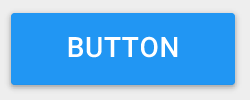
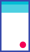
RaisedButton
- Material Design 的按钮,一个凸起的材质矩形按钮
RaisedButton({// 键Key key,// 按钮点击事件监听,当返回null则认为是禁用@required VoidCallback onPressed,// 点击按钮时返回true,当按钮松开手,或焦点离开按钮时会返回falseValueChanged<bool> onHighlightChanged,// 按钮文本颜色主题(未设置按钮文本颜色时有效),与ThemeData值有关。ButtonTextTheme textTheme,// 按钮文本颜色Color textColor,// 按钮禁用时文本颜色Color disabledTextColor,// 按钮的颜色Color color,// 按钮禁用时的颜色Color disabledColor,// 具有输入焦点的按钮的颜色(没搞清楚作用,感觉是Web端的属性)Color focusColor,// 指针悬停在按钮上时的颜色(没搞清楚作用,感觉是Web端的属性)Color hoverColor,// 当按钮处于按下状态时,高亮突出的颜色Color highlightColor,// 水波纹溅射颜色Color splashColor,// 和字体颜色有关,Brightness枚举类型-dark和light(在未设置字体颜色时,dark模式文字为白色,light文字为黑色)Brightness colorBrightness,// 和阴影投影范围有关double elevation,// 焦点高度(应该是聚焦情况下,对应elevation的值)double focusElevation,// 悬停高度(应该是悬停情况下,对应elevation的值)double hoverElevation,// 高亮高度(高亮情况下,对应elevation的值)double highlightElevation,// 禁用高度(按钮禁用情况下,对应elevation的值)double disabledElevation,// 按钮内边距EdgeInsetsGeometry padding,// 按钮的形状ShapeBorder shape,// 剪切行为(设置溢出部分内容是否剪切,且以何种方式剪切)Clip clipBehavior,// 焦点节点(暂时不知道有什么用处)FocusNode focusNode,// 自动聚焦(暂时不知道有什么用处)bool autofocus = false,// 点击范围大小(MaterialTapTargetSize枚举类型padded拓展最小点击范围为48px*48px,按实际最小来)、该属性具体适用范围不明MaterialTapTargetSize materialTapTargetSize,// 动画时长(定义[形状]和[高程]的动画更改的持续时间,默认为200ms)Duration animationDuration,// 按钮的内容,不一定是Text,也可以是Icon等WidgetWidget child,})
- 按钮效果图
textTheme属性全解.RaisedButton.textTheme属性值为ButtonTextTheme枚举类的对象,总共有三个值,分别为normal、accent及primary三个值。normal:按钮文本是黑色还是白色,取决于[ThemeData.brightness];accent:按钮文本为[ThemeData.accentColor]
按钮禁用:当设置onPressed属性值为null时,则按钮为禁用状态,没有单独的属性设置按钮是否禁用
clipBehavior属性,用于从child溢出是否剪裁,Clip枚举类型不同值效果截图Clip.none(不剪裁)、Clip.hardEdget(剪裁但是边缘未开启抗锯齿模式)、Clip.antiAlias(剪裁且开启抗锯齿模式)、Clip.antiAliasWithSaveLayer(功能与Clip.antiAlias基本相同,该模式具有缓存,且处理比较慢)


- animationDuration按钮形状与elevation高度动画变更持续时间效果,以下为200ms和5000ms效果展示:
FloatingActioButton
- 一个原形图标按钮,它悬停在内容之上,以展示应用程序中的主要动作。FloatingActionButton通常用于Scaffold.floatingActionButton字段。
FloatingActionButton({// 主键Key key,// 一般为Text或者Iconthis.child,// 长按后文字提示this.tooltip,// 前景颜色this.foregroundColor,// 背景颜色this.backgroundColor,// 聚焦颜色this.focusColor,// 悬停颜色this.hoverColor,// 水波纹溅射颜色this.splashColor,// hero动画标记this.heroTag = const _DefaultHeroTag(),// 和阴影投影范围有关this.elevation,// 焦点高度(应该是聚焦情况下,对应elevation的值)this.focusElevation,// 悬停高度(应该是悬停情况下,对应elevation的值)this.hoverElevation,// 高亮高度(高亮情况下,对应elevation的值)this.highlightElevation,// 禁用高度(按钮禁用情况下,对应elevation的值)this.disabledElevation,// 按钮点击事件监听,值为null时,按钮为禁用模式@required this.onPressed,// 控制此按钮的大小。默认情况下,浮动操作按钮是非迷你按钮,其高度和宽度为56.0逻辑像素。迷你浮动动作按钮的高度和宽度为40.0逻辑像素,布局宽度和高度为48.0逻辑像素。this.mini = false,// 按钮形状this.shape,// 剪切行为(设置溢出部分内容是否剪切,且以何种方式剪切)、具体参考RaisedButton.clipBehavior属性说明this.clipBehavior = Clip.none,// 焦点节点(暂时不知道有什么用处)this.focusNode,// 自动聚焦(暂时不知道有什么用处)this.autofocus = false,// 点击范围大小(MaterialTapTargetSize枚举类型padded拓展最小点击范围为48px*48px,按实际最小来)、该属性具体适用范围不明this.materialTapTargetSize,// 是否是拓展(作用不是很清楚,和悬浮按钮点击事件有关)this.isExtended = false,})
- FloatingActionButton按钮效果图

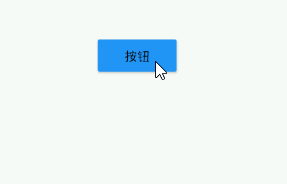
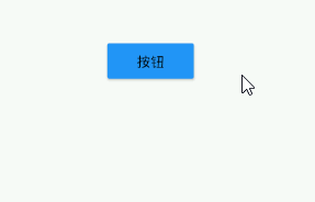
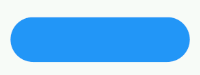
FlatButton
- 一个扁平的Material按钮,属性基本与RaiseButton相同
FlatButton({// 键Key key,// 按钮点击事件监听,当返回null则认为是禁用@required VoidCallback onPressed,// 点击按钮时返回true,当按钮松开手,或焦点离开按钮时会返回falseValueChanged<bool> onHighlightChanged,// 按钮文本颜色主题(未设置按钮文本颜色时有效),与ThemeData值有关。ButtonTextTheme textTheme,// 按钮文本颜色Color textColor,// 按钮禁用时文本颜色Color disabledTextColor,// 按钮的颜色Color color,// 按钮禁用时的颜色Color disabledColor,// 具有输入焦点的按钮的颜色(没搞清楚作用,感觉是Web端的属性)Color focusColor,// 指针悬停在按钮上时的颜色(没搞清楚作用,感觉是Web端的属性)Color hoverColor,// 当按钮处于按下状态时,高亮突出的颜色Color highlightColor,// 水波纹溅射颜色Color splashColor,// 和字体颜色有关,Brightness枚举类型-dark和light(在未设置字体颜色时,dark模式文字为白色,light文字为黑色)Brightness colorBrightness,// 按钮内边距EdgeInsetsGeometry padding,// 按钮形状ShapeBorder shape,// 剪切行为(设置溢出部分内容是否剪切,且以何种方式剪切)、具体参考RaisedButton.clipBehavior属性说明Clip clipBehavior,// 焦点节点(暂时不知道有什么用处)FocusNode focusNode,// 自动聚焦(暂时不知道有什么用处)bool autofocus = false,// 点击范围大小(MaterialTapTargetSize枚举类型padded拓展最小点击范围为48px*48px,按实际最小来)、该属性具体适用范围不明MaterialTapTargetSize materialTapTargetSize,// 一般是Text、Icon这些,也可以是其他Widget@required Widget child,})
- FlatButton(扁平按钮)效果图
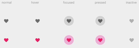
IconButton
- 一个Material图标按钮,点击时会有水波动画
IconButton({// 键Key key,// 图标大小this.iconSize = 24.0,// 按钮内边距this.padding = const EdgeInsets.all(8.0),// 图标位于按钮部件的位置this.alignment = Alignment.center,// 图标,Icon或ImageIcon对象@required this.icon,// 图标的颜色this.color,// 具有输入焦点的按钮图标的颜色(没搞清楚作用,感觉是Web端的属性)this.focusColor,// 指针悬停在按钮图标上是的颜色(没搞清楚作用,感觉是Web端的属性)this.hoverColor,// 当按钮处于按下状态时,高亮突出的颜色,出现后会迅速消失this.highlightColor,// 飞溅的水波纹颜色this.splashColor,// 图标按钮禁用时,图标的颜色this.disabledColor,// 按钮点击监听事件@required this.onPressed,// 焦点节点(不是很清楚怎么用)this.focusNode,// 是否自动聚焦this.autofocus = false,// 长按后提示工具this.tooltip,})
- IconButton不同状态的颜色比较及使用实例
IconButton(icon: const Icon(Icons.add_alert),onPressed: () {// 点击事件处理},)
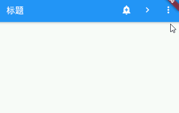
PopupMenuButton
- 当菜单隐藏式,点击或调用onSelected时显示一个弹出式菜单列表
PopupMenuButton({// 键Key key,// PopupMenuItemBuilder<T>,一个返回PopMenuItem的集合(弹出菜单的子Widget按钮)@required this.itemBuilder,// 菜单项的值(如果有),在菜单打开时突出显示。this.initialValue,// 点击Item的点击事件监听this.onSelected,// 取消关闭弹窗监听this.onCanceled,// 长按弹出的提示文字this.tooltip,// 和阴影有关this.elevation,this.padding = const EdgeInsets.all(8.0),// 自定义按钮样式,不能与icon属性同时使用,二者选一,如果按钮样式自定义选择这种方式this.child,// 按钮的图标this.icon,// 弹出窗位置偏移量,如果不设置默认弹出位于右上角顶边this.offset = Offset.zero,// 按钮是否能点击this.enabled = true,// 弹出框的形状this.shape,// 弹出框的背景颜色this.color,})
- PopupMenuButton使用实例
class ScaffoldDemoPage extends StatefulWidget {ScaffoldDemoPage({Key key}) : super(key: key);@overrideState<StatefulWidget> createState() {return _ScaffoldDemoState();}}class _ScaffoldDemoState extends State<ScaffoldDemoPage>with SingleTickerProviderStateMixin {final _scaffoldKey = GlobalKey<ScaffoldState>();// 选中的菜单值Choice _selectedChoice = choices[0];// 菜单项点击事件void _select(Choice choice) {setState(() { // Causes the app to rebuild with the new _selectedChoice._selectedChoice = choice;});_scaffoldKey.currentState.showSnackBar(SnackBar(content: Text('点击了${choice.title}')));}@overrideWidget build(BuildContext context) {return Scaffold(key: _scaffoldKey,appBar: AppBar(title: Text('标题'),actions: <Widget>[IconButton(icon: const Icon(Icons.add_alert),tooltip: 'Show Snackbar',onPressed: () {_scaffoldKey.currentState.showSnackBar(SnackBar(content: Text('点击了')));},),IconButton(icon: const Icon(Icons.navigate_next),tooltip: 'Next page',onPressed: () {openPage(context);},),// 这里是PopuMenuButton的使用,Choice为菜单项实体类PopupMenuButton<Choice>(// PopuMenuButton按钮样式icon: const Icon(Icons.more_vert)// PopuMenuButton长按提示文字tooltip: '设置',// 菜单项点击事件监听onSelected: _select,// 菜单项部件构建函数itemBuilder: (BuildContext context) {return choices.skip(2).map((Choice choice) {return PopupMenuItem<Choice>(value: choice,child: Text(choice.title),);}).toList();},// 菜单窗口位置偏离量offset: Offset(0, 40),// 菜单窗口形状设置shape: RoundedRectangleBorder(borderRadius: BorderRadiusDirectional.all(Radius.circular(20.0))),),],),body: Center(child: Text('AppBar测试'),),);}void openPage(BuildContext context) {Navigator.push(context, MaterialPageRoute(builder: (BuildContext context) {return Scaffold(appBar: AppBar(title: const Text('Next page'),),body: const Center(child: Text('This is the next page',style: TextStyle(fontSize: 24),),),);},));}}// 为菜单项实体类class Choice {const Choice({this.title, this.icon});final String title;final IconData icon;}// 菜单项实体类对象集合const List<Choice> choices = const <Choice>[const Choice(title: 'Car', icon: Icons.directions_car),const Choice(title: 'Bicycle', icon: Icons.directions_bike),const Choice(title: 'Boat', icon: Icons.directions_boat),const Choice(title: 'Bus', icon: Icons.directions_bus),const Choice(title: 'Train', icon: Icons.directions_railway),const Choice(title: 'Walk', icon: Icons.directions_walk),];
ButtonBar
水平排列的按钮组,通常可以用在Dialog底部确定和取消按钮组合的地方
ButtonBar({// 键Key key,// 对齐方式,默认右对齐this.alignment = MainAxisAlignment.end,// 枚举类型MainAxisSizethis.mainAxisSize = MainAxisSize.max,// 按钮集合this.children = const <Widget>[],})
ButtonBar.mainAxisSize中MainAxisSize,max(宽度占满父容器)与MainAxisSize.min(宽度自适应)差异

若有收获,就点个赞吧
0 人点赞
