延续上一节的内容,上一节我们讲解了各种Dialog跟提示,其中包括轻量级跟非轻量级,我们了解到了像
SnackBar、Tooltip、Dialog等各种具有提示交互作用的Widget,今天我们继续上一篇的内容,来一块了解一下各种用于进度显示的Widget跟checkBox等选择作用的Widget。
今天我们来一块了解一下各种Index跟Chose控件,像 CircularProgressIndicator圆环进度条,
LinearProgressIndicator水平进度条, Slider滑杆,还有Checkbox,Switch等,下面我们就一块来进入今天的分享。
1. CircularProgressIndicator
老规矩,先从构造方法入手
const CircularProgressIndicator({Key key,double value,Color backgroundColor,Animation<Color> valueColor,this.strokeWidth = 4.0,String semanticsLabel,String semanticsValue,})
从上述 CircularProgressIndicator的方法签名中,我们首先可以得到的信息是,圆环进度条可以自定义指定背景颜色跟宽度,可以设置进度,我贴上几个简单的例子来直观体验一下。
import 'package:flutter/material.dart';void main() {runApp(new MaterialApp(home: new FlutterDemo()));}class FlutterDemo extends StatelessWidget {@overrideWidget build(BuildContext context) {return new Scaffold(appBar: new AppBar(title: new Text("Flutter进阶之旅"),),body: new Center(child: new Column(children: <Widget>[SizedBox(height: 30.0),Text("设置进度比为80%(0.8)"),SizedBox(height: 30.0),CircularProgressIndicator(value: 0.8,backgroundColor: Colors.green,strokeWidth: 10.0,),SizedBox(height: 30.0),Text("未做任何处理,默认一直循环"),CircularProgressIndicator(),Text("设置圆环进度颜色为红色"),CircularProgressIndicator(valueColor: AlwaysStoppedAnimation(Colors.deepOrange),),],)),);}}
效果图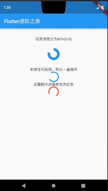
2.LinearProgressIndicator
对比 LinearProgressIndicator的构造方法
const LinearProgressIndicator({Key key,double value,Color backgroundColor,Animation<Color> valueColor,String semanticsLabel,String semanticsValue,})
我们发现 LinearProgressIndicator与 CircularProgressIndicator除了少了一个strokeWidth不支持设置进度条宽度之外,其他完全一致,所以我就不多做讲解了,直接看下效果吧。
效果图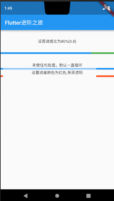
样例代码
import 'package:flutter/material.dart';void main() {runApp(new MaterialApp(home: new FlutterDemo()));}class FlutterDemo extends StatelessWidget {@overrideWidget build(BuildContext context) {return new Scaffold(appBar: new AppBar(title: new Text("Flutter进阶之旅"),),body: new Center(child: new Column(children: <Widget>[SizedBox(height: 30.0),Text("设置进度比为80%(0.8)"),SizedBox(height: 30.0),LinearProgressIndicator(value: 0.8,backgroundColor: Colors.green,),SizedBox(height: 30.0),Text("未做任何处理,默认一直循环"),LinearProgressIndicator(),Text("设置进度颜色为红色,背景透明"),LinearProgressIndicator(backgroundColor: Colors.transparent,valueColor: AlwaysStoppedAnimation(Colors.deepOrange),),],)),);}}
3.Slider
构造方法
const Slider({Key key,@required this.value,@required this.onChanged,this.onChangeStart,this.onChangeEnd,this.min = 0.0,this.max = 1.0,this.divisions,this.label,this.activeColor,this.inactiveColor,this.semanticFormatterCallback,})
Slider滑杆进度条,支持用户手动拖拽定位,如果不涉及到用户拖拽交互,我们可以把他认为就是一个静态的 LinearProgressIndicator,使用起来也比较简单。但是如果需用跟用户交互,涉及到用户的拖拽手势然后动态的改变Slider的值,就需要借助我们之前讲到的 StatefullWidget,通过 setState来完成用户交互的数据重新更新渲染到Slider上,我们来一起体验一下。
3.1 静态Slider
import 'package:flutter/material.dart';void main() {runApp(new MaterialApp(home: new FlutterDemo()));}class FlutterDemo extends StatelessWidget {@overrideWidget build(BuildContext context) {return new Scaffold(appBar: new AppBar(title: new Text("Flutter进阶之旅"),),body: new Center(child: new Slider(value: 0.4,onChanged: null,),),);}}
效果图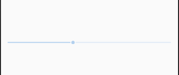
如上图,就仅仅只是一个指示作用,不支持用户手指拖拽滑动,下面我们来借助StatefullWidget来做一下简单交互。
3.2 动态Slider
我们来模拟一下用户拖拽Slider可以设置当前是星期几的效果。
效果图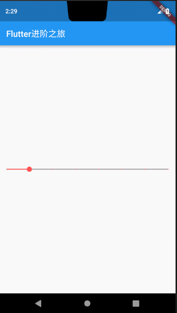
这里提到一个小细节,有读者给我反馈说 在使用Slider的时候,在Slider上方的label一直不显示,这里是因为label在指定了divisions也就是指定当前进度被离散成多少份之后才会显示,读者注意到这个细节即可。下面是上图的样例代码,供大家参考。
import 'package:flutter/material.dart';void main() {runApp(new MaterialApp(home: new FlutterDemo()));}class FlutterDemo extends StatefulWidget {@overrideState<StatefulWidget> createState() => SliderState();}class SliderState extends State {double _currentIndex = 0.0;void _onSliderStateChanged(double value) {setState(() {_currentIndex = value;print(_currentIndex.toString() + '-------------------');});}@overrideWidget build(BuildContext context) {return new Scaffold(appBar: new AppBar(title: new Text("Flutter进阶之旅"),),body: new Center(child: new Slider(value: _currentIndex,label: '星期${(_currentIndex*10).floor().toString()}',activeColor: Colors.redAccent,inactiveColor: Colors.grey,max: 0.7,min: 0.0,onChanged: _onSliderStateChanged,onChangeStart: (value){print('开始滑动-------------$value');},onChangeEnd: (value){print('结束滑动-------------$value');},divisions: 7,),),);}}
上面说完了常用的进度展示控件,我们通过上面的学习基本能处理业务上不同场景下如果选用进度Widget,下面我们来进入本篇的第二部分,关于Chose控件的介绍。
4.Checkbox
Checkbox跟Slider一样,因为需要处理或者说需要记录用户的选择状态,然后去更新 Checkbox的选中状态,所以理所当然我们也需要使用 StatefullWidget来完成这一操作。否则 Checkbox只能跟上面分析 Slider一样,只能一个静态展示,不能完成或者说记录用户的行为操作。
Checkbox使用跟原生Android一样,没有什么需要特别注意的知识点,我就不多做讲解了,下面我们一起来看一个例子。
样例代码
import 'package:flutter/material.dart';void main() {runApp(new MaterialApp(home: new FlutterDemo()));}class FlutterDemo extends StatefulWidget {@overrideState<StatefulWidget> createState() => SliderState();}class SliderState extends State {bool isChecked = false;void _onCheckStateChanged(bool value) {setState(() {isChecked = value;});}@overrideWidget build(BuildContext context) {return new Scaffold(appBar: new AppBar(title: new Text("Flutter进阶之旅"),),body: new Center(child: new Checkbox(value: isChecked,onChanged: _onCheckStateChanged,activeColor: Colors.green,),),);}}
5.Switch
Switch跟 Checkbox用户上类似,都是为了记录用户的选中状态,只不过是 Switch可定制的部分比 Checkbox更多一些,开发者可以加入更多的个性化定制,我们还是先从构造方法说起。
const Switch({Key key,@required this.value,@required this.onChanged,this.activeColor,this.activeTrackColor,this.inactiveThumbColor,this.inactiveTrackColor,this.activeThumbImage,this.inactiveThumbImage,this.materialTapTargetSize,})
下面我把几个配置不同样式的Switch效果图贴上了,读者可根据代码自行分析其具体实现细节,我就不逐一讲解构造方法中各个属性的作用了。
效果图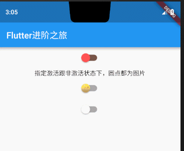
这里说明一下,上图为什么点击其中一个
Switch另外两个也会跟着联动,原因是我在写测试代码的时候,为了减少代码的书写量,尽可能的让代码清晰,所以给三个Switch在onChanged的时候绑定的是同一个函数回调,没有分开单独处理每个Swtich的回调事件,读者知道即可,不用过于纠结。
如上图:
第一个Switch我指定了,激活跟非激活状态的圆点颜色跟滑动轨迹的颜色
第二个Switch我指定了,激活跟非激活状态下圆点是资源图片。
第三个Swtich没有做任何处理。
上述效果图代码如下:
import 'package:flutter/material.dart';void main() {runApp(new MaterialApp(home: new FlutterDemo()));}class FlutterDemo extends StatefulWidget {@overrideState<StatefulWidget> createState() => SliderState();}class SliderState extends State {bool isChecked = false;void _onCheckStateChanged(bool value) {setState(() {isChecked = value;});}@overrideWidget build(BuildContext context) {return new Scaffold(appBar: new AppBar(title: new Text("Flutter进阶之旅"),),body: new Center(child: Column(children: <Widget>[new Switch(value: isChecked,inactiveThumbColor: Colors.redAccent,inactiveTrackColor: Colors.brown,activeTrackColor: Colors.blue,onChanged: _onCheckStateChanged,activeColor: Colors.green,),Text("指定激活跟非激活状态下,圆点都为图片"),new Switch(value: isChecked,inactiveThumbImage: AssetImage('images/a.png'),activeThumbImage: AssetImage('images/aaa.png'),onChanged: _onCheckStateChanged,activeColor: Colors.green,),new Switch(value: isChecked,onChanged: _onCheckStateChanged,)],),),);}}
属性及外观
Switch和Checkbox属性比较简单,读者可以查看API文档,它们都有一个activeColor属性,用于设置激活态的颜色。至于大小,
到目前为止,Checkbox的大小是固定的,无法自定义,而Switch只能定义宽度,高度也是固定的。值得一提的是Checkbox有一个属性tristate ,表示是否为三态,其默认值为false ,这时Checkbox有两种状态即“选中”和“不选中”,对应的value值为true和false ;如果其值为true时,value的值会增加一个状态null,读者可以自行了解。
6.Radio
在项目开发或者真实案例中Radio通常都是成组出现,比如性别选择、爱好选择等等场景中,Flutter充分考虑到了这一场景需求,给我们提供了便捷使用Radio的API。利用flutter的Radio能满足我们在原生Android中各个使用Radio的场景。下面我们来一起看下构造方法,顺便有一点小细节需要讲解一下。
const Radio({Key key,@required this.value,@required this.groupValue,@required this.onChanged,this.activeColor,this.materialTapTargetSize,})
看下Radio中的这段代码
final T value;final T groupValue;
从Radio的这段源码注释中我们可以看到Radio在处理分组时,value跟groupValue是作为一个泛型参数,也就是说我们可以指定value的类型为int、或者String等类型,并且当value和groupValue一致的时候则选中
根据这些我们就可以自由发挥去处理我们实际开发中需要使用Radio分组的业务逻辑了。下面我贴上一个选择性别跟选择数字的样例代码供大家参考,读者可结合上述关于Radio的源码分析和下面的代码对比学习。
import 'package:flutter/material.dart';void main() {runApp(new MaterialApp(home: new FlutterDemo()));}class FlutterDemo extends StatefulWidget {@overrideState<StatefulWidget> createState() => SliderState();}class SliderState extends State {int _value = 0;String _sex = '男';void _onRadioChanged(int value) {setState(() {_value = value;});}void _onSexRadioChanged(String value) {setState(() {_sex = value;});}@overrideWidget build(BuildContext context) {return new Scaffold(appBar: new AppBar(title: new Text("Flutter进阶之旅"),),body: new Center(child: Column(children: <Widget>[Radio(value: 0,groupValue: _value,onChanged: _onRadioChanged,),Radio(value: 1,groupValue: _value,onChanged: _onRadioChanged,),Radio(value: 2,groupValue: _value,onChanged: _onRadioChanged,),Text("选择的数字为$_value"),SizedBox(height: 50.0),Text("选择性别"),new Row(mainAxisAlignment: MainAxisAlignment.center,children: <Widget>[Radio(value: '男',groupValue: _sex,onChanged: _onSexRadioChanged,),Radio(value: '女',groupValue: _sex,onChanged: _onSexRadioChanged,),],),Text(_sex),]),),);}}
效果图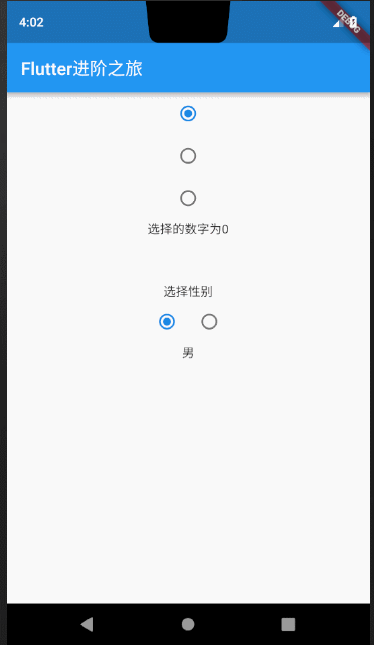

若有收获,就点个赞吧
0 人点赞
