在本栏的前面章节的学习中,我们基本上把Flutter中所有的常用布局、组件包括多页面跳转路由都介绍过了,细心的读者可能会发现在前面的课程中我们每次新建一个
Flutter Page的时候都会在根布局的build方法中直接return一个Scaffold然后,再通过配置Scaffold中的相关属性来快速的渲染页面布局:没错Scaffold的出现就是为了帮助我们实现基本的 Material Design 布局结构,简化我们页面开发工作,我们可以形象的把Scaffold理解为页面搭建的脚手架
课程学习目标
了解并掌握Scaffold中提供的快速搭建页面的脚手架方法
appBar: 显示在界面顶部的一个菜单导航栏body:页面中显示主要内容的区域,可任意指定WidgetfloatingActionButton: 悬浮按钮(类似原生Android中的floatingActionButton)drawer、endDrawer:分别用于在左右两侧边栏展示抽屉菜单bottomNavigationBar:显示在底部的导航栏按钮栏
在Flutter脚手架中给我们提供了上述用于快速构建页面的常用属性,开发者可根据自己的页面需求,选择性的引入不同属性达到定制出不同UI呈现的目的,关于Scaffold中的其他属性,我就不逐个讲解了,下面我结合代码跟大家一块测试下上述常用方法。
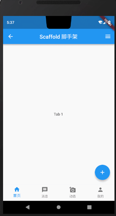
Scaffold课程完整效果图
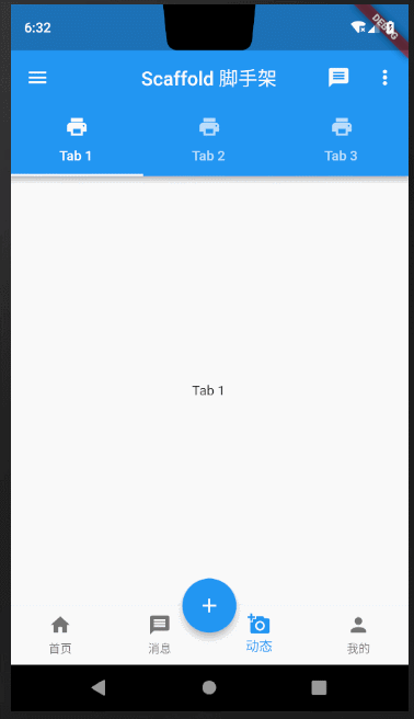
下面我拆分每一部分组件,详细对Scaffold中常用方法做讲解说明。
1. appBar
在前面的每一节课程中我们都可以找到appBar的身影,但是由于之前的课程重点不在appBar上,所以我们并没有对appBar展开过多的介绍,就仅仅是作为展示页面标题使用。
我们先来看看Scaffold源码中对appBar的解释说明: 一个展示在Scaffold顶部的APP Bar
/// An app bar to display at the top of the scaffold.final PreferredSizeWidget appBar;
通常我们会给根据不同的业务场景设置不同的AppBar,关于AppBar的构造方法大部分属性读者都可以根据属性名自解释,我就不贴出来赘述了,下面我举几个常用的例子
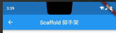
1.1 设置Title
appBar: AppBar(title: Text("Scaffold 脚手架"),),
标题居中:
appBar: AppBar(title: Text("Scaffold 脚手架"),centerTitle: true,),
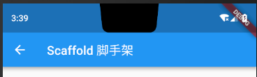
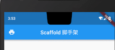
1.2设置左上角返回按钮
从上面的代码以及图片中我们看到Scaffold中默认为我们在appBar上指定了一个返回的箭头,点击箭头返回上一页,当然我们可以通过 leading属性自定义左上角的图标,但是当我们指定了 leading点击事件就需要我们自己单独处理了,也就是说,指定了 leading之后,我们就没办法在点击箭头的时候结束当前页,但是我们可以自己实现这一操作。
appBar: AppBar(leading: GestureDetector(child: Icon(Icons.print),onTap: (){Navigator.of(context).pop();}),title: Text("Scaffold 脚手架"),centerTitle: true,),
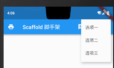
1.3 右侧溢出菜单
在Flutter中我们通过Appbar的 actions属性设置菜单项,一般重要的菜单选项我们会直接放在右边bar上显示,非重要功能选项我们会通过PopupMenuButton以三个小点的形式放进折叠菜单里,下面我们结合源码看下效果图,读者一看便知。
appBar: AppBar(leading: GestureDetector(child: Icon(Icons.print),onTap: (){Navigator.of(context).pop();}), //添加leading之后需要重写点击事件唤起抽屉菜单title: Text("Scaffold 脚手架"),actions: <Widget>[IconButton(icon: Icon(Icons.message), onPressed: () {}),IconButton(icon: Icon(Icons.access_alarm), onPressed: () {}),PopupMenuButton(onSelected: (String value) {print('-----------------$value');},itemBuilder: (BuildContext context) => [new PopupMenuItem(value: "选项一的内容", child: new Text("选项一")),new PopupMenuItem(value: "选项二的内容", child: new Text("选项二")),new PopupMenuItem(value: "选项三的内容", child: new Text("选项三")),])],),
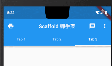
1.4 标题栏底部TabBar
在原生Android中我们很熟悉的就是利用TabLayout设置标题栏下方的tab切换效果,在Flutter中我们通过给AppBar的bottom属性设置TabBar来完成这一效果。
bottom: TabBar(controller: _tabController,tabs: topTabLists.map((element) => Tab(text: element,)).toList(),// onTap: (index) => {},)),
使用TabBar必须传入controller属性,我们通过initState()方法初始化_tabController
@overridevoid initState() {super.initState();//初始化顶部TabController_tabController = TabController(length: topTabLists.length, vsync: this);}
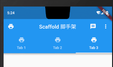
Tab属性设置icon图标+文字
bottom: TabBar(controller: _tabController,tabs: topTabLists.map((element) => Tab(text: element,icon: Icon(Icons.print),)).toList(),// onTap: (index) => {},)),
2.body部分
根据Scaffold页面布局的上下顺序,下面我们讲解第二部分 body部分。关于body部分在前面的课程中,我们使用了很多次了,也没什么需要特别说的地方,这里我就不展开介绍了,body作为一个页面的主要视图部分,可以传入任意指定的Widget,可现实在屏幕中央,这里我就不过多赘述了。
body: Container(child: Text("内容区域"),),
3.抽屉菜单
在文章开题的时候,我提到了抽屉菜单可以通过drawer、endDrawer指定左右两侧打开的抽屉菜单。下面我们就来看下效果。
左侧抽屉
drawer: MyDrawer(), //MyDrawer详细代码在下面
右侧抽屉
endDrawer: MyDrawer(), //MyDrawer详细代码在下面
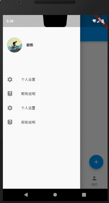
上述抽屉相关的 MyDrawer代码如下
class MyDrawer extends StatelessWidget {@overrideWidget build(BuildContext context) {return Drawer(child: Column(crossAxisAlignment: CrossAxisAlignment.start,children: <Widget>[Padding(padding: const EdgeInsets.only(top: 88.0, bottom: 30.0),child: Row(children: <Widget>[Padding(padding: const EdgeInsets.symmetric(horizontal: 16.0),child: ClipOval(child: Image.network("https://avatar.csdn.net/6/0/6/3_xieluoxixi.jpg",width: 60,),),),Text("谢栋",style: TextStyle(fontWeight: FontWeight.bold),)],),),Expanded(child: ListView(children: <Widget>[ListTile(leading: const Icon(Icons.settings),title: const Text('个人设置'),),ListTile(leading: const Icon(Icons.live_help),title: const Text('帮助说明'),),ListTile(leading: const Icon(Icons.settings),title: const Text('个人设置'),),ListTile(leading: const Icon(Icons.live_help),title: const Text('帮助说明'),),],),)],));}}
4.floatingActionButton
floatingActionButton在前面讲解Button章节中我们讲解过,知识点也比较简单,就是在页面布局快速构建出一个悬浮按钮。
floatingActionButton: FloatingActionButton(onPressed: (){print("---------");},child: Icon(Icons.add),),
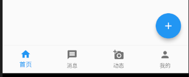
我们可以通过在Scaffold脚手架中指定floatingActionButtonLocation来指定floatingActionButton显示的位置。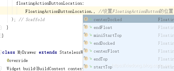
各个位置属性基本见名知意,我就不逐个写效果图展示了,下面只贴上一个悬停在底部导航栏上的样式。
floatingActionButtonLocation:FloatingActionButtonLocation.centerDocked, //设置FloatingActionButton的位置);
5.底部导航栏 bottomNavigationBar
bottomNavigationBar的使用场景还比较多,一般我们的多页面app都会通过底部的Tab来切换App首页展示的不同内容,在Flutter的Scaffold中为我们提供了快捷用于构建底部Tab的方法,我们通过给BottomNavigationBar的 Items属性设置需要展示的BottomNavigationBarItem数组即可。
bottomNavigationBar: BottomNavigationBar(//不设置该属性多于三个不显示颜色type: BottomNavigationBarType.fixed,items: [BottomNavigationBarItem(icon: Icon(Icons.home), title: Text("首页")),BottomNavigationBarItem(icon: Icon(Icons.message), title: Text("消息")),BottomNavigationBarItem(icon: Icon(Icons.add_a_photo), title: Text("动态")),BottomNavigationBarItem(icon: Icon(Icons.person), title: Text("我的"))],currentIndex: _currentBottomIndex,fixedColor: Colors.blue,onTap: (index) => _onBottomTabChange(index),),
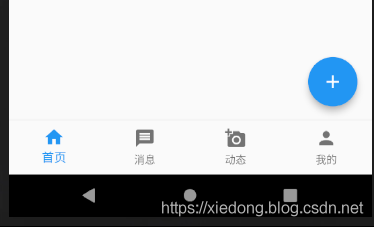
这里有个细节需要说一下,有读者私下里问我说设置了bottomNavigationBar的属性其中tab为三个的时候可以正常显示,但是多于三个就变成白色了,不能正常显示。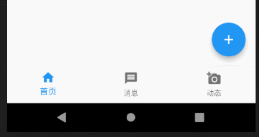
这里我从源码角度上给读者解读一下。
BottomNavigationBar({Key key,@required this.items,this.onTap,this.currentIndex = 0,BottomNavigationBarType type,this.fixedColor,this.iconSize = 24.0,}) : assert(items != null),assert(items.length >= 2),assert(items.every((BottomNavigationBarItem item) => item.title != null) == true,'Every item must have a non-null title',),assert(0 currentIndex && currentIndex < items.length),assert(iconSize != null),type = type ?? (items.length 3 ? BottomNavigationBarType.fixed : BottomNavigationBarType.shifting),super(key: key);
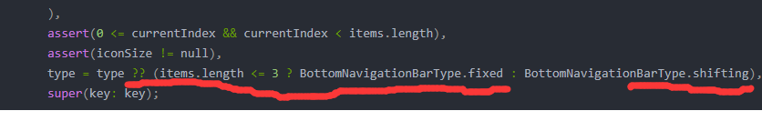
从源码上的这段标红线的地方,我们可以读到,当BottomNavigationBar中的items数量小于等于3时,type为BottomNavigationBarType.fixed,大于3则为BottomNavigationBarType.shifting,所以我们只需在代码中重载type属性,大于3个的时候设置type值为BottomNavigationBarType.fixed即可。我在一开始的代码注释中也解释了这个问题。
UI小特效
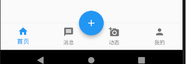
在实现底部导航栏时,Flutter还为我们提供了一个Material组件中的类似’”镶嵌”效果,使用BottomAppBar配合FloatingActionButton完成,文字描述可能云里雾里的。
一图胜千言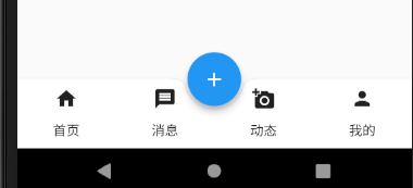
//与FloatingActionButton配合实现"打洞"效果bottomNavigationBar: BottomAppBar(color: Colors.white,shape: CircularNotchedRectangle(), // 底部导航栏打一个圆形的洞child: Row(children: [Tab(text: "首页", icon: Icon(Icons.home)),Tab(text: "消息", icon: Icon(Icons.message)),Tab(text: "动态", icon: Icon(Icons.add_a_photo)),Tab(text: "我的", icon: Icon(Icons.person)),],mainAxisAlignment: MainAxisAlignment.spaceAround, //均分底部导航栏横向空间),),floatingActionButton: FloatingActionButton(onPressed: () => _onFabClick,child: Icon(Icons.add),),floatingActionButtonLocation:FloatingActionButtonLocation.centerDocked, //设置FloatingActionButton的位置);
虽然我们在上面借助 BottomNavigationBar也实现了类似的效果,但是前者是直接压在导航栏上面的,而后者是嵌入进去的,效果更逼真。读者可对比下方的效果图。

若有收获,就点个赞吧
0 人点赞
