1.官方默认不支持多tab,我们要实现多页签效果, 先要至少有2个页面来进行切换,我们现在的菜单是从数据库中获取的动态菜单,对应的页面并未实现,所以第一步我们挑两个页面来实现简单的列表效果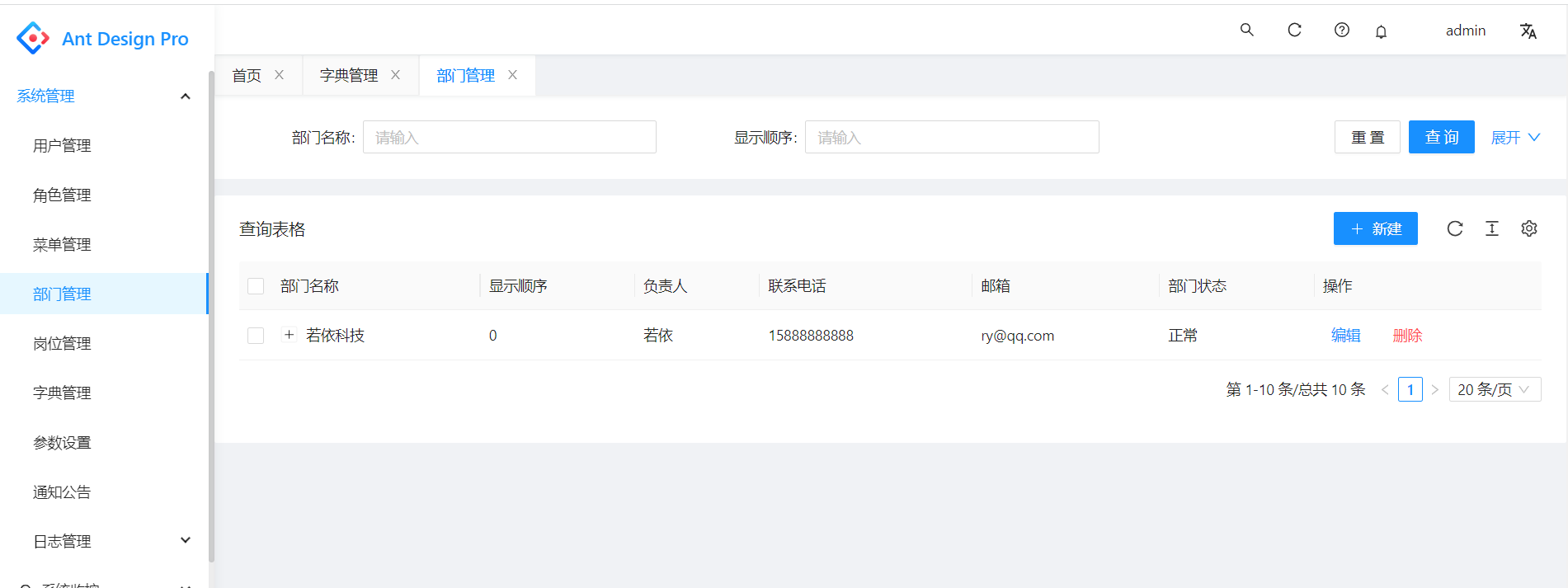
2.这里挑了字典管理、部门管理两个页面,来实现多页签效果。由于代码较多,我们无法象之前的章节一样一步步来操作了,只描述下目录结构和文件组成,本节所有代码都已经在码云上提交。另字典管理、和部门管理两块的代码借鉴了若依React版,若依React版最新版已经支持Antd Pro V5,若依React版是TypeScript,字典管理、和部门管理列表页面的代码基本上是基于若依React的TypeScript翻成了JS版本。
3.修改了config目录下的config.js和routes.js,routes.js中只放我们要访问的部分页面,config.js中引入routes.js,完整的routes.js代码如下
export default [{path: '/user',layout: false,routes: [{path: '/user/login',layout: false,name: 'login',component: './user/Login',},{path: '/user',redirect: '/user/login',},{name: 'register-result',icon: 'smile',path: '/user/register-result',component: './user/register-result',},{name: 'register',icon: 'smile',path: '/user/register',component: './user/register',},{component: '404',},],},{name: 'account',icon: 'user',path: '/account',routes: [{path: '/account',redirect: '/account/center',},{name: 'center',icon: 'smile',path: '/account/center',component: './account/center',},{name: 'settings',icon: 'smile',path: '/account/settings',component: './account/settings',},],},{path: '/home',name: 'home',icon: 'smile',component: './dashboard/analysis/index',title:'首页',},{name: 'system',icon: 'BugOutlined',path: '/system',routes: [{path: '/',redirect: '/system/dict',},{name: 'dept',icon: 'PartitionOutlined',path: '/system/dept',component: 'system/dept/index',title:'部门管理',},{name: 'dict',icon: 'PartitionOutlined',path: '/system/dict',component: 'system/dict/index',title:'字典管理',},],},{path: '/',redirect: '/home',},{component: './404',},];
4.routes里面配置了字典管理和部门管理两个页面的路由及对应组件信息
{name: 'dept',icon: 'PartitionOutlined',path: '/system/dept',component: 'system/dept/index',title:'部门管理',},{name: 'dict',icon: 'PartitionOutlined',path: '/system/dict',component: 'system/dict/index',title:'字典管理',},
5 src/pages/system下的dept和dict目录结构及文件如下图所示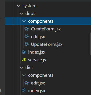
index.jsx是列表首页,service.js封装了用umi request调用后台服务的接口,components中封装了子组件。v5的umi request简化了操作,不再需要dva中的model和connect操作。
6.部门管理要用到字典管理中部分封装代码,字典管理列表页面效果如下图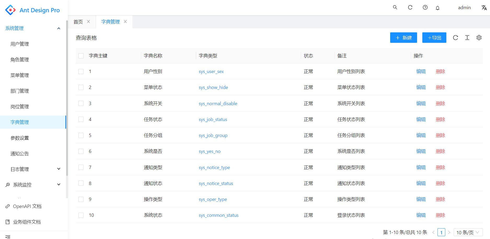
7.部门管理的列表页面效果如下图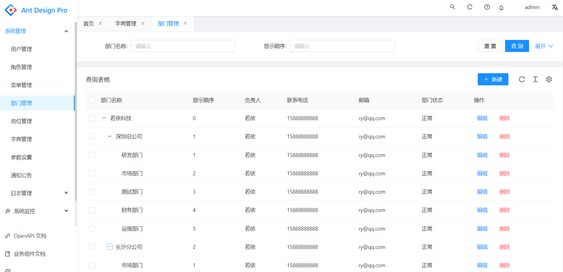
8.接下来开始做多页签Tab效果,这里用的第三方组件来实现,用了3,4个第三方组件,踩了几个坑,最后用这个组件基本实现了预期效果。
9.多页签Tab组件使用操作步骤1,修改config/defaultSettings.js
import { Mode } from 'use-switch-tabs';const Settings= {navTheme: 'light',// 拂晓蓝primaryColor: '#1890ff',layout: 'side',contentWidth: 'Fluid',fixedHeader: false,fixSiderbar: true,colorWeak: false,title: 'Ant Design Pro',pwa: false,logo: 'https://gw.alipayobjects.com/zos/rmsportal/KDpgvguMpGfqaHPjicRK.svg',iconfontUrl: '',switchTabs: {mode: Mode.Route,fixed: true,reloadable: true,persistent: {force: true,},},};export default Settings;
10.步骤2src/layouts增加目录和文件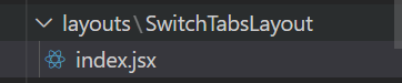
11.步骤3 src/app.jsx中多处调整
import SwitchTabsLayout from './layouts/SwitchTabsLayout';import defaultSettings from '../config/defaultSettings';
return {fetchUserInfo,currentUser,settings: defaultSettings,};
const { switchTabs, ...restSettings } = initialState?.settings || {};
rightContentRender: () => (<RightContent switchTabsReloadable={switchTabs?.mode && switchTabs.reloadable} />),disableContentMargin: false,waterMarkProps: {content: initialState?.currentUser?.name,},className: switchTabs?.mode && 'custom-by-switch-tabs',childrenRender: (children, props) => {const { route } = props;return (<SwitchTabsLayoutmode={switchTabs?.mode}persistent={switchTabs?.persistent}fixed={switchTabs?.fixed}routes={route.routes}footerRender={() => <Footer />}>{children}</SwitchTabsLayout>);},
完整的app.jsx代码如下
import { PageLoading } from '@ant-design/pro-layout';import { history, Link } from 'umi';import RightContent from '@/components/RightContent';import Footer from '@/components/Footer';import { currentUser as queryCurrentUser } from './services/ant-design-pro/api';import { BookOutlined, LinkOutlined } from '@ant-design/icons';import { requestInterceptors, responseInterceptors, errorHandler } from '@/utils/Request';import { getCurrentUserMenus } from './services/ant-design-pro/menu';import fixMenuItemIcon from '@/utils/fixMenuItemIcon';import SwitchTabsLayout from './layouts/SwitchTabsLayout';import defaultSettings from '../config/defaultSettings';const isDev = process.env.NODE_ENV === 'development';const loginPath = '/user/login';/** 获取用户信息比较慢的时候会展示一个 loading */export const initialStateConfig = {loading: <PageLoading />,};/*** @see https://umijs.org/zh-CN/plugins/plugin-initial-state* */export async function getInitialState() {const fetchUserInfo = async () => {try {const msg = await queryCurrentUser();const currentUser={...msg.user,permissions: msg.permissions};console.log("login user info:",currentUser);return currentUser;} catch (error) {history.push(loginPath);}return undefined;};if (history.location.pathname !== loginPath) {const token = localStorage.getItem('access_token');if (!token) {history.push(loginPath);return {fetchUserInfo,currentUser:{},settings: defaultSettings,};}const currentUser = await fetchUserInfo();return {fetchUserInfo,currentUser,settings: defaultSettings,};}return {fetchUserInfo,currentUser,settings: defaultSettings,};}// ProLayout 支持的api https://procomponents.ant.design/components/layoutexport const request = {errorHandler,requestInterceptors: [requestInterceptors],responseInterceptors: [responseInterceptors],};export const layout = ({ initialState,setInitialState }) => {const { switchTabs, ...restSettings } = initialState?.settings || {};return {rightContentRender: () => (<RightContent switchTabsReloadable={switchTabs?.mode && switchTabs.reloadable} />),disableContentMargin: false,waterMarkProps: {content: initialState?.currentUser?.name,},className: switchTabs?.mode && 'custom-by-switch-tabs',childrenRender: (children, props) => {const { route } = props;return (<SwitchTabsLayoutmode={switchTabs?.mode}persistent={switchTabs?.persistent}fixed={switchTabs?.fixed}routes={route.routes}footerRender={() => <Footer />}>{children}</SwitchTabsLayout>);},footerRender: () => <Footer />,onPageChange: () => {const { location } = history; // 如果没有登录,重定向到 loginif (!initialState?.currentUser && location.pathname !== loginPath) {history.push(loginPath);}},links: isDev? [<Link to="/umi/plugin/openapi" target="_blank"><LinkOutlined /><span>OpenAPI 文档</span></Link>,<Link to="/~docs"><BookOutlined /><span>业务组件文档</span></Link>,]: [],menuHeaderRender: undefined,menu: {// 每当 initialState?.currentUser?.userId 发生修改时重新执行 requestparams: {userId: initialState?.currentUser?.userId,},request: async (params, defaultMenuData) => {const tempMenuData = await getCurrentUserMenus();const menuData=fixMenuItemIcon(tempMenuData);setInitialState({...initialState,menuData: menuData,});return menuData;},},// 自定义 403 页面// unAccessible: <div>unAccessible</div>,...restSettings,};};
12.步骤4,修改src/global.less,组件文档上未说这一步,导致我的页签位置效果始终不对,对着组件源码比较了很久,才发现要改global.less 样式文件,改完样式,效果基本就对了。
@import '~antd/es/style/themes/default.less';html,body,#root {height: 100%;}.colorWeak {filter: invert(80%);}.ant-layout {min-height: 100vh;}.ant-pro-sider.ant-layout-sider.ant-pro-sider-fixed {left: unset;}canvas {display: block;}body {text-rendering: optimizeLegibility;-webkit-font-smoothing: antialiased;-moz-osx-font-smoothing: grayscale;}ul,ol {list-style: none;}@media (max-width: @screen-xs) {.ant-table {width: 100%;overflow-x: auto;&-thead > tr,&-tbody > tr {> th,> td {white-space: pre;> span {display: block;}}}}}// Compatible with IE11@media screen and(-ms-high-contrast: active), (-ms-high-contrast: none) {body .ant-design-pro > .ant-layout {min-height: 100vh;}}.custom-by-switch-tabs {.ant-pro-basicLayout-content {margin: unset;& .ant-pro-page-container {margin: unset;}}}
13.完整的多页Tab栏效果一开始已有截图,我们补一个右键操作的效果截图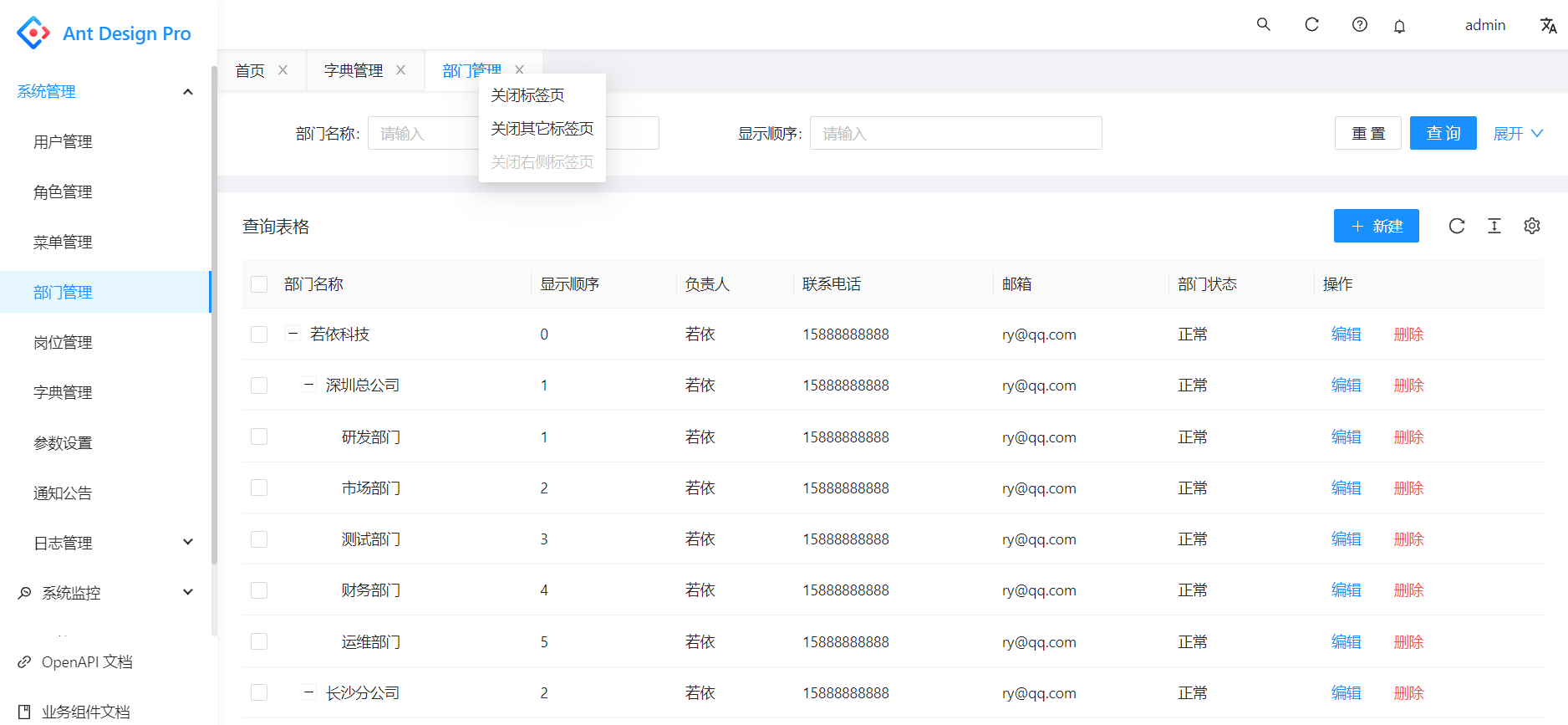
14.到此节,一个比较完整的前端React Antd Pro V5的架子已经搭好,我们只要根据业务的需要,再往里面增加模块即可,由于若依React珠玉在前,且新版的若依React已经使用了Antd Pro V5,若依React用的是现在主流的TypeScript,我们没必要再把若依React的所有功能再做一遍,我的这个系列的文章算是抛砖引玉,让大家熟悉了解Antd Pro V5的一些基本操作和原理。

若有收获,就点个赞吧
0 人点赞
