Scatter plot and line
Code implementation:
# 确定x轴和y轴的坐标x = np.linspace(dataSet.Population.min(), dataSet.Population.max())y = theta1[0, 0] + (theta1[0, 1] * x)fig, ax = plt.subplots(figsize=(12,8))# 绘制直线ax.plot(x, y, 'r', label='Prediction')# 绘制散点图ax.scatter(dataSet.Population, dataSet.Profit, label='Traning Data')# 设置图例(左上角)ax.legend(loc=2)# 设置x轴和y轴的标签以及图的标题ax.set_xlabel('Population')ax.set_ylabel('Profit')ax.set_title('Predicted Profit vs. Population Size')plt.show()
Running effect: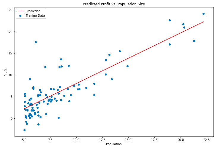
Correlation function
- np.linspace
resources: https://numpy.org/doc/stable/reference/generated/numpy.linspace.html
- plt.subplots
resources: https://matplotlib.org/3.2.2/api/_as_gen/matplotlib.pyplot.subplots.html
- ax.plot
resources: https://blog.csdn.net/leaf_zizi/article/details/87094168
- ax.scatter
resources: https://blog.csdn.net/qiu931110/article/details/68130199
- ax.legend

若有收获,就点个赞吧
0 人点赞
