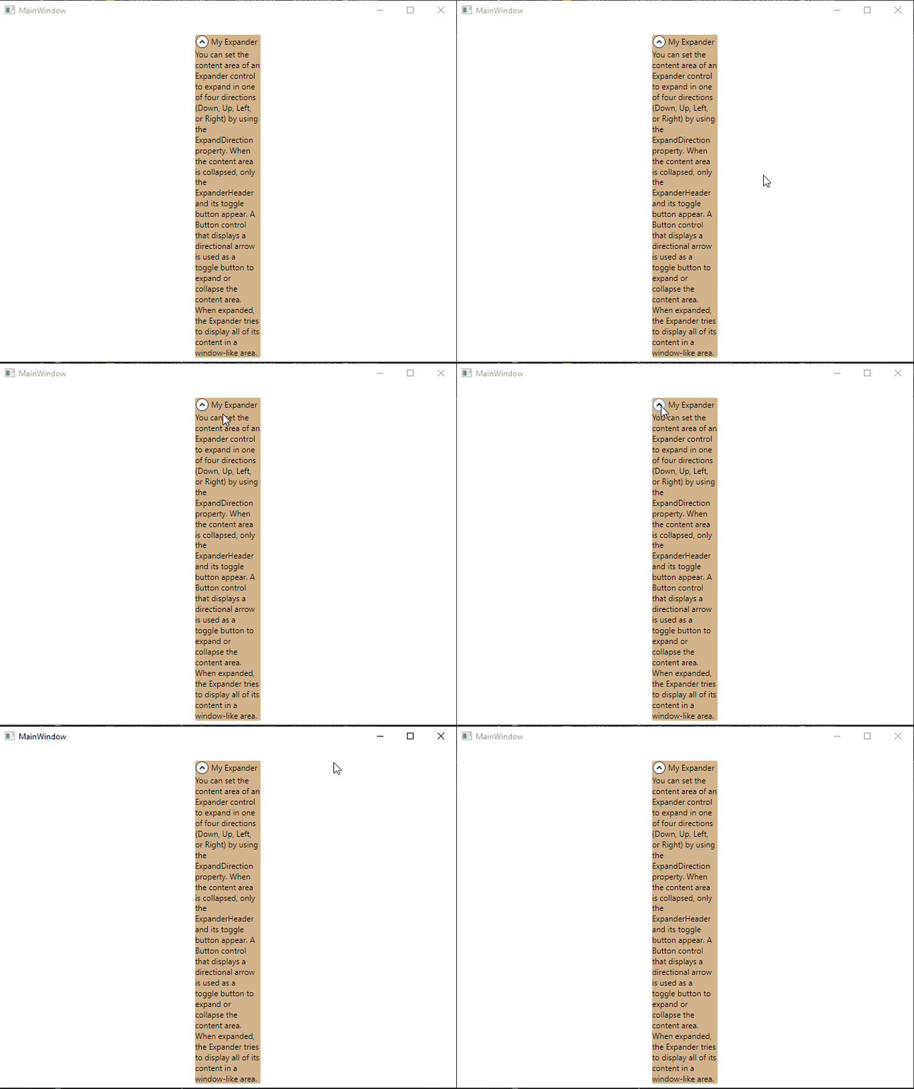
简单例子
代码
<Grid><Grid.RowDefinitions><RowDefinition Height="20"/><RowDefinition Height="Auto"/><RowDefinition Height="*"/></Grid.RowDefinitions><ExpanderGrid.Row="1"Name="myExpander"Width="100"HorizontalAlignment="Center"Background="Tan"ExpandDirection="Down"Header="My Expander"IsExpanded="True" ><TextBlock TextWrapping="Wrap">You can set the content area of an Expander control to expand in oneof four directions (Down, Up, Left, or Right) by using theExpandDirection property. When the content area is collapsed,only the ExpanderHeader and its toggle button appear. A Buttoncontrol that displays a directional arrow is used as a toggle buttonto expand or collapse the content area. When expanded, the Expandertries to display all of its content in a window-like area.</TextBlock></Expander></Grid>
效果


