1,如何在WPF中使用ComboBox
代码
<Grid><ComboBox Width="200" Height="23"><ComboBoxItem Content="Tea" /><ComboBoxItem Content="Milk" IsSelected="True" /><ComboBoxItem Content="Coffee" /></ComboBox></Grid>
效果

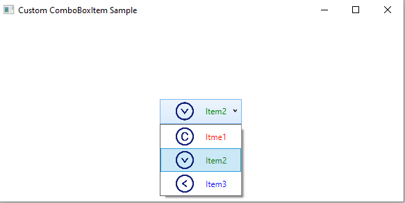
2,自定义ComboBox的Item
代码
<Grid><ComboBoxHorizontalAlignment="Center"VerticalAlignment="Center"SelectedIndex="1"><ComboBoxItem><StackPanel Orientation="Horizontal"><ImageWidth="60"Height="30"Source="/ComboBox Style Sample;component/img/copyright.png" /><TextBlock VerticalAlignment="Center" Foreground="Red">Itme1</TextBlock></StackPanel></ComboBoxItem><ComboBoxItem><StackPanel Orientation="Horizontal"><ImageWidth="60"Height="30"Source="/ComboBox Style Sample;component/img/down-circle.png" /><TextBlock VerticalAlignment="Center" Foreground="Green">Item2</TextBlock></StackPanel></ComboBoxItem><ComboBoxItem><StackPanel Orientation="Horizontal"><ImageWidth="60"Height="30"Source="/ComboBox Style Sample;component/img/left-circle.png" /><TextBlock VerticalAlignment="Center" Foreground="Blue">Item3</TextBlock></StackPanel></ComboBoxItem></ComboBox></Grid>
效果
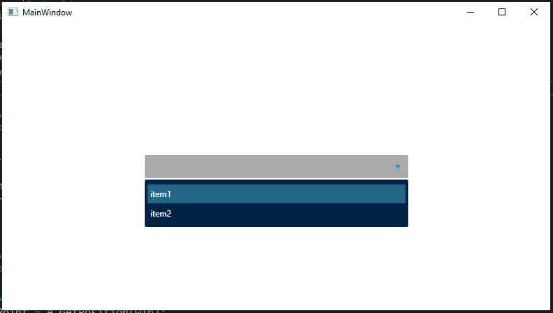
3,自定义ComboBox样式
代码
ComboBoxItem样式
<Style x:Key="stlCbxItem" TargetType="{x:Type ComboBoxItem}"><Setter Property="HorizontalContentAlignment" Value="Stretch" /><Setter Property="VerticalContentAlignment" Value="Center" /><Setter Property="RenderOptions.ClearTypeHint" Value="Enabled" /><Setter Property="BorderThickness" Value="0" /><Setter Property="Foreground" Value="White" /><Setter Property="Height" Value="28" /><Setter Property="Template"><Setter.Value><ControlTemplate TargetType="{x:Type ComboBoxItem}"><Grid Margin="0,0.5" Background="{TemplateBinding Background}"><Borderx:Name="ItemBackground"Background="{TemplateBinding Background}"BorderBrush="{TemplateBinding BorderBrush}"BorderThickness="{TemplateBinding BorderThickness}"CornerRadius="1"IsHitTestVisible="False"SnapsToDevicePixels="{TemplateBinding SnapsToDevicePixels}" /><ContentPresenterx:Name="contentPresenter"Margin="{TemplateBinding Padding}"HorizontalAlignment="{TemplateBinding HorizontalContentAlignment}"VerticalAlignment="{TemplateBinding VerticalContentAlignment}" /></Grid><ControlTemplate.Triggers><Trigger Property="IsSelected" Value="True"><Setter TargetName="ItemBackground" Property="Background" Value="#224466" /></Trigger><Trigger Property="IsMouseOver" Value="True"><Setter TargetName="ItemBackground" Property="Background" Value="#226688" /></Trigger></ControlTemplate.Triggers></ControlTemplate></Setter.Value></Setter></Style>
ToggleButton样式
<Style x:Key="stlToggleButton" TargetType="{x:Type ToggleButton}"><Setter Property="Foreground" Value="White" /><Setter Property="Template"><Setter.Value><ControlTemplate><Grid Background="Transparent"><Grid.ColumnDefinitions><ColumnDefinition Width="0.7*" /><ColumnDefinitionWidth="0.3*"MinWidth="16"MaxWidth="30" /></Grid.ColumnDefinitions><TextBlockGrid.Column="0"Margin="5,0,0,0"VerticalAlignment="Center"Foreground="White"Text="{Binding Text, RelativeSource={RelativeSource AncestorType={x:Type ComboBox}, Mode=FindAncestor}}" /><Borderx:Name="Back"Grid.Column="1"Background="Transparent"BorderBrush="Transparent"BorderThickness="0"><Pathx:Name="PathFill"Width="8"Height="6"Data="M5,0 L10,10 L0,10 z"Fill="#1b94e0"RenderTransformOrigin="0.5,0.5"Stretch="Fill"StrokeThickness="0"><Path.RenderTransform><TransformGroup><ScaleTransform /><SkewTransform /><RotateTransform Angle="180" /><TranslateTransform /></TransformGroup></Path.RenderTransform></Path></Border></Grid><ControlTemplate.Triggers><Trigger Property="IsMouseOver" Value="True"><Setter TargetName="PathFill" Property="Fill" Value="#1b94e0" /><Setter TargetName="Back" Property="Background" Value="Transparent" /><Setter TargetName="Back" Property="BorderBrush" Value="Transparent" /></Trigger></ControlTemplate.Triggers></ControlTemplate></Setter.Value></Setter></Style>
ComboBox样式
<Style x:Key="stlCbx" TargetType="{x:Type ComboBox}"><Setter Property="SnapsToDevicePixels" Value="True" /><Setter Property="ScrollViewer.HorizontalScrollBarVisibility" Value="Auto" /><Setter Property="ScrollViewer.VerticalScrollBarVisibility" Value="Auto" /><Setter Property="ScrollViewer.CanContentScroll" Value="True" /><Setter Property="HorizontalAlignment" Value="Left" /><Setter Property="Height" Value="28" /><Setter Property="Margin" Value="0,0,0,0" /><Setter Property="ItemContainerStyle" Value="{StaticResource stlCbxItem}" /><Setter Property="ItemTemplate"><Setter.Value><DataTemplate><TextBlockMargin="0,3,0,3"Foreground="#ffffff"Text="{Binding Text}" /></DataTemplate></Setter.Value></Setter><Setter Property="Template"><Setter.Value><ControlTemplate TargetType="{x:Type ComboBox}"><BorderBackground="#aaaaaa"BorderBrush="#eee"BorderThickness="0"CornerRadius="2"><Grid><ToggleButtonClickMode="Press"IsChecked="{Binding IsDropDownOpen, Mode=TwoWay, RelativeSource={RelativeSource TemplatedParent}}"Style="{StaticResource stlToggleButton}" /><Popupx:Name="Popup"AllowsTransparency="True"Focusable="False"IsOpen="{TemplateBinding IsDropDownOpen}"Placement="Bottom"PopupAnimation="Slide"><Borderx:Name="DropDown"MinWidth="{TemplateBinding ActualWidth}"MaxHeight="{TemplateBinding MaxDropDownHeight}"Background="Transparent"SnapsToDevicePixels="True"><BorderMargin="0,2,0,0"Background="#002244"CornerRadius="2"><ScrollViewerMaxHeight="{TemplateBinding MaxDropDownHeight}"Margin="4,6,4,6"CanContentScroll="True"HorizontalScrollBarVisibility="Auto"SnapsToDevicePixels="True"VerticalScrollBarVisibility="Auto"><StackPanel IsItemsHost="True" KeyboardNavigation.DirectionalNavigation="Contained" /></ScrollViewer></Border></Border></Popup></Grid></Border></ControlTemplate></Setter.Value></Setter></Style>
页面中使用ComboBox样式
<Windowx:Class="ComboBox_Style_Sample.MainWindow"xmlns="http://schemas.microsoft.com/winfx/2006/xaml/presentation"xmlns:x="http://schemas.microsoft.com/winfx/2006/xaml"xmlns:d="http://schemas.microsoft.com/expression/blend/2008"xmlns:mc="http://schemas.openxmlformats.org/markup-compatibility/2006"Title="MainWindow"Width="800"Height="450"mc:Ignorable="d"><Grid><ComboBoxWidth="377"Height="33"Margin="0"HorizontalAlignment="Center"VerticalAlignment="Center"Style="{StaticResource stlCbx}"><ComboBoxItem Content="item1" /><ComboBoxItem Content="item2" /></ComboBox></Grid></Window>
效果
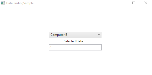
4,数据绑定
代码
<Grid><StackPanel VerticalAlignment="Center" Orientation="Vertical"><ComboBoxName="myComboBox"Width="200"Height="23"SelectionChanged="myComboBox_SelectionChanged" /><Label Width="97" Content="Selected Data:" /><TextBoxName="txtData"Width="202"Height="23"Text="TextBox"TextWrapping="Wrap" /></StackPanel></Grid>
public partial class DataBindingSample : Window{private List<Computer> Computers;public DataBindingSample(){InitializeComponent();Computers = new List<Computer>();myComboBox.ItemsSource = Computers;myComboBox.DisplayMemberPath = "Name";myComboBox.SelectedValuePath = "ID";}private void Window_Loaded(object sender, RoutedEventArgs e){Computers.Add(new Computer() { ID = 1, Name = "Computer A"});Computers.Add(new Computer() { ID = 2, Name = "Computer B" });Computers.Add(new Computer() { ID = 3, Name = "Computer C" });myComboBox.SelectedIndex = 1;}private void myComboBox_SelectionChanged(object sender, System.Windows.Controls.SelectionChangedEventArgs e){txtData.Text = myComboBox.SelectedValue.ToString();}}public class Computer{public string Name { get; set; }public int ID { get; set; }}
效果
5,示例代码下载

若有收获,就点个赞吧
0 人点赞
