前情回顾
1、前期准备
2、html基础
3、css基本选择器
今日内容
1、css常用属性
- 文本
- 字体
- 颜色
背景
<div id="box">css常用属性</div>
#box{/*a 文本*//*text-align: center;*/text-indent: 2em;/*text-decoration: underline;*/text-decoration: line-through;/*b 字体*/font-size: 50px;font-family: "楷体";font-weight: bold;font-style:italic;/*c 颜色*//*color: #008000;*/color: rgb(255,0,0);/*css属性来自 设计稿*//*d 背景*//*background: orange url("img/taohua2.jpg");*//*background: orange url("img/taohua2.jpg") repeat-x;*//*background: orange url("img/taohua2.jpg") repeat-y;*/background: orange url("img/taohua2.jpg") no-repeat;/*background-size: 100%,100%;*/background-size: 10%,10%;/*盒子模型*/width:300px;height: 400px;}
2、盒子模型
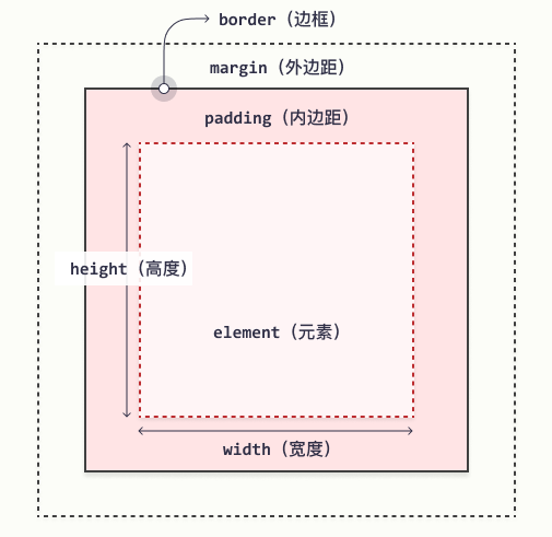
把每个标签看成一个盒子,都有下面5个属性。网页的布局,排版就是由一个个标签组成的,也就是一个个盒子组成。通过下面5个属性,就可以设置每个盒子(标签)的 宽,高,内边距,外边距,边框。宽
- 高
- 内边距:内容与边框的距离
- 外边距:盒子之间的距离
边框
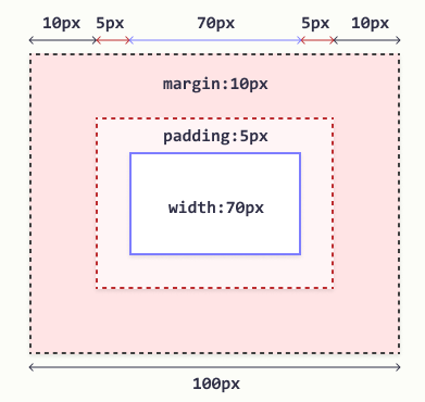
#box {width: 70px;margin: 10px;padding: 5px;}
3、布局-浮动
改变元素布局的一种方式,默认块级元素会独占一行(不会换行),要让块级元素水平排列,可以使用浮动,同时会脱离文档流,不占文档位置(会飘起来)。
常见块元素:div,p,h1-h6,ul li,ol li,dl dt dd,table,form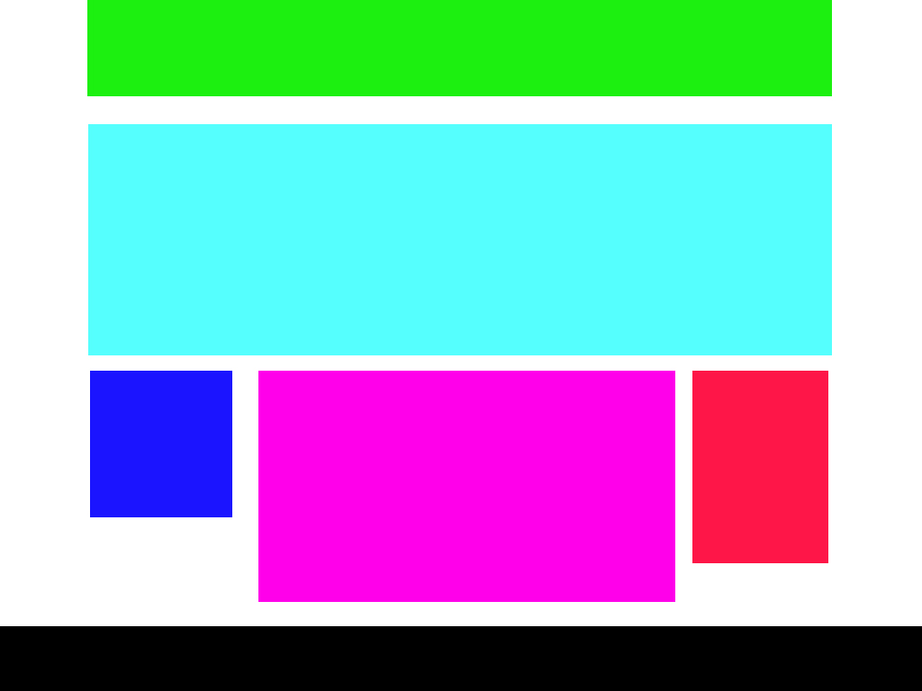 ```html
<a name="b4WcJ"></a>### 4、布局-定位改变元素位置,布局的一种方案,适合复杂布局,让一个元素在另一个元素上,不占文档位置。<br />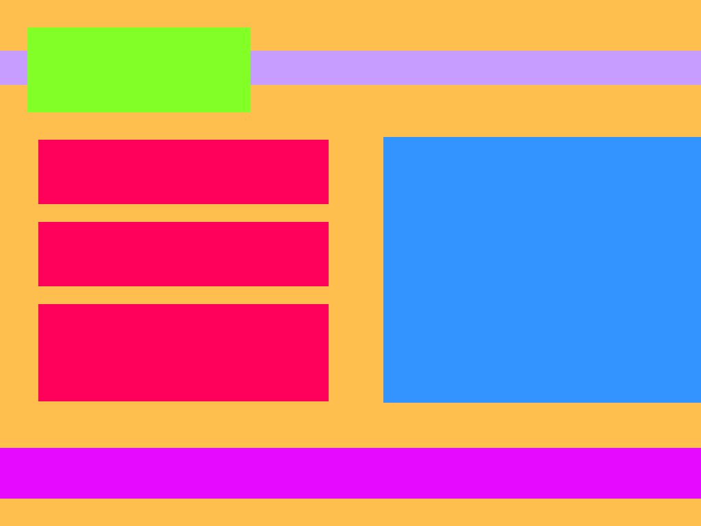```html<style type="text/css">*{padding:0;margin: 0;}body{/*整个给背景*/background:#FEBE4F;}#nav{height: 50px;background-color: #C79DFF;width: 100%;margin:50px 0;/*给一个定位属性,作为里面被包含的元素 定位的 参考点*/position: relative;}#nav div{width: 200px;height: 80px;background: #82FF26;/*参考最近的父元素(标签) 进行绝对定位*/position: absolute;/*父元素是50,当前元素是80,往上走-15相信刚好垂直居中*/top:-15px;left: 30px;}.wrap{height: 480px;width: 1200px;/*background: darkorange;*/margin:0 auto;}/*left,right 是div标签,是块元素,默认会垂直排列,所以要使用浮动让水平排列*/.wrap .left{width: 590px;/*里面 3个 item 每个height:150px,在加上 前2个item 又下边距12px*//*150*3 + 2*15 = 480*/height: 480px;float:left;/*background-color: #FF005A;*//*background-color: green;*/}.wrap .left .item{width: 100%;height: 150px;background: #FF005A;margin-bottom: 15px;}/*去掉最后一个的 下边距*/.wrap .left .item:last-child{margin-bottom: 0;}.wrap .right{width: 590px;height: 480px;float:right;background-color: #3494FF;}#footer{/*满屏:宽度为100%*/width: 100%;height: 80px;background:#E60BFF;margin-top: 30px;}</style><div id="nav"><div></div></div><div class="wrap"><div class="left"><div class="item"></div><div class="item"></div><div class="item"></div></div><div class="right"></div></div><div id="footer"></div>
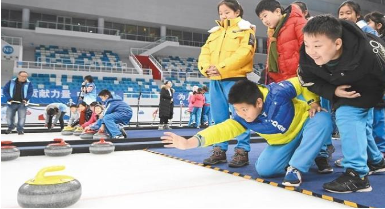
5、练习
1、演示代码
- day02 中演示代码
- 下图效果图实现


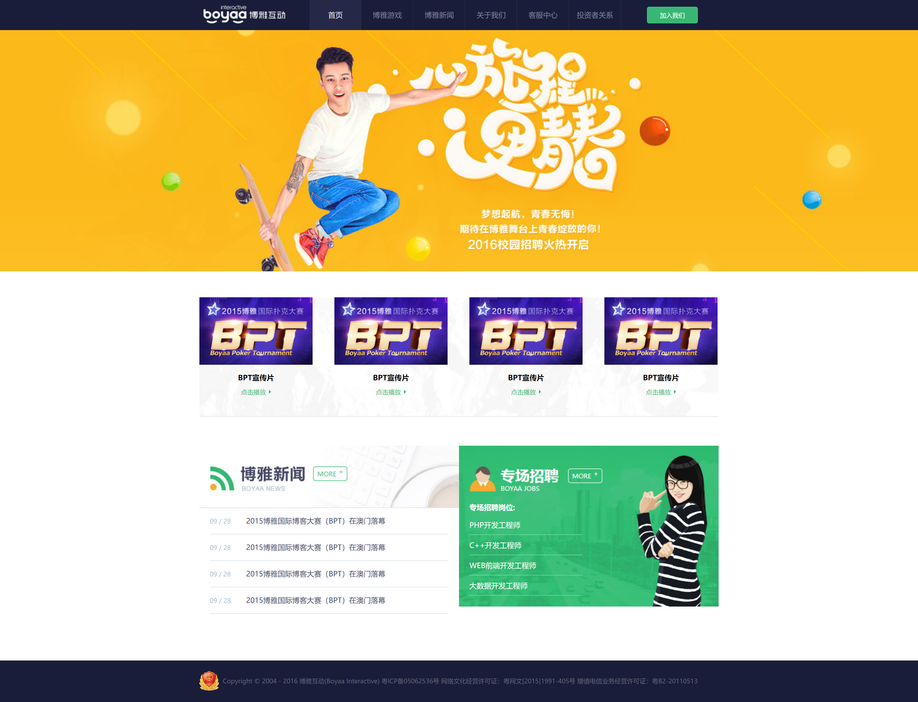
2、博雅互动布局实现(选做)

若有收获,就点个赞吧
0 人点赞
