创建
# an empty figure with no Axesfig = plt.figure()# a figure with a single Axesfig, ax = plt.subplots()# a figure with a 2x2 grid of Axesfig, axs = plt.subplots(2, 2)
坐标轴
# 坐标轴名称ax.xlabel("横坐标")ax.ylabel("纵坐标")# 坐标范围ax.xlim((-1,2))ax.ylim((-1,2))# 刻度&自定义刻度ax.xticks(np.linspace(-1,2,5)ax.yticks([0,30,60,90],['zero',30,'sixty',90])# 坐标轴颜色# 位置:left,right,top,bottom# 颜色:none为无颜色ax.spines['left'].set_color('none')# 选取X,Y坐标轴ax.xaxis.set_ticks_position("top") #bottomax.yaxis.set_ticks_position("right") #left# 移动坐标轴ax.spines['bottom'].set_position(('data',0))ax.spines['bottom'].set_position(('data',0))# 坐标轴放缩ax.set_yscale('log')
图例(legend)
fig, ax = plt.subplots()x = np.arange(0, 10, 1)l1, = ax.plot(x, 2 * x, label='up')l2, = ax.plot(x, 3 * x, color='red', linewidth=1.0, linestyle='--', label='down')# 默认图例ax.legend()# 手动图例ax.legend(handles=[l1, l2, ], labels=['$y=x^2$','bbb'],loc="best")fig.show()
注解(annotation)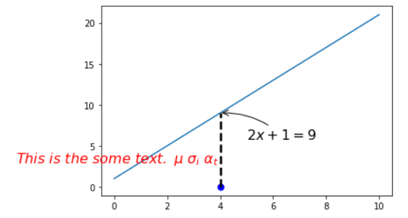
import matplotlib.pyplot as pltimport numpy as npx = np.linspace(0, 10, 50)y = 2 * x + 1fig, ax = plt.subplots()ax.plot(x, y)x0 = 4y0 = 2 * x0 + 1ax.scatter(x0, 0, s=50, color='b')ax.plot([x0, x0], [0, y0], 'k--', lw=2.5)# 注解 箭头ax.annotate(r"$2x+1=%s$" % y0,xy=(x0, y0), xycoords='data',xytext=(+30, -30), textcoords='offset points',fontsize=16,arrowprops=dict(arrowstyle='->', connectionstyle='arc3,rad=.2'))# 打字ax.text(-3.7, 3,r"$This\ is\ the\ some\ text. \ \mu\ \sigma_i\ \alpha_t$",fontdict={'size': 16, 'color': 'r'})
tick透明度设置
如下图,坐标轴的刻度影响了线条的绘制效果,可以通过将坐标轴刻度进行虚化显示出更好的效果。
import matplotlib.pyplot as pltimport numpy as npx = np.linspace(-3, 3, 50)y = 0.1 * xfig, ax = plt.subplots()ax.plot(x, y, lw=10)ax.spines['top'].set_color('none')ax.spines['right'].set_color('none')ax.spines['bottom'].set_position(('data', 0))ax.spines['left'].set_position(('data', 0))# 设置层叠优先次序 数值大的在上层ax.set_zorder(2)# 循环处理for tick in ax.get_xticklabels() + ax.get_yticklabels():# 改变刻度字体大小tick.set_fontsize(12)tick.set_zorder(1)# 改变刻度bounding box的样式tick.set_bbox(dict(facecolor='white', edgecolor="None", alpha=0.7))
散点图 scatter
import matplotlib.pyplot as pltimport numpy as npn = 1024X = np.random.normal(0, 1, n)Y = np.random.normal(0, 1, n)T = np.arctan2(Y, X)# s:size c:color alpha:透明度plt.scatter(X, Y, s=75, c=T, alpha=0.5)plt.xlim((-1.5, 1.5))plt.ylim((-1.5, 1.5))plt.xticks(())plt.yticks(())plt.show()
条形图 bar 
import matplotlib.pyplot as pltimport numpy as np%matplotlib inlinen = 12X = np.arange(n)Y = (1 - X / n) * np.random.uniform(0.5, 1.0, n)fig, ax = plt.subplots()ax.bar(X, Y, facecolor='#9999ff', edgecolor='white')ax.bar(X, -Y, facecolor='#ff9999', edgecolor='white')# 设置坐标轴和标签ax.set_xlim(-.5, n)ax.set_ylim(-1.25, 1.25)ax.set_xticks(())ax.set_yticks(())# 注解for x, y, y_hat in zip(X, Y, -Y):# ha: horizontal alignment va:vertical alignmentax.text(x, y + 0.05, '%.2f' % y, ha='center', va='bottom')ax.text(x, y_hat - 0.15, '%.2f' % y_hat, ha='center', va='bottom')fig.show()
等高线图 contours
import matplotlib.pyplot as pltimport numpy as np# 伪数据生成def gen_data(x, y):return (1 - x / 2 + x ** 5 + y ** 3) * np.exp(-x ** 2 - y ** 2)n = 256x = np.linspace(-3, 3, n)y = np.linspace(-3, 3, n)X, Y = np.meshgrid(x, y)Z = gen_data(X, Y)# contour and contourf draw contour lines and filled contours, respectivelyfig, ax = plt.subplots()#ax.contourf(X, Y, Z, levels=8, alpha=0.75, cmap=plt.cm.hot)C = ax.contour(X, Y, Z, levels=8, colors='black', linewidths=.5)ax.clabel(C, inline=True, fontsize=10)ax.set_xticks(())ax.set_yticks(())fig.show()
热力图
import matplotlib.pyplot as pltimport numpy as npimport matplotliba = np.random.random((3, 3))fig, ax = plt.subplots()image = ax.imshow(a, interpolation='nearest', cmap='bone', origin='lower')fig.colorbar(image, shrink=0.9)fig.show()
子图(组图)
import matplotlib.pyplot as pltplt.subplot(2, 1, 1)plt.plot([0, 1], [0, 1])plt.subplot(2, 3, 4)plt.plot([0, 1], [0, 1])plt.subplot(2, 3, 5)plt.plot([0, 1], [0, 1])plt.subplot(2, 3, 6)plt.plot([0, 1], [0, 1])
组图
import matplotlib.pyplot as pltimport numpy as npplt.figure()ax1 = plt.subplot2grid((3, 3), (0, 0), colspan=3, rowspan=1)ax1.plot([1, 2], [1, 2])ax2 = plt.subplot2grid((3, 3), (1, 0), colspan=2)ax3 = plt.subplot2grid((3, 3), (1, 2), rowspan=2)ax4 = plt.subplot2grid((3, 3), (2, 0))ax4 = plt.subplot2grid((3, 3), (2, 1))plt.show()
图嵌套(绝对定位)
import matplotlib.pyplot as pltfig = plt.figure()x = np.arange(1, 8)y = np.arange(1, 8)left, bottom, width, height = 0.1, 0.1, 0.8, 0.8ax1 = fig.add_axes([left, bottom, width, height])ax1.plot(x, y, 'r')left, bottom, width, height = 0.2, 0.6, 0.25, 0.25ax2 = fig.add_axes([left, bottom, width, height])ax2.plot(x, y, 'b')
双坐标轴
x = np.arange(0, 10, 0.1)y1 = 0.05 * x ** 2y2 = -1 * y1fig, ax1 = plt.subplots()ax2 = ax1.twinx()ax1.plot(x, y1, 'g--')ax2.plot(x, y2, 'b--')ax1.set_xlabel('X data')ax1.set_ylabel('Y1', color='g')ax2.set_ylabel('Y2', color='b')

若有收获,就点个赞吧
0 人点赞
