
1. 如何理解界面上的卡片?
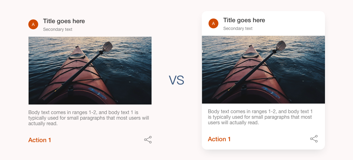
卡片可以理解为物理上的容器概念,将不同的元素封装为一个整体。一般而言,卡片设计有三大优点:
- 通过信息分类和再组合,使页面显得整洁有序(类似于储物盒的作用)
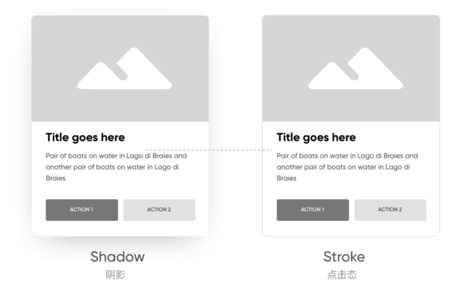
- 突出强调重要元素,如通过添加阴影或者边框线凸显卡片在界面上的存在感
- 轻松变换风格。卡片作为页面一个单一的封装模块,可以适应和搭配不同的场景。通过改变背景颜色或其他的元素搭配,可以在保持自身独立性的同时轻松变换不同的页面风格。
UI cards can be understood as physical containers. They encapsulates different elements into a whole, and distinguishes themselves from other UI elements, thus making the interface clean and orderly. By adding shadows or border lines, we can highlight the card on the interface. In addition, as a single module of the page, the card can adapt to and match different scenarios. By changing the background and collocation of other elements, we can easily change the UI styles while maintaining the exact same card design. Therefore, card design has a very wide applicability.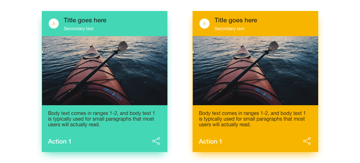
图片来源:三分设微信公众号
2. 如何设计卡片?
2.1 错落式布局和格式对比
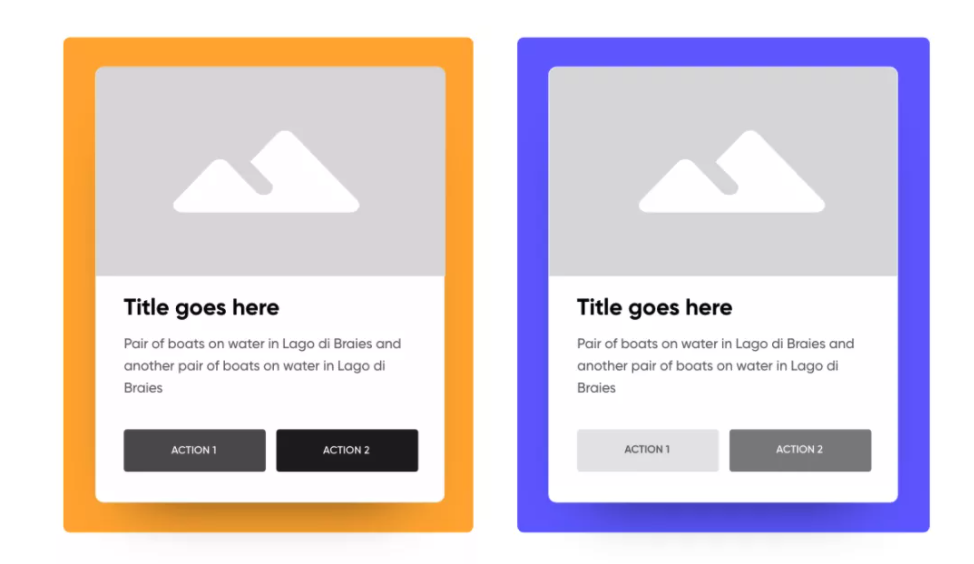
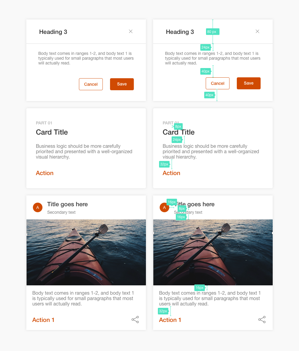
根据信息的重要层级,决定文字的字号大小和明度值。通过错落文字的错落安排,和不同明度的颜色对比,可以增强界面的节奏感和美感。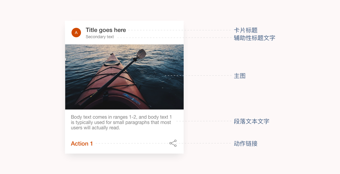
2.2 UI参数设置推荐
风格关键词:年轻,圆润,轻松,可爱,温和…
卡片圆角半径≈卡片宽度的0.04,阴影颜色=按钮颜色的 Alpha50%,x=0,y=按钮高度的20%,模糊值=按钮高度的50%,扩展=按钮高度的 -15%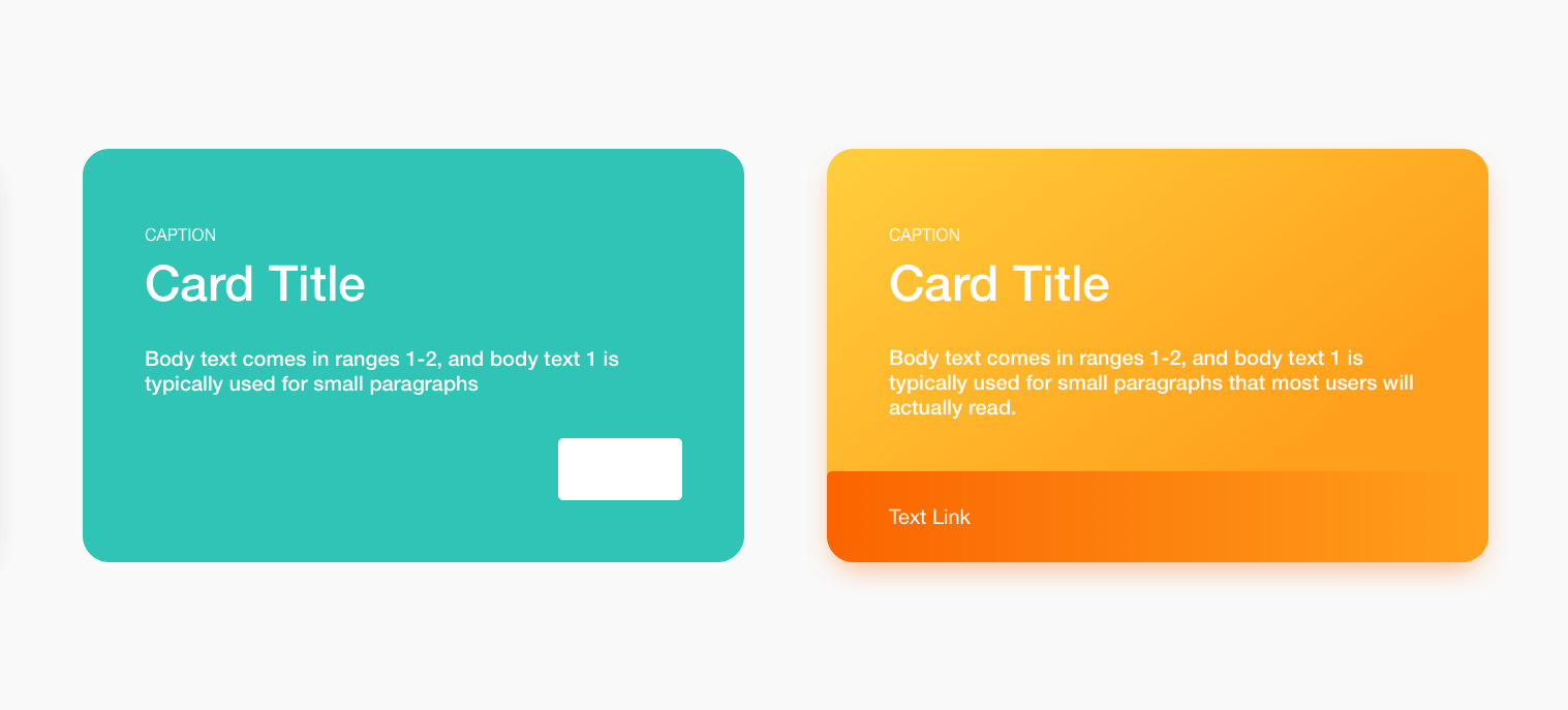 风格关键词:商务,安全,科技,正式…
卡片圆角半径≈卡片宽度的0.01,阴影颜色=按钮颜色的 Alpha50%,x=0,y=按钮高度的20%,模糊值=按钮高度的50%,扩展=按钮高度的 -15%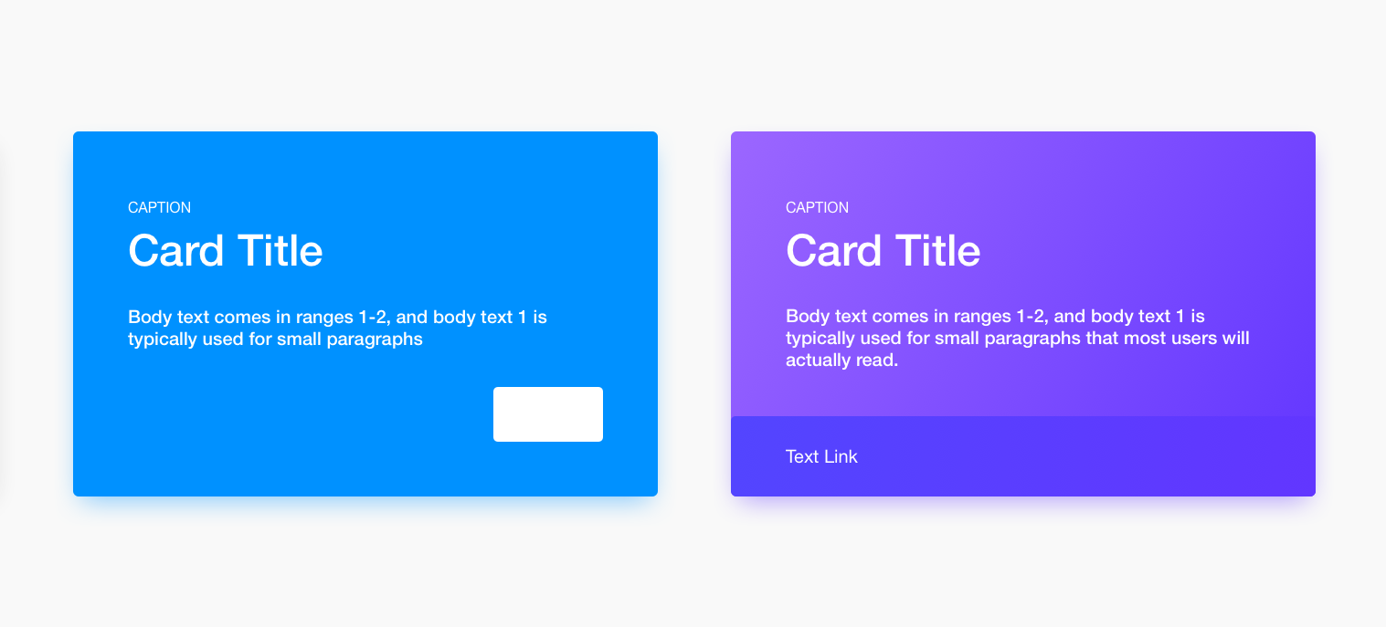
卡片设计库存案例/Card Library
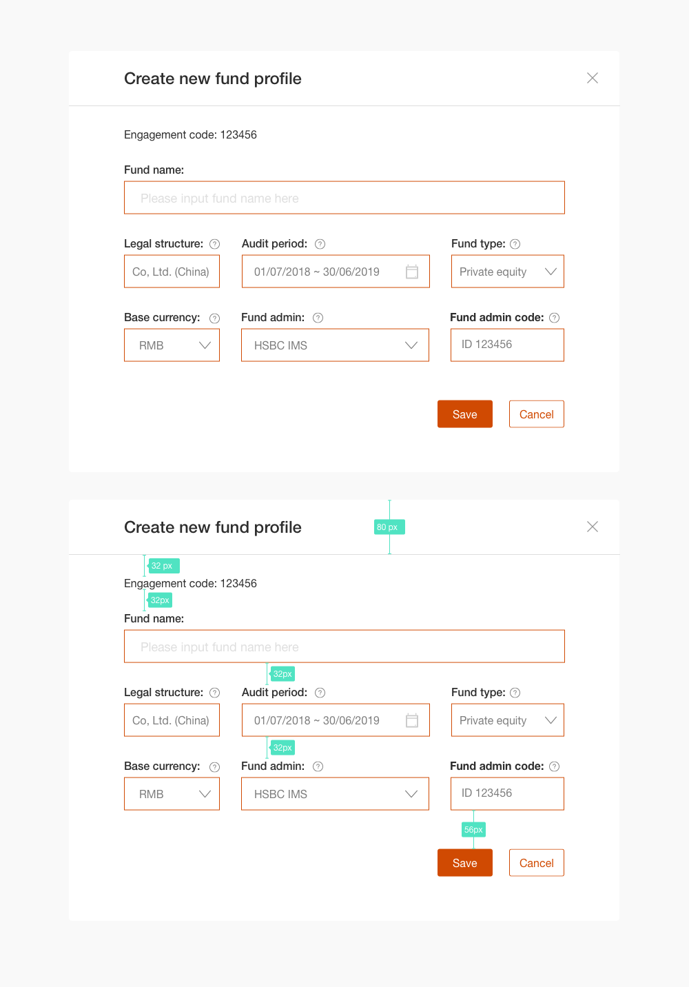
1. 弹框和信息卡片设计
2. 表格卡片

若有收获,就点个赞吧
0 人点赞
