TARGET&CONTENTS
TARGET
- 准确阐述盒子模型的4个组成部分
- 利用边框复合写法给元素添加边框
- 计算盒子的实际大小
- 利用盒子模型布局模块案例
- 给盒子设置圆角边框
- 给盒子添加阴影
- 给文字添加阴影 CONTENTS
- 盒子模型
- PS基本操作
- 综合案例
- 圆角边框
- 盒子阴影
- 文字阴影
一、盒子模型(重点)
页面布局要学习三大核心,盒子模型、浮动和定位。学习好盒子模型能非常好的帮助我们布局页面。
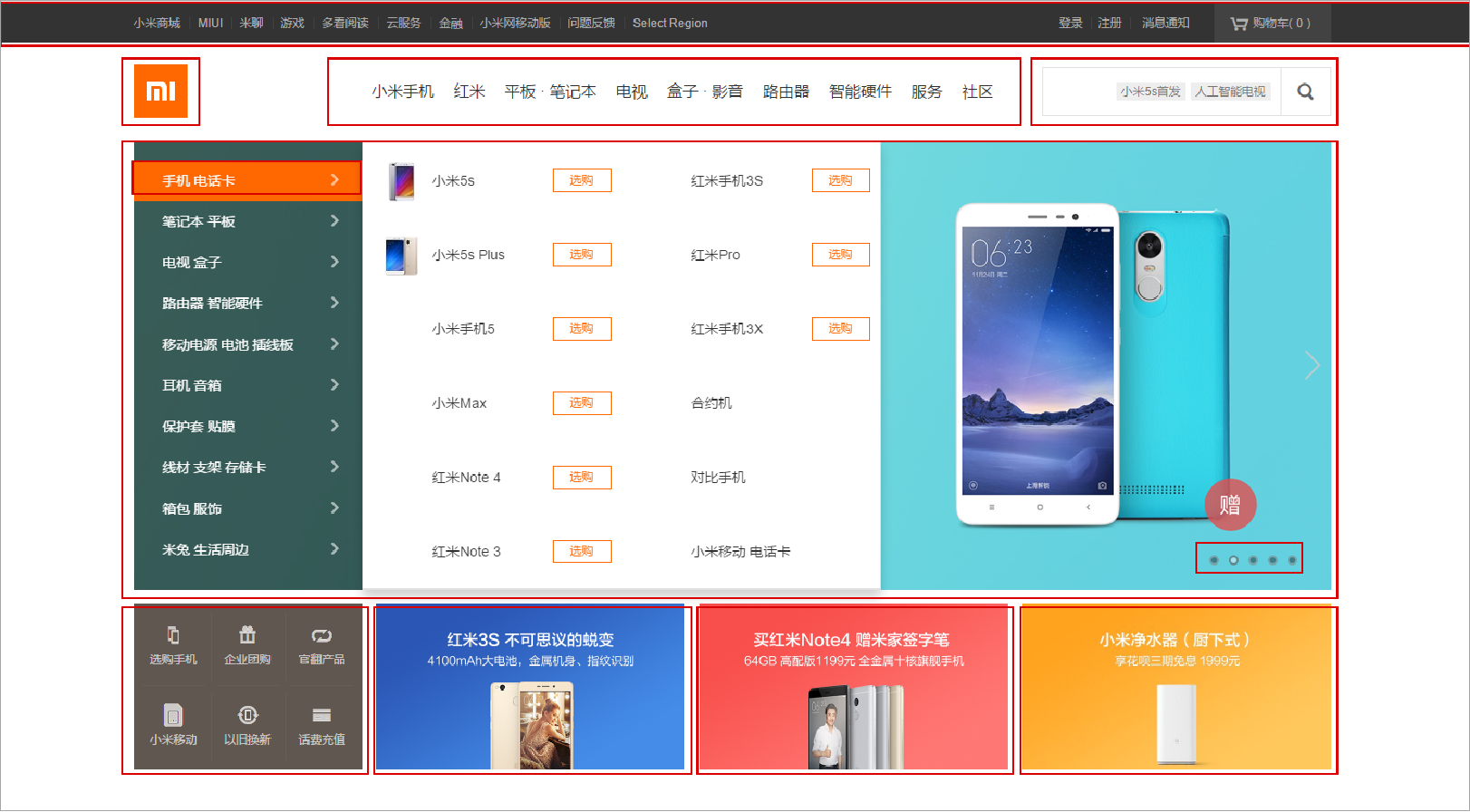
1.1 看透网页布局的本质
网页布局过程:
- 先准备好相关的网页元素,网页元素基本都是盒子Box。
- 利用CSS设置好盒子样式,然后摆放到相应位置。
- 往盒子里面装内容。
1.2 盒子模型(Box Model)组成
盒子模型:就是把HTML页面中的布局元素看作是一个矩形的盒子,也就是一个盛装内容的容器。
CSS盒子模型本质上是一个盒子,封装周围的HTML元素,它包括:边框、外边距、内边距和实际内容。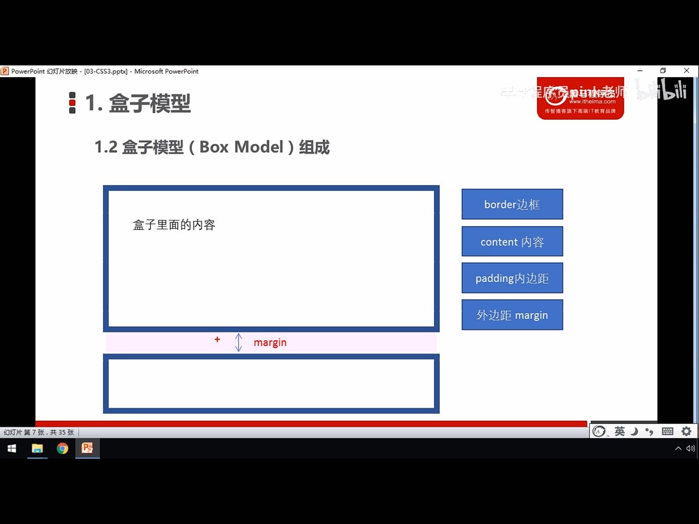

1.3 边框(border)
border可以设置元素的边框。边框由三部分组成:边框宽度(粗细)、边框样式、边框颜色。
语法:border:border-width | border-style | border-color
| 属性 | 作用 |
|---|---|
| border-width | 边框粗细,单位px |
| border-style | 边框样式 |
| border-color | 边框颜色 |
border-style:重点记住实线/虚线/点线边框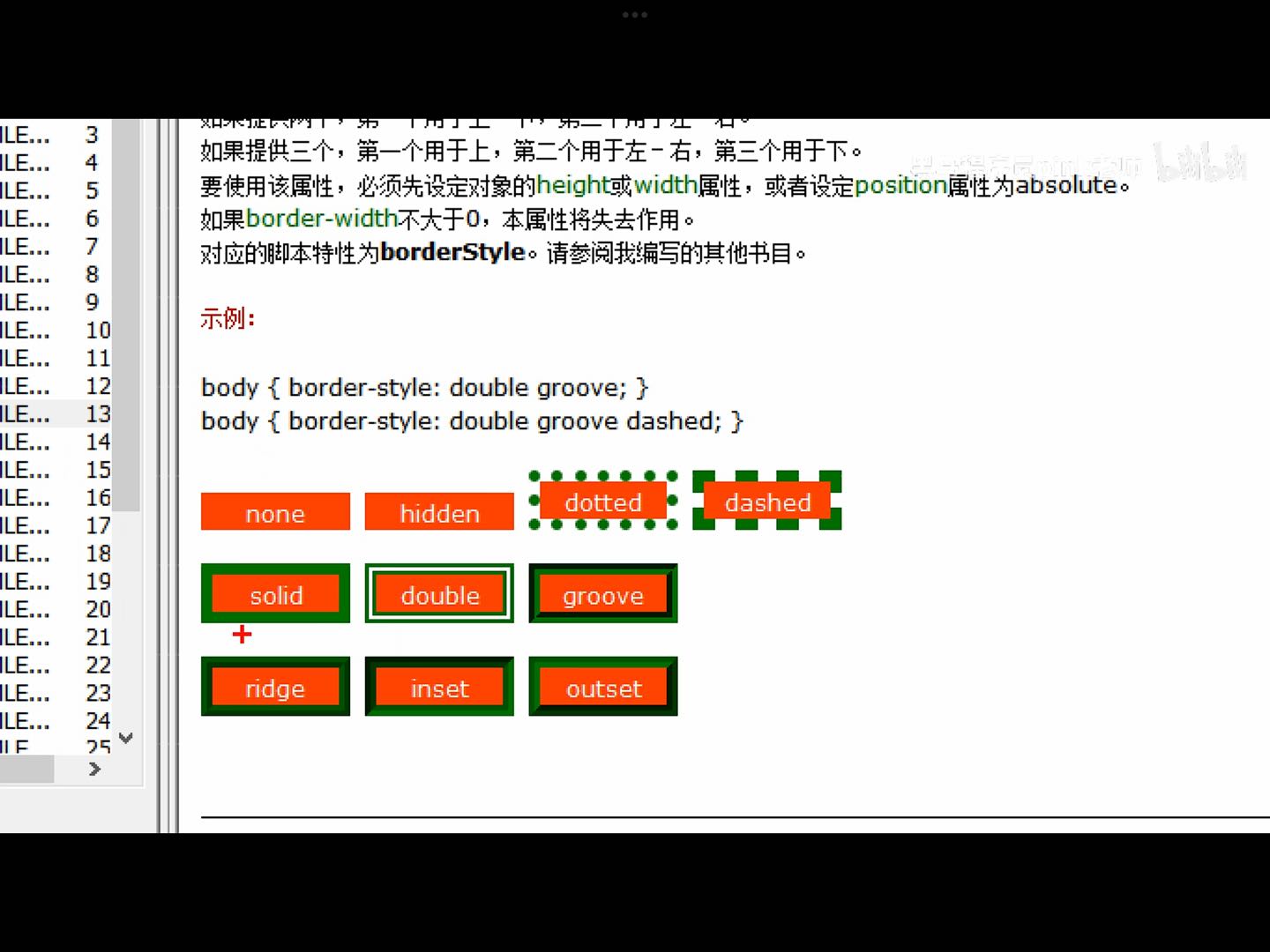
<!DOCTYPE html><html lang="en"><head><meta charset="UTF-8"><meta http-equiv="X-UA-Compatible" content="IE=edge"><meta name="viewport" content="width=device-width, initial-scale=1.0"><title>Document</title><style>div {width: 300px;height: 200px;/* border-width 边框的粗细 一般情况下都用px */border-width: 5px;/* border-style 边框样式 solid 实线边框 *//* border-style: solid; *//* dashed 虚线边框 */border-style: dashed;/* dotted 点线边框 *//* border-style: dotted; *//* border-color 边框的颜色 */border-color: pink;}</style></head><body><div></div></body></html>
边框的复合性写法:
CSS边框属性允许你指定一个元素边框的样式和颜色。
语法:border:1px solid red; 没有顺序昂
<!DOCTYPE html>
<html lang="en">

<head>
    <meta charset="UTF-8">
    <meta http-equiv="X-UA-Compatible" content="IE=edge">
    <meta name="viewport" content="width=device-width, initial-scale=1.0">
    <title>Document</title>
    <style>
        div {
            width: 300px;
            height: 200px;
            /* 边框的复合写法 */
            border: 2px pink solid;
        }
    </style>
</head>

<body>
    <div></div>
</body>

</html>
边框分开写法:border-top:1px solid red; /只设定上边框,其余同理/
<!DOCTYPE html>
<html lang="en">

<head>
    <meta charset="UTF-8">
    <meta http-equiv="X-UA-Compatible" content="IE=edge">
    <meta name="viewport" content="width=device-width, initial-scale=1.0">
    <title>Document</title>
    <style>
        div {
            width: 300px;
            height: 200px;
            /* 边框的复合写法 */
            /* border: 2px pink solid; */
            /* 上边框 */
            border-top: 3px pink solid;
            /* 下边框 */
            border-bottom: 3px black dashed;
        }
    </style>
</head>

<body>
    <div></div>
</body>

</html>
课堂练习:请给一个200*200的盒子,设置上边框为红色,其余边框为蓝色(提示:注意边框层叠性)
<!DOCTYPE html>
<html lang="en">

<head>
    <meta charset="UTF-8">
    <meta http-equiv="X-UA-Compatible" content="IE=edge">
    <meta name="viewport" content="width=device-width, initial-scale=1.0">
    <title>Document</title>
    <style>
        /* 请给一个200*200的盒子,设置上边框为红色,其余边框为蓝色(注意CSS边框层叠性) */
        div {
            width: 200px;
            height: 200px;
            border: 3px solid blue;
            /* 利用层叠性只改变上边框 */
            border-top: 3px solid red;
        }
    </style>
</head>

<body>
    <div></div>
</body>

</html>
1.4 表格的细线边框
border-collapse属性控制浏览器绘制表格边框的方式。它控制相邻单元格的边框。
语法:border-collapse: collapse; (表示相邻边框合并在一起)
collapse:合并
<!DOCTYPE html>
<html lang="en">

<head>
    <meta charset="UTF-8">
    <meta http-equiv="X-UA-Compatible" content="IE=edge">
    <meta name="viewport" content="width=device-width, initial-scale=1.0">
    <title>Document</title>
    <style>
        /* 表格整体大小用table设置 */
        table {
            width: 500px;
            height: 249px;
        }

        /* 把表头单元格做的高一点 */
        th {
            height: 35px;
        }

        /* 给表格 表头单元格 普通单元格样式及其内容加属性 */
        table,
        th,
        td {
            border: 1px solid pink;
            /* 合并相邻的边框 */
            border-collapse: collapse;
            /* 字号设置 */
            font-size: 14px;
            /* 文本居中设置 */
            text-align: center;
        }
    </style>
</head>

<body>
    <table align="center" cellspacing="0">
        <thead>
            <tr>
                <th>排名</th>
                <th>关键词</th>
                <th>趋势</th>
                <th>进入搜索</th>
                <th>最近七日</th>
                <th>相关链接</th>
            </tr>
        </thead>
        <tbody>
            <tr>
                <td>1</td>
                <td>鬼吹灯</td>
                <td><img src="down.jpg" </td>
                <td>456</td>
                <td>123</td>
                <td><a href="#">贴吧</a> <a href="#">图片</a> <a href="#">百科</a></td>
            </tr>
            <tr>
                <td>1</td>
                <td>鬼吹灯</td>
                <td><img src="down.jpg" </td>
                <td>456</td>
                <td>123</td>
                <td><a href="#">贴吧</a> <a href="#">图片</a> <a href="#">百科</a></td>
            </tr>
            <tr>
                <td>1</td>
                <td>西游记</td>
                <td><img src="up.jpg" </td>
                <td>456</td>
                <td>123</td>
                <td><a href="#">贴吧</a> <a href="#">图片</a> <a href="#">百科</a></td>
            </tr>
            <tr>
                <td>1</td>
                <td>鬼吹灯</td>
                <td><img src="down.jpg" </td>
                <td>456</td>
                <td>123</td>
                <td><a href="#">贴吧</a> <a href="#">图片</a> <a href="#">百科</a></td>
            </tr>
            <tr>
                <td>1</td>
                <td>鬼吹灯</td>
                <td><img src="down.jpg" </td>
                <td>456</td>
                <td>123</td>
                <td><a href="#">贴吧</a> <a href="#">图片</a> <a href="#">百科</a></td>
            </tr>
            <tr>
                <td>1</td>
                <td>鬼吹灯</td>
                <td><img src="down.jpg" </td>
                <td>456</td>
                <td>123</td>
                <td><a href="#">贴吧</a> <a href="#">图片</a> <a href="#">百科</a></td>
            </tr>
        </tbody>
    </table>
</body>

</html>
</table>
</body>

</html>
1.5 边框会影响盒子实际大小
<!DOCTYPE html>
<html lang="en">

<head>
    <meta charset="UTF-8">
    <meta http-equiv="X-UA-Compatible" content="IE=edge">
    <meta name="viewport" content="width=device-width, initial-scale=1.0">
    <title>Document</title>
    <style>
        /* 我们需要一个200*200的盒子,但是这个盒子有10像素的红色边框 */
        div {
            width: 200px;
            height: 200px;
            background-color: pink;
            border: 10px solid red;
            /* 加了border得到的盒子变成了220*220,也就是说此时盒子的实际大小=200+border */
        }
    </style>
</head>

<body>
    <div></div>
</body>

</html>
边框会额外增加盒子的实际大小,有两种解决方案:
| 属性 | 作用 |
|---|---|
| padding-left | 左内边距 |
| padding-right | 右内边距 |
| padding-top | 上内边距 |
| padding-bottom | 下内边距 |
<!DOCTYPE html>
<html lang="en">

<head>
    <meta charset="UTF-8">
    <meta http-equiv="X-UA-Compatible" content="IE=edge">
    <meta name="viewport" content="width=device-width, initial-scale=1.0">
    <title>Document</title>
    <style>
        div {
            width: 200px;
            height: 200px;
            background-color: pink;
            padding-left: 20px;
            padding-top: 30px;
        }
    </style>
</head>

<body>
    <div>盒子内容是content盒子内容是content盒子内容是content盒子内容是content</div>
</body>

</html>
padding简写属性可以有1~4个值。
| 值的个数 | 表达意思 |
|---|---|
| padding:5px; | 1个值,代表上下左右都有5像素内边距 |
| padding:5px 10px; | 2个值,代表上下内边距5px,左右内边距10px |
| padding:5px 10px 20px; | 3个值,代表上内边距5px,左右内边距10px,下内边距20px |
| padding:5px 10px 20px 30px; | 4个值,上5px,右10,下20,左30 顺时针 |
以上4种情况,我们实际开发都会遇到。
<!DOCTYPE html>
<html lang="en">

<head>
    <meta charset="UTF-8">
    <meta http-equiv="X-UA-Compatible" content="IE=edge">
    <meta name="viewport" content="width=device-width, initial-scale=1.0">
    <title>Document</title>
    <style>
        div {
            width: 200px;
            height: 200px;
            background-color: pink;
            /* 内边距复合写法 */
            padding: 15px;
        }
    </style>
</head>

<body>
    <div>盒子内容是content盒子内容是content盒子内容是content盒子内容是content</div>
</body>

</html>
当我们给盒子指定padding值之后:
- 内容和边框有了距离,添加了内边距。
- padding影响了盒子实际大小。(和边框border的影响一样)
- 解决方案:让width/height减去多出来的内边距大小(不要忽略两倍问题)
- 如果盒子本身没有指定width/height属性,则此时padding不会撑开盒子大小。 ```css <!DOCTYPE html>
<a name="hewSM"></a>
#### #案例:新浪导航--padding影响盒子好处
padding内边距可以撑开盒子,我们可以做非常巧妙的运用。<br />因为每个导航栏里面的字数不一样多,我们可以不用给每个盒子宽度,直接给padding更合适。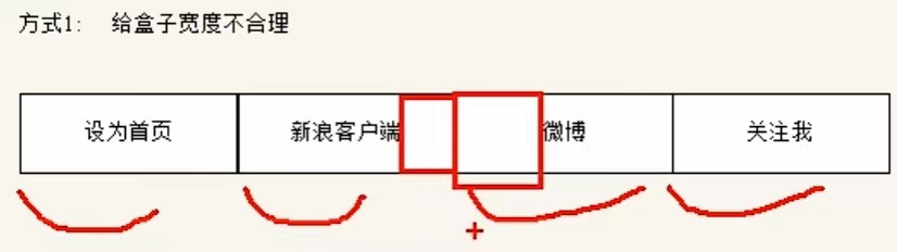<br />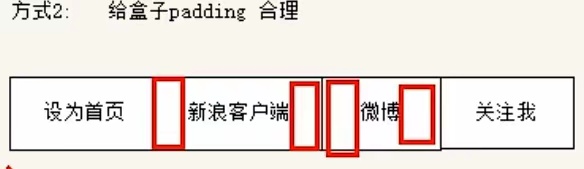
参照图片:新浪导航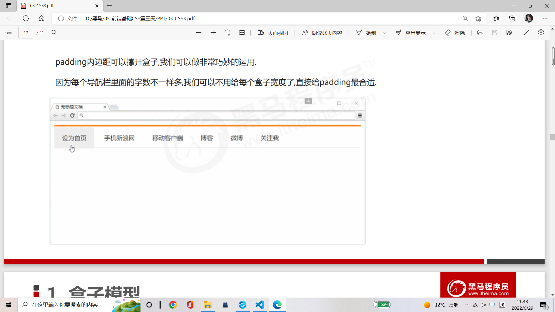<br />相关取值:
1. 上边框3px,颜色#ff8500
1. 下边框1px,颜色#edeef0
1. 盒子高度为41px,背景颜色#fcfcfc
1. 文字颜色#4c4c4c
```css
<!DOCTYPE html>
<html lang="en">
<head>
<meta charset="UTF-8">
<meta http-equiv="X-UA-Compatible" content="IE=edge">
<meta name="viewport" content="width=device-width, initial-scale=1.0">
<title>Document</title>
<style>
.nav a {
color: #4c4c4c;
font-size: 14px;
/* text-align: center; */
line-height: 45px;
text-decoration: none;
padding: 14px;
}
.nav {
height: 45px;
background-color: #fcfcfc;
border-top: 3px solid #ff8500;
border-bottom: 1px solid #edeef0;
}
a:hover {
background: rgba(0, 0, 0, .1);
}
</style>
</head>
<body>
<div class="nav">
<a href="#">设为首页</a>
<a href="#">手机新浪网</a>
<a href="#">移动客户端</a>
<a href="#">博客</a>
<a href="#">微博</a>
<a href="#">关注我</a>
</div>
</body>
</html>
<!DOCTYPE html>
<html lang="en">

<head>
    <meta charset="UTF-8">
    <meta http-equiv="X-UA-Compatible" content="IE=edge">
    <meta name="viewport" content="width=device-width, initial-scale=1.0">
    <title>Document</title>
    <style>
        .nav {
            /* height: 45px; */
            height: 41px;
            border-top: 3px solid #ff8500;
            border-bottom: 1px solid #edeef0;
            background-color: #fcfcfc;
            line-height: 41px;
        }

        .nav a {
            /* a属于行内元素 要设置高度就必须转换成 行内块元素 */
            display: inline-block;
            height: 41px;
            padding: 0 20px;
            color: #4c4c4c;
            /* font-size: 14px; */
            font-size: 12px;
            /* line-height: 45px; */
            text-decoration: none;
            /* padding: 14px; */
        }

        a:hover {
            /* background: rgba(0, 0, 0, .1); */
            background-color: #eee;
            color: #ff8500;
        }
    </style>
</head>

<body>
    <div class="nav">
        <a href="#">设为首页</a>
        <a href="#">手机新浪网</a>
        <a href="#">移动客户端</a>
        <a href="#">博客</a>
        <a href="#">微博</a>
        <a href="#">关注我</a>
    </div>
</body>

</html>
##案例:小米导航案例修改-padding影响盒子大小计算
padding内边距可以撑开盒子,也会让我们去修改宽度。
所以小米侧边栏这个案例,文字距离左侧的距离不应该用text-indent,这样不准确。
实际开发的做法是给padding值,这样更加准确。
<!DOCTYPE html>
<html lang="en">

<head>
    <meta charset="UTF-8">
    <meta http-equiv="X-UA-Compatible" content="IE=edge">
    <meta name="viewport" content="width=device-width, initial-scale=1.0">
    <title>Document</title>
    <style>
        a {
            /* 1.把a转换为块级元素 */
            display: block;
            /* width: 290px;   给了padding内边距之后需要在width宽度减掉padding的值 */
            width: 260px;
            height: 55px;
            background-color: #929695;
            font-size: 14px;
            color: white;
            /* tdn简写即可打出消除下划线的代码 */
            text-decoration: none;
            /* 后期学了盒子模型会通过内边距调整文字距起始的长度,现在用首行缩进两个字的方法 */
            /* text-indent: 2em; */
            padding-left: 30px;
            /* 单行文字垂直居中 使文字行高等于盒子的高度 */
            line-height: 55px;
        }

        /* 2.鼠标经过a链接变换背景颜色 */
        a:hover {
            background-color: #ff6700;
        }
    </style>
</head>

<body>
    <a href="#">手机</a>
    <a href="#">电视</a>
    <a href="#">笔记本 平板</a>
    <a href="#">出行 穿戴</a>
    <a href="#">耳机 音响</a>
    <a href="#">家电</a>
    <a href="#">智能 路由器</a>
    <a href="#">电源 配件</a>
    <a href="#">健康 儿童</a>
    <a href="#">生活 箱包</a>
</body>

</html>
1.7 外边距(margin)
margin属性用于设置外边距,即控制盒子和盒子之间的距离。
| 属性 | 作用 |
|---|---|
| margin-left | 左外边距 |
| margin-right | 右 |
| margin-top | 上 |
| margin-bottom | 下 |
<!DOCTYPE html>
<html lang="en">

<head>
    <meta charset="UTF-8">
    <meta http-equiv="X-UA-Compatible" content="IE=edge">
    <meta name="viewport" content="width=device-width, initial-scale=1.0">
    <title>Document</title>
    <style>
        div {
            width: 200px;
            height: 200px;
            background-color: pink;
        }

        /* .one {
            margin-bottom: 10px;
        } */
        .two {
            margin-top: 10px;
        }
    </style>
</head>

<body>
    <div class="one">1</div>
    <div class="two">2</div>
</body>

</html>
margin简写方式跟padding完全一致。
调试工具-Elements-Computed可以看到盒子属性图解。
#外边距典型应用
外边距可以让块级盒子水平居中,但是必须满足两个条件:
① 盒子必须指定了宽度width;
② 盒子左右的外边距都设置为auto。
语法:.header { width: 900px; margin: 0 auto; }
常见写法,以下三种都可:
- margin-left:auto;margin-right:auto;
- margin:auto;
- margin:0 auto; ```css <!DOCTYPE html>
注意:<br />以上方法是让块级元素水平居中,行内元素或者行内块元素水平居中给其父元素添加text-align:center即可。
```css
<!DOCTYPE html>
<html lang="en">

<head>
    <meta charset="UTF-8">
    <meta http-equiv="X-UA-Compatible" content="IE=edge">
    <meta name="viewport" content="width=device-width, initial-scale=1.0">
    <title>Document</title>
    <style>
        .header {
            width: 900px;
            height: 200px;
            background-color: pink;
            margin: 100px auto;
            /* 行内元素或者行内块元素水平居中给其父元素添加text-align: center即可 */
            text-align: center;
            line-height: 200px;
        }
    </style>
</head>

<body>
    <div class="header">
        <span>早安晚安</span>
    </div>
    <div class="header">
        <img src="down.jpg" alt="">
        <!-- img、input、td都是行内块元素 -->
    </div>
</body>

</html>
1.8 外边距合并
使用margin定义块元素的垂直外边距时,可能会出现外边距的合并。
1.8.1相邻块元素垂直外边距的合并
当上下相邻的两个块元素(兄弟关系)相遇时,如果上面的元素有下外边距margin-bottom,下面的元素有上外边距margin-top,则它们之间的垂直间距不是margin-bottom与margin-top之和。取两个值中的较大者这种现象被称为相邻块元素垂直外边距的合并。
解决方案:尽量只给一个盒子添加margin值
1.8.2 嵌套块元素垂直外边距的塌陷
对于两个嵌套关系(父子关系)的块元素,父元素上有外边距同时子元素上也有外边距,此时父元素会塌陷较大的外边距值。
解决方案:
① 可以为父元素定义上边框
② 可以为父元素定义上内边距
③ 可以为父元素添加overflow:hidden
还有其他方法,比如浮动、固定,绝对定位的盒子不会有塌陷问题,后期会学习总结。
<!DOCTYPE html>
<html lang="en">

<head>
    <meta charset="UTF-8">
    <meta http-equiv="X-UA-Compatible" content="IE=edge">
    <meta name="viewport" content="width=\, initial-scale=1.0">
    <title>Document</title>
    <style>
        .father {
            width: 400px;
            height: 400px;
            background-color: purple;
            margin-top: 50px;
            /* 为避免外边距合并,可以为父元素定义上边框 */
            /* border: 1px solid transparent; */
            /* 为避免外边距合并,可以为父元素定义上内边距 */
            /* padding: 1px; */
            /* 为避免外边距合并,可以为父元素添加overflow:hidden */
            overflow: hidden;
        }

        .son {
            width: 200px;
            height: 200px;
            background-color: pink;
            margin-top: 100px;
        }
    </style>
</head>

<body>
    <div class="father">
        <div class="son"></div>
    </div>
</body>

</html>
1.9 清除内外边距
网页元素很多都带有默认的内外边距,而且不同浏览器默认的也不一致。因此我们在布局前,首先要清除下网页元素的内外边距。
语法:
{
padding:0; /清除内边距/
margin:0; /清除外边距*/
}
<!DOCTYPE html>
<html lang="en">

<head>
    <meta charset="UTF-8">
    <meta http-equiv="X-UA-Compatible" content="IE=edge">
    <meta name="viewport" content="width=device-width, initial-scale=1.0">
    <title>Document</title>
    <!-- 这句话也是我们CSS的第一行代码 -->
    <style>
        * {
            margin: 0;
            padding: 0;
        }

        span {
            background-color: pink;
            margin: 20px;
            /* 在这里即便设置了margin上下左右都有外边距20px,但实际在浏览器中显示调试时只有左右外边距,没有上下外边距 */
            /* 所以行内元素为照顾兼容性,尽量只设置左右内外边距.但是转换为块级元素或行内块元素也可以设置上下内外边距 */
        }
    </style>
</head>

<body>
    123
    <ul>
        <li>abcd</li>
    </ul>
    <span>行内元素尽量只设置左右的内外边距</span>
</body>

</html>
注意:行内元素为了照顾兼容性,尽量只设置左右内外边距,不要设置上下内外边距。但是转换为块级和行内块元素就可以了。
二、PS基本操作
因为网页美工大部分效果图都是利用PS来做的,所以以后我们大部分切图工作都是在PS里面完成。

三、综合案例
案例1:产品模块
参照图片
用PS方形选区测量大小:
盒子:298*415px

<!DOCTYPE html>
<html lang="en">

<head>
    <meta charset="UTF-8">
    <meta http-equiv="X-UA-Compatible" content="IE=edge">
    <meta name="viewport" content="width=device-width, initial-scale=1.0">
    <title>Document</title>
    <style>
        * {
            margin: 0;
            padding: 0;
        }

        body {
            background-color: #f5f5f5;
        }

        a {
            color: #333;
            text-decoration: none;
        }

        .box {
            width: 298px;
            height: 415px;
            background-color: #fff;
            /* 让块级盒子水平居中 */
            margin: 100px auto;
        }

        .box img {
            /* width: 298px; */
            /* width: 100%  图片的宽度和父亲一样宽 */
            width: 100%;
        }

        .box p {
            height: 70px;
            font-size: 14px;
            /* 因为这个块级元素段落没有width属性,所以padding不会撑开盒子的宽度 */
            padding: 0 28px;
            margin-top: 30px;
        }

        .appraise {
            font-size: 12px;
            color: #b0b0b0;
            padding: 0 28px;
            margin-top: 20px;
        }

        .info {
            font-size: 14px;
            padding: 0 28px;
            margin-top: 15px;
        }

        .info h4 {
            display: inline-block;
            font-weight: 400;
        }

        .info span {
            color: #ff6700;
        }

        .info em {
            /* em是倾斜标签 */
            font-style: normal;
            color: #ebe4e0;
            margin: 0 6px 0 15px;
        }
    </style>
</head>

<body>
    <div class="box">
        <img src="images/img.jpg" alt="">
        <p class="review">快递牛,整体不错蓝牙可以说秒连,红米给力</p>
        <div class="appraise">来自于1997赵大宝的评价</div>
        <div class="info">
            <h4><a href="#">Redmi AirDots真无线蓝...</a></h4>
            <em>|</em>
            <span>99.9元</span>
        </div>
    </div>
</body>

</html>
pink老师总结
- 布局为啥用不同盒子,我只想用div?
- 标签都是有语义的,合理的地方用合理的标签。比如产品标题就用h,大量文字就用p。
- 为啥用辣么多类名?
- 类名就是给每个盒子起一个名字,可以更好地找到这个盒子,选取盒子更容易,后期维护也方便。
- 到底用margin还是padding?
- 大部分情况两个可以混用,两者各有优缺点,但是根据实际情况,总是有更简单的方法实现。
- 自己做没有思路?
- 布局有多种实现方式,可以开始先模仿pink的写法,然后再做出自己的风格。
案例2:快报模块


新知识点:去掉li前面的项目符号(小圆点)
语法:list-style:none;
<!DOCTYPE html>
<html lang="en">

<head>
    <meta charset="UTF-8">
    <meta http-equiv="X-UA-Compatible" content="IE=edge">
    <meta name="viewport" content="width=device-width, initial-scale=1.0">
    <title>Document</title>
    <style>
        * {
            margin: 0;
            padding: 0;
        }

        li {
            /* 去掉li前面的小圆点,基本整个页面都需要去掉,小破原点对咱木用! */
            list-style: none;
        }

        .box {
            width: 248px;
            height: 163px;
            border: 1px solid #ccc;
            margin: 100px auto;
        }

        .box h3 {
            font-size: 14px;
            color: #666;
            font-weight: 400;
            height: 32px;
            line-height: 32px;
            border-bottom: 1px dotted #ccc;
            /* 在这里不用外边距margin,因为外边距会推动整个h3的盒子,导致下边框也向右挪动。 */
            /* 因为没有给宽度,所以用左右padding内边距调距离,不会撑出盒子 */
            padding-left: 15px;
        }

        .box ul li a {
            font-size: 12px;
            color: #666;
            text-decoration: none;
        }

        .box ul li a:hover {
            text-decoration: underline;
        }

        .box ul li {
            height: 23px;
            line-height: 23px;
            /* 在这里padding和margin都可以,因为没有设置宽度,不用担心撑出盒子 */
            /* margin-left: 20px; */
            padding-left: 20px;
        }

        .box ul {
            padding-top: 6px;
            /* padding-left: 20px; */

        }
    </style>
</head>

<body>
    <div class="box">
        <h3>品优购快报</h3>
        <ul>
            <li><a href="#">【特惠】爆款耳机5折秒!</a></li>
            <li><a href="#">【特惠】母亲节,健康好礼低至5折!</a></li>
            <li><a href="#">【特惠】爆款耳机5折秒!</a></li>
            <li><a href="#">【特惠】9.9元洗100张照片!</a></li>
            <li><a href="#">【特惠】长虹智能空调立省1000</a></li>
        </ul>
    </div>
</body>

</html>
四、圆角边框(重点)
圆角边框、盒子阴影、文字阴影,都是CSS3新增 ,有兼容性问题,ie9以及ie9以上版本才支持,但是这三个属性
对我们页面整体布局并无影响。
在CSS3中,新增圆角边框样式,我们的盒子可以有圆角了。
border-radius属性用于设置元素的外边框圆角。
语法:border-radius:length;
radius半径(圆的半径)原理:(椭)圆与边框的交集形成圆角效果。
- 参数值可以为数值或百分比的形式
- 如果是正方形,想要设置为一个圆,把数值修改为高度或宽度的一半即可,或者直接写为50%
- 该属性是一个简写属性,可以跟四个值,分别代表左上角、右上角、右下角、左下角 顺时针
- 分开写:
- border-top-left-radius
- border-top-right-radius
- border-bottom-right-radius
- border-bottom-left-radius
- 兼容性ie9浏览器支持,但是不会影响页面布局,可以放心使用。 ```css <!DOCTYPE html>
<a name="cdDhh"></a>
### 五、盒子阴影(重点)
CSS3中新增了盒子阴影,我们可以使用box-shadow属性为盒子添加阴影。<br />语法:box-shadow:h-shadow  v-shadow  blur  spread  color inset;

| **值** | **属性** |
| --- | --- |
| h-shadow | 必需。水平阴影的位置。允许负值。 |
| v-shadow | 必需。垂直阴影的位置。允许负值。 |
| blur | 可选。模糊距离。 |
| spread | 可选。阴影的尺寸。 |
| color | 可选。阴影的颜色。请参阅CSS颜色值。 |
| inset | 可选。将外部阴影(outset)改为内部阴影。 |

```css
<!DOCTYPE html>
<html lang="en">

<head>
    <meta charset="UTF-8">
    <meta http-equiv="X-UA-Compatible" content="IE=edge">
    <meta name="viewport" content="width=device-width, initial-scale=1.0">
    <title>Document</title>
    <style>
        div {
            width: 200px;
            height: 200px;
            background-color: pink;
            margin: 100px auto;
            box-shadow: 10px 10px 10px -4px rgba(0, 0, 0, .3);
        }
    </style>
</head>

<body>
    <div></div>
</body>

</html>
注意:
- 默认的是外阴影(outset),但是不可以写这个单词,否则造成阴影无效。
- 盒子阴影不占用空间,不会影响其他盒子排列。 ```css <!DOCTYPE html>
六、文字阴影(了解)
在CSS3中,我们可以使用text-shadow属性将阴影应用于文本。
语法:text-shadow:h-shadow v-shadow blur color;
| 值 | 描述 |
|---|---|
| h-shadow | 必需。水平阴影的位置。允许负值。 |
| v-shadow | 必需。垂直阴影的位置。允许负值。 |
| blur | 可选。模糊的距离 |
| color | 可选。阴影的颜色。参阅CSS颜色值。 |

若有收获,就点个赞吧
0 人点赞


