- min-width 设置元素的最小宽度, 如果元素的宽度比这个值小,强制按照这个值显示
- min-height 设置元素的最小高度
- max-width 设置元素的最大宽度,如果元素的宽度比这个值还大,强制按照这个值显示
-
百分比的换算
小盒子px除 大盒子px 乘100
width:200px/1280px*100%字体图
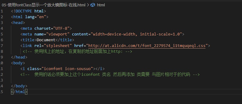
链接:http://www.iconfont.cn/
找到需要的图 加入购物车—点击添加项目—添加项目后点击Font class—点击生成代码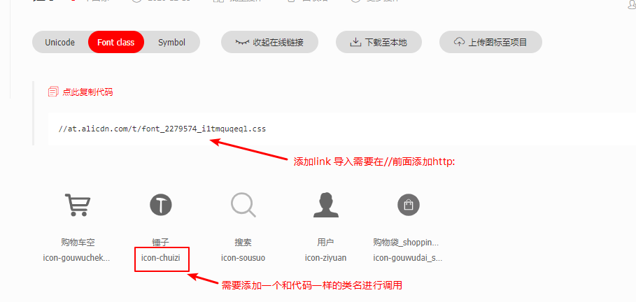
其他一些字体图标链接
icommon字体图标 http://www.iconfont.cn/
- Font-Awesome http://fortawesome.github.io/Font-Awesome/
favicon制作
https://tool.lu/favicon
点击选择照片
选中图片后
点击下载ico
下载好后 点击复制地址链接
导入
在href上粘贴复制图片地址链接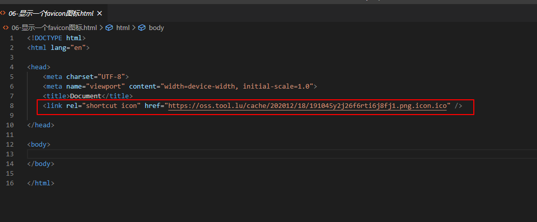
媒体查询(响应式布局)
是一种css语法,可以根据设备的不同(主要是屏幕的宽度不同),去加载对应的css代码
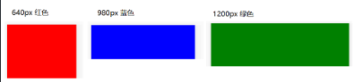
以下代码分别在 宽度为640px,980px,1200px的屏幕下显示的是不同的颜色!
- 在css中写入媒体查询代码
@media screen and (width:xxx)除了xxx之外,其他都是关键字 - 只有当屏幕的宽度满足 width:值 条件时,才会去加载里面的css代码
<!DOCTYPE html><html lang="en"><head><meta charset="UTF-8"><meta name="viewport" content="width=device-width, initial-scale=1.0"><meta http-equiv="X-UA-Compatible" content="ie=edge"><title>Document</title><style>/* 400px 的屏幕 */@media screen and (width: 640px) {body {background-color: red;}}/* 600px 的屏幕 */@media screen and (width: 980px) {body {background-color: blue;}}/* 800px 的屏幕 */@media screen and (width: 1200px) {body {background-color: green;}}</style></head><body></body></html>
注意:如果屏幕明明是640的宽,但是就是没有加载对应样式时,可以在页面头部设置如下代码
横屏与竖屏<head> ... <meta name="viewport" content="width=device-width, initial-scale=1.0,maximum-scale=1,minimum-scale=1,user-scalable=no"> ... </head>
(orientation:landscape) 横屏
(orientation:portrait) 竖屏@media screen and (orientation:landscape) { /*当屏幕是横屏时(宽度大于高度就是横屏),执行{}里面的样式代码*/ body { background-color: #000; }媒体类型
媒体类型可以理解为不同的设备,如 打印机,计算机的屏幕等。
可以加载不同的媒体类型,一般是 screen 使用得最多
- all 匹配所有的媒体类型 默认值
- screen 匹配 计算机显示器
print 匹配打印机设备
/* 匹配所有的媒体类型 */
  @media all and (width:800px) {
    body {
      background-color: red;
    }
  }
/*等价与上面的 @media all and (width:800px)*/
   @media (width:800px) {
    body {
      background-color: #000;
    }
  }

  /* 匹配屏幕 */
  @media screen and (width:800px){
    body {
      background-color: red;
    }
  }
媒体关键字
not 取反
- only 实现更好的兼容(使用较多)
- and 连接(使用较多)
or 或者 (使用
,表示)/* 取反 屏幕宽度不为800px的时候 被选中 */ @media not screen and (width:800px){ body{ background-color: red; } } /* only 更好的兼容 屏幕为800px的时候被选中 */ @media only screen and (width:800px){ body{ background-color: red; } } /* or 代码中体现为 逗号(,) 意思屏幕为800px或者600px的时候被选中 */ @media screen and (width:800px),screen and (width:600px) { body{ background-color: green; } }媒体查询引入方式
style标签里或者css文件中
<!-- 在style标签里或者在css文件里写媒体查询  -->
<style>
  @media screen and (width:800px) {
    body {
      background-color: red;
    }
  }
</style>
style标签上
<!-- 在style标签上通过属性的方式写媒体查询 -->
<style media="screen and (width:800px)">
  body {
    background-color: red;
  }
</style>
link标签上
  <link rel="stylesheet" media="screen and (max-width:600px)" href="./CSS/phone.css">
  <link rel="stylesheet" media="screen and (min-width:601px) and (max-width:900px)" href="./CSS/ipad.css">
  <link rel="stylesheet" media="screen and (min-width:901px)" href="./CSS/index.css">

若有收获,就点个赞吧
0 人点赞
