特点
- 近大远小
- 物体后面遮挡不可见
网页三维坐标系
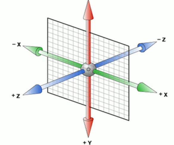
- x轴,水平向右 x右边是正值,左边是负值
- y轴,垂直向下 y下面是正值,上面是负值
- z轴,垂直屏幕 往外面是正值,往里面是负值
主要知识点
3D转换我们主要学习工作中最常用的 3D 位移 和 3D 旋转
- 3D 位移:translate3d(x,y,z)
- 3D 旋转:rotate3d(x,y,z)
- 透视:perspective
- 3D 呈现 transform-style
3D 移动 translate3d
- transform:translateX(100px):仅仅是在x轴上移动
- transform:translateY(100px):仅仅是在Y轴上移动
- transform:translateZ(100px):仅仅是在Z轴上移动(注意:translateZ 一般用px单位)
- transform:translate3d(x,y,z):其中 x、y、z 分别指要移动的轴的方向的距离
但是没有透视是看不出立体的效果的
透视 perspective
在2D平面产生近大远小视觉立体,但是只是效果二维的
- 若果想要在网页产生 3D 效果需要透视(理解成 3D 物体投影在 2D 平面内)。
- 模拟人类的视觉位置,可认为安排一只眼睛去看
- 透视,我们也称为视距:视距就是人的眼睛到屏幕的距离
- 距离视觉点越近的在电脑平面成像越大,越远成像越小
- 透视的单位是像素
注意:透视写到被观察元素的父盒子上面
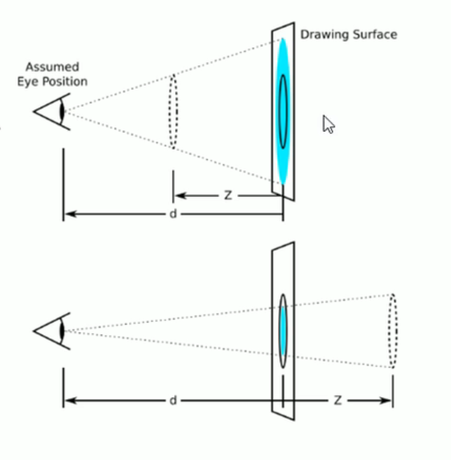
d :就是视距,视距就是-一个距离人的眼睛到屏幕的距离。
z :就是z轴,物体距离屏幕的距离, z轴越大(正值)我们看到的物体就越大。
例子
<!DOCTYPE html><html lang="en"><head><meta charset="UTF-8"><meta http-equiv="X-UA-Compatible" content="IE=edge"><meta name="viewport" content="width=device-width, initial-scale=1.0"><title>Document</title><style>body {perspective: 1000px;}div {width: 100px;height: 100px;background-color: blue;/* animation: name duration timing-function delay iteration-count direction fill-mode; */animation: move 5s linear 1s forwards;}@keyframes move {0% {}100% {transform: translate3d(400px, 400px, 400px);}}</style></head><body><div></div></body></html>
3D旋转 rotate3d
3D旋转指可以让元素在三维平面内沿着x轴, y轴, z轴或者自定义轴进行旋转。
语法:
- transform:rotateX(45deg) :沿着x轴正方向旋转45度
- transform:rotateY(45deg) : 沿着y轴正方向旋转45deg
- transform:rotateZ(45deg) : 沿着Z轴正方向旋转45deg
- transform:rotate3d(x,y,z,deg) :沿着自定义轴旋转deg为角度(了解即可) x,y,z 可以填1或0
对于元素旋转的方向的判断 我们需要先学习一个左手准则
左手准则
- 左手的手拇指指向x轴的正方向
- 其余手指的弯曲方向就是该元素沿着x轴旋转的方向

rotateX例子:
图:bin.jpg
transform: rotateX(360deg);
<!DOCTYPE html>
<html lang="en">

<head>
  <meta charset="UTF-8">
  <meta http-equiv="X-UA-Compatible" content="IE=edge">
  <meta name="viewport" content="width=device-width, initial-scale=1.0">
  <title>Document</title>

  <style>
    body {
      perspective: 300px;
    }

    img {
      display: block;
      width: 400px;
      margin: auto;
    }

    img:hover {
      animation: rotate 4s forwards;
    }

    @keyframes rotate {
      0% {}

      100% {
        transform: rotateX(360deg);
      }
    }
  </style>
</head>

<body>
  <img src="bin.jpg" alt="">
</body>

</html>
rotateY例子
transform: rotateY(360deg);
<!DOCTYPE html>
<html lang="en">

<head>
  <meta charset="UTF-8">
  <meta http-equiv="X-UA-Compatible" content="IE=edge">
  <meta name="viewport" content="width=device-width, initial-scale=1.0">
  <title>Document</title>

  <style>
    body {
      perspective: 300px;
    }

    img {
      display: block;
      width: 400px;
      margin: auto;
      transition: all 5s;
    }

    img:hover {
      transform: rotateY(360deg);
    }
  </style>
</head>

<body>
  <img src="bin.jpg" alt="">
</body>

</html>
rotateZ例子
transform: rotateZ(360deg);
<!DOCTYPE html>
<html lang="en">

<head>
  <meta charset="UTF-8">
  <meta http-equiv="X-UA-Compatible" content="IE=edge">
  <meta name="viewport" content="width=device-width, initial-scale=1.0">
  <title>Document</title>

  <style>
    body {
      perspective: 300px;
    }

    img {
      display: block;
      width: 400px;
      margin: auto;
      transition: all 5s;
    }

    img:hover {
      transform: rotateY(360deg);
    }
  </style>
</head>

<body>
  <img src="bin.jpg" alt="">
</body>

</html>
rotate3d例子
transform: rotate3d(1,1,1,360deg);
<!DOCTYPE html>
<html lang="en">

<head>
  <meta charset="UTF-8">
  <meta http-equiv="X-UA-Compatible" content="IE=edge">
  <meta name="viewport" content="width=device-width, initial-scale=1.0">
  <title>Document</title>

  <style>
    body {
      perspective: 300px;
    }

    img {
      display: block;
      width: 400px;
      margin: auto;
      transition: all 5s;
    }

    img:hover {
      transform: rotate3d(1,1,1,360deg);
    }
  </style>
</head>

<body>
  <img src="bin.jpg" alt="">
</body>

</html>
3D 呈现 transform-style 很重要
- 控制子元素是否开启三维立体环境。
- transform-style: flat子元素不开启3d立体空间默认的
- transform-style: preserve- 3d;子元素开启立体空间
- 代码写给父级,但是影响的是子盒子
- 这个属性很重要,后面必用
例子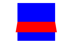
<!DOCTYPE html>
<html lang="en">

<head>
  <meta charset="UTF-8">
  <meta http-equiv="X-UA-Compatible" content="IE=edge">
  <meta name="viewport" content="width=device-width, initial-scale=1.0">
  <title>Document</title>

  <style>
    .box {
      position: relative;
      width: 100px;
      height: 100px;
      margin: 100px auto;
      perspective: 500px;
      transform-style: preserve-3d;
      /*
      perspective: 500px;
      transform-style: preserve-3d;
      别加给 body,浏览器不支持的
      不是说好transform-style: preserve-3d 要加给父级吗?
      为啥这里得加给本身
       */
      transition: all 2s;
    }

    .box div {
      position: absolute;
      top: 0;
      left: 0;
      width: 100%;
      height: 100%;
      background-color: blue;
      transition: all 5s;
    }

    .box:hover {
      transform: rotateY(60deg);
    }

    .box div:last-child {
      background-color: red;
      transform: rotateX(60deg);
    }
  </style>
</head>

<body>
  <div class="box">
    <div></div>
    <div></div>
  </div>
</body>

</html>
perspective 用在body里无效的问题 (很重要)
perspective: 500px; <br /> transform-style: preserve-3d;<br /> 别加给 body,浏览器不支持的<br /> 不是说好transform-style: preserve-3d 要加给父级吗?<br /> 为啥这里得加给本身<br />**后来我知道怎么解决这个问题:**<br />**可以在这个盒子外面再包一个盒子,给这个大盒子加perspective就OK了,比如下面的旋转木马的效果**
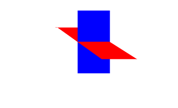
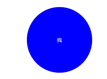
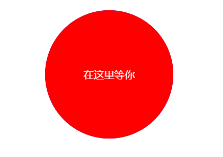
两面盒子翻转例子
<!DOCTYPE html>
<html lang="en">

<head>
  <meta charset="UTF-8">
  <meta http-equiv="X-UA-Compatible" content="IE=edge">
  <meta name="viewport" content="width=device-width, initial-scale=1.0">
  <title>Document</title>

  <style>
    .box {
      position: relative;
      width: 200px;
      height: 200px;
      margin: 200px auto;
      /* 让背面的红色盒子保留立体空间 */
      transform-style: preserve-3d;
      perspective: 500px;
      transition: all .4s;
    }

    .box:hover {
      transform: rotateY(180deg);
    }

    .box div {
      position: absolute;
      width: 100%;
      height: 100%;
      top: 0;
      left: 0;
      border-radius: 50%;
      color: #fff;
      line-height: 200px;
      text-align: center;
    }

    .front {
      background-color: blue;
      z-index: 1;
    }

    .back {
      background-color: red;
      transform: rotateY(180deg);
    }
  </style>
</head>

<body>
  <div class="box">
    <div class="front">我</div>
    <div class="back">在这里等你</div>
  </div>
</body>

</html>
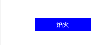
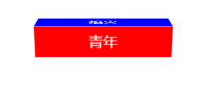
3D 导航栏
<!DOCTYPE html>
<html lang="en">

<head>
  <meta charset="UTF-8">
  <meta http-equiv="X-UA-Compatible" content="IE=edge">
  <meta name="viewport" content="width=device-width, initial-scale=1.0">
  <title>Document</title>

  <style>
    * {
      margin: 0;
      padding: 0;
    }

    ul {
      margin: 100px;
    }

    li {
      width: 150px;
      height: 35px;
      list-style: none;
      perspective: 500px;
    }

    .box {
      position: relative;
      width: 100%;
      height: 100%;
      transform-style: preserve-3d;
      transition: all 1s;
      color: #fff;
      line-height: 35px;
      text-align: center;
    }

    .box:hover {
      transform: rotateX(90deg);
    }

    .front,
    .bottom {
      position: absolute;
      width: 100%;
      height: 100%;
    }

    .front {
      background-color: blue;
      z-index: 1;
      transform: translateZ(17.5px);
    }

    .bottom {
      background-color: red;
      /* 如果有移动 或者其他样式,必须先写我们的移动   */
      transform: translateY(17.5px) rotateX(-90deg);
    }
  </style>
</head>

<body>
  <ul>
    <li>
      <div class="box">
        <div class="front">焰火</div>
        <div class="bottom">青年</div>
      </div>
    </li>
  </ul>
</body>

</html>
旋转木马
<!DOCTYPE html>
<html lang="en">

<head>
  <meta charset="UTF-8">
  <meta http-equiv="X-UA-Compatible" content="IE=edge">
  <meta name="viewport" content="width=device-width, initial-scale=1.0">
  <title>Document</title>

  <style>
    * {
      margin: 0;
      padding: 0;

    }

    /*
    body {
      perspective: 1000px;
      -webkit-perspective: 1000px;
    } */

    .bigBox {
      perspective: 1000px;
    }

    section {
      position: relative;
      width: 220px;
      height: 124px;
      margin: 100px auto;
      transform-style: preserve-3d;
      animation: rotate 5s linear infinite;
      background: url(image/seven.jpeg);
    }

    section div {
      position: absolute;
      top: 0;
      left: 0;
      width: 100%;
      height: 100%;

    }

    @keyframes rotate {
      0% {
        transform: rotateY(0);
      }

      100% {
        transform: rotateY(360deg);
      }
    }

    section div:nth-child(1) {
      transform: translateZ(220px);
      background: url(image/one.jpeg) no-repeat;
    }

    section div:nth-child(2) {
      transform: rotateY(60deg) translateZ(220px);
      background: url(image/two.jpg) no-repeat;
    }

    section div:nth-child(3) {
      transform: rotateY(120deg) translateZ(220px);
      background: url(image/three.jpeg) no-repeat;
    }

    section div:nth-child(4) {
      transform: rotateY(180deg) translateZ(220px);
      background: url(image/four.jpeg) no-repeat;
    }

    section div:nth-child(5) {
      transform: rotateY(240deg) translateZ(220px);
      background: url(image/five.jpeg) no-repeat;
    }

    section div:nth-child(6) {
      transform: rotateY(300deg) translateZ(220px);
      background: url(image/six.jpeg) no-repeat;
    }
  </style>
</head>

<body>
  <div class="bigBox">
    <section>
      <div></div>
      <div></div>
      <div></div>
      <div></div>
      <div></div>
      <div></div>
    </section>
  </div>
</body>

</html>

若有收获,就点个赞吧
0 人点赞
