github代码库:GitHub - OnionGF/CSS-in-js: css-in-js 代码库
集成在 css 代码 在 javaScript 文件中
目录:
- 为什么会有 CSS-IN-JS
- CSS-IN-JS 介绍
- Emotion 库
1、为什么会有 CSS-IN-JS
CSS-IN-JS 是 WEB 项目中 将 CSS 代码 捆绑在 JavaScript 代码中的解决方案
这种方案旨在解决 CSS 的局限性, 例如缺乏动态功能, 作用域和 可移植性
css 没有作用域的概念, css-in-js 利用js 的作用域 来模拟 css 的作用域
2、CSS-IN-JS 介绍
优点:
- 让 CSS 代码拥有独立的作用域,组织 css 代码泄漏到组件外部,防止样式冲突
- 让组件更具有可移植性,实现开箱即用,轻松创建松耦合的应用程序
- 让组件更具有可重用性,只需编写一次即可,可以在任何地方运行,不仅可以在用一个应用程序中重用组件,而且可以在使用相同框架构建的其他应用中重用组件
- 让样式具有动态功能,可以将复杂的逻辑应用于样式规则,如果要创建需要动态动能的复杂UI,他是理想的解决方案
缺点:
- 为项目增加了额外的复杂性
- 自动生成的选择器大大降低了代码的可读性
3、Emotion 库
3.1 Emotion 介绍
Emotion 是一个旨在使用JavaScript 编写的 CSS 样式的库npm install @emotion/core @emotion/styled
3.2 css 属性支持
1、jsx Pragma
通知babel,不再需要将 jsx 语法转换为 React.createElement 方法,而是需要转换为 jsx 方法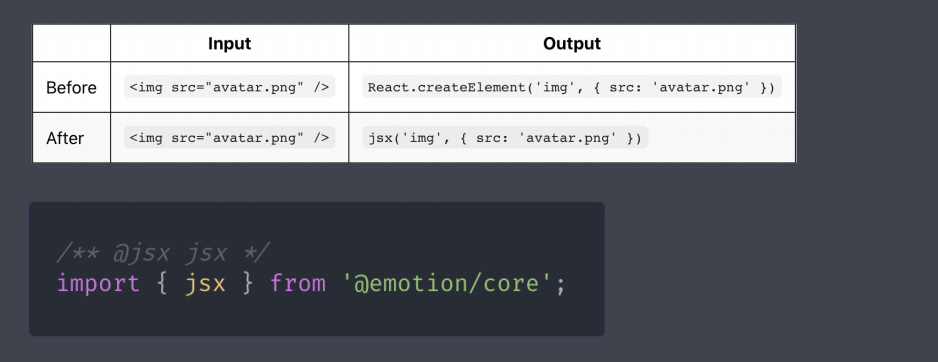
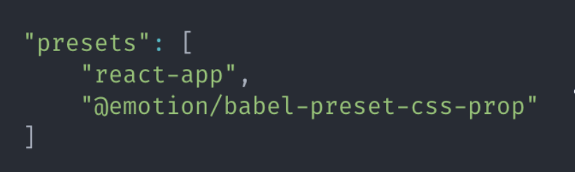
2、Babel Preset (推荐)
- npm run eject
- npm install @emotion/babel-preset-css-prop
- 在 package.json 文件中找到 babel 属性,加入以下内容
如果报错 尝试执行下面的命令解决:
npm install @mui/material @emotion/react @emotion/styled
3.3 css 方法
1、String Styles (推荐 更符合 写css 代码的习惯)
import { css } from '@emotion/core';const style = css`width: 100px;height: 100px;background: skyblue`<div css={style}>CSS-IN-JS</div>
2、Object Styles
import { css } from '@emotion/core';const style = css({width: 100;height: 100;background: 'skyblue'});<div css={style}>CSS-IN-JS</div>
3.4 css属性优先级
prop 对象中的css 属性优先级高于组件内部的 css 属性
在调用组件时可以再覆盖组件默认样式
import React from 'react';import { css } from '@emotion/core'const style = css`width: 100px;height: 200px;background: skyblue;`function Css(props) {return <div css={style} {...props}> css - in - js </div>}export default Css;
如上述代码所示, props 时外部调用组件时传进来的样式
当style 和 props 同时存在时, props 样式的优先级是高于style 样式的
3.5 Styled Components 样式化组件
样式化组件就是采用构建用户界面的, 是emotion 库提供的
另一种 为元素添加样式的方式
3.5.1、 创建样式化组件
import styled from ‘@emotion/styled’
1、String Styles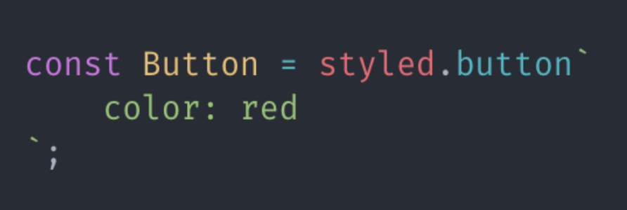
2、Object Styles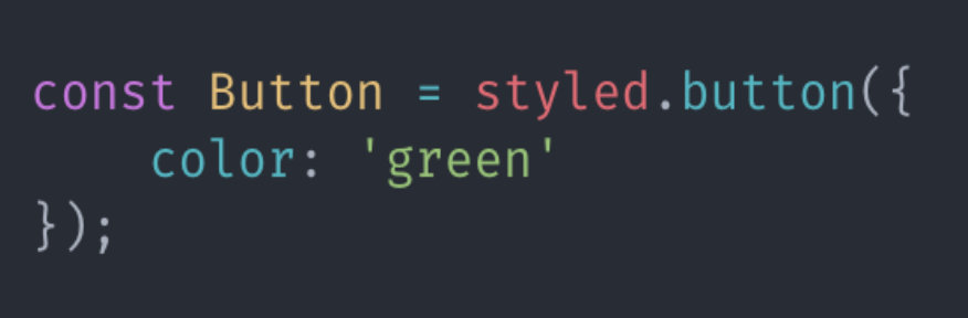
import styled from '@emotion/styled';const Button = styled.button`width: 100px;height: 50px;background: blue;`function App() {return (<div><Button>我是一个按钮</Button></div>);}export default App;
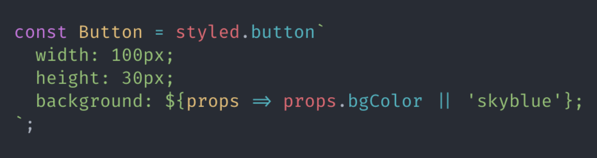
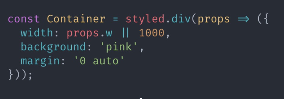
3.5.2、 根据 props 属性覆盖样式
1、String Styles
2、Object Styles
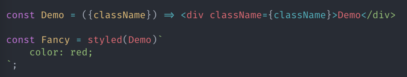
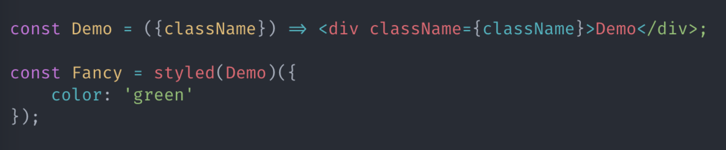
3.5.3、为任何组件添加样式
有一个Demo 组件 , 想在每次调用时, 为其传递不同的组件样式
1、String Styles
2、Object Styles
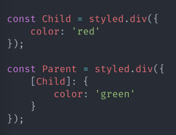
3.5.4、通过父组件设置子组件样式
Child 组件单独用的时候 文字是 红色
Child 组件 被 Parent 组件包裹的时候 文字是 绿色
1、String Styles
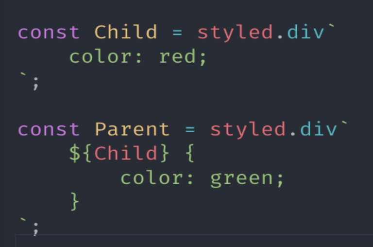
2、Object Styles
3.5.5、嵌套选择器 &
& 表示组件本身
如:
&:hover 鼠标滑过组件时
& > span 组件的子元素 span 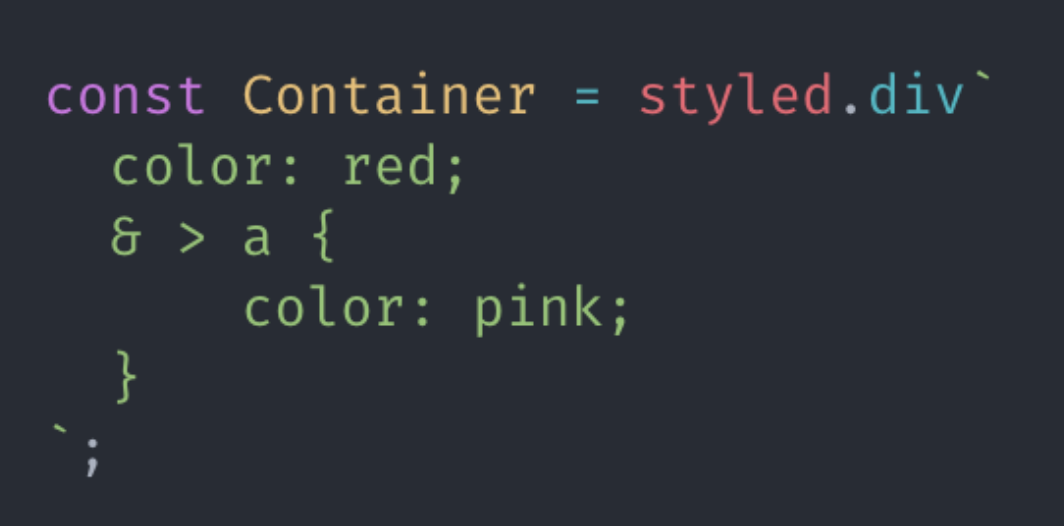
3.5.6 as 属性
要使用组件中的样式, 但要更改呈现的元素, 可以使用 as 属性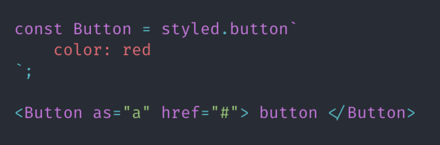
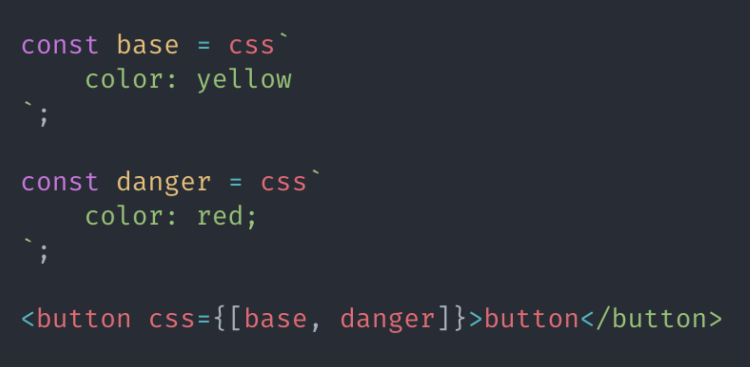
3.6 样式组合
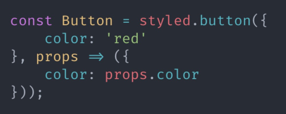
在样式组合中,后调用的样式优先级高于先调用的样式
import { css } from ‘@emotion/core’
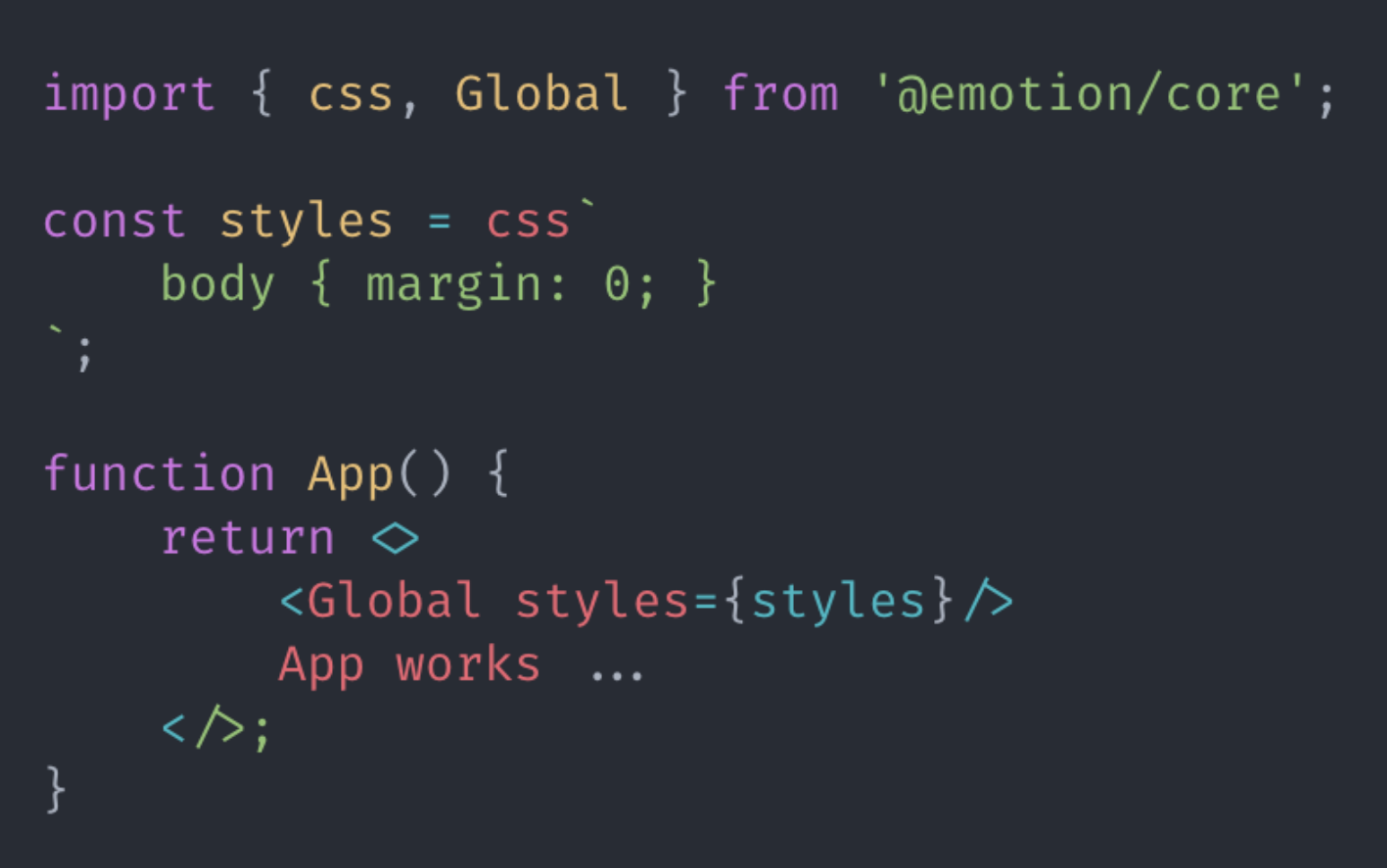
3.7 全局样式
3.8 关键帧动画
import { keyframes, css } from ‘@emotion/core’
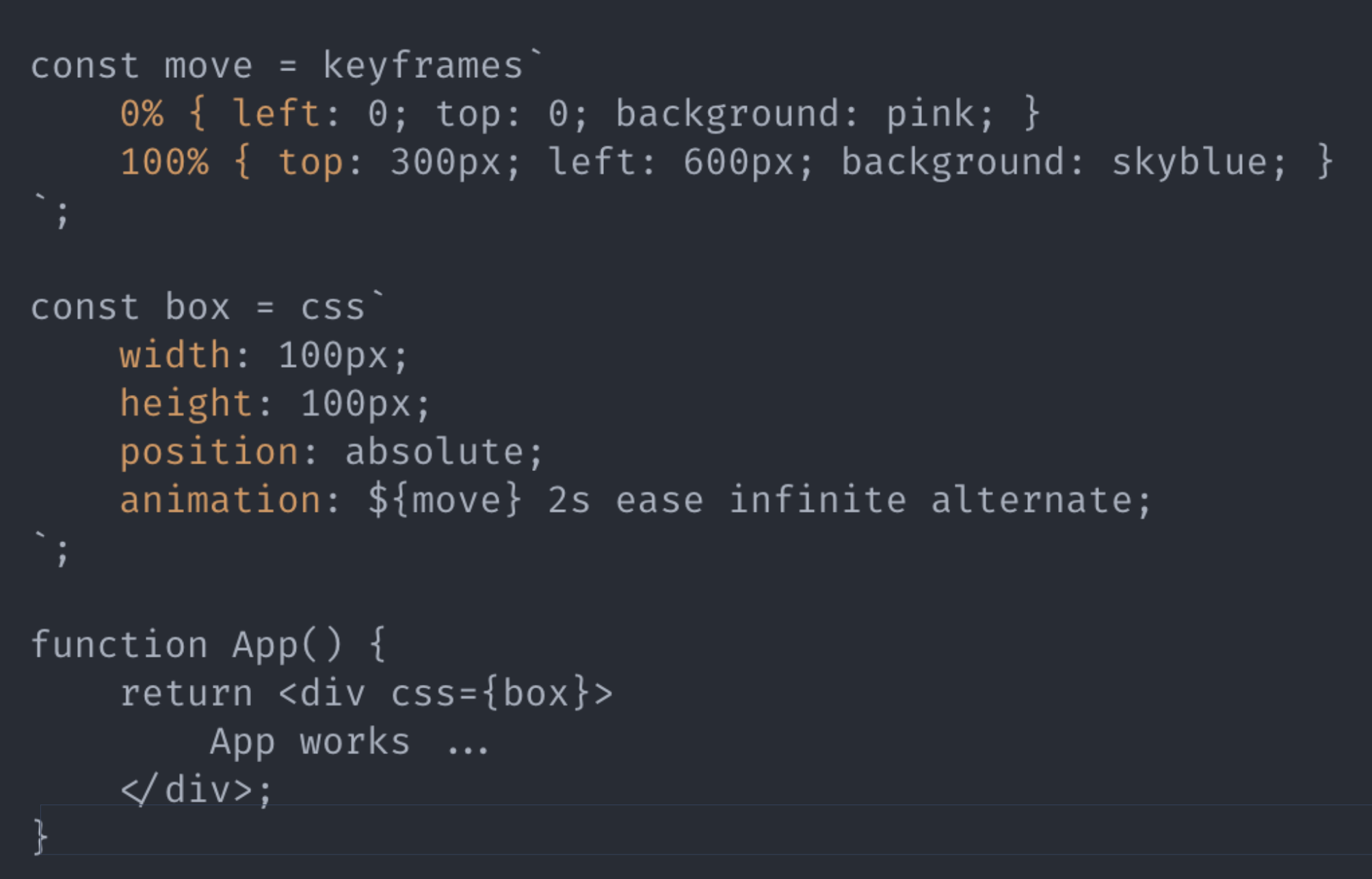
import { keyframes, css } from '@emotion/core'const move = keyframes`0% {left:0;top: 0;background: pink;}100% {top: 300px;left: 600px;background: skyblue;}`const box = css`width: 100px;height: 100px;position: absolute;animation: ${move} 4s ease infinite alternate;`function Box () {return <div css={box}>app move</div>}export default Box
3.9 主题
1、主题模块emotion-theming (该模块已经移动到@emotion/react)
npm install emotion-theming
2、引入 ThemeProvider 组件
import { ThemeProvider } from ‘@emotion/react’;
3、将 ThemeProvider 放置在视图最外层、添加主题内容
const root = ReactDOM.createRoot(document.getElementById('root'));const theme = {colors: {primary: 'tomato'}}root.render(<React.StrictMode><ThemeProvider theme={theme}><App /></ThemeProvider></React.StrictMode>);
4、获取主题内容
1、props 方式获取
const themeColor = props => css`color: ${props.colors.primary}`
2、钩子函数的方式获取
import { useTheme } from '@emotion/react';const theme = useTheme()const themeColor = props => css`color: ${theme.colors.primary}`

若有收获,就点个赞吧
0 人点赞
