组装
组合的思想始终贯穿在框架设计之中
**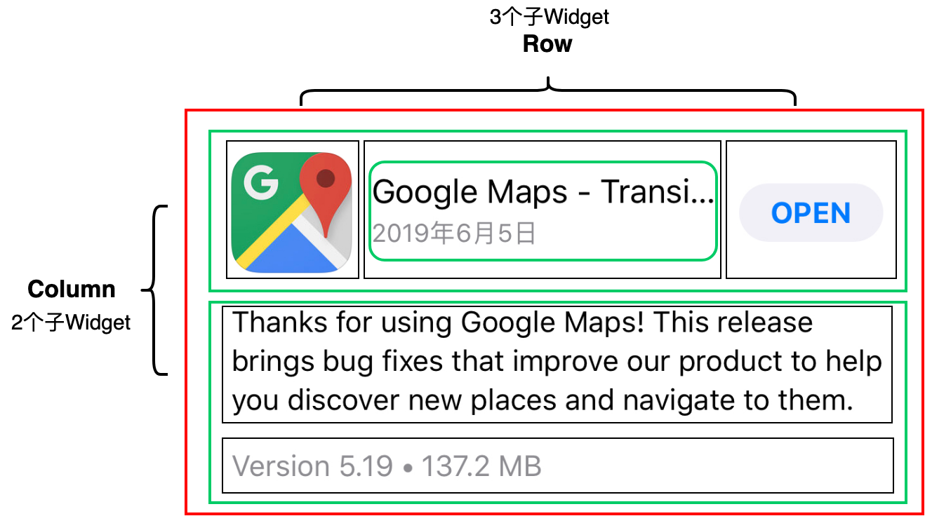
图 2 升级项 UI 整体结构示意图
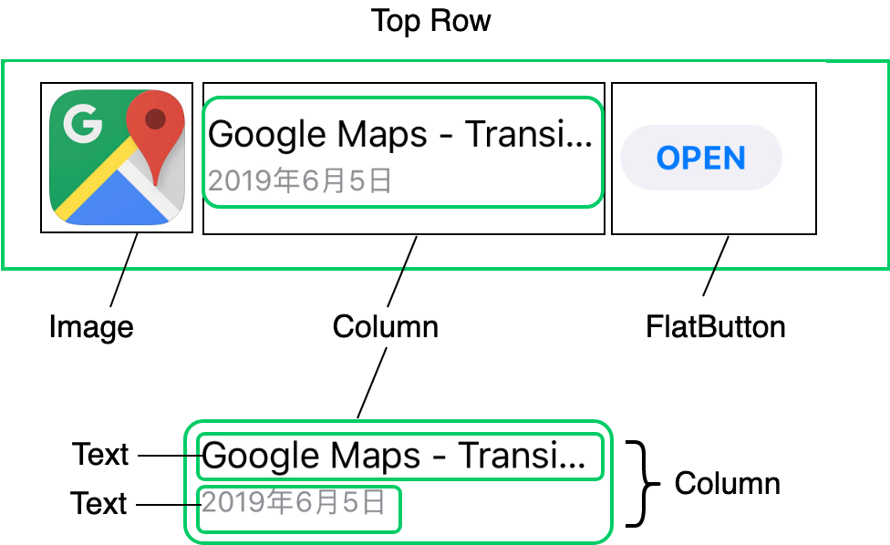
图 3 上半部分 UI 结构示意图
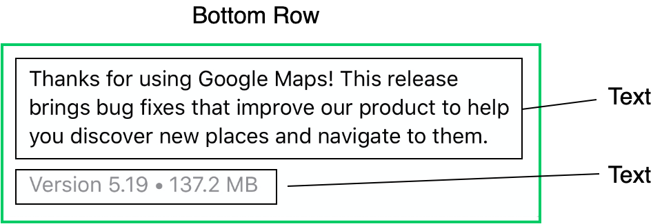
图 4 下半部分 UI 结构示意图
使用的控件:
- Row
Column
Padding
- Expanded
ClipRRect
Image
- FlatButton
- Text
自绘
在原生 iOS 和 Android 开发中,我们可以继承 UIView/View,在 drawRect/onDraw 方法里进行绘制操作。其实,在 Flutter 中也有类似的方案,那就是 CustomPaint。
CustomPaint 是用以承接自绘控件的容器,并不负责真正的绘制。既然是绘制,那就需要用到画布与画笔。
在 Flutter 中,画布是 Canvas,画笔则是 Paint,而画成什么样子,则由定义了绘制逻辑的 CustomPainter 来控制。将 CustomPainter 设置给容器 CustomPaint 的 painter 属性,我们就完成了一个自绘控件的封装。
在下面的代码中,我们继承了 CustomPainter,在定义了绘制逻辑的 paint 方法中,通过 Canvas 的 drawArc 方法,用 6 种不同颜色的画笔依次画了 6 个 1/6 圆弧,拼成了一张饼图。最后,我们使用 CustomPaint 容器,将 painter 进行封装,就完成了饼图控件 Cake 的定义。
class WheelPainter extends CustomPainter {// 设置画笔颜色Paint getColoredPaint(Color color) {//根据颜色返回不同的画笔Paint paint = Paint();//生成画笔paint.color = color;//设置画笔颜色return paint;}@overridevoid paint(Canvas canvas, Size size) {//绘制逻辑double wheelSize = min(size.width,size.height)/2;//饼图的尺寸double nbElem = 6;//分成6份double radius = (2 * pi) / nbElem;//1/6圆//包裹饼图这个圆形的矩形框Rect boundingRect = Rect.fromCircle(center: Offset(wheelSize, wheelSize), radius: wheelSize);// 每次画1/6个圆弧canvas.drawArc(boundingRect, 0, radius, true, getColoredPaint(Colors.orange));canvas.drawArc(boundingRect, radius, radius, true, getColoredPaint(Colors.black38));canvas.drawArc(boundingRect, radius * 2, radius, true, getColoredPaint(Colors.green));canvas.drawArc(boundingRect, radius * 3, radius, true, getColoredPaint(Colors.red));canvas.drawArc(boundingRect, radius * 4, radius, true, getColoredPaint(Colors.blue));canvas.drawArc(boundingRect, radius * 5, radius, true, getColoredPaint(Colors.pink));}// 判断是否需要重绘,这里我们简单的做下比较即可@overridebool shouldRepaint(CustomPainter oldDelegate) => oldDelegate != this;}//将饼图包装成一个新的控件class Cake extends StatelessWidget {@overrideWidget build(BuildContext context) {return CustomPaint(size: Size(200, 200),painter: WheelPainter(),);}}

若有收获,就点个赞吧
0 人点赞
