- Systemizing Perceptual Patterns
- Color
- START WITH THE PURPOSE
- COLLECT AND GROUP EXISTING COLORS
- DEFINE PATTERNS
- SPECIFY BUILDING BLOCKS
- Start Only with What You Need
- Make Sure Color Contrast Is Accessible
- AGREE ON THE GUIDING PRINCIPLES
- Animations
- PURPOSE AND FEEL
- AUDIT EXISTING ANIMATIONS
- DEFINE PATTERNS
- SPECIFY BUILDING BLOCKS
- AGREE ON THE GUIDING PRINCIPLES
- Voice And Tone
- AUDIT VOICE AND TONE PATTERNS
- DEFINE PATTERNS
- AGREE ON THE GUIDING PRINCIPLES
- Summary
Systemizing Perceptual Patterns
The exercise in this chapter describes how to define perceptual patterns and integrate them into the system.
Something grabbed my attention recently in the two
products I was using — the design of accordion con-
trols. In both interfaces the accordions looked similar
and had identical (standard) functionality: expanding and
collapsing sections of content. Both would be considered
“aesthetically pleasing” by most people. But somehow one
of them didn’t feel as robust as the other. The hover state
was too subtle, the transitions were a little slow, the selected
state didn’t stand out, and there didn’t seem to be enough
contrast between headings and body copy.
The design of the other accordion seemed to get all the details just right. Not only that, the same patterns — color, transitions, contrast, typography — were applied through- out the interface which helped to make it feel sturdy and well built. Even though the two products had similar utility, one of them gave a perception of quality and reliability, while the other came across flimsy and fragile.
Sometimes we think that if beauty is not what we’re after,
we don’t have to place any importance on aesthetics: “It’s
just a functional tool. It doesn’t have to feel like anything in
particular.” But then we miss a key opportunity to influence how a product is perceived. What’s important is, of course,
not the styles themselves but the _effect _they have. A func-
tional tool should be useful and usable, but it should also
_feel _simple, safe and robust.
<br />To influence perception in a reliable and scalable way, we
need to be aware of the patterns that create it.
Looking Beyond Style Properties
The most obvious way to think of color, typography, spacing
and other styles, is in terms of their properties: color values,
text sizes, measurement units.
Take color, for instance. In many pattern libraries it’s repre-
sented by a set of values.
Pivotal’s (http://smashed.by/pivotal) color variables demonstrate a common
approach to represent color information.
But even with a standardized color palette there’s still plenty
of scope for interpretation. What do the values represent?
Which variation of green should you use? How do the colors
work together?
Here’s a counterintuitive thought, for a design systems
enthusiast: slight diversions in color aren’t problematic.
In fact, having twenty shades of blue isn’t an issue, if blue has a consistent _meaning _throughout the interface. But if blue represents links in some parts of the site, and in others there are blue headings users can’t click, it can cause usabil- ity concerns. A set of shared colors is not enough — you also need a shared _use of color _in the context of the product.
Likewise, a well-defined typographic scale alone won’t make
your typography more cohesive. Even after we standardized
all the text sizes on FutureLearn and introduced a unified
type scale, the headings still weren’t always used consist-
ently — designers and developers weren’t sure which size
to pick from the scale. A shared use of typography required
clear guidelines and patterns of usage which everyone could
understand.
The typographic scale on FutureLearn provided a foundation for all typography.
How do we define the styles in a way that communicates their purpose and encourages their consistent use? As before, we’ll start at a higher level, and then go down into the details. With functional patterns we looked first at user behaviors. With perceptual patterns, we will start with aesthetic qualities.
Aesthetic Qualities And Signature Patterns
Every interface has a certain feel, even if it’s only repre- sented through text or voice. The most effective styles aren’t applied on the surface but evolve with the product — they will link to its ethos and core design principles (“Timeless, not cutting edge,” “Direction over choice”). Think how those qualities are embodied. What makes your product feel time- less, or utilitarian, or traditional, or cutting edge, or warm, or robust?
If the design has been around for a while, pinning down those patterns isn’t always easy. We’ve seen (with the FutureLearn examples in chapter 4) that as your product grows, its core aesthetic can change. By the time you look at the styles, you might notice that some of them are more effective than others and have stronger associations with your brand.
Signature patterns1 is a useful kick-off exercise to get the whole team (not only designers) on the same page, especially if they’re not used to thinking about perceptual patterns.
1 See chapter 4
Ask each person to write down the most memorable and distinct elements that make your product feel a certain way.
What are the styles and tones that first come to mind when people think about your product?
How do your users describe the aesthetic?
Are there any moments frequently recalled in user feed-
back (“That pink tick always makes me smile”)?
It’s also helpful to identify places where the design is off- brand; for example, “Small subtle animations, not quick bouncy ones.”
Think not only about the properties but also high-level
principles, combinations of different elements, and the
relationships between them. For instance, instead of simply
listing the colors, describe the proportions between them:
“Primarily white with pink and blue accents.” Include
examples of a typical representation of the pattern.
Here’s what your list might look like:
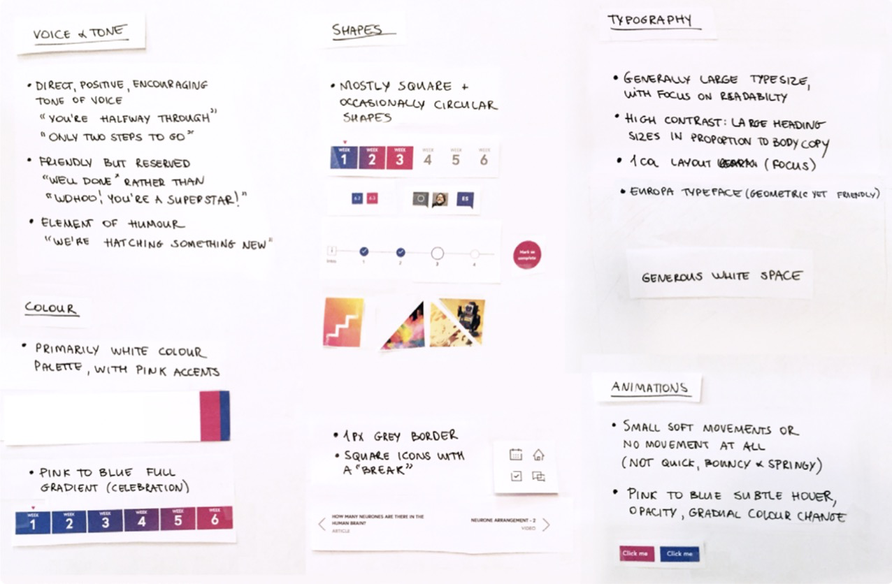
Notes from signature patterns exercise for FutureLearn.
I find that capturing signature patterns as a team can pro- vide guidance and inspiration for the whole process. When looking at shapes, say, if circles are a distinguishing feature in your interface, you might want to question why you use squares in some cases.
Identifying Perceptual Patterns
Drawing on the signature patterns exercise, you should
then make your own list of individual styles to work
through. Here are some of the types of things that may
appear in your list:
• color
• interactive states
• animations
• typography
• spacing
• iconography styles
• shapes and borders
• illustrations
• photography
• voice and tone
• sounds and audio cues
With each individual style you choose to focus on, there’s a
simple process to systemize them:
1. Start with the purpose.
- Collect and group existing elements.
- Define patterns and building blocks.
- Agree on the guiding principles.
You won’t be able to go through all of the styles in one go. Each one will need its own inventory (and possibly a sprint or longer to integrate the changes afterwards).
As you go through them, there will be overlaps: between typography and space, color and text, shapes and borders, borders and iconography. This is good, because you can build on the properties you’ve defined previously and you can see how they relate to each other. For example, the colors you define will be used in interactive states; inter- active states will be used in animations. When looking at typography and spacing, you can see how size of text affects spacing around it.
Color
The goal of the first step is to make the use of color more consistent. To do that we will start by listing _the roles _color plays in your interface.
START WITH THE PURPOSE
Wording is important. How we phrase a purpose shouldn’t
be vague and obvious. A statement like this, from the gov-
ernment of Canada’s Web Experience Toolkit,2 wouldn’t be
particularly helpful: “Use color as a presentation element
for either decorative purposes or to convey information.”
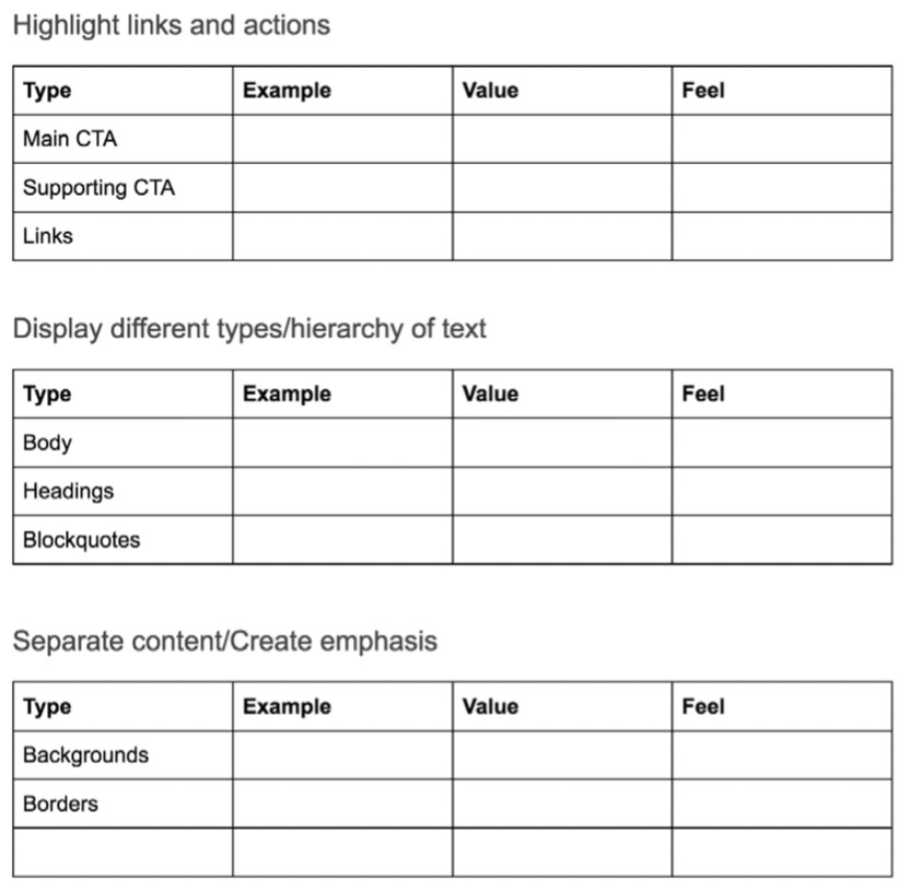
Be specific. For example, color can be used to:
Display different types and hierarchy of text (body, headings, blockquotes).
Highlight links and actions (main CTAs, supporting CTAs, links).
Draw attention to messages and differentiate between them (affirmation, warning).
Separate content or create emphasis (backgrounds, borders).
Differentiate between types of data (in charts, graphs).
The roles you define will determine the categories for your
inventory.
COLLECT AND GROUP EXISTING COLORS
Even though I prefer paper inventories because of their tangibility, it’s tricky to audit styles by cutting them out on paper. A Google doc3 can work better, and so can Keynote, PowerPoint or Sketch — whatever suits you.
3 http://smashed.by/coloraudit
<br />Set up a blank document with the categories. As you go
through the audit, you might adjust the headings or add
new ones, but it helps not to start with a blank page.
Example of initial categories for auditing colors in a Google doc
(http://smashed.by/coloraudit).
For each category add:
Type: Specify the type of object the color is applied to, such as a call to action, a heading, a feedback message, and so on.
Example: Add a screenshot of the element, to show where color is used.
Value: Specify the hex value.
Feel: If the purpose of the color is to create a certain
mood or feel, specify that.
You’ll end up with a list of color instances grouped by pur- pose. Here’s an example of an audit for links and buttons in the public library’s interface. In the same manner, I would collect and group text colors, feedback messages, back- grounds, borders, and so on.
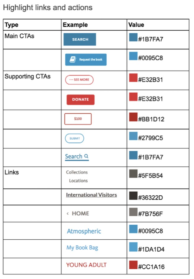
Audit of links and buttons, conducted in a Google doc.
Some colors will have a specific feel associated with them. In TED’s interface, black headers are used to create a more cinematic (and less informational) feel. On FutureLearn, a full blue to yellow gradient helps to create a celebratory mood when a learner completes a milestone.
Use of full gradient on FutureLearn for a milestone celebration.
If there are specific emotional qualities that color is meant to bring into your product, it’s important to capture that. Misuse can weaken the purpose colors were intended for. Using a full gradient in promotional modules on Future- Learn, for instance, would weaken its association with celebration.
DEFINE PATTERNS
Next, you can define patterns of usage based on the purpose
of color (and feel, if appropriate). When do you use blue
links and when gray? What is the meaning of red calls to
action? Why are some backgrounds gray and others brightly
colored? What is the difference between black and red
headings?
<br />Don’t worry about the exact hex values just yet. What mat-
ters is that you agree on the _use of color _across the interface. Here’s an example of how patterns could be defined for links and buttons.
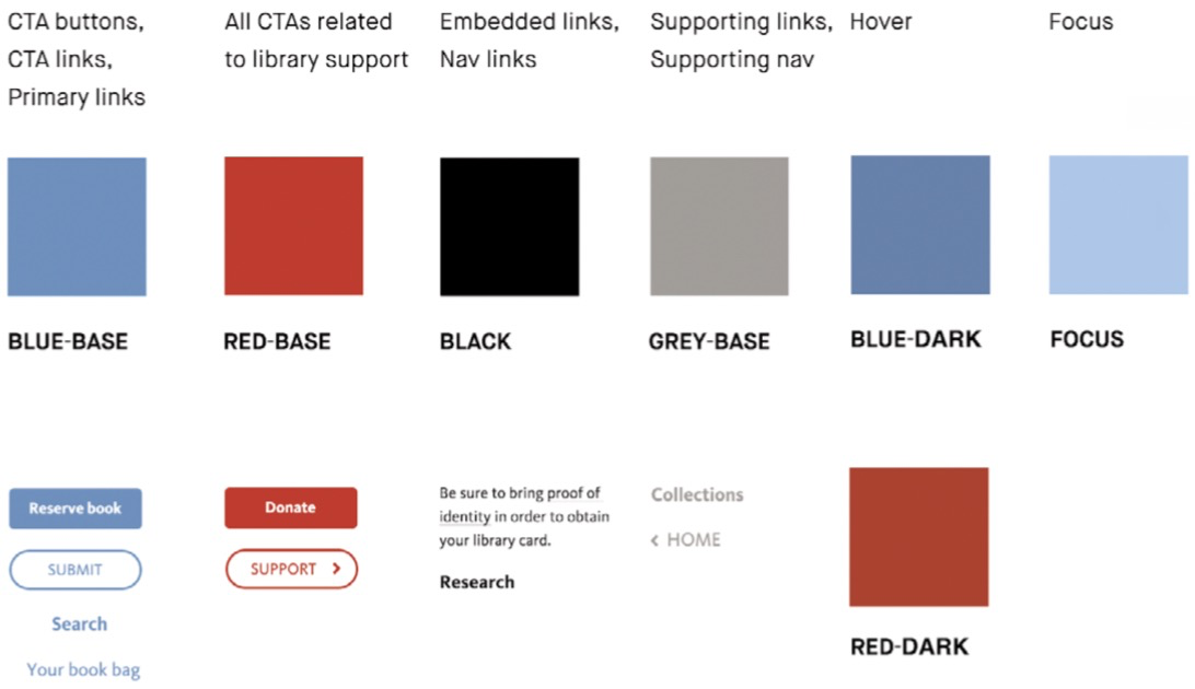
How color patterns for links and buttons could be defined for the library site.
_Purpose first _means that you’re sometimes changing the way color is used. For instance, when interactive elements are red, we’d expect all red elements to be interactive (like in the image above). But in the example on the following page, you can’t click the “Recommendations” heading to view recom- mendations. In this case we can consider changing the color of the heading to black or making the heading interactive.

A red heading on the library site
that is not interactive.
It’s important to note that these decisions can alter the over- all aesthetic of the site. We might decide that links and calls to action should be red instead of blue, but that could result in a more noticeable overall change — suddenly there would be many more red elements in proportion to blue.
In FutureLearn’s interface, we considered changing the square shapes used in the course progress module to circles, before we realised that the course navigation was a sig- nature pattern and replacing the shapes would alter the brand’s feel.
Understanding signature patterns can help you find the right balance between making improvements and making sure you don’t weaken or dilute the existing aesthetic. If your goal is to change the current design, it should be done prior to the systemizing exercise.
SPECIFY BUILDING BLOCKS
During a color inventory it’s not uncommon to discover doz- ens of variations of the same color (Marcin Treder discov- ered 62 shades of gray while doing the color inventory for UXPin4). Most of them are unnecessary and create needless complexities in design and code.
4 http://smashed.by/colorinventory
<br />The goal of this step is to make the color palette more
focused, precise and accessible. Typically this involves reducing the number of variables for each color.
Here are a few tips that can be helpful in this process.
Start Only with What You Need
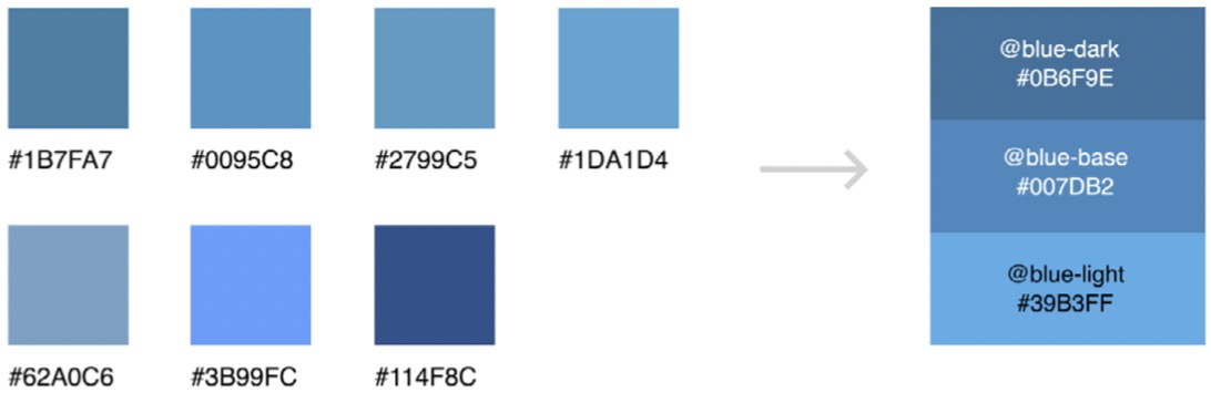
The advantage of a purpose-directed inventory is that it helps you guide and limit color choices. When you start with the role and meaning of color, you get an idea of how many options you really need. By considering where and how they’ll be used, you will know, for instance, that you only need three variations of blue.
The number of shades and tints will vary, depending on your circumstances. In FutureLearn’s interface, we purpose- fully avoided shades and tints (darker and lighter varieties of the same color) to keep the palette crisp. It helped us make the color system simple and focused.
On the other hand, UXPin, a prototyping tool, has light and dark modes, which means the color palette needs several shades of the same color to provide sufficient contrast in both settings.
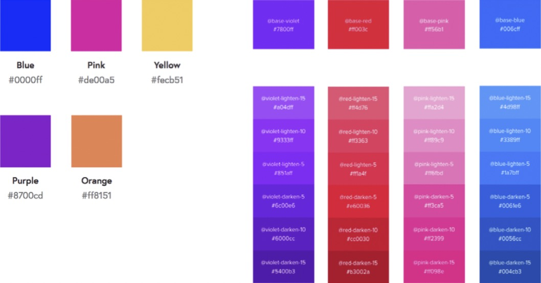
FutureLearn’s primary and secondary colors (left) and some of the UXPin colors
show how the need for color variation is different in different interfaces.
Sometimes you need to have more options, particularly if there are multiple themes, or if you’re dealing with data vis- ualization. But it’s important to avoid including the colors just to add more variety to your palette. The more choices there are, the more complex the system is, then the harder it is to achieve consistent use of color. Start with only what you need and build on it.
If you have more than two variations of the same color, it helps to specify a base value and then add additional shades and tints: 20% lighter than base, 20% darker than base, and so on. Base color values provide consistent defaults. When there are many options to consider, defaults and meaningful increments are easier to remember and work with. Spec- ifying the base color and increments also works for other perceptual patterns, such as typography (base font size), spacing (base measurement unit), and animations, as we will see later.
Make Sure Color Contrast Is Accessible
Test the color contrast between text and background.
Adjusting or removing the values as needed will limit your
palette. For example, among several variations of light
gray used for supporting links on the library site, one of
the frequently used values passes WCAG 2.0 standards.
This would make it an obvious choice for the default value
of supporting links.
There are plenty of tools to check color contrast, such as Lea
Verou’s Contrast Ratio,5 which is quick and straightforward
to use.
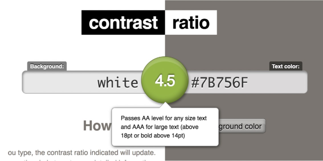
Lea Verou’s Contrast Ratio checker.
It’s worth mentioning that adjusting color values needs careful balancing within the overall aesthetic. Change the blue to a darker shade, for instance, and the whole interface can suddenly feel different, perhaps less vibrant. If your color palette was created without considering color accessi- bility in the first place, getting the balance right will require some finessing.6
5 http://smashed.by/contrastratio
6 In a project where color accessibility was a factor right from the
start, you wouldn’t end up with such widely different palettes.
You can introduce different accent colors for light and dark backgrounds, or change text on colored backgrounds from light to dark, or vice versa. There are also plenty of tools for generating contrast-compliant color combinations, or for finding accessible alternatives to the original color, such as Color Safe7 and Tanaguru8 Contrast Finder.9
AGREE ON THE GUIDING PRINCIPLES
Finally, agree on a few basic principles for color usage. Guid-
ing principles help you approach color holistically, and they
can be referred to when something doesn’t quite work. Some
principles can be general (such as “always use accessible color
contrast”); others will be more more specific to your brand
(and can be defined during the signature patterns exercise).
For example, in Sky’s toolkit10 the team explains the reasons
for a minimal color palette:
We allow our great content to be the color that brings the page to life. We do not color code our sites, or sections within our sites.”
7 http://colorsafe.co/
8 http://smashed.by/contrastfinder
9 For further reading on balance with aesthetics, I highly recommend
_Color Accessibility Workflows _by Geri Coady. http://smashed.by/colora11y
10 http://smashed.by/skytoolkit
The University of Oxford explains clearly how and why to use its colors:11
11 http://smashed.by/oxfordstyle
<br />_The (dark) Oxford blue is used primarily in general page furniture
such as the backgrounds on the header and footer. This makes for
a strong brand presence throughout the site. Because it features so
strongly in these areas, it is not recommended to use it in large areas
elsewhere. However it is used more sparingly in smaller elements
such as in event date icons and search/filtering bars.”
_
Animations
Even with more complex patterns, such as animations, we can follow the same process: start with the purpose, collect and group existing styles, define patterns and building blocks. Let’s take FutureLearn as an example this time.
PURPOSE AND FEEL
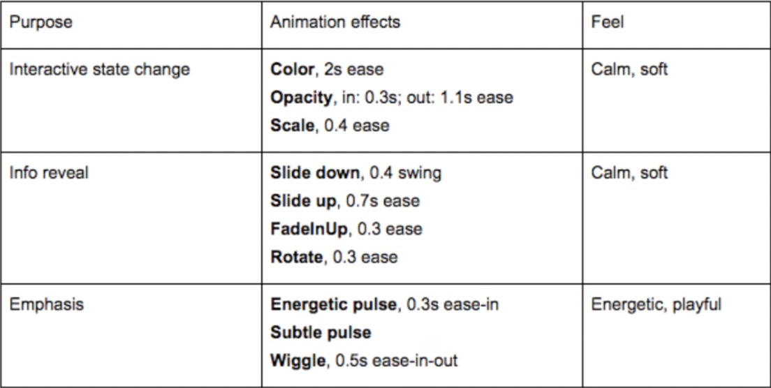
Specify the roles animation plays. For example:
_Soften transitions _between interactive states, such as hover states.
_Add emphasis _to specific information or an action; for example, a nudge to encourage users to progress to the next step.
Hide and reveal extra information, such as a menu being hidden to the side, a dropdown, or a popover.
The feel of the animation is another important aspect
to consider. In Designing Interface Animation,12 Val Head
explains how adjectives describing brand qualities can be
used for defining motion. A quick, soft, bouncy motion can
be perceived as lively and energetic, whereas steady ease-in-
outs feel certain and decisive.
To be meaningful and effective, animations should have a purposeful feel across the interface.
AUDIT EXISTING ANIMATIONS
Once you have an idea of the role animation plays in your interface, and how it should feel, the next step is to audit existing animations. Collect the animations and group them into categories, as we did with color earlier. The examples can be captured with QuickTime or another screen record- ing application.
12 http://smashed.by/designingia
The “State Change” page from FutureLearn’s animation audit, conducted in
a Google doc.
DEFINE PATTERNS
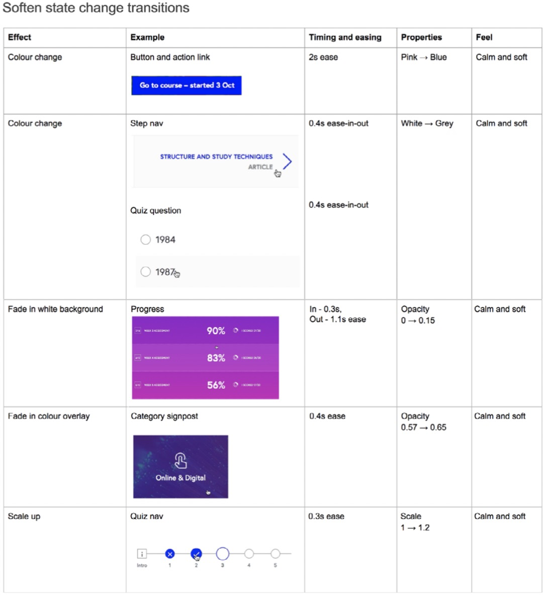
Define patterns of usage based on the purpose and feel. In FutureLearn’s interface we noticed that emphasis ani- mations typically feel more playful, and that state change transitions are more subtle and calm.
If these are the tones you want to strike throughout the system, try aligning all the animations to them. Like the signature patterns exercise, take the examples that work well (that is, achieve the purpose effectively and have the right feel) and try out their properties with other anima- tions from the same category. You’ll end up with a handful of patterns:
Animation patterns on FutureLearn, grouped by purpose and feel.
SPECIFY BUILDING BLOCKS
There are two important concepts in animation, which go hand in hand: timing and easing. Timing is how long an ani- mation takes. In combination with distance, it determines speed. Easing defines how something is animated: does it start out slow and build up speed (ease-in), or does it start out fast and gradually slow down (ease-out)? Additionally, we would define the properties that are being animated, such as color, opacity, scale, and so on.
Timing, especially, is crucial in animation. Getting the timing right is not so much about perfect technical consistency as making sure that the timing feels consistent. Two elements animated at the same speed can feel completely different if they are different sizes or travel different distances.
I like Sarah Drasner’s13 idea to deal with animation timing like we deal with headings in typography.14 Instead of just a single value, start with a base and provide several incre- mental steps. For example, if the base time is 0.5 seconds, smaller items that travel a shorter distance (such as an icon scaling up) would take less time. Items that travel longer distances (such as a menu popping up) would require more time. A full-screen transition would be one or two incre- ments above the base value.
13 http://sarahdrasnerdesign.com/
14 http://smashed.by/animationdesignsys
AGREE ON THE GUIDING PRINCIPLES
If your team is not yet confident with animation, it may be worth defining general principles, such as “Reserve anima- tion for the most important moments of the interaction,” and “Don’t let animation get in the way of completing a task.”
The most helpful principles are usually specific to how your team approaches animation. For example, the Salesforce Lightning Design System principles15 advise keeping the timing short and the motion subtle.
Guiding principles can also include spatial metaphors, which can provide a helpful mental model to animators. Google’s Material Design16 is a great example of how view- ing an interface as physical materials can provide a common reference for designers and developers when thinking about motion in their applications.17
15 http://smashed.by/salesforcemotion
16 http://smashed.by/materialmotion
17 Foramoredetailedoverviewoftheprocess,seemyarticle“Integrat-
ing Animation into a Design System”. (http://smashed.by/animationala)
Voice And Tone
Voice and tone in UI copy play a fundamental role in how a product is perceived. This is particularly the case in voice- based interfaces but also for people who experience digi- tal products through senses other than sight. In a recent conversation with Léonie Watson,18 an accessibility expert who is also a screen reader user owing to blindness, she noted that her experience of digital products “often comes through in the form of style of writing.”
However, team members who define the interactions and patterns are often not the same people who will be working on voice and tone. This can lead to a patchy and thought- less style of writing across the experience. To make sure voice and tone are expressed consistently and purposefully, design, brand and marketing teams need to coordinate their efforts when defining patterns.
AUDIT VOICE AND TONE PATTERNS
In addition to collecting all the UI copy in a Google doc, there are more creative ways to audit voice and tone. In her blog post,19 content strategist Ellen de Vries, shared how she “harvested” the language patterns during Clearleft’s20 voice and tone refresh: from phrases people use in meetings and pitch presentations, to informal conversations with the founders. They even made a mood board to see how lan- guage and imagery work together across Clearleft’s website.
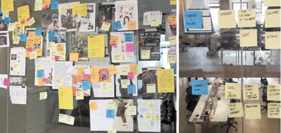<br />_Inventory of voice and tone patterns for Clearleft.
_
<br />18 https://tink.uk/<br />
19 “Takeacloserlookatthepatternsinourlanguage”byEllendeVries.
(http://smashed.by/voicetoneinventory)
20 https://clearleft.com/
DEFINE PATTERNS
Once the copy and other materials have been gathered,
define the patterns and formulate guidelines for how they
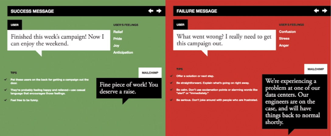
can be applied in the interface. MailChimp’s Voice & Tone21
is one of the most effective examples of how language
patterns can be defined. The tone shifts to respond to the
emotional condition of the user: when it’s appropriate to
be humorous and lighthearted (“Fine piece of work”), and
when the copy needs to take a serious practical tone (“We’re
expecting a problem at one of our data centers”).
Similarly, Salesforce gives a breakdown of common use cases and suggests patterns of copy to use with each one. The goal of the message affects the emotional tone, such as “suggest a solution using lighthearted language”.
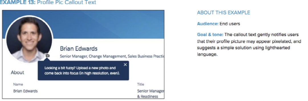
Example of voice and tone patterns in Salesforce voice and tone guidelines
AGREE ON THE GUIDING PRINCIPLES
Like the overarching design principles (see chapter 2), guid- ing principles for individual styles shouldn’t be vague and general. Not only does Intuit’s Harmony22 list the voice and tone principles (“Lead the way,” “Keep it simple,” “Have fun”), it also explains how to do all those things.
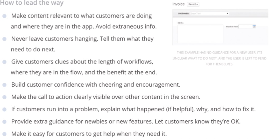
Intuit’s voice and tone guidelines explain how to apply the principles.
Summary
Each style should be approached as a system in its own right
— typography system, layout system, color system, and so
on. They should be interconnected and directed towards
achieving a larger purpose: to help shape how a product is
perceived.
To do that, look at the big picture first. Capture the aes-
thetic qualities as a whole and identify the patterns that are
particularly effective at expressing it. Then you can follow
a similar process for all the styles: start with the key roles
a style has in the context of your product, audit existing
instances, and then define patterns and building blocks. The
guiding principles help to connect everything together and
link it back to the purpose.
Let’s now look at pattern libraries as a tool for documenting
and sharing the patterns.

若有收获,就点个赞吧
0 人点赞
