- 模式库
- Content
- Organization Of Patterns
- ABSTRACTING PERCEPTUAL PATTERNS
- ORGANIZING FUNCTIONAL PATTERNS
- Alphabetical
- Hierarchical
- By Purpose or Structure
- Pattern Documentation
- DOCUMENTING FUNCTIONAL PATTERNS
- Name
- Purpose
- Example
- Variants
- Cross-Reference Styles
- Show Relationships between the Elements
- Workflow
- PROCESS FOR ADDING NEW PATTERNS
- CRITERIA FOR ADDING NEW PATTERNS
- PEOPLE AND RESPONSIBILITIES
- ALIGNING FACETS OF THE SYSTEM
- Tools
- KEEPING THE PATTERN LIBRARY UP TO DATE
- KEEPING MASTER DESIGN FILES UP TO DATE
- The Future Of Pattern Libraries
- Further Reading and Resources
- Other Resources
模式库
In this chapter we’ll look at some practical techniques to set up foun- dations for a long-lasting and multidisciplinary pattern library.
For some teams, a systematic approach to designing
and building digital products is almost unthinkable
without a pattern library. But as we’ve discussed
throughout the book, a pattern library is not the system
itself, it is a _tool _for documenting and sharing design pat-
terns. To be effective, it needs a system foundation at its
root. In chapter 7 we looked at some of the general strate-
gies for establishing such foundation:
Agree on the main goals and objectives, related to both the interfaces and how the teams operate, such as “Define and standardize reusable design pat- terns,” “Define guiding design principles,” “Establish a pattern library.”
Break up objectives into manageable stories and create a simple roadmap for your system.
Make your progress transparent by documenting and sharing it. For many teams, making their pat- tern library public made a huge difference to their progress and the team’s confidence in the work they were doing.
Create a culture of knowledge sharing by making the design language visible and accessible to the whole team.
Practice thinking in systems through experiments, workshops and group exercises.
In the experience of every team I spoke to, multidisciplinary
pattern libraries are more resilient and enduring. They facil-
itate a shared language across the organization and bring
value to everyone. Conversely, a pattern library built to serve
the needs of one discipline is more fragile.1
The technical complexity of Sipgate’s first pattern library
prevented designers being fully involved. Without the
knowledge of what patterns existed in the system, they
would sometimes create a page from scratch in Photoshop,
where existing patterns could be used.
It was often left to developers to fit the design with the existing pat-
terns, who had to tweak them until they fit. This led to numerous
if-statements, exceptions and duplicate patterns.
— Mathias Wegener, front-end developer, Sipgate
1 There are many other types of design documentation, such as brand
identity documents, front-end style guides for clients, and so on. In
this chapter we’re only talking about pattern libraries created by in-
house teams to support a design system.
<br />
Even though developers were determined to make a pattern library comprehensive and up to date, it was impossible without designers’ active involvement.
Similarly, patterns designed without the content disci- pline’s perspective can fall apart in everyday use. We end up designing patterns that are too closely tied to specific content, such as a module where an extra line of copy would push an important call to action below the visible area. Or we force content into patterns that aren’t designed for it, compromising both content and design.
In this chapter we’ll focus on establishing foundations for a pattern library that can support the goals of multiple disciplines.
Content
Looking back, at FutureLearn we spent far too much time researching tools and working out what the pattern library should look like. There wasn’t full agreement on how it should be designed and built, and the work progressed slowly. Switching our focus to the _content _of the library made a big difference — both to our progress, and the team’s morale.
Going through the process described in the previous two chapters will give you a good grasp of what can go into your pattern library. It can be documented simply, using Google Docs or another collaborative writing app. There are two main benefits of this:
First, everyone on the team can access the content to review, make edits and provide their feedback. By using a tool that’s familiar and easily accessible, you give more people an opportunity to be involved.
Second, a folder in Google Docs is like an MVP pattern library — the team can start using at as a reference right away. Once you have the content, it will be easier to figure out how the website for it should be designed and built.
Here’s how Andrew Couldwell at WeWork2 captured some
of the patterns for the Plasma design system3 using Google
Docs:
2 https://www.wework.com/
3 http://smashed.by/plasmads
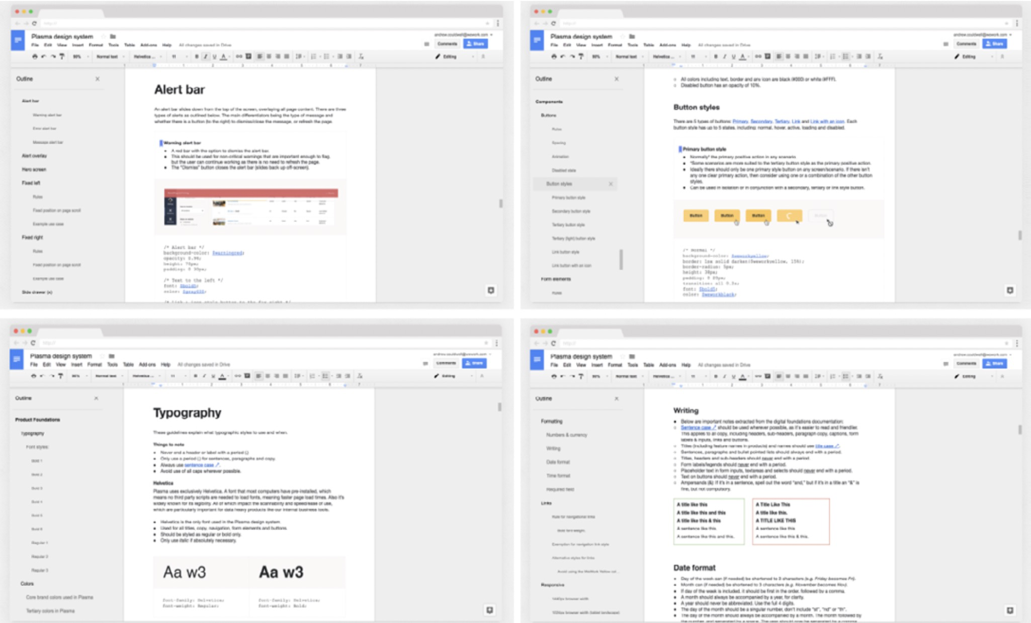
<br />_Documenting patterns in Google Docs for the Plasma design system.__3_<br /><br />The team was able to get down all the core patterns and
their definitions quickly, instead of being held back by build and design constraints.
Organization Of Patterns
When documenting the content, the question will likely arise of how the patterns should be organized. The naviga- tional structure is one of the things teams tend to struggle to agree on. Should buttons be separate or grouped with form elements? Where does the footer go? Should pagina- tion be part of the navigation section?
The structure doesn’t have to be perfect at the start — you can (and probably will) change it later. What’s importantis that the team are on the same page. Having a common methodology to organizing patterns will make it easier to add and find things as your pattern library grows. The same thinking can apply not only to the pattern library, but front- end architecture and the design files.
Let’s take a look at some of the common approaches.
ABSTRACTING PERCEPTUAL PATTERNS
The simplest way to think about the structure is in terms of
components and styles (functional and perceptual patterns).
As we saw in the previous chapter, perceptual patterns are
connected and work together. Abstracting them makes it
easier to be aware of their role in the system. Here are a few
examples of how perceptual and functional patterns are
referred to.
| Pattern | Functional patterns | Pperceptual patterns |
|---|---|---|
| Airbnb DLS | Components | Foundation |
| Atlassian | Components | Foundation |
| BBC GEL | Design patterns | Foundation |
| IBM Carbon | Components | Style |
| Lonely Planet Rizzo | UI components | Design elements |
| Marvel | Components | Design |
| Office Fabric | Components | Styles |
| Salesforce Lightning Design System | Components | Design tokens |
| Shopify Polaris | Components | Visuals |
There seems to be a general consensus to refer to functional patterns as “com- ponents,” but more diversity in terminology used for perceptual patterns.
ORGANIZING FUNCTIONAL PATTERNS
While the number of styles is limited, the list of functional patterns can keep growing. The findability of modules is one of the greatest barriers to pattern library adoption. If team members don’t know that a pattern exists or can’t find what they need, they are likely to create a new one or go outside the pattern system.
Teams organize modules alphabetically, hierarchically, by type (navigation, form elements, and so on), by purpose, or in entirely different ways.
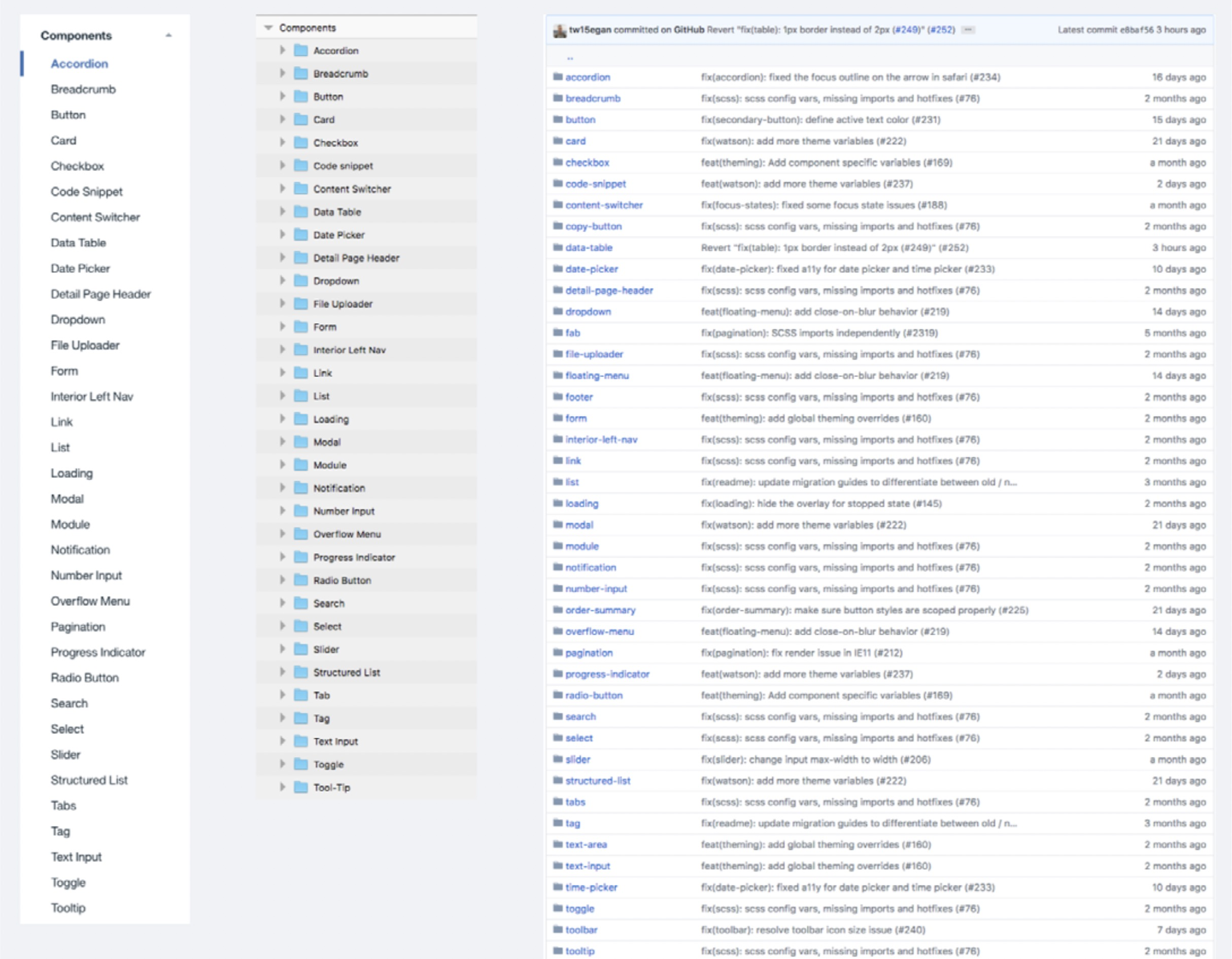
Alphabetical
In IBM’s Carbon design system, Sky Toolkit and Lonely Planet’s Rizzo (among others) components are kept in one list and arranged alphabetically.
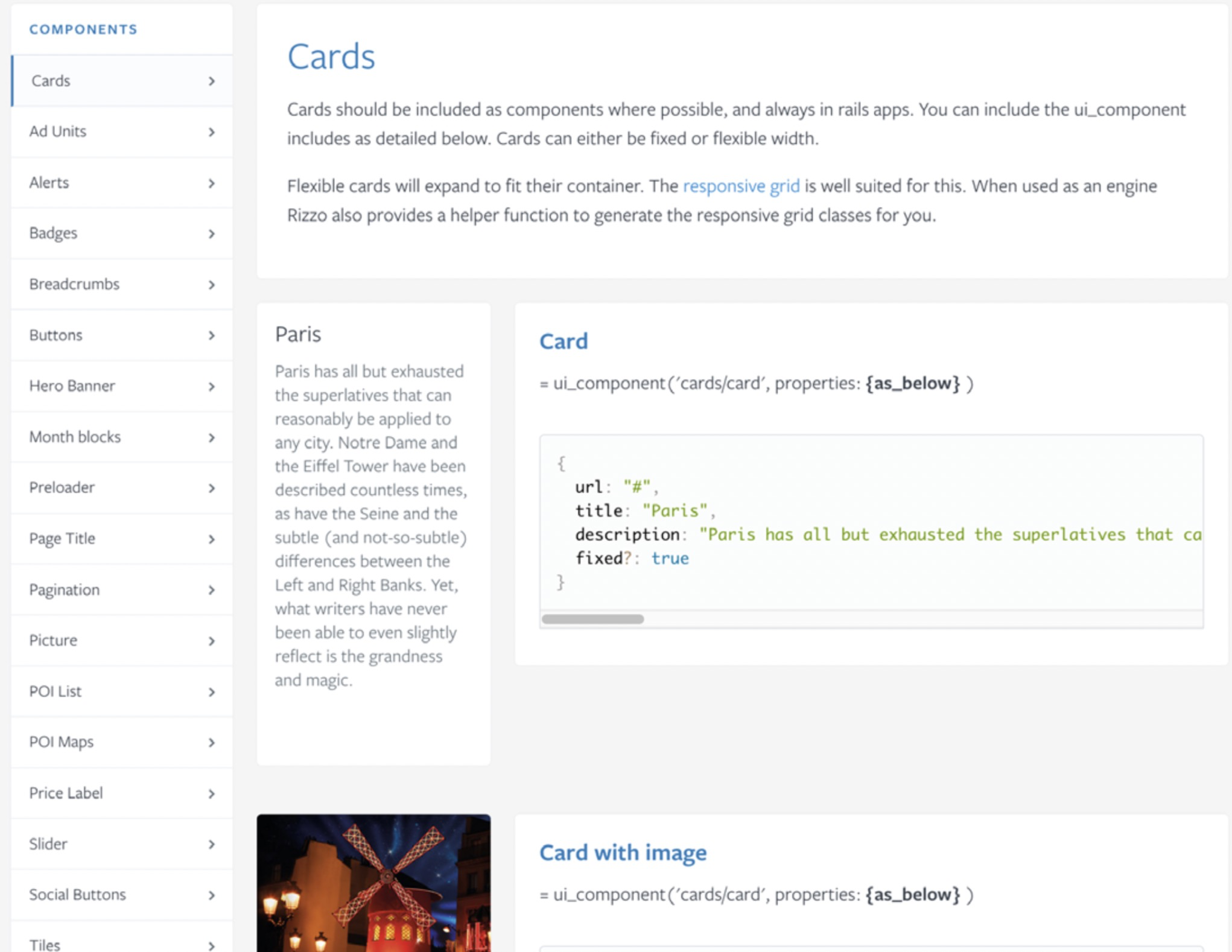
<br />_Most components are arranged alphabetically in Lonely Planet’s Rizzo__4
_(although navigation and form elements are in separate groups).
A single list makes decision-making easier — it avoids the debates about how things should be categorized. If the list grows and becomes unmanageable, teams start exper- imenting with other options to make components more discoverable.
Hierarchical
Another way to classify functional patterns is in terms of their complexity. Some teams separate granular elements from more complex ones. The levels of granularity vary in number and perceived complexity.
Atomic design,5 pioneered by Brad Frost, is a popular example of hierarchical categorization. Atoms are the basic building blocks, which combine to create more complex standalone elements: molecules. For example, a form label, input and button combine into a search form. Molecules join together into organisms (such as a site header), and organisms into templates and pages.
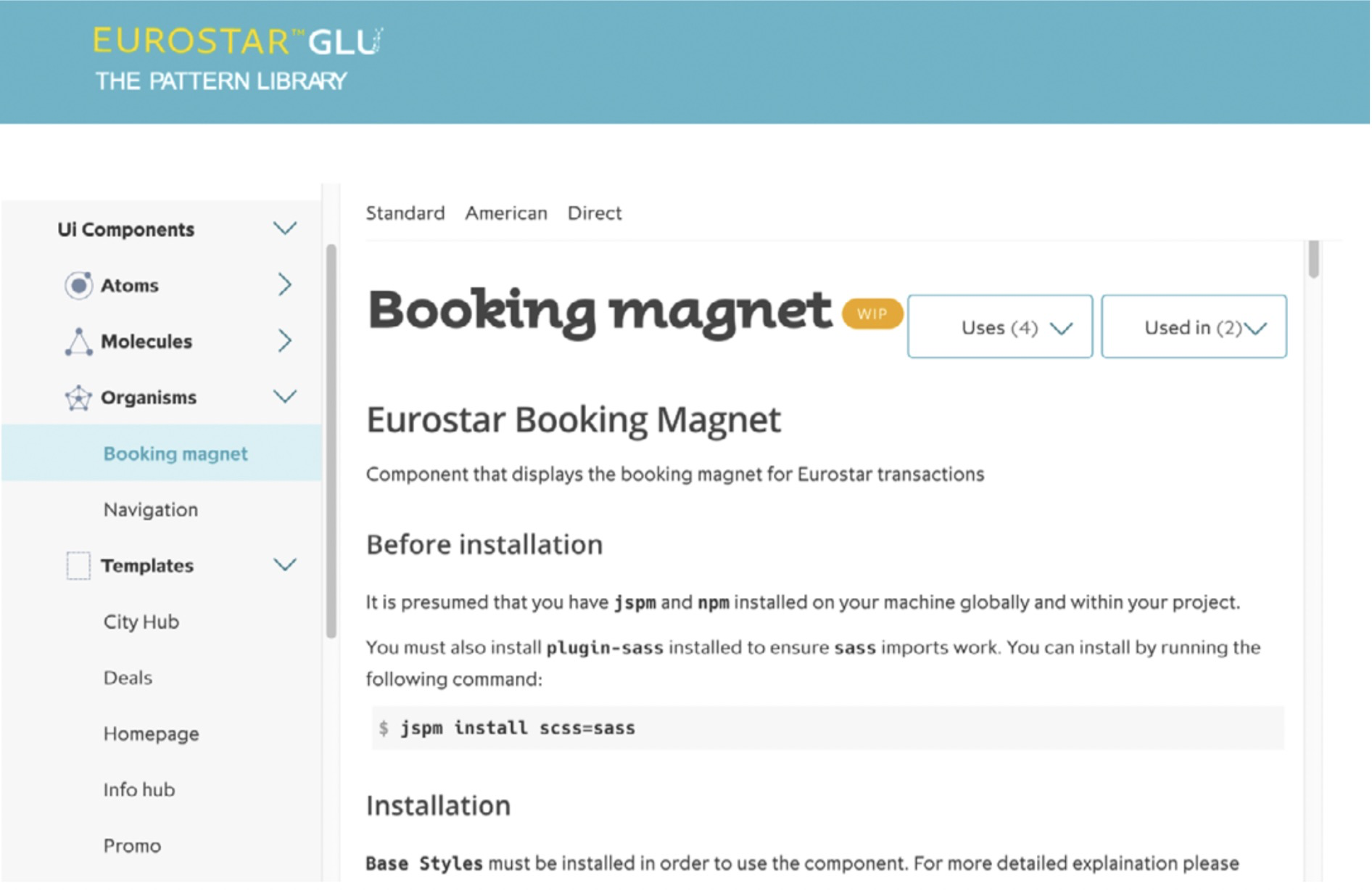
<br />_Components arranged hierarchically at _https://style.eurostar.com_/
_
5 http://smashed.by/atomicdesign
As a methodology, atomic design can bring many benefits. Thinking of patterns as nested matryoshka dolls can help to reuse the elements, since you’re conscious of how the levels build on each other. Defining the rules for combining and encapsulating the patterns can promote consistency across the system. For the team at FutureLearn, the analogy with chemistry provided a shared point of reference when we were new to modular design thinking.
But it’s important to remember that atomic design (or any other methodology) might not be right for you right out of the box. At FutureLearn we struggled to find a use for “tem- plates” and “pages.” The team preferred to work with smaller elements, so we could have greater flexibility over how they were combined.
What’s more, we spent far too much time debating whether
something was a molecule or an organism. Since the team
didn’t see enough distinction between the two types, they
were merged together. We ended up with two levels of hier-
archy: atoms and molecules.
More than two types of functional patterns can get confusing,
but separating granular elements from more complex ones
makes sense — both in the pattern library and in the code.
Teams do it to varying degrees, with or without following
atomic design nomenclature.
| Atomic Design | Atomic | Molecules | Organisms | Templates |
|---|---|---|---|---|
| Ceasefire Oregon | Elements | Components | - | - |
| ClearFractal | Units | Groups | - | - |
| GE Predix | Basics | Components | Templates | Features |
| Lewis+Humphreys | Elements | Components | Components | - |
| WeWork’s Plasma | Components | Patterns | - | - |
What I find interesting is that the strictness of a system (discussed in chapter 6) may be reflected in how the pattern library is structured. The more granular the patterns are, the more loose and flexible is the system.
In a strict system, like Airbnb’s or GE’s Predix,6 the larger patterns are documented: user flows, templates and pages. In a system like TED’s or FutureLearn’s, you would docu- ment smaller parts and leave it up to the individual design- ers to combine them as they see fit.
By Purpose or Structure
At FutureLearn we never stopped experimenting with ways to organize modules: in one long list, hierarchically (following atomic design methodology), by compositional role on the page (“intros,” “outros,” “heroes” and “bridges”). But everything was either too restricting, or too complex to work with.
After two years of trial and error we settled on classifying elements by purpose — promotional modules, modules focused on encouraging learner progress, modules around communication with the user, social modules, and so on.
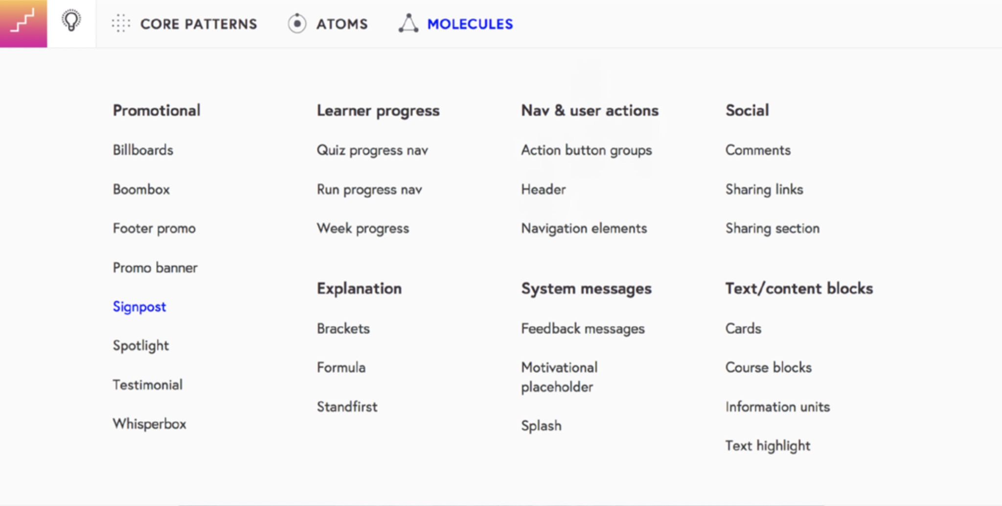
<br />_Modules arranged by purpose in __FutureLearn’s pattern library__.__7
_
Organizing patterns by purpose gives the team some guid- ance and inspiration for where to use a specific module. This structure also fit with our purpose-directed approach for defining patterns.
In Shopify Polaris,8 components are also categorized based on the team’s mental models. The initial grouping was the outcome of an open card sort and usability testing.
7 http://smashed.by/futurelearn
8 http://smashed.by/polaris
Even though there isn’t perfect alignment among different
disciplines, the internal user research is continuously shap-
ing how patterns are organized:
Designers tended to think in terms of structure. Developers tended
to default to functionality. Content strategists tended to combine
both. We’re conducting a range of usability studies to understand
how well the grouping of components is working for people.”
— Selene Hinkley, content strategist, Shopify Polaris 9
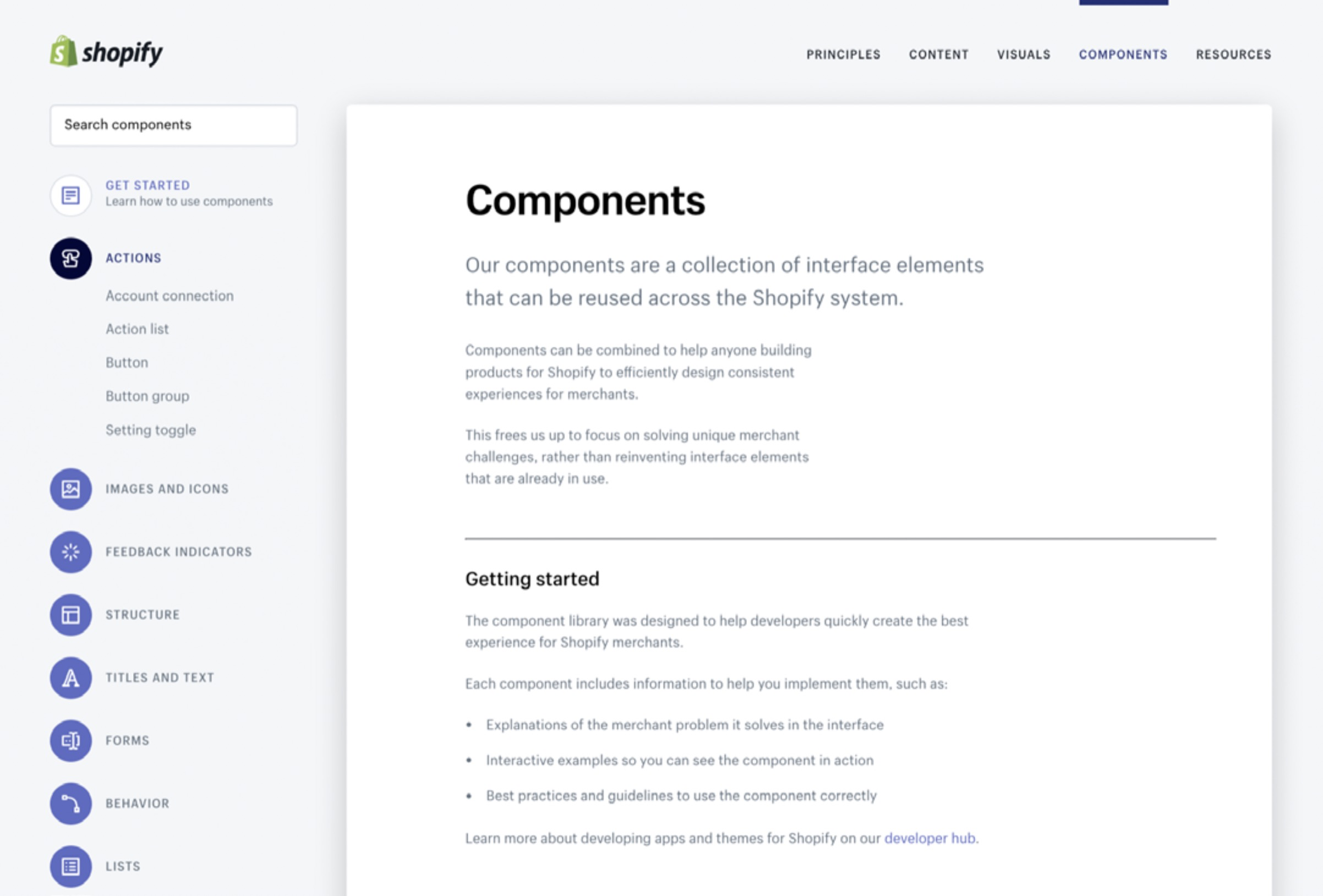
<br />_Components in Shopify Polaris are arranged by structure and function._<br /><br />9 From email correspondence with Amy Thibodeau, UX lead at
Shopify, August 2017
These are just some of the ways teams organize patterns. What’s important is that the choice is grounded in how people who use it think. Find a structure that’s right for _your _team. If it doesn’t work, if people struggle to find what they’re looking for, continue experimenting with different approaches. This can take time. The phrase I hear the most from all the teams with effective patterns libraries is that their “work is never done.”
Pattern Documentation
Although many things can be documented alongside each pattern, trying to cover everything right away is not feasi- ble, especially for smaller teams.
To see tangible benefits sooner, start with a lightweight overview of the main patterns. Once you have a simple foundation, you can improve the pattern library over time, by adding features and information the team needs. Here are some of the points to consider when documenting func- tional and perceptual patterns.
DOCUMENTING FUNCTIONAL PATTERNS
To make documentation focused and easily scannable, start
with the basics:
• name
• purpose
• example (visual and code)
• variants
Name
Throughout the book I’ve tried to emphasize the impor-
tance of a well-chosen name. A good name is focused and
memorable, and embodies the purpose of the pattern.
Ideally, someone should be able to glean the purpose from
the name, without needing to read the description. To help
make the page more scannable, names should be prominent
and stand out from the rest of the content.
<br />_Each pattern’s name is prominently displayed in IBM’s Carbon
(_http://smashed.by/ibmcarbon).
Purpose
When browsing a pattern library, most people skip descrip-
tions, especially long ones. That’s why they should be focused and to the point: typically, one or two sentences explaining what a pattern is and what it’s for is enough.
Although this seems like a simple task, in practice capturing the purpose of a pattern concisely and accurately is not easy. Too often we come up with vague descriptions that don’t have a lot of practical value.
Take a look at how the team at Sipgate initially described a component called “Showcase”:
“Use Showcase to present multiple types of information with a media file.”
Even though factually correct, it doesn’t communicate the purpose of “Showcase,” which makes it more likely to be misused or duplicated. Later, the team adopted a new prac- tice for defining a pattern’s purpose, and writing descrip- tions. Here’s how it was applied to another example:
_“Fact Grid is a shortlist of facts or bits of interesting information. Use Fact Grid to give the reader an immediate impression about the upcoming content.”_This second description is much more effective at commu- nicating what the pattern is for. You might even be able vis- ualize the “Fact Grid” just by reading these two sentences.
Additionally, there are design and content recommenda- tions for making the pattern achieve its purpose in the most effective ways, such as “Maximum of 3 lines per fact” or “Maximum of 12 facts.” Collaborating with a content disci- pline can be invaluable for defining these rules.
<br />_Fact Grid at _https://design.sipgateteam.de_/
_
Example
A good example helps to enhance the understanding of the pattern’s purpose. In Marvel’s style guide,10 examples are self-documenting and show multiple variants and use cases. The UI copy in the pattern helps guide usage further.
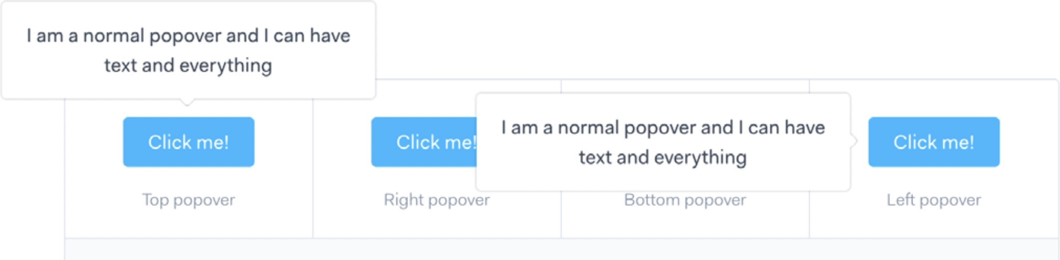
<br />_Marvel’s style guide makes it easy to see how different pop-overs behave._
A lesser example doesn’t help to communicate the purpose. Nothing in the way “Billboard” is presented in Future- Learn’s library suggests that it’s a “prominent promotional element.” Making small adjustments, such as changing the default copy and the background image could help express its purpose more clearly.

<br />_“Billboard” in FutureLearn’s pattern library is less than inspiring.
_
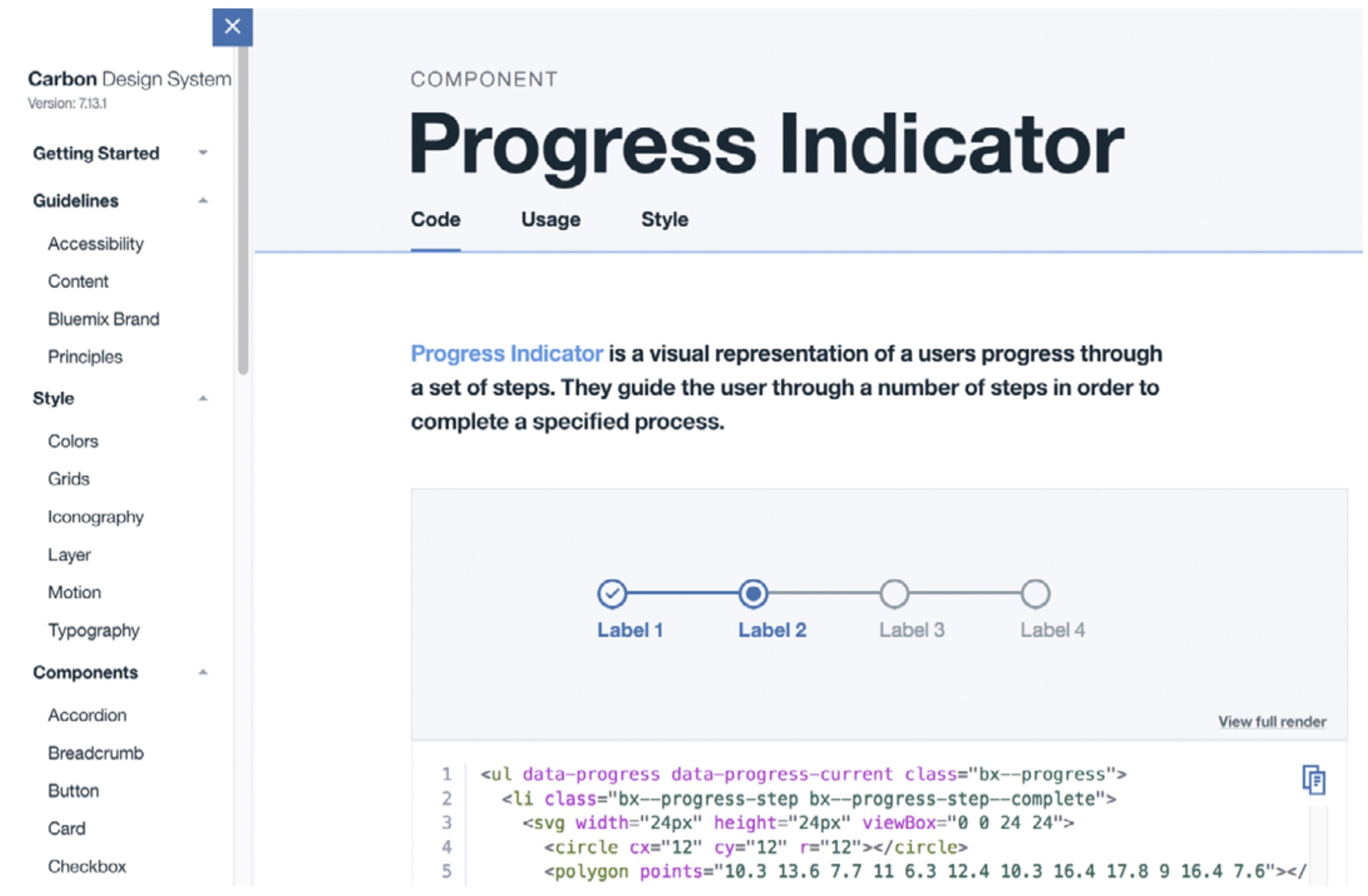
A living instance of a pattern, with component code along- side it, is usually preferred — it can show responsiveness, interactions and animation. But in some cases a static image or a GIF is more helpful, particularly when you need to show a specific behavior or a state that can’t be recreated in a living example.
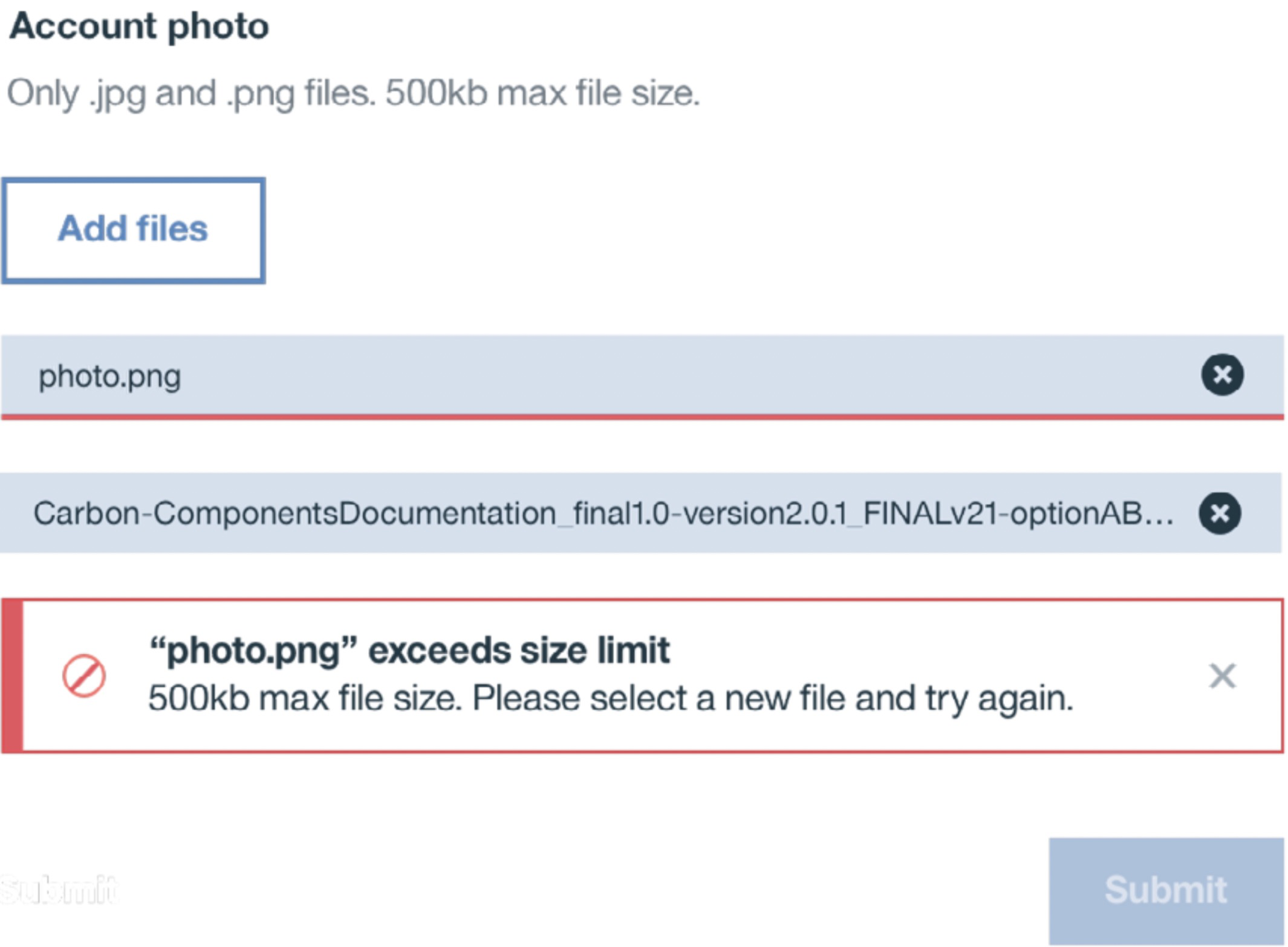
<br />_Carbon uses a combination of live and static examples to illustrate specific
Variants
Presenting variants alongside one another, as a suite, makes it easier to see at a glance what is available within the pur- pose. Not only that, we need to know how the options are _different _from one another.
11 http://carbondesignsystem.com/
Although Office Fabric12 helpfully presents all the variants, it doesn’t explain the differences between them.
Compare it with Carbon’s13 presentation, which clearly states the purpose of each variant.
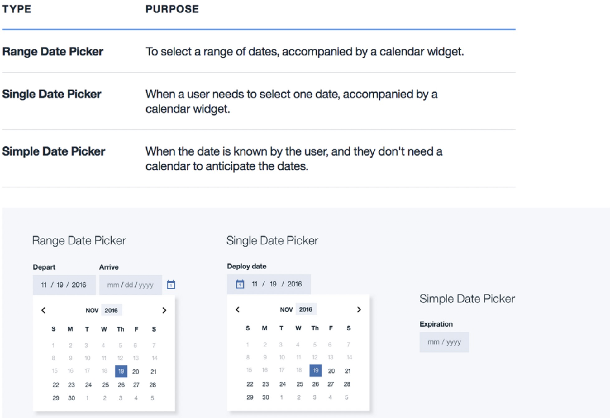
<br />_Types of date pickers and the differences between them explained in Carbon.
12 http://smashed.by/fabric
13 http://smashed.by/ibmcarbon
Similarly, Atlassian’s design guidelines14 describe when to use each type of button (although, from my point of view, some of the copy, such as “Use when you have nothing to prove,” could benefit from being more precise).
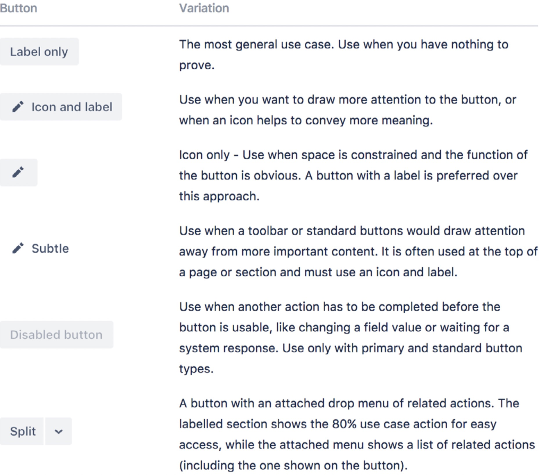
Button variations explained in Atlassian’s design guidelines.
14 http://smashed.by/atlassian
<br />There are many other aspects that can be important to docu-
ment, such as:
• Versioning of components. If products supported by
a pattern library get major upgrades, some components
can benefit from documenting changes in the API or UI
elements, relative to previous versions. The same goes
for obsolete elements and their replacements.
• Team members. Listing people involved in the crea-
tion of the pattern, like the Sky Toolkit15 example below,
can give people a sense of ownership, and also helps
with future development.

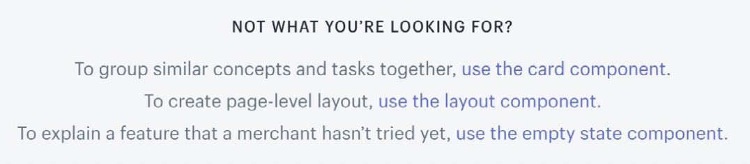
• Related patterns. Shopify Polaris16 shows alternatives if the pattern is not quite what you’re looking for. This can reduce the chance of patterns being duplicated.
15 http://smashed.by/skytoolkit
16 http://smashed.by/polarisnav
Depending on your team’s needs, there are many other bits of information that can be included. In his article _Taking The Pattern Library To The Next Level _Vitaly Friedman shared two checklists: one for the patterns to document, and another for the things to include alongside each pattern.17
DOCUMENTING PERCEPTUAL PATTERNS
When documenting perceptual patterns, the focus tends
to be on the buildings blocks — color palette, typographic
scale, and so on. But as we saw in the previous chapter, it’s
also important to know how those properties are used and
how they work together. Here are a few tips and examples.
Specify Usage, Not Only the Building Blocks
Representation of color doesn’t have to be limited to a list of
variables. The GOV.UK style guide18 helpfully specifies the
usage of color for text, links, backgrounds, and other roles.
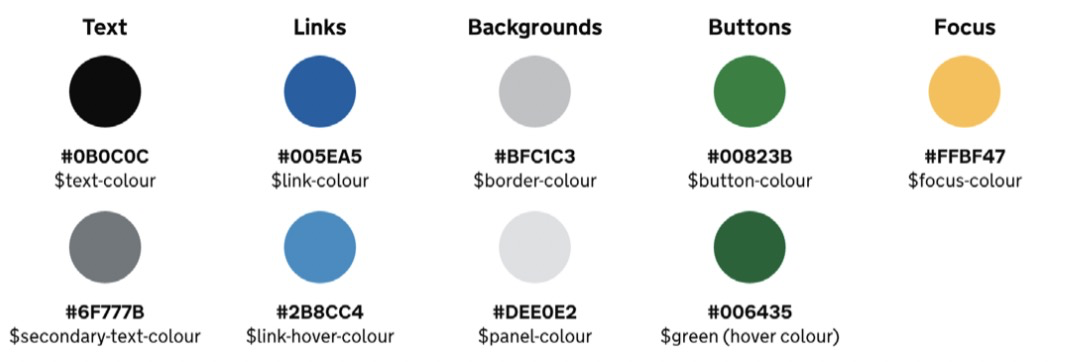
The GOV.UK style guide shows patterns of usage in their color palette.
17 http://smashed.by/pattern2doc
18 http://smashed.by/govuk
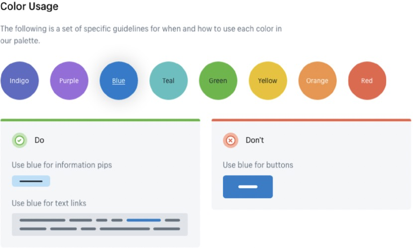
The dos and don’ts format can also be useful, particularly when there’s an expected misuse. In Shopify Polaris,16 both indigo and blue are primary colors used for interactive elements. Stating explicitly that blue shouldn’t be used for buttons is helpful in this case, as it would be reasonable to assume otherwise.
The typography section of the US government’s web stand- ards19 shows type pairings and their recommended usage. Expandable examples demonstrate typographic treatments in context.
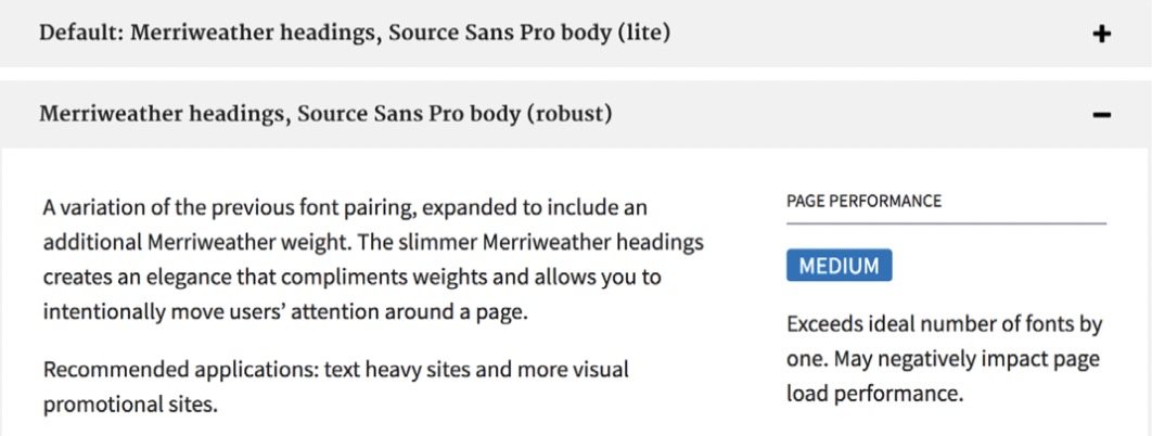
US Gov. web standards19 include pairings and their recommended usage.
Cross-Reference Styles
Although we separate styles and components to make them easier to work with, in practice they’re closely interlinked. Even if there are duplications, referencing styles at the mod- ule level, as well as separately, is useful. A button has many styles that define what kind of button it is (color, shape, style of label, transitions, spacing, and so on). At the same time, some of those styles can be applied to other objects — menus, links, toggle controls. Sharing styles is what makes those objects feel like they belong to the same system.
In Carbon, the styles of a specific module, such as color, are shown on a separate tab. The usage of colors is also docu- mented separately.
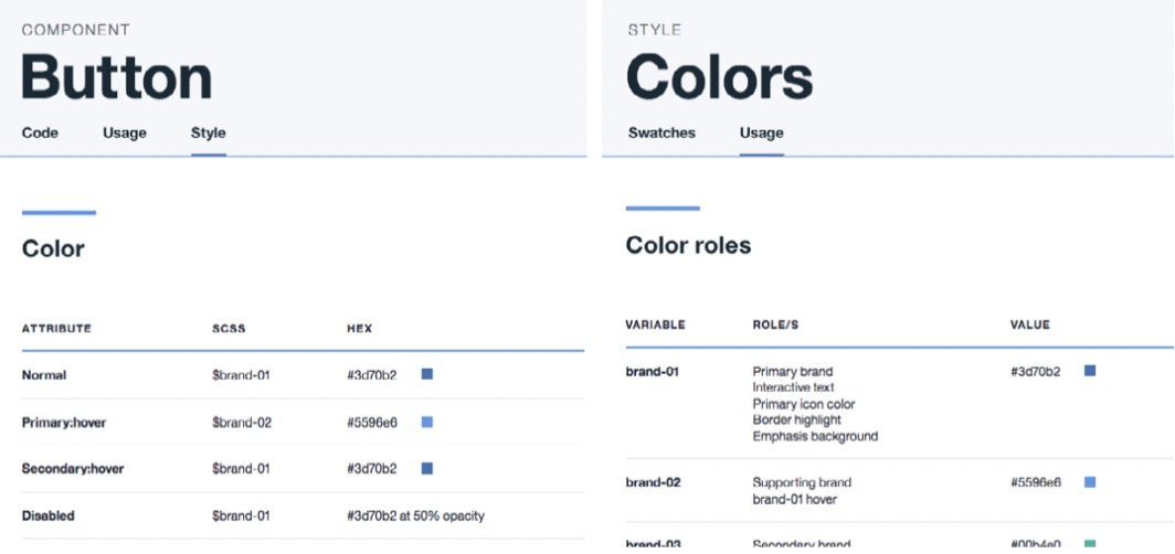
_In Carbon, colors are referenced at both the module level and all together.
Take another example: interactive states. Typically, we see them documented only at the module level: here’s a button and its hover state. But it is also useful to see all the states together, at a glance. How does the hover state apply to secondary links? To icon buttons? To ghost buttons? To tab controls? Why in some cases does the outline change to solid, and in others the color value changes?
Showing interactive states for FutureLearn in one grid
allowed us to define the overarching rules for interactive
states and apply them consistently as more interactive ele-
ments were added.
<br />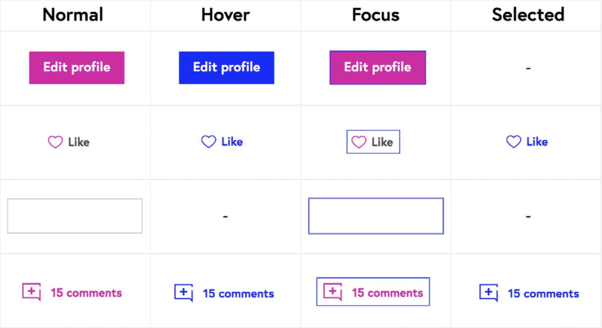<br />_Some of the interactive states in FutureLearn’s pattern library are shown
together.20
20 http://smashed.by/flstates
Show Relationships between the Elements
To be effective, perceptual patterns should interconnect
and work together. By showing the relationships (between
colors, between typography and spacing, between voice and
tone and the visuals), you help make the whole system more
connected.
The same color values can have entirely different effects when applied in different proportions. As Michael McWatters noted, with too much or too little red, TED can feel like a dif- ferent brand. The color chips in the Open Table style guide21 make the hierarchy of colors clear.
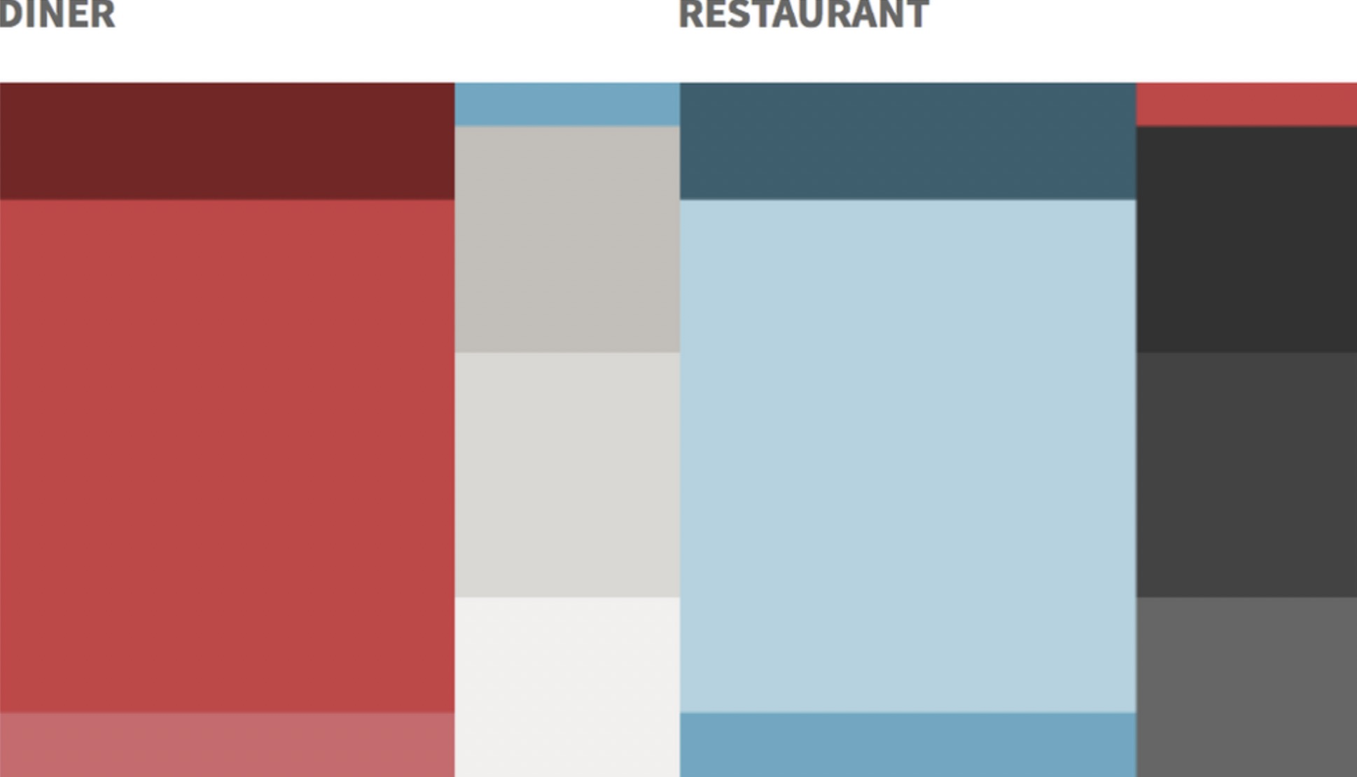
21 http://smashed.by/opentable
<br />Typography and spacing are also closely interlinked. Large,
higher-contrast typography requires more white space. Smaller text can get lost in the same amount of space ifyou don’t compensate by reducing the padding. Even if you have a limited selection of predefined spacing options (such 8px or 16px units), different designers might have different preferences — some prefer more generous white space, others like it cosier. The values might be consistent, but that doesn’t mean that the visual density will be.
To help guide the density and contrast across the product,
at FutureLearn we tried to show the relationship between
typography and spacing.
_Spacious _modules have high typographic contrast (large heading in proportion to the body font size) and generous spacing to balance out the high-con- trast typography.
_Regular _modules form the majority of sections on FutureLearn. They have the default heading and spacing.
_Compact _modules have headings only slightly larger than the body copy.

<br />_Some of the section types for FutureLearn.
_
_Those settings also reflect the purpose of the modules.
High-impact promotional sections benefit from high-con-
trast typography. On the other hand, modules with a sup-
porting function tend to be more compact.
Finally, in the vast majority of today’s pattern libraries, styles are displayed on separate pages. I see this as a limi- tation. Perhaps the next generation of pattern libraries can show them in more connected ways.
Like mood boards or element collages, styles could be
presented in a way that shows how they work together, and
that highlights signature patterns and the relationships
between various elements.
Workflow
Teams with effective pattern libraries have systematic approaches ingrained in their workflow. How, exactly, varies across companies. Some teams, like Airbnb, have strict and precisely specified processes with powerful tooling. Others are much more informal.
PROCESS FOR ADDING NEW PATTERNS
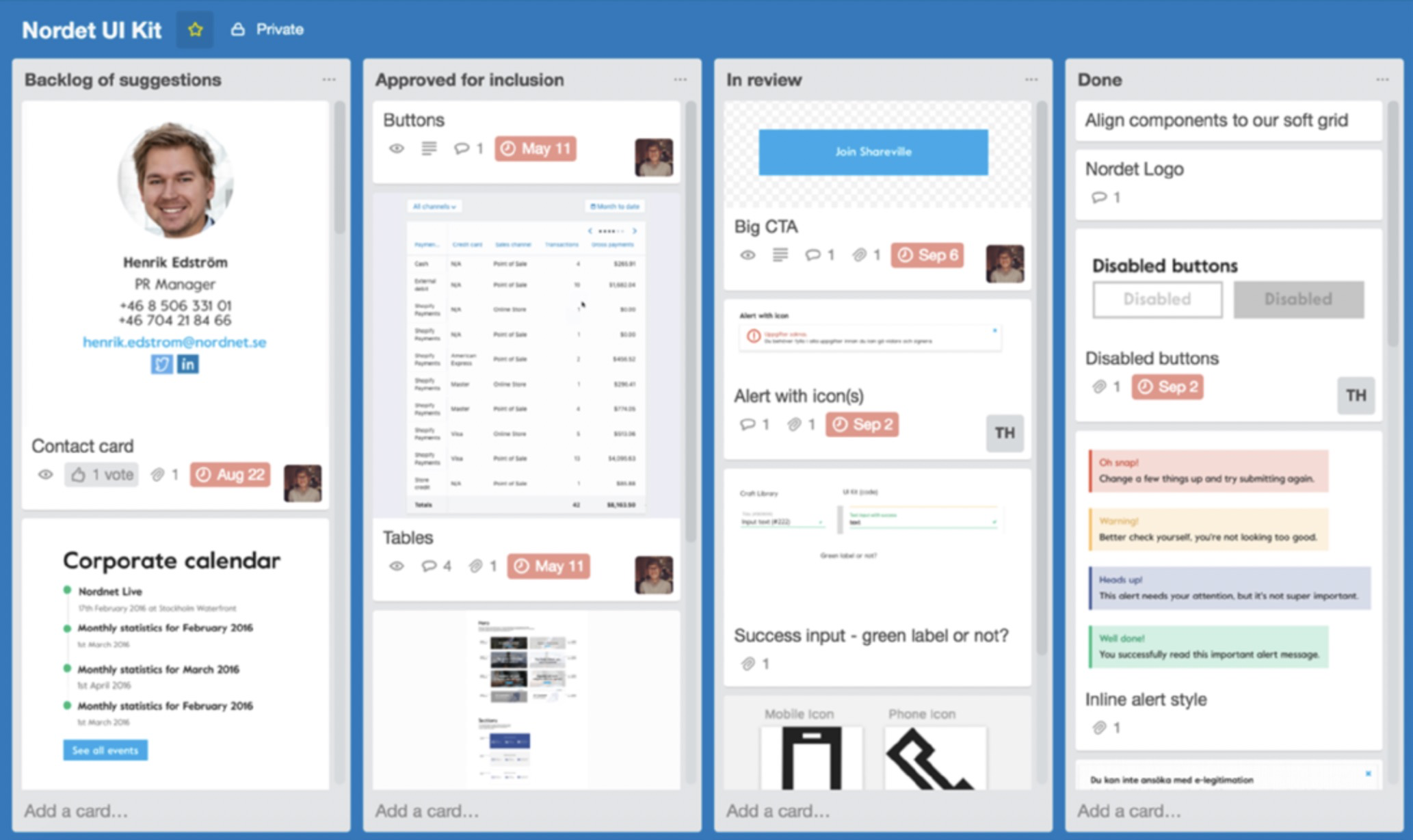
One of the foundational aspects to agree on is how the new patterns will be added to the system. The team at Nordnet follows a simple three step process:22
Submit a design to the UI kit folder on Dropbox.
Discuss the inclusion of the pattern as a team.
Document any included designs inside the UI kit. Add
the new design to the Craft Library which will auto- matically roll out to the entire team.
The team meet every fortnight to discuss new submissions. They go through a Trello backlog and decide if a module should be approved for inclusion or archived.
22 See “Super easy Atomic Design documentation with Sketch app” by Ross Malpass. (http://smashed.by/nordnet)
A similar workflow is adopted by the teams at Shyp23 (using GitHub for adding and reviewing the patterns), Future- Learn, and many others. The process doesn’t have to be strict but it’s important to have something in place that enforces, in some way, a regular review of patterns.
To make sure the format of submissions is consistent, some
teams find it useful to have a standard template with simple
guidelines, such as name, description, author, and date.
At FutureLearn, submissions come directly to the pattern
library rather than the master design file, and there is an
informal guide for writing a description for a pattern. It
consists of three questions: What is it? What is it for? How
does it achieve its purpose?
CRITERIA FOR ADDING NEW PATTERNS
A common problem teams have is a lack of agreement on what constitutes a design pattern. A way to manage this is to have shared criteria for adding (and also updating and removing) patterns.
The two most common approaches are:
Everynewelementonthesiteisalsoautomaticallyadd- ed to the pattern library. This works if you’re strict with accepting patterns to the system. There should be a pro- cess which checks if a similar pattern exists already, or if an existing one can be modified (such as regular review of new patterns as a team). Without those processes, the risk is ending up with duplicated patterns.
Elements are added only when they’re reused. Some teams add modules only on the second, or even third use. The idea is that an element has to prove itself as a pattern before being added to the system, which helps to keep the pattern library lean. With this approach it’s important to have visibility of everything being created and effective communication across teams. A log of un- documented patterns should also be kept, so the team has full visibility of what’s available, even if it’s not in the pattern library.
It’s also possible to base your decision on _potential _reuse. At FutureLearn, the specificity of a component’s purpose is used as a criterion. If an element is defined in a generic way, it is more likely to be reused in the future. In this case, it is added to the pattern library. If a new component has a spe- cific purpose (such as a seasonal promo, a module related to a specific event, and so on), it can be treated as a one-off.
When following this rule, the whole team should take care in how they define components and not make something specific unless absolutely necessary. If someone introduces a one-off, they should share it and explain why it is specific. Occasionally someone else will find the module useful for their needs. In this situation, we’d redefine the pattern as more generic and add it to the library.
PEOPLE AND RESPONSIBILITIES
Another aspect to consider is the practicalities of updating
documentation, particularly if there’s no dedicated team.
If contributions come from everyone, you have to be strict
at making sure they’re added to the library. For instance,
adding a component can be a part of the story for creating
it. The designer and developer who create a pattern are
responsible for adding it to the pattern library. As we saw in
chapter 6, this model doesn’t work for every team. Some-
times you need a person or group of people responsible for
curating and maintaining the pattern library, even if every-
one contributes to it.
If there’s a dedicated design systems team, it’s important to
agree on their role, as well as the process for managing con-
tributions. A systems team can have the role of a curator or a
producer, and many companies have a combination of both.
• Curator. Contributions for new patterns come from all
over the organization. The systems team defines how
internal teams contribute, including setting require-
ments and the review process. If a submitted pattern
doesn’t meet the standards, the team encourages the
designers and developers who created it to change it,
rather than making the change themselves. The team at
Atlassian follow this model.
• Producer.Withthisapproachthedesignsystemsteam
creates the majority of patterns. They’d typically work
closely with the product designers in different teams
and hold open meetings where others can ask questions,
give feedback, or propose missing patterns. The systems
team accept submissions from across the company, but
they have the final say over what is included, adjusted or
removed. Airbnb uses this approach.
When choosing a direction, consider your organizational structure, team culture, and specific product needs. The curator role is usually suited to distributed teams with looser system structures, whereas producers are more com- mon in stricter and more centralized systems.
In both cases it’s important that the systems team are seen as partners, rather than police.
We want to collaborate with teams as early as possible when they’re
thinking about developing new patterns and components. Our rela-
tionship with product teams should be a partnership, rather than a
situation where someone goes away and does a bunch of work and
then we either approve or veto it. If that happens, we’re not doing
our jobs very well.”
— Amy Thibodeau, UX lead, Shopify.
ALIGNING FACETS OF THE SYSTEM
Code, design and the pattern library are facets of the same
system. Treating it that way makes it more robust, because
the system is supported from multiple angles. This doesn’t
necessarily mean that the patterns must be fully synchro-
nized. What’s important is that the team practice the same
_approach _across the facets — to naming, structure and
understanding of the purpose.
The Carbon design team tries to be as consistent as possi-
ble across their Sketch design kit, component library and
the code.
<br />_In the Carbon design system, names and folder structure are consistent
across the three facets of the system. _
Designers at Nordnet use atomic design to organize folders in their Sketch kit. They even follow BEM naming conven- tions for their design files24 to help developers and design- ers talk the same language.
When design and code are aligned conceptually, synchroni- zation between them is easier to achieve. It’s also easier to find the tools that fit with your workflow.
24 See http://smashed.by/atomicflow by Ross Malpass.
Tools
Keeping the pattern library in sync with production code is one of the main challenges. Teams use different approaches — from manual copy-and-paste, to making a pattern library part of the production environment (Lonely Planet’s Rizzo is an example of the latter). Many tools help to achieve it. Here are some of the most popular ones.
KEEPING THE PATTERN LIBRARY UP TO DATE
Some of the easiest to implement are CSS documentation parsing tools, such as KSS.25 They all work in a similar way: comments in the CSS provide a description (which is pulled into the documentation programatically); running a script generates the markup for the pattern library. Parsing tools are relatively simple but limited in functionality. They can also lead to duplicate markup, which can make maintenance more time-consuming.
Among more powerful tools are style guide generators, such as Pattern Lab26 by Brad Frost, Dave Olsen and Brian Muenzenmeyer. Pattern Lab comes with many useful fea- tures, such as responsive preview and support for multiple languages. It’s predominantly suited to larger sites with multiple templates, particularly those that practice atomic design methodology.
25 http://warpspire.com/kss/
26 http://patternlab.io/
Fractal27 by Mark Perkins is one of the more lightweight and flexible tools which is gaining popularity. Fractal helps build and document a pattern library, and integrate it into your project. One of its main advantages is that it’s flexible and unopinionated — Fractal can work with any templating language and organizational structure.
Full synchronization between the pattern library and the code is extremely difficult to achieve, and companies manage it with varying degrees of success. The ways teams prioritize synchronization also varies:
It’s always slightly off-sync. If it’s too perfect, it’s not going to work.
Our design language, as any language, is constantly evolving. We
change details and patterns and we add patterns. We constantly
build products. So at any given time there are many versions of the
design language. We embrace this fact and design a system which
can deal with these imperfections.”
— Jürgen Spangl, head of design, Atlassian
In stricter systems and centralized organization it is more important, whereas companies with looser structures are more tolerant to having it out of sync.
KEEPING MASTER DESIGN FILES UP TO DATE
Designers practicing a systematic approach currently tend to use Sketch28 as their main tool (largely thanks to the fea- tures such as text styles, symbols and artboards, which seem to be well suited for a design system workflow). Teams typ- ically have a master file which contains a UI kit with some or all of the core components and styles. Product designers tend to work from their own files, pulling elements from the master as needed.
The challenge is making sure that the master kit always has the latest patterns. There are many tools to help achieve that — from the lightweight to more comprehensive solutions.
Abstract29 is a version-controlled hub for your design files. You can create branches, commit explorations, and merge changes. Abstract makes it easier to keep one single source of truth for your design files, including a master UI kit.
Another popular tool is Invision’s Craft.30 Craft is a set of plug- ins for Sketch which syncs the UI kit to anyone who has the plug-in installed. A Craft library can be saved on Dropbox.
28 https://www.sketchapp.com/
29 https://www.goabstract.com/
30 http://smashed.by/craft
More comprehensive options include UXPin,31 Brand.ai32 and Lingo.33 These tools allow you to create and manage a pattern library without having to use code. Naturally, they don’t provide as much flexibility as a custom-built pattern library, but many of them have useful features, such as interactivity of components, Sketch plug-ins for keeping files up to date,34 integration with Slack that pings a channel when the library is updated, and more.
PATTERN LIBRARY AS THE SOURCE OF TRUTH
With pattern libraries gaining “source of truth” status, in
some companies it has become somewhat less important
to keep master UI kits perfectly up to date. At FutureLearn,
the master Sketch file (updated and shared via GitHub)
only contains the core granular elements that don’t tend to
change (typography, buttons, navigation, and so on).
Designers use the pattern library as the main reference for up-to-date patterns; Sketch or Photoshop are used mainly for exploratory work. Because the majority of the components are defined and named, more and more often the team can get by with paper sketches, without needing detailed design specs.
31 http://smashed.by/uxpin
32 https://brand.ai
33 https://www.lingoapp.com
34 http://smashed.by/lingoapp
Thanks to design systems and pattern libraries, design
and engineering workflows are moving toward each other.
There are a lot of experiments in this area,35 such as tools
for generating Sketch files directly from a web page, and
importing real data. In the near future we may not have to
worry about keeping UI kits in sync, as they could be gener-
ated any time from the pattern library.
The Future Of Pattern Libraries
Tools should accommodate the natural workflow of the whole team. Only then will everyone take ownership, and contributions to the pattern library will be evenly distrib- uted. FutureLearn’s library didn’t have the capability for designers to update descriptions of modules, which in some way reduced their responsibility. Front-end developers were under more pressure to keep the documentation updated, which at times felt like a burden.
In the future I hope to see pattern libraries accommodate multidisciplinary workflow. They could become environ- ments where all disciplines could contribute to discussions around design patterns and help define their purpose.
With tools getting better, pattern libraries and a system- atic approach to design will continue affecting designers and developers deeply. Many teams are seeing the changes already. Something that used to take days of manual work can be done in minutes — no more detailed design specs, no more building the same patterns again and again.
At first, this might seem threatening (Will we have jobs in years to come? Does it take away from the creativity and craftsmanship on the web?). But perhaps the opposite is the case. Design systems free our time and energy to solve big- ger and more meaningful problems, like understanding our users better and making design languages more inclusive.
Conclusion
In programming and design, Christopher Alexander’s pat-
tern discipline has become one of the most widely applied
and important ideas. It is now influencing how many of us
think about design systems. But there’s an essential feature
we may still be missing from Alexander’s original idea: the
moral imperative to create systems that make a positive
difference to human lives.
In his keynote speech for OOPSLA in 1996, Alexander emphasized that at the root of the architectural pattern language there’s a fundamental question: will these patterns make human life better as a result of their injection into the system? Even if not all of them will have that capacity, there should be at least a _constant effort _to achieve it.1
Many aspects of our lives can now be managed online, from buying groceries and paying bills, to finding a date or completing a degree. Pattern language gave us a format for thinking about design – and it also gave us a challenge: do the patterns we create have a positive impact on human life? How do we know if they do? How do we continuously test that?
1 See “Patterns in Architecture” by Christopher Alexander. (http://smashed.by/archpatterns)
It is hard to carefully consider these questions, when you are given a task to optimize the number of clicks, or encour- age people to spend more time on a site. Even with the best intentions, a lot of what we create on the web is designed for short-term commercial benefit, rather than bringing real value to everyday lives: patterns designed to get users hooked,2 patterns biased towards some population groups, patterns that encourage people to spend time and money in ways they might regret later.
On the other hand, we don’t always consider, for instance, what happens to all our digital accounts and information when someone passes away, how the designs we create improve someone’s quality of life, or how inclusive and empathetic our systems really are.
The pattern language for the web we’re creating is powerful. It has the capacity to influence not only the digital world, but the physical one. We owe it to ourselves, and the people who use our products, to constantly consider and challenge the shape this language takes, and be thoughtful in what we contribute to it.
2 “How Technology is Hijacking Your Mind—from a Magician and Google Design Ethicist” by Tristan Harris http://smashed.by/techhijack
Further Reading and Resources
These three books are a great source of knowledge and inspiration for anyone interested in design systems. I kept referring to them again and again while writing this book.
_The Timeless Way of Building_3 by Christopher Alexander
_Thinking in Systems: A Primer_4 by Donella Meadows
_How Buildings Learn: What Happens After They’re Built_5 by Stewart Brand
See also:
_How to Make Sense of Any Mess_6 by Abby Covert
_Front-end Style Guides_7 by Anna Debenham
- _Atomic Design_8 by Brad Frost
- _Responsive Design: Patterns and Principles_9 by Ethan Marcotte • _Inclusive Design Patterns_10 by Heydon Pickering
3 http://smashed.by/timeless
4 http://smashed.by/thinksys
5 http://smashed.by/howlearn
6 http://smashed.by/makesense
7 http://smashed.by/fesg
8 http://smashed.by/atomic
9 http://smashed.by/rwdpatterns
10 http://smashed.by/inclusivedesignpatterns
Other Resources
Design Systems’ Slack channel,11 created by Jina Anne
Design system articles12 by Nathan Curtis
Style Guide Podcast,13 hosted by Anna Debenham and Brad Frost
Design Systems Newsletter,14 curated by Stuart Robson
Responsive Web Design Podcast,15 hosted by Karen
McGrane and Ethan MarcotteWebsite Style Guide Resources16
Thank you for reading. This book is really just the beginning
of a conversation about design systems. I’m keen to con-
tinue it beyond the book, and would be happy if you’d email
me at alla@craftui.com with your thoughts and stories.
11 http://smashed.by/dslack
12 http://smashed.by/nathan
13 http://smashed.by/sgpc
14 http://smashed.by/dsnl
15 http://smashed.by/rwdpc
16 http://styleguides.io/

若有收获,就点个赞吧
0 人点赞
