系统化功能范式
本章中的练习描述了一种从产品用途开始的系统化功能范式的方法。
The exercise in this chapter describes an approach to systemizing functional patterns, starting with a product’s purpose.
在我居住的小镇上,有一间小书店。当您走进去时,会看到一些书架。有些附有小手写笔记:阅读它们的人的评论。即使您不知道想要阅读什么,也很有可能会偶然发现一些有趣的东西。完成后,您将有一个带沙发的安静区域,您可以边喝咖啡边看书。您可能决定买东西,也可能不会决定,没有压力。商店的精神是发现和阅读;销售出现在次要位置。它的图案在笔记,安静的区域,沙发和茶几上反映了这一点。
In the town where I live there’s a small bookstore. As you walk in, you see a few shelves of book covers. Some have small handwritten notes attached to them: reviews from the people who read them. Even if you don’t know what you’d like to read, there’s a good chance you’ll stumble upon something intriguing. Once you do, there’s a quiet area with sofas to look through the books over coffee. You might decide to buy something or you might not, there’s no pressure. The ethos of the store is discovery and reading; sales appear secondary. Its patterns the notes, quiet areas, sofas and coffee tablereflect that.
同样,数字产品鼓励或实现某些行为。考虑一下 Slack 如何支持与电子邮件或其他聊天应用程序相比更具协作性的工作方式。或者想想 Tinder 如何通过滑动式互动促进休闲,无承诺的关系。可以围绕相似的用户目标和需求设计产品,同时鼓励完全不同的行为。
Similarly, digital products encourage or enable certain behaviors. Consider how Slack supports ways of working which are more collaborative compared with email or other chat apps. Or think how Tinder promotes casual, commit- ment-free relationships with its swiping interaction. Prod- ucts can be designed around similar user goals and needs, while encouraging entirely different behaviors.
因此,在将范式与产品的设计意图和精神联系起来时,思考行为会有所帮助。
That’s why thinking of behaviors can be helpful when connecting patterns with the design intent and ethos of the product.1
设计意图可以无数种方式呈现,其中图案不必是可视的。它们可以用物理对象(例如书店的内部)来表示,也可以用声音读出。阐明行为有助于以一种更加面向未来的方式定义范式,因为行为与平台无关。
Design intent can be rendered in countless ways — patterns don’t have to be visual. They can be represented in physical objects (like the interior of a bookstore), or they can be read out by a voice. Articulating the behaviors helps to define pat- terns in a way that is more future-proof, because behaviors are platform-neutral.
用途明确的库存
界面清单是开始系统化界面的一种流行做法。它涉及拍摄各种 UI 元素的屏幕截图,然后将外观相似的东西组合在一起。
The interface inventory is a popular exercise to start systemizing an interface. It involves taking screenshots of various UI elements, and then grouping similar-looking things together.
但是,尽管这个想法很简单,但是可以通过多种方式来实现。有时清单集中在界面的视觉一致性上。例如,确保所有按钮看起来相同,所有菜单都一致等等。
But while the idea is straightforward, it can be done in a variety of ways. Sometimes inventories focus on the visual consistency of the interface; for example, making sure all buttons look the same, all menus are consistent, and so on.
本章描述的过程的主要目标不是要解决所有视觉上的不一致;而是要解决所有视觉上的不一致。定义最基本的设计范式,并在团队中就如何在整个系统中工作达成共识。完成此过程将使您的团队了解哪些区域需要更多关注。典型的结果是需要标准化的元素列表,以及有关如何定义范式的一些草图和想法。
The main goal of the process described in this chapter is not to account for all the visual inconsistencies; it’s to define the most essential design patterns and get mutual understanding in the team on how they should work across the system. Going through this process will give your team an idea of which areas need more attention. A typical outcome would be a list of elements that need to be standardized, along with some sketches and ideas of how patterns should be defined.
可视化清单通常按外观和类型(按钮,标签控件等)对事物进行分组,但在后续练习中,您可能最终将同一组中的事物看起来有所不同,因为您将它们分组按目的(他们旨在鼓励或启用的行为)。
While a visual inventory typically groups things by appear- ance and type (buttons, tab controls, and so on), in the follow- ing exercise you might end up with things in the same group that look different, because you’re grouping them by purpose(the behaviors they’re designed to encourage or enable).
在以目标为导向的广告资源中,同一类别中的事物看起来可能有所不同,因为它们是按目标而非视觉进行分组的
这意味着,我们将着重于了解何时使用某种类型的按钮,何时使用链接而不是按钮,何时根本不使用按钮并单击,而不是着眼于使所有项目的按钮看起来一致。当然,在这样做的过程中,我们将改善视觉一致性,但这并不是重点。
This means, rather than focusing on making all buttons look consistent, we will first try to understand when to use a certain type of button, when to use a link instead of a button, and when not to use a button at all and instead click directly on the object. Of course, in the process of doing that we will improve visual consistency, but it won’t be the focus.
1 同样,设计范式可用于创建行为,以劫持用户的注意力或操纵人们将时间和金钱用于他们稍后会后悔的事情(https://darkpatterns.org/)。保持对行为的意识可以帮助确保用户兴趣始终是设计的核心。
2 http://smashed.by/uiinventory
1 Equally, design patterns can be used to create behaviors that hijack user attention or manipulate people to spend time and money on something they’ll regret later (https://darkpatterns.org/). Remaining conscious of behaviors can help make sure that user interests are always at the heart of the design. 2 http://smashed.by/uiinventory
准备工作
定时
为了最有效,应在制定完基础的 UX 工作(用户研究,内容策略,信息体系结构,设计方向)之后运行此过程。如果设计存在根本性的缺陷和可用性问题,那么它们会分散注意力并产生反作用。出于类似的原因,如果您的界面即将进行重大的重新设计,最好先弄清楚新设计的方向。
To be most effective, this process should be run after the foundational UX work — user research, content strategy, information architecture, design direction — has been worked out. If the design has fundamental flaws and usabil- ity issues, they would be distracting and counterproductive to deal with.For similar reasons, if your interface is about to go through a major redesign, it’s best to get clarity on the new design direction first.
成员
具有不同的观点可以帮助您变得更加客观,并说明更多的用例。设计师和前端开发人员必须参与其中,但最好由后端开发人员,具有内容背景的人员和产品经理来参与。理想的团体人数约为4-8人。如果需要更多人参与,可以考虑与几个来自不同学科的代表一起进行初始练习,然后举行后续会议,向更多人汇报。
Having different perspectives can help you to be more objective and account for more use cases. It’s important that designers and front-end developers take part, but ideally involve a back-end developer, someone with a content background, and a product manager. The ideal group size is around 4–8 people. If a larger group needs to be involved, consider running the initial exercise with a few represent atives from different disciplines, and then hold follow-up sessions to debrief more people.
界面打印输出
确定对于您的产品而言绝对重要的关键屏幕和用户流程,没有这些屏幕和用户流程就不会存在该产品。通常,大约10–12个屏幕就足够了,有时甚至更少。它们可以是设计模型,也可以是现有界面的屏幕截图。
Identify the key screens and user flows that are absolutely fundamental for your product, those without which the product couldn’t exist. Typically, about 10–12 screens is enough, sometimes fewer. They can be design mock-ups, or screenshots of an existing interface.
假设您正在使用公共图书馆网站。该网站的目的是通过确保读者可以提前预订图书,从而扩大实体图书馆的使用体验,从而避免在图书馆就读后排队等候材料。
Let’s say you’re working on a public library website. The purpose of the website is to extend the experience of the physical library, perhaps by making sure that readers can reserve books in advance and so avoid queueing up and waiting for materials once they are at the library.
关键屏幕允许您查找特定书籍,发现新书籍,保留要收集的资料以及下载资料,从而帮助实现该目的。当然,图书馆网站还有更多内容:活动和展览,会员资格,在线馆藏。虽然我们应该注意其他方面,但是通常不需要每个视图都可以开始。
The key screens help to achieve that purpose by allowing you to find specific books, discover new books, reserve materials for collection, and download the materials. Of course, there’s a lot more to a library website: events and exhibitions, memberships, online collections. While we should take note of the other areas, usually every single view is not needed to get started.
打印出每个屏幕的两个副本。按照典型的用户旅程顺序,将第一组放在墙上。第二组将用于剪切图案并将其分组。
Print out two copies of each screen. Put the first set on the wall, in the order of a typical user journey. The second set will be used for cutting out patterns and grouping them.
在整个练习中,您将不断地从系统整体转向个人范式。拥有两套打印输出将帮助您专注于细节和更大的画面,而不会丢失裁剪后的图案来源背景。
You will be constantly shifting from the system as a whole to individual patterns throughout the exercise. Having two sets of printouts will help you focus on both the details and the bigger picture, without losing the context of where the patterns come from once you’ve cut them out.
您还将需要剪刀,记号笔,便签纸以及足够的墙壁和桌子空间来进行操作。
You will also need scissors, markers, sticky notes, and plenty of wall and desk space to work on.
1.识别关键行为
首先确定关键的用户需求和您希望在用户旅程的每个阶段中支持的行为。对于只有几个屏幕的小型应用,您将查看单个屏幕或同一屏幕上的不同状态。对于较大的产品,它有助于将页面分为用户旅程的各个部分。
Start by identifying the key user needs and behaviors you want to support at each segment of the user journey. For a small app with only a few screens, you’ll be looking at the individual screens or different states on the same screen. For larger products it helps to group pages into segments of the user journey.
要返回到公共图书馆网站示例,您可以根据以下行为对一些页面进行分组:
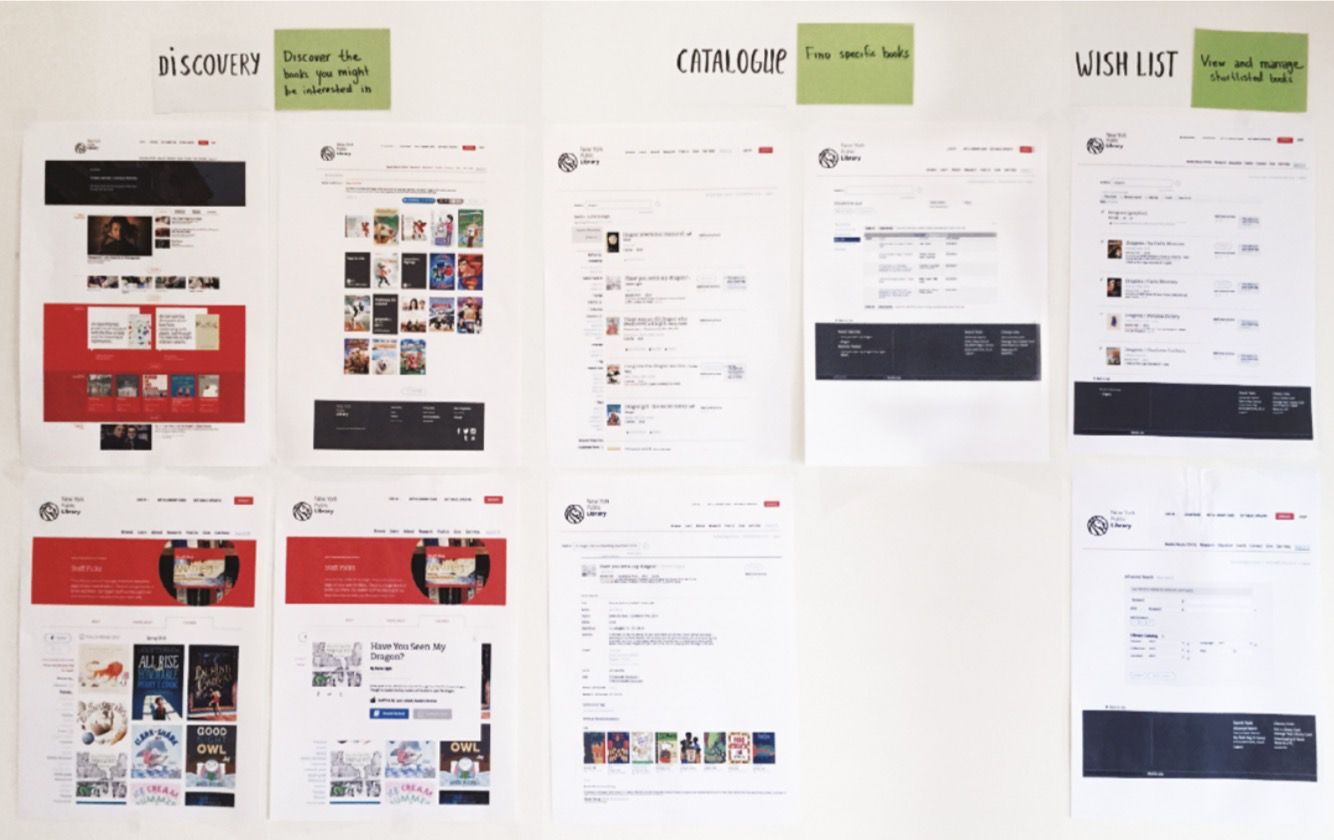
- 发现:鼓励人们发现他们可能感兴趣的书。类似于书店,该区域就像员工挑选的书架或新书架。如果某人不知道自己在寻找什么,他们可能会受到显示选择的启发。
- 目录:查找特定书籍。通过目录进行搜索就像与工作人员进行联系并发出请求一样。
- 愿望清单:允许人们查看和管理其入围图书。在实体商店中,您可以将一些书放在一边,以便稍后决定保留哪些书。
To return to the public library website example, you might group some of your pages based on these behaviors:
- Discovery: Encourage people to discover books they might be interested in. To draw an analogy with a bookstore, this area is like the staff picks or new books showcase shelves. If someone doesn’t know what they’re looking for, they might be inspired by the selec- tion on display.
- Catalog: Find specific books. Searching through a cat- alog is like approaching a member of staff and making a request.
- Wish list: Allow people to view and manage their shortlisted books. In a physical store, you would put some of the books aside so you can decide later which ones to keep.3
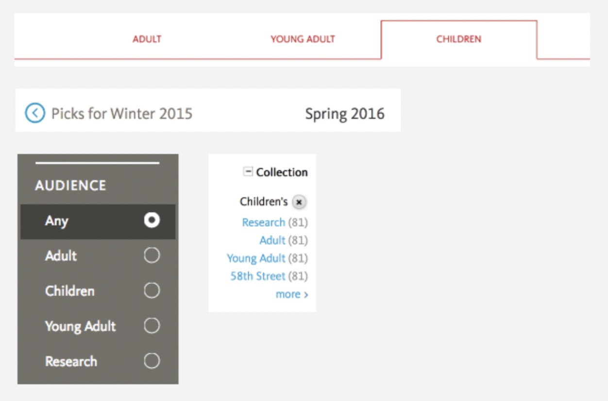
一些核心屏幕按它们在整个用户旅程中支持的行为分组
请注意行为冲突的页面:在这种情况下,我们鼓励人们查看新书,下载某些内容,注册时事通讯并同时检查所有最新事件。即使一个屏幕支持多种行为,最重要的动作也应该清晰明了,并且彼此之间不冲突。在处理多种行为时,首先要关注核心用户旅程和最重要的行为。在此示例中:发现,查找和预订书籍。
Take note of the pages with conflicting behaviors: situations where we encourage people to look at new books, download something, sign up for a newsletter, and check the latest events all at the same time. Even if a screen supports several behaviors, the most important actions should be clear and not in conflict with one another. When dealing with mul- tiple behaviors, focus on the core user journeys and most important behaviors first. In this example: discovering, find- ing and reserving books.
3 如果同一段中的页面太多,无法支持相似的行为,则表明您的信息体系结构可能需要工作。
4 示例页面摘自https://www.nypl.org,以用于说明目的。
3 If you have too many pages in the same segments supporting similar behaviors, it’s an indication that your information architecture might need work. 4 The example pages are taken from https://www.nypl.org, for illustrative purposes.
措辞是基础
我们选择的话很重要。它们影响我们的思维方式。我在 FutureLearn 工作的团队几个月来一直以“保留率”作为我们的指标。它的重点是让更多的人在课程开始后继续学习。保留的设计很难。还不清楚保留能如何使我们的用户真正受益。如果该度量标准被称为“参与度”,则可能导致不同的设计结果。甚至更重要的是,指标是否以学习的质量和满意度为中心,而不是在网站上花费的时间。 (某人本可以在 FutureLearn 上花费半个小时,并了解他们的需求,但这并不算成功)。
The words we choose matter. They influence how we think. For a few months the team I worked in at FutureLearn had “retention” as our metric. It focused on getting more people to continue learning on a course after it began. Designing for retention was hard. It also wasn’t clear how exactly retention benefited our users. Had the metric been called “engagement,” it might have led to different design outcomes. And perhaps even more, had the metric been centered on quality and satisfaction of learning, rather than the time spent on the site. (Someone could have spent half an hour at FutureLearn and learned what they needed, but it wouldn’t have counted as success.)
行为应该是有意义的,并且应该从用户的角度以及从企业的角度进行工作。5图书的“推广”仅使图书馆受益,而“发现”新书也对读者有价值。这样可以更好地选择语言,并且可以影响正在显示的图书的选择以及它们的显示方式。
Behaviors should be meaningful and work from the user’s perspective, as well as the business’s.5 “Promotion” of the books benefits only the library, but “Discovering” new books also has value for the reader. This makes it a better language choice and can influence the selection of the books being displayed, as well as how they’re displayed.
将行为分解为行动
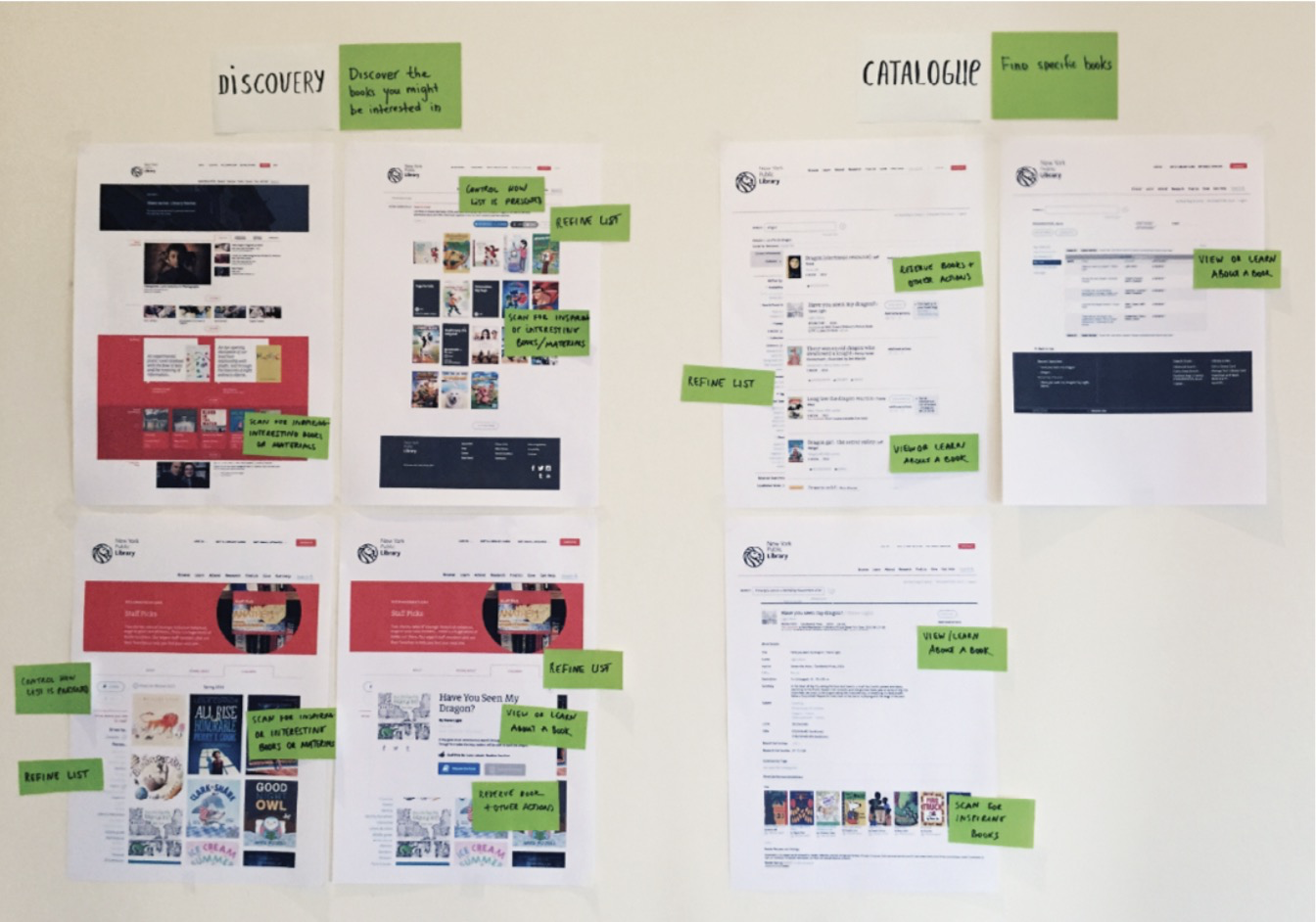
定义高级行为后,将其分解为更具体的动作,这些动作将反馈到这些行为中。在每个屏幕旁边写下它们。例如,支持“图书发现”的操作是:
- 扫描任何启发性或有趣的书
- 优化推荐书籍清单
- 控制列表的显示方式
- 查看和学习一本书
- 选择您可能喜欢的书
- 候选清单和备用书
After you define the high-level behaviors, break them down into more specific actions that feed into those behaviors. Write them down next to each screen. For instance, the actions that support “Book discovery” are: Scan for any inspiring or interesting books Refine list of recommended booksControl how list is presentedView and learn about a book Make a selection of books you might like Shortlist and reserve books
Actions feed into higher-level behaviors.
You might notice that some of the actions are repeated throughout the interface. But the elements that represent them aren’t always the same. On some occasions we refine a list of books by clicking through tabs; on others, by selecting an item from a menu. To reveal these inconsistencies, we can audit the existing elements.
5 成功的企业将用户目标与企业目标结合在一起。如果您真的很难将两者结合在一起,则您的产品可能存在更深层次的问题,而设计系统将无法解决。
5 Successful businesses join user goals with business goals. If you re- ally struggle to join the two together, your product might have deeper issues a design system won’t be able to solve.
2.按目的对现有元素进行分组
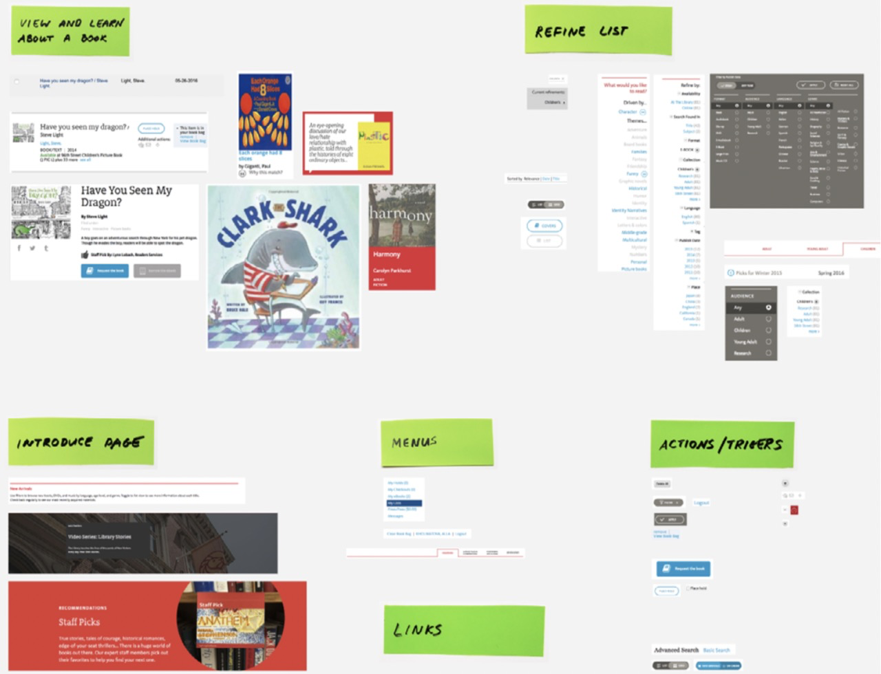
一次采取一种行为,浏览所有页面以查找支持该行为的元素。例如,要“查看书”,我们可能在促销页面,目录搜索结果和愿望清单中使用不同的项目。
Taking one behavior at a time, look across all the pages to find the elements that support it. For example, to “View a book” we might be using different items on the promo pages, in the catalog search results, and in the wish list.
使用第二组打印输出剪切相关元素。将它们分为几组并为每组加上标签:“查看书”,“刷新列表”,依此类推。它们是被定义为范式的候选者。元素应按相同的粒度级别进行分组,因此同一组中将没有“图书列表”模块和“预订”按钮。
Cut the related elements out using the second set of print- outs. Arrange them into groups and label each group: “View a book,” “Refine a list,” and so on. They are the candidates to be defined as patterns. The elements should be grouped at the same level of granularity, so you won’t have a “Book list” module and a “Reserve” button in the same group.
项目组:定义为范式的候选项
3.定义模式
现在您已经有了元素组,决定如何处理每个组中的项目。是否应该将它们合并为一种模式或分开放置?通常,这是根据具体情况制定的。但是我发现有两种技术特别有用:将模式置于特定的规模上,并绘制其内容结构。
Now that you have groups of elements, decide how to deal with the items in each group. Should they be merged into one pattern or kept separate? Typically, this is worked out on a case-by-case basis. But there are two techniques I find particularly helpful: placing a pattern on a specificity scale, and mapping out its content structure.
比例尺
可以将同一模式定义为更具体或更通用。假设我们需要在图书馆现场展示活动和展览。如果我们将它们定义为两个单独的模式,则可以使每个模式更加具体。另一方面,将它们统一为“内容块”之类的内容会使模式更加通用。
The same pattern can be defined as more specific or more generic. Say we need to display events and exhibitions on the library site. If we define them as two separate patterns we can make each one more specific. On the other hand, unifying them into something like a “content block” would make the pattern more generic.
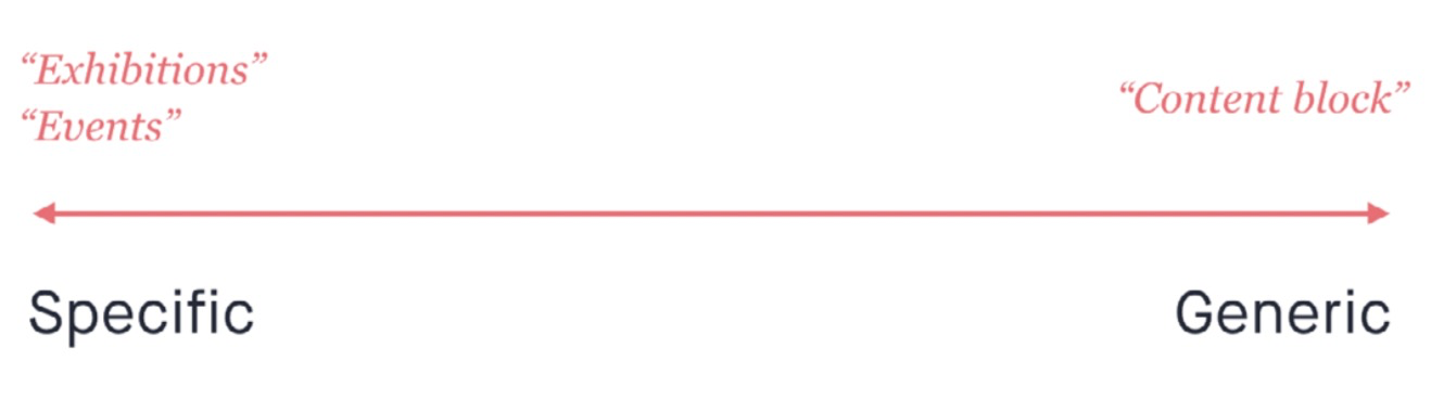
特异性量表
尽管这似乎是一个简单的概念,但确定特异性的水平是模块化设计中最棘手的事情之一。内容越具体,可重用性就越差。相反,为了使某些东西可重用,您还需要使其更通用。使用更具体的部件,系统变得难以维护和保持一致性。但是太多的通用模块导致通用设计。与许多事情一样,没有正确的方法来定义模式,这完全取决于我们要实现的目标。
While it seems like a simple concept, deciding the level of specificity is one of the trickiest things about modular design. The more specific something is, the less reusable it is. And conversely, to make something more reusable, you also need to make it more generic. With more specific parts, the system becomes harder to maintain and to keep consist- ent. But too many generic modules lead to generic designs. Like with many things, there’s no right way to define pat- terns and it all depends on what we’re trying to achieve.
我们是否希望网站的访问者对展览会和活动有所不同?关于活动是否有可能与展览的设计发生冲突?如果是这样,我们应该考虑将它们拆分。例如:
- 展览模块的设计可以围绕艺术图像为中心。由于展览是独特的,因此它们可以具有与艺术相辅相成的自定义标题,使其具有海报般的感觉。可以将日期设置为较小的类型,并将其放置在角落,以免分散发布者的注意力。
- 事件更简单。我们可以将设计围绕一个重要的日期和事件的标志进行。
Do we want visitors of the site to perceive exhibitions differ- ently to events? Is there anything about events that might conflict with the design of exhibitions? If so, we should consider splitting them up. For example:
- The design of an exhibition module can be centered around an image of the art. Since exhibitions are unique, they can feature custom titles that complement the art to give it a poster-like feel. The date could be set in smaller type and positioned in the corner, so that it doesn’t distract from the poster.
- Events are simpler. We could center design around a prominent date and an icon of the event.
如果没有理由区分这两种类型,我们应该将它们统一为一种模式:库中要做的事情。这样做将使模式更加通用,因为它必须在两种情况下都适用。但这也意味着我们对活动所做的任何更改都将应用于展览。一致性将更容易实现,但会牺牲灵活性。
If there’s no reason to differentiate between the two types, we should unify them into one pattern: things to do in the library. Doing that will make the pattern more generic because it would have to work for both cases. But it would also mean that every change we make to events will apply to exhibitions. Consistency will be easier to achieve but at the expense of flexibility.
内容结构
我认为另一个有用的工具是绘制模式的内容结构。我们在关于功能模式的第 4 章中简要介绍了它。这里提醒您:
- 列出模块有效的核心内容。该模块可以在没有图像的情况下运行吗?或者图像对于其用途必不可少?是否总是需要标签?标记可选元素。
- 确定元素的层次结构并决定如何对其进行分组:图标是键信息的一部分还是图像的一部分?
- 绘制草图以可视化结构。可以用无数种方式呈现相同的图案,而草图绘制有助于找到最佳设计。
Another tool that I find helpful is mapping out a pattern’s content structure. We covered it briefly in chapter 4 on functional patterns. Here’s a reminder of what it involves:
- List the core content slots a module needs to be effec- tive. Can this module function without the image or is the image essential to its purpose? Is a label always necessary? Mark optional elements.
- Determine the hierarchy of elements and decide how they should be grouped: is the icon part of the key info or is it part of the image?
- Make sketches to visualize the structure. The same pattern can be presented in countless ways and sketch- ing helps find the optimal design.
通常,可以合并为一个模式的元素共享相同的基础结构。另一方面,如果您在不损害其目的的情况下努力统一多个元素的结构,则表明它们不应该合并。
Typically, elements that can be merged into one pattern share the same underlying structure. On the other hand, if you struggle to unify the structures of multiple elements without compromising their purpose, it’s an indication that they shouldn’t be merged.
有时元素具有相似的结构,但是由于上下文或我们的设计意图,它们需要在外观或行为上有所不同。在这种情况下,我们可以创建变体。变体是相同模式的修改版本。
Sometimes elements have a similar structure, but owing to context or our design intent, they need to look or behave differently. In this case we can create variants. A variant is a modified version of the same pattern.
再次访问图书馆网站。假设您已经在“查看书”组中找到了这些项目。
Take the library website again. Say you’ve ended up with these items in your “View book” group.
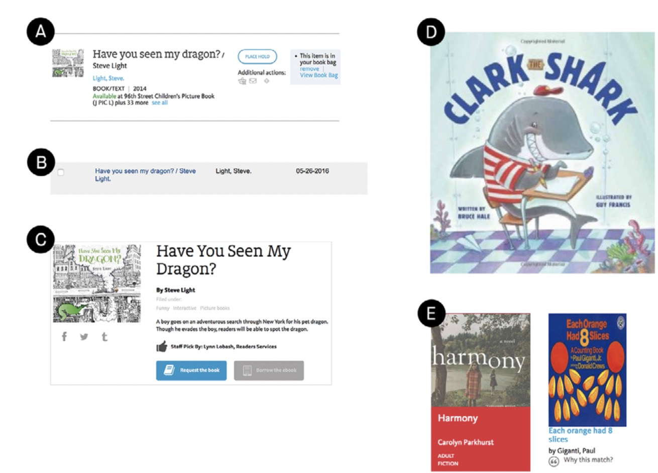
分组书籍项目:定义为模式的候选项目
您可能会决定项目A和B具有相同的目的:它们都出现在列表中,并允许人们查看和了解书。它们还共享相同的内容结构:
You might decide that items A and B share the same pur- pose: they both appear in lists and allow people to view a book and learn about it. They also share the same content structure:
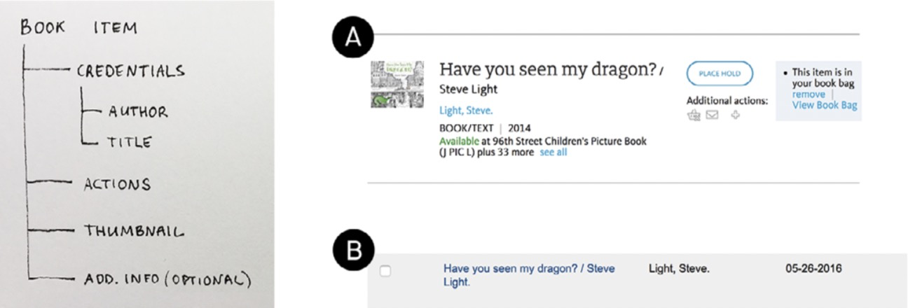
书本的内容结构
尽管项目B缺少动作和缩略图,但没有明显的原因。缩略图对于扫描书很有用,您应该能够保留书而不必离开心愿单。
Although actions and thumbnail are missing from item B, there’s no obvious reason for that. Thumbnails are useful for scanning the books and you should be able to reserve one without having to leave your wish list.
另一方面,项目 D 和 E 不同。他们的主要目的是提供灵感和展示新的和值得注意的物品。如果我们绘制它们的结构,它可能看起来像这样:
On the other hand, items D and E are different. Their main purpose is focused on providing inspiration and showcasingnew and noteworthy items. If we draw their structure, it might look like this:
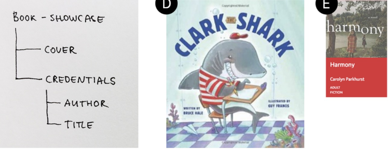
图书展示柜的内容结构
您可以通过考虑如何期望发生变化来检查这一点。问问自己:如果我更改了此模块,是否希望其他人也以相同的方式进行更改?例如,即使“cover”和“thumbnail”看起来相似,我们仍可能决定将它们视为完全不同的事物。发现页面的设计可能涉及一些特定的交互作用和动画,以引起人们对展示书籍的关注。我们不希望将相同的效果应用于列表中的标准图书项目。
You can check this by thinking about how you expect changes to happen. Ask yourself: if I change this module,do I want the others to change in the same way? For instance, even though “cover” and “thumbnail” look similar we might decide to treat them as entirely different things. Perhaps the design of the discovery pages involves some specific inter- actions and animation to draw attention to the showcased books. We don’t want the same effect to apply to a standard book item in a list.
现在让我们看一下项目C。它类似于A和B,并共享它们的内容结构。但是由于它的上下文,它更加突出:发现并展示了网站的一部分。它也比清单中的书本更为详细,并提供更多信息。在这种情况下,使此元素成为书本的变体是很有意义的。
Now let’s take a look at item C. It is similar to A and B and shares their content structure. But it is more prominent because of its context: the discovery and showcase parts of the site. It is also more detailed and provides more infor- mation than a book item in a list. In this situation it would make sense to make this element a variant of the book item.
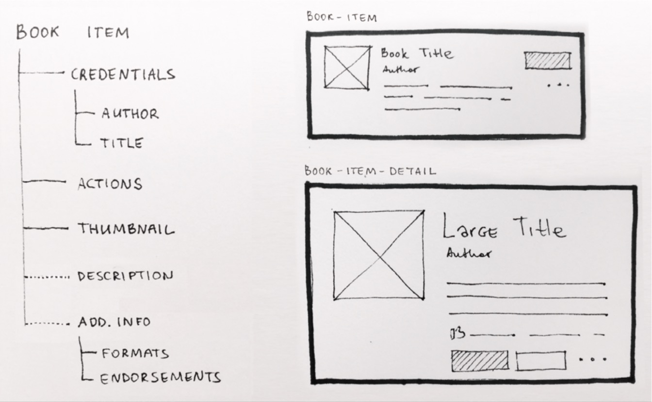
使用变体时,通常会使用带有核心样式的默认模式。变体将具有其他样式。重要的是要知道哪些功能是模式的核心,哪些功能是特定于变体的。然后,您可以预测其中一个的更改将如何影响另一个。
在上面的示例中,核心默认模式中的某些元素的比例各不相同,从而使该模式感觉完全不同:
- 大标题
- 大缩略图
- 更加宽敞的布局
With variants, you would normally have a default pattern with the core styles. Variants would have additional styles. It’s important to know which features are core to the pat- tern, and which are specific to the variants. Then you can predict how a change in one of them will affect the others. In the example above, some of the elements in the core default pattern vary in scale, making the pattern feel quite different:
- large title
- large thumbnail
- more spacious layout
我们知道可以在不影响书籍项目的情况下更改标题,但是,如果更改作者的风格,则更改将在两个地方都适用。
We know that we can change the title without affecting the book item, but if we change the author style, for instance, the change will apply in both places.
查看内容结构和样式之间的关系可以增加更多样式的重用。尝试浏览所有模式,并将基础内容(“书名”)与样式名称(“大标题”,“小标题”,“小元数据”)匹配。同样,这是开始查看字符数或图像尺寸变化的好地方。如果标准化了不同的大小,则模式将适用于更多的内容类型。
Looking at the relationship between the content structure and styles can increase the reuse of more patterns. Try going through all your patterns and match the underlying content (“book title”) with style names (“large title,” “small title,” “small metadata”). Similarly, this would be a good place to start looking at character counts or image sizing variations. A pattern will work with more content types if different sizes are standardized.
命名
正如我们在第5章关于共享语言所讨论的那样,名称会影响模式的使用方式。精心选择的名称是用于设计系统的强大工具。
As we discussed in chapter 5 on shared language, names affect how patterns are used. A well-chosen name is a pow- erful tool for shaping your design system.
尝试找到一个可以反映出模式在特异性标度上的位置的名称。如有疑问,请以更具体的名称开头。例如,我们过去将FutureLearn课程的学习过程视为一种特殊的体验,它带有针对课程领域的自己的一组模块。
Try to find a name that reflects a pattern’s position on the specificity scale. If in doubt, start with a more specific name. For example, we used to see the process of learning on a course on FutureLearn as a special kind of experience, which came with its own set of modules, specific to the course area.
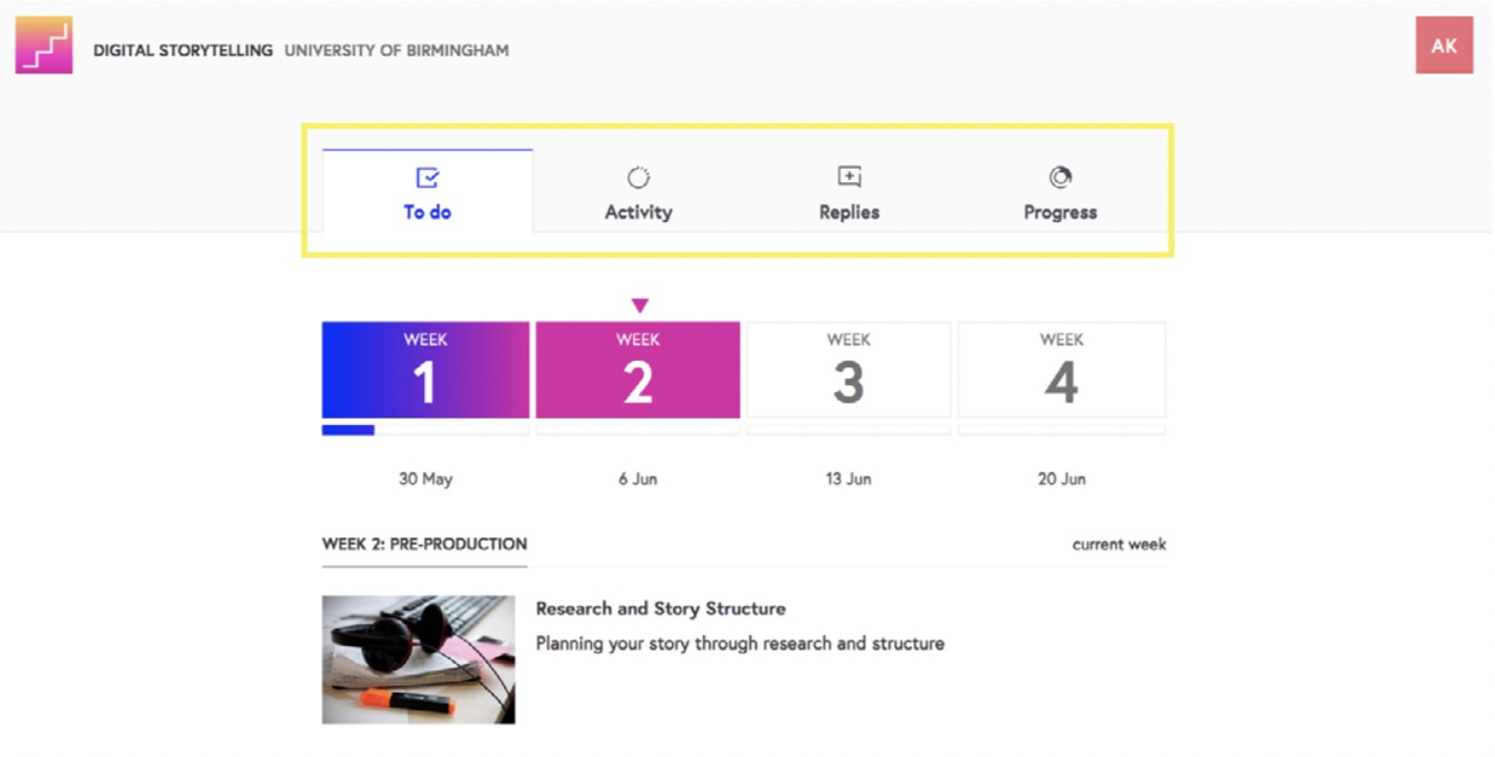
FutureLearn 的课程概述区域中的课程选项卡
在这种情况下,可以使用“课程标签”这个名称-我们不想在其他任何地方重复使用它们。此名称还向团队的其他成员发出信号,即它们不仅是任何常规标签,而且是针对课程领域的。后来,我们决定将该模块在其他地方也有用,并将其名称更改为“页面标签”。新名称更通用,再次向团队表明,现在可以在其他领域使用它了。
In this case it made sense to use the name “Course tabs” — we didn’t want to reuse them anywhere else. This name also signalled to the rest of the team that they weren’t just any generic tabs — they were specific to the course area. Later we decided that this module could also be useful in other places and changed the name to “Page tabs.” The new name was more generic, and again signaled to the team that it was now available to be used in other areas.
有时,模块是在前端命名的,但是命名也是 UX 决定的,应该在设计阶段进行协作。名称需要考虑内容类型,但不应仅基于内容。有效的名称可以指导用法,并减少重复模式的出现。
Sometimes modules are named in the front-end, but naming is also a UX decision and should be made collaboratively at the design stage. Names need to take the content type into consideration but shouldn’t be based solely on the content. Effective names guide usage and reduce the chances of duplicate patterns.
以较小的规模重复该过程
将独立的零件分组后,对其他元素重复该过程。通常,这将涉及多个会话:一个讨论大用户的行为,另一个讨论更细粒度的模式,例如:
按钮和链接
- 标题
- 清单
- 标签和菜单
- 单选按钮
- 切换按钮
- 复选框
- 反馈消息
- 导航
- 图像
- 图标
Once you group the self-contained parts, repeat the process with other elements. Typically, this would involve several sessions: one to discuss big-picture user behaviors, and sep- arate ones to look at more granular patterns such as:
- buttons and links
- headings
- lists
- tabs and menus
- radio buttons, toggle buttons and checkboxes
- feedback
- messages
- navigation
- images
- icons
如果您具有相似目的的元素,则应将它们相互关联而不是独立考虑。按钮与链接有何不同?选项卡式导航与列表菜单有何不同?下拉菜单与一组按钮有何不同?复选框与切换按钮有何不同?
If you have elements with similar purposes, think of them in relation to each other rather than independently. How are buttons different from links? How is tabbed naviga- tion different to a list menu? How is a dropdown different from a set of buttons? How is a checkbox different from a toggle button?
在审核链接和按钮时,需要考虑以下几点。
Here are some points to consider when auditing links and buttons.
动作一致性
按钮和链接
传统上,在Web开发中,链接和按钮是不同的。链接将用户导航到当前页面之外。按钮可提交动作并在界面中进行切换。但实际上,仅根据此标准做出设计决策并不容易。
Traditionally in web development, links and buttons are different. A link navigates the user away from the current page. A button submits an action and toggles something in the interface.7 But in practice, it’s not easy to make design decisions based on this criterion alone.
假设我们有一个带有“查看书本”按钮的书本。单击该按钮将展开该模块,以显示有关该书的更多信息。现在想象一下,相同的信息将在另一个页面上打开。这是否意味着该动作应作为链接呈现?
Suppose we have a book item with a “View book” button. Clicking the button expands the module, revealing more information about the book. Now imagine that the same information opens on a different page instead. Does this mean that the action should be presented as a link?
与许多其他事物一样,混乱常常在于语言。有些人(通常是开发人员)将按钮定义为提交数据的触发器。因此,被他们标记为按钮的链接不会被视为真正的按钮。其他人(通常是设计师)将按钮视为一个独特的,独立的号召性用语。即使将其标记为链接,他们也会将独立元素“查看书”称为按钮。
As with many other things, the confusion often lies in the language. Some people (developers, often) define a button as a trigger that submits data. So a link marked up as a button wouldn’t be considered a true button by them. Others (often designers) view a button as a distinct, standalone call to action. They would refer to a standalone element “View book” as a button, even if it’s marked up as link.
不同的系统也对此有所不同。在IBM的Carbon中,链接是一个导航元素。仅当用户的操作将更改或操纵数据时,才使用按钮。另一方面,在Shopify Polaris中,按钮可以代表任何类型的操作,包括导航。链接用于嵌入式操作和导航。
Different systems also approach this differently. In IBM’s Carbon, links are a navigational element. Buttons are only used if the user’s action will change or manipulate data.In Shopify Polaris,on the other hand, buttons can represent any type of action, including navigation. Links are used both for embedded actions and for navigation.
6 有一些通用准则和最佳实践(有关出色的资源,请参见Bill Scott和Theresa Neil的《设计Web界面》;以及Jenifer Tidwell的《设计界面:有效的交互设计模式》),但有些情况可能因您的情况而异。即使他们是某些人的常识,也值得用语言来表达,以便团队其他成员可以学习。
7 参见Marcy Sutton的http://smashed.by/linksvsbuttons;以及DennisLembrée的http://smashed.by/properbuttons。
8 http://smashed.by/ibmcarbon
9 http://smashed.by/polaris
6 There are general guidelines and best practices (for an excellent re- source see Designing Web Interfaces by Bill Scott and Theresa Neil; and Designing Interfaces: Patterns for Effective Interaction Design by Jenifer Tidwell), but some things might be specific to your situation. Even if they’re common knowledge for some people, it is worth verbalizing them so the rest of the team can learn. 7 See http://smashed.by/linksvsbuttons by Marcy Sutton; andhttp://smashed.by/properbuttons by Dennis Lembrée. 8 http://smashed.by/ibmcarbon 9 http://smashed.by/polaris
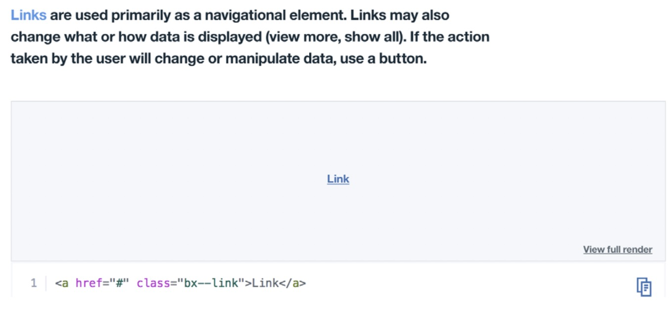
使用IBM Carbon中的链接
To me, the most important aspect is a consistent expression of purpose. Users (both those who access the interface visually and via screen readers) need to know what to expect. If but- tons are always used only for submitting data, then it would be confusing to have one situation where they behave as links. But if there’s a consistent use of links styled as but- tons (such as for standalone calls to action) throughout the interface, then it would be appropriate.
To avoid confusion and misuse of these essential elements, it’s important to agree on their definitions. What are the shared meanings of “button” and “link” in your team? What are the basic guidelines for their usage?
One of the simplest and most effective distinctions I’ve come across was suggested by Heydon Pickering in Inclu- sive Design Patterns.10 The idea is to differentiate between links and calls to action (CTAs), rather than buttons and links. An important standalone action can be presented as a button, but be marked up either as a link or a button, depending on the interaction. The question of whether it’s a link or button is a matter of variants — first and foremost it’s a CTA.
10 http://smashed.by/inclusivedesignpatterns
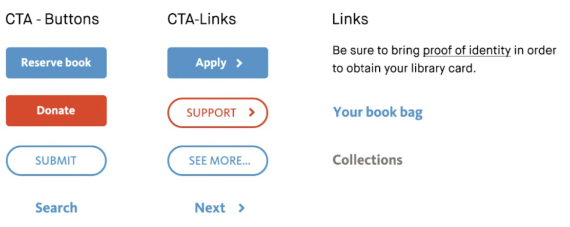
An example of a classification of buttons and links. Additionally, it helps to make a subtle difference in the style of CTAs, to indicate a difference in the interaction.
If the action occurs on the current page, use a CTA button. If the action takes the user away from the current context, use a CTA link. Calls to action are different from standard links, which represent pathways to optional information and are typically embedded in the content: body text, titles, images.
Making a distinction in this manner allows you to meet the design need for keeping the important calls to action prominent, while at the same time keeping the code simple and accessible.
VISUAL HIERARCHY
Most interfaces have equivalents of primary and secondary buttons. But what does “primary” mean exactly? Does it signify the most important action in the context of the whole interface, or a specific screen or section? For example, should a “Reserve book” button always be a certain style because of the importance of the action on a library website?
In Marvel’s design system,11 “flat” buttons are used to sig- nify “necessary or mandatory actions”; “ghost” buttons are used to signify “optional, infrequent or subtle actions.” Flat buttons can be used alongside each other, when actions are equally important. I like this distinction because it’s simple, clear, and specific to the button’s purpose.
But for more complex interfaces with a larger number of buttons, it’s hard to keep their functions so specific. You may also need to see how buttons relate to each other when used together. In Atlassian’s system12 and Shopify’s Polaris,13primary buttons represent “the most important actions in any experience” and therefore should only appear once per screen.
11 http://smashed.by/marvel
12 http://smashed.by/atlassian
13 http://smashed.by/polaris
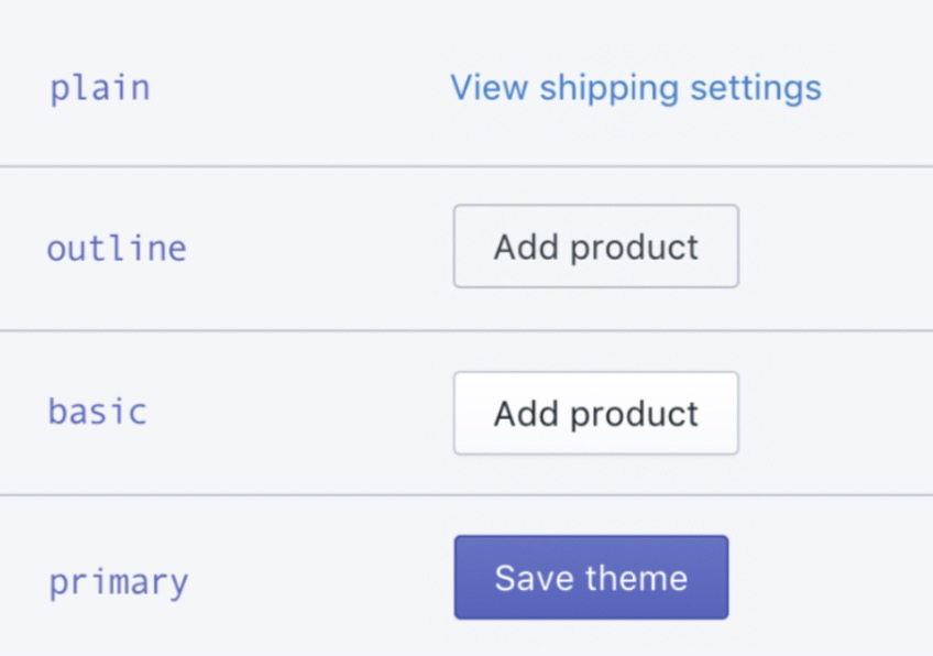
Some of the button types in Polaris, arranged by the level of prominence
They have a “basic” button, used by default. Other styles are used only “if a button requires more or less importance.” Think of it this way: if the interface were read out by a voice, which action would be read out first? Which actions would be announced more loudly or with a different intonation?
SPECIAL CASES
There will always be special cases. In the library website example, the “Reserve” button could be treated differently. It could include states specific to the action; for instance, its label could change to “Cancel reservation” if the book hasn’t been collected yet.
FutureLearn’s “Progress toggle” button can also be seen as a special case. It is only used on learning steps, to indicate if a step is complete. A bouncy animation and a tick icon popping up are designed to give it a celebratory feel. It’s not meant for anything else.

Progress toggle button.
Perhaps this specificity is why we struggled so much to name it — we tried to come up with a generic name (“Pro- gress toggle”) when in fact it could have had a name specific to its function — even “Mark complete” could have been a more appropriate and memorable name in this case.
Both the “Progress toggle” button and the library “Reserve” button are things we might want to make more memorable. They are key functions of the brand, and perhaps opportuni- ties for signature moments. Special cases like this should be occasional, both so they appear distinct but also so the general pattern rules are maintained.
Summary
In this chapter we looked at systemizing a small section of an interface. After following this process in your team, you’ll have a better knowledge of your system and the areas that need attention.
For the next steps, teams can dive into code and Sketch to work on finalizing designs for the patterns – making sure it works for all required use cases, defining states and behav- iors, refactoring code.
The first time you do this exercise you might be over- whelmed by the number of elements and patterns. You don’t have to do it all in one go. Start with core patterns, funda- mental to the experience, then move to another area. Most importantly, this exercise needs to be done regularly, as your system evolves. It’s a bit like gardening — the longer you leave it, the harder it is to get it into a good shape.
Now, let’s look at perceptual patterns.

若有收获,就点个赞吧
0 人点赞
