是什么?
这是一个Flutter组件库插件,用于快速部署开发环境,由于谷歌的Material UI跟国内设计风格不一,所以参考小程序实现了showModal、showToast、showLoading、showMessage、actionSheet、 picker等组件以及提供一种能够精确还原设计搞的适配方案。
点击前往github库
安装
ksir: git: url: https://github.com/debugksir/Ksir.git ref: 09c5ed9
使用
import 'package:ksir/ksir.dart';...void main() { runApp(MyApp());}class MyApp extends StatelessWidget { @override Widget build(BuildContext context) { return MaterialApp( title: 'Welcome to Flutter', debugShowCheckedModeBanner: false, home: HomePage(), ); }}class HomePage extends StatefulWidget { @override _HomePageState createState() => _HomePageState();}class _HomePageState extends State<HomePage> { @override Widget build(BuildContext context) { // 在入口文件初始化,其中width为设计稿宽度,默认值为750,也推荐设置750 Ksir.init(context, width: 750); return ... }}
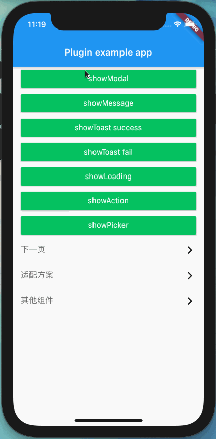
组件
showLoading
API
| 属性 | 说明 | 类型 | 默认值 |
| —- | —- | —- | —- |
| iconType | 加载图标类型。枚举如下:BallBeatIndicator()、BallSpinFadeLoaderIndicator()、LineScaleIndicator() | Indicator | BallSpinFadeLoaderIndicator() |
使用案例
MaterialButton(minWidth: setSize(690),color: Color(0xff07c160),onPressed: () { Ksir.showLoading(); Timer(Duration(seconds: 2), () { Navigator.pop(context); });},child: Ksir.text('showLoading', color: Colors.white),)
showModal
| 属性 |
说明 |
类型 |
默认值 |
| confirm |
点击确定的回调函数 |
Function |
- |
| cancel |
点击取消的回调函数 |
Function |
- |
| confirmTitle |
确定按钮标题 |
String |
“确定” |
| cancelTitle |
取消按钮标题 |
String |
“取消” |
MaterialButton( minWidth: setSize(690), color: Color(0xff07c160), onPressed: () { Ksir.showModal('确认提交吗?'); }, child: Ksir.text('showModal', color: Colors.white),)
showToast
| 属性 |
说明 |
类型 |
默认值 |
| callback |
Toast消失时的回调函数 |
Function |
- |
| duration |
Toast展示时长 |
int |
1500 |
| isSuceess |
是否展示成功的图标 |
bool |
true |
MaterialButton( minWidth: setSize(690), color: Color(0xff07c160), onPressed: () { Ksir.showToast('提交成功!'); }, child: Ksir.text('showToast success', color: Colors.white),),MaterialButton( minWidth: setSize(690), color: Color(0xff07c160), onPressed: () { Ksir.showToast('提交失败!', isSuccess: false); }, child: Ksir.text('showToast fail', color: Colors.white),)
showMessage
| 属性 |
说明 |
类型 |
默认值 |
| callback |
Message消失时的回调函数 |
Function |
- |
| duration |
Toast展示时长 |
int |
1500 |
• 使用案例
MaterialButton( minWidth: setSize(690), color: Color(0xff07c160), onPressed: () { Ksir.showMessage('账号不能为空!'); }, child: Ksir.text('showMessage', color: Colors.white),)
actionSheet
| 属性 |
说明 |
类型 |
默认值 |
| options |
子项列表 |
List |
- |
| 属性 |
说明 |
类型 |
默认值 |
| title |
标题 |
String |
- |
| onTap |
点击函数 |
Function |
- |
| color |
标题颜色 |
Color |
Color(0xff333333) |
| isShow |
是否展示 |
bool |
true |
• 使用案例
MaterialButton( minWidth: setSize(690), color: Color(0xff07c160), onPressed: () { Ksir.actionSheet([ ActionSheetType(title: '修改', onTap: () { print('修改'); }), ActionSheetType(title: '删除', onTap: () { print('删除'); }, color: Colors.red), ]); }, child: Ksir.text('showAction', color: Colors.white),)
picker
| 属性 |
说明 |
类型 |
默认值 |
| options |
选项 |
List |
- |
| title |
标题 |
String |
- |
| defaultValue |
默认值 |
dynamic |
- |
| onChange |
选项监听函数 |
Function |
- |
| onCancel |
点击取消函数 |
Function |
- |
| onConfirm |
点击确认函数 |
Function |
- |
| cancelTitle |
取消标题 |
String |
“取消” |
| confirmTitle |
确认标题 |
String |
“确认” |
| cancelColor |
取消标题颜色 |
Color |
Color(0xff999999) |
| confirmColor |
确认标题颜色 |
Color |
Color(0xff459EF9) |
| optionTextStyle |
选项字体样式 |
TextStyle |
TextStyle(fontSize: setSize(28), color: Color(0xff666666)) |
| titileTextStyle |
标题字体样式 |
TextStyle |
TextStyle(fontSize: setSize(32), color: Color(0xff333333)) |
| optionsHeight |
选项集高度 |
double |
300 |
| optionHeight |
选项高度 |
double |
60 |
| closeAble |
是否可以关闭 |
bool |
true |
| 属性 |
说明 |
类型 |
默认值 |
| label |
选项标题 |
String |
- |
| value |
选项值 |
dynamic |
- |
• 使用案例
MaterialButton( minWidth: setSize(690), color: Color(0xff07c160), onPressed: () { Ksir.picker( options: [PickerType(label: '北京', value: '1'), PickerType(label: '广州', value: '2'), PickerType(label: '上海', value: '3'), PickerType(label: '杭州', value: '4')], title: '请选择', optionHeight: 80, optionTextStyle: TextStyle(fontSize: 14, color: Colors.blueAccent), defaultValue: '3', onChange: (index, item) { print('$index : $item'); }, onConfirm: (index, item) { print('$index : ${item.label} / ${item.value}'); } ); }, child: Ksir.text('showPicker', color: Colors.white),)
text
| 属性 |
说明 |
类型 |
默认值 |
| value |
文字内容 |
String |
- |
| fontSize |
字体大小 |
double |
32 |
| color |
字体颜色 |
Color |
Colors.black |
| fontWeight |
字体厚度,枚举:bold、normal、100、200、300、400、500、600、700、800、900 |
String |
“normal” |
| lineHeight |
行高 |
double |
1.2 |
| textAlign |
对齐方式 |
TextAlign |
TextAlign.left |
| overflow |
超出展示形式 |
TextOverflow |
TextOverflow.ellipsis |
| maxLines |
最大行数 |
int |
- |
Container( width: setFullWidth(), child: Ksir.text('好好学习,天天向上!', fontSize: 48, color: Colors.black, fontWeight: 'bold', textAlign: TextAlign.right),),
image
| 属性 |
说明 |
类型 |
默认值 |
| src |
图片路径 |
String |
- |
| width |
宽度 |
double |
300 |
| height |
高度 |
double |
300 |
| fit |
图片适配方式 |
BoxFit |
BoxFit.cover |
/// 图片组件使用cached_network_image插件缓存图片,节省用户请求,同时自动识别asset和network图片类型,当传入src是以http开头时判定为network类型,否则为asset类型。暂不支持file类型Ksir.image('http://via.placeholder.com/350x150', width: 500, height: 500, fit: BoxFit.cover),
avatar
| 属性 |
说明 |
类型 |
默认值 |
| src |
图片路径 |
String |
- |
| width |
宽度 |
double |
60 |
Ksir.avatar('http://via.placeholder.com/350x150', width: 200),
nextPage
| 属性 |
说明 |
类型 |
默认值 |
| color |
图标颜色 |
Color |
Colors.black |
| size |
大小 |
double |
32 |
| params |
传递参数 |
Map |
- |
| onTap |
点击函数 |
Function |
- |
Container( width: setSize(690), height: setSize(100), decoration: BoxDecoration( border: Border(bottom: BorderSide(width: setSize(1), color: Color(0xffe8e8e8))) ), child: Row( mainAxisAlignment: MainAxisAlignment.spaceBetween, crossAxisAlignment: CrossAxisAlignment.center, children: <Widget>[ Ksir.text('下一页', fontSize: 32, color: Color(0xff666666)), Ksir.nextPage(onTap: () { Navigator.push(context, MaterialPageRoute(builder: (context) => NextPage(),)); }) ], ),),
goback
| 属性 |
说明 |
类型 |
默认值 |
| context |
上下文 |
BuildContext |
- |
| color |
图标颜色 |
Color |
Colors.black |
| size |
大小 |
double |
32 |
| params |
传递参数 |
Map |
- |
| onTap |
点击函数 |
Function |
- |
Widget build(BuildContext context) { return Scaffold( appBar: AppBar( leading: Ksir.goBack(context, color: Colors.white), title: Ksir.text('返回上一页', color: Colors.white), ), body: Ksir.text(demo), );}
适配方案
默认以750px设计为准, 如果需要自定义,可以在初始化的时候指定, 如设计稿宽度375:Ksir.init(context, width: 375); 推荐设置750px,以下Demo以750为例。
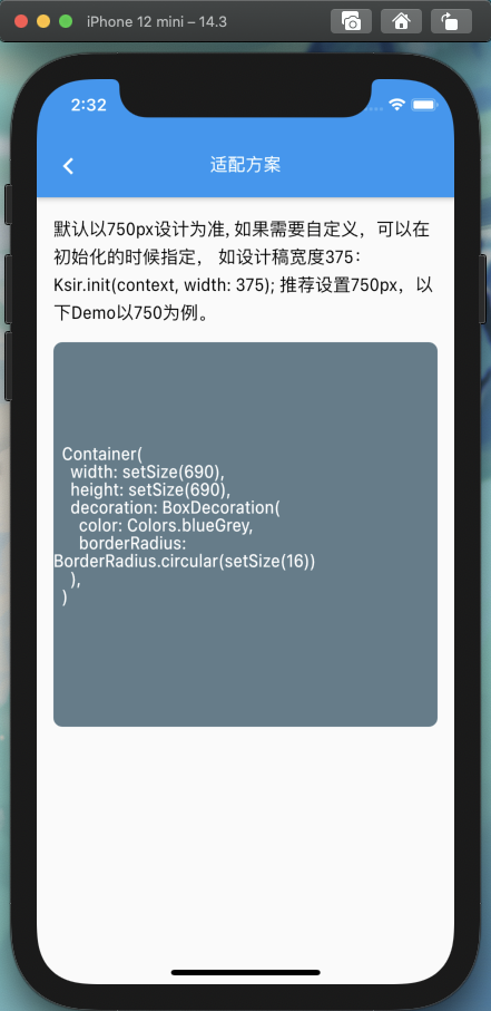
Container( width: setSize(690), height: setSize(690), decoration: BoxDecoration( color: Colors.blueGrey, borderRadius: BorderRadius.circular(setSize(16)) ), alignment: Alignment.center, child: Ksir.text(demo01, color: Colors.white),)
更多方法如下:
设置设备上的尺寸计算设计稿的尺寸:setSize(double rpx)
根据设计稿尺寸计算设备上的尺寸:sizeSet(double xpr)
底部操作栏高度:bottomBarHeight()
每个逻辑像素的字体像素数,字体的缩放比例:textScaleFactory()
设备的像素密度: pixelRatio()
当前设备宽度 dp:screenWidthDp()
当前设备高度 dp:screenHeightDp()
当前设备宽度 px:screenWidth()
当前设备高度 px:screenHeight()
状态栏高度 dp:statusBarHeight()
设置最大宽度:setFullWidth(BuildContext context)
设置最大高度:setFullHeight(BuildContext context)

