设置浏览器滚动条颜色
::-webkit-scrollbar-track-piece{width:8px;background-color:#0b0c11}::-webkit-scrollbar{width:8px;background-color:#e71822}::-webkit-scrollbar-thumb{width:8px;background-color:#e71822}::-webkit-scrollbar-thumb:hover{width:8px;background-color:#3d3d3d}
好看的阴影
box-shadow: 0 1px 6px 0 rgba(32,33,36,0.28);box-shadow: rgba(0, 0, 0, 0.06) 0px 2px 5px 0px; // box 阴影box-shadow: rgba(0, 0, 0, 0.06) 0px 1px 1px 0px; // 按钮边框
好看的字体
font-family: Crimson Text, Georgia, serif;
设置input[placeholder]的样式
::-webkit-input-placeholder { /* Chrome/Opera/Safari */color: #999999;}::-moz-placeholder { /* Firefox 19+ */color: #999999;}:-ms-input-placeholder { /* IE 10+ */color: #999999;}:-moz-placeholder { /* Firefox 18- */color: #999999;}
去除input[type=date]的默认样式
input[type="date"]::-webkit-calendar-picker-indicator {display: none;}input[type="date"]::-webkit-clear-button{display:none;}input[type="time"], input[type="date"] {border: none;appearance:none;-moz-appearance:none;-webkit-appearance:none;background: none;}input[type="time"]::-ms-expand,input[type="date"]::-ms-expand{display: none;}
好看的动态Button
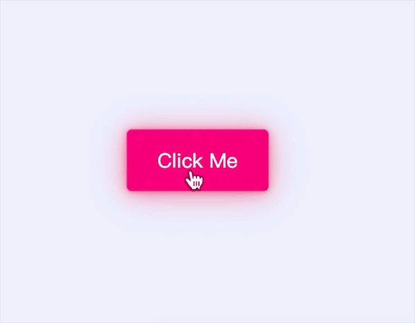
body {display: flex;height: 100vh;justify-content: center;align-items: center;background: #eceffc;}.btn {--hue: 190;--btn-bg-color: hsl(var(--hue), 100%, 50%);--btn-bg-color-darker: hsl(var(--hue), 100%, 45%);position: relative;padding: 0.75rem 1.5rem;margin: 1rem;font-size: 1rem;font-family: Lato, sans-serif;line-height: 1.5;color: white;text-decoration: none;background-color: var(--btn-bg-color);border: 1px solid var(--btn-bg-color);border-radius: 4px;box-shadow: 0 0.1px 0.7px rgba(233, 30, 99, 0.141), 0 0.1px 1.7px rgba(233, 30, 99, 0.202), 0 0.3px 3.1px rgba(233, 30, 99, 0.25), 0 0.4px 5.6px rgba(233, 30, 99, 0.298), 0 0.8px 10.4px rgba(233, 30, 99, 0.359), 0 2px 25px rgba(233, 30, 99, 0.5);outline: transparent;overflow: hidden;cursor: pointer;user-select: none;white-space: nowrap;transition: 0.25s;}.btn-pink {--hue: 330;}.btn-bubbles {overflow: visible;transition: transform ease-in 0.1s, background-color ease-in 0.1s, box-shadow ease-in 0.25s;}.btn-bubbles::before {position: absolute;content: "";left: -2em;right: -2em;top: -2em;bottom: -2em;transition: ease-in-out 0.5s;background-repeat: no-repeat;background-image: radial-gradient(circle, transparent 20%, var(--btn-bg-color) 20%, transparent 30%), radial-gradient(circle, var(--btn-bg-color) 20%, transparent 20%), radial-gradient(circle, transparent 20%, var(--btn-bg-color) 20%, transparent 30%), radial-gradient(circle, transparent 20%, var(--btn-bg-color) 20%, transparent 30%), radial-gradient(circle, var(--btn-bg-color) 20%, transparent 20%), radial-gradient(circle, var(--btn-bg-color) 20%, transparent 20%), radial-gradient(circle, transparent 20%, var(--btn-bg-color) 20%, transparent 30%), radial-gradient(circle, var(--btn-bg-color) 20%, transparent 20%), radial-gradient(circle, transparent 20%, var(--btn-bg-color) 20%, transparent 30%), radial-gradient(circle, transparent 20%, var(--btn-bg-color) 20%, transparent 30%), radial-gradient(circle, transparent 20%, var(--btn-bg-color) 20%, transparent 30%), radial-gradient(circle, var(--btn-bg-color) 20%, transparent 20%), radial-gradient(circle, var(--btn-bg-color) 20%, transparent 20%), radial-gradient(circle, transparent 20%, var(--btn-bg-color) 20%, transparent 30%), radial-gradient(circle, transparent 20%, var(--btn-bg-color) 20%, transparent 30%), radial-gradient(circle, var(--btn-bg-color) 20%, transparent 20%);background-size: 12% 16%, 14% 16%, 14% 15%, 15% 14%, 19% 11%, 13% 17%, 20% 17%, 16% 12%, 18% 13%, 13% 15%, 20% 17%, 14% 19%, 20% 19%, 11% 13%, 14% 19%, 12% 10%;background-position: 18% 40%, 20% 31%, 30% 30%, 40% 30%, 50% 30%, 57% 30%, 65% 30%, 80% 32%, 15% 60%, 83% 60%, 18% 70%, 25% 70%, 41% 70%, 50% 70%, 64% 70%, 80% 71%;animation: bubbles ease-in-out 0.75s forwards;}.btn-bubbles:active {transform: scale(0.95);background: var(--btn-bg-color-darker);}.btn-bubbles:active::before {animation: none;background-size: 0;}@keyframes bubbles {0% {background-position: 18% 40%, 20% 31%, 30% 30%, 40% 30%, 50% 30%, 57% 30%, 65% 30%, 80% 32%, 15% 60%, 83% 60%, 18% 70%, 25% 70%, 41% 70%, 50% 70%, 64% 70%, 80% 71%;}50% {background-position: 10% 44%, 0% 20%, 15% 5%, 30% 0%, 42% 0%, 62% -2%, 75% 0%, 95% -2%, 0% 80%, 95% 55%, 7% 100%, 24% 100%, 41% 100%, 55% 95%, 68% 96%, 95% 100%;}100% {background-position: 5% 44%, -5% 20%, 7% 5%, 23% 0%, 37% 0, 58% -2%, 80% 0%, 100% -2%, -5% 80%, 100% 55%, 2% 100%, 23% 100%, 42% 100%, 60% 95%, 70% 96%, 100% 100%;background-size: 0% 0%;}}
<button class="btn btn-pink btn-bubbles">Click Me</button>
3D旋转图片预览

body {display: -webkit-box;display: flex;-webkit-box-pack: center;justify-content: center;-webkit-box-align: center;align-items: center;height: 100vh;background: black;}.scene {width: 1000px;display: -webkit-box;display: flex;-webkit-box-pack: justify;justify-content: space-between;-webkit-perspective: 800px;perspective: 800px;}.scene .card {position: relative;width: 240px;height: 300px;color: white;cursor: pointer;-webkit-transition: 1s ease-in-out;transition: 1s ease-in-out;-webkit-transform-style: preserve-3d;transform-style: preserve-3d;}.scene .card:hover {-webkit-transform: rotateY(0.5turn);transform: rotateY(0.5turn);}.scene .card .card__face {position: absolute;top: 0;left: 0;width: 100%;height: 100%;-webkit-backface-visibility: hidden;backface-visibility: hidden;-webkit-transition: 1s ease-in-out;transition: 1s ease-in-out;-webkit-box-reflect: below 0 linear-gradient(transparent, transparent, rgba(0, 0, 0, 0.4));}.scene .card .card__face img {width: 240px;height: 300px;-o-object-fit: cover;object-fit: cover;}.scene .card .card__face--back {-webkit-transform: rotateY(0.5turn);transform: rotateY(0.5turn);}
<div class="scene"><div class="card"><div class="card__face card__face--front"><img src="https://i.loli.net/2019/11/23/cnKl1Ykd5rZCVwm.jpg" /></div><div class="card__face card__face--back"><img src="https://i.loli.net/2019/11/16/cqyJiYlRwnTeHmj.jpg" /></div></div><div class="card"><div class="card__face card__face--front"><img src="https://i.loli.net/2019/11/16/FLnzi5Kq4tkRZSm.jpg" /></div><div class="card__face card__face--back"><img src="https://i.loli.net/2019/10/18/buDT4YS6zUMfHst.jpg" /></div></div><div class="card"><div class="card__face card__face--front"><img src="https://i.loli.net/2019/10/18/uXF1Kx7lzELB6wf.jpg" /></div><div class="card__face card__face--back"><img src="https://i.loli.net/2019/11/03/RtVq2wxQYySDb8L.jpg" /></div></div></div>
兼容全面屏
@media only screen and (device-width: 375px) and (device-height: 812px) and (-webkit-device-pixel-ratio: 3), only screen and (device-width: 414px) and (device-height: 896px) and (-webkit-device-pixel-ratio: 3), only screen and (device-width: 414px) and (device-height: 896px) and (-webkit-device-pixel-ratio: 2)xxx {padding-bottom: calc(env(safe-area-inset-bottom) - 16px)!important;}

若有收获,就点个赞吧
0 人点赞
