规范
代码规范
ESLint Rules [链接]
项目自定义设置在(.eslintrc.js)
页面使用规范
页面过度loading(必须使用)
进入页面会有有一个原生层面的loading,用以提升交互体验。进入页面时需要调用ready方法告知原生已准备就绪,移除页面加载的loading
// 引入自定义模块import fjkModule from '@/bridge'// 在适当的时机fjkModule.ready()
导航栏(尽量使用)
// 在mixin/index.js里面已经默认全局引入fg-nav-bar,因而可以直接使用该组件<template><fg-nav-bar title="导航栏标题" /></template>
命名规范
创建新页面
新页面 : src/pages/<业务描述>/index.vue ,其中 index.vue 为固定写法
页面内的组件: src/page/<业务描述>/components/项目通用前缀-业务描述-功能描述.vue , 如:fg-visitor-cell.vue
全局通用组件
文件存储位置: src/components/xxx.vue
命名规范: 项目前缀-功能描述 如: fg-list.vue
组件引用命名
引用规则:保持组件名与文件名保持一致,组件变量以驼峰命名的方式命名
<template><text-component /> //保持一致</template><script>import textComponent from '@/src/components/text-component' //保持一致export default {components: {textComponent //保持一致}}</script>
原生组件
项目前缀-功能描述,原生文件以component结尾,如:fg-rich-text 对应类文件为:FGRichTextComponent
网络
基本写法(网络请求)
// 引入service模块
const services = require('@/services')

// 对应的位置
const params = { nextId : 'xx' }
services.requireXXX(params)
    .then((result) => {
        // network success
    })
    .catch((error) => {
        // network error
    })
    .fianlly(() => {
        // public exit
    })
定义一个GET请求
// service/index.js

// 定义一个请求用户数据的GET请求
function getUserInfo(query) {
    const options = {
    method: 'GET',
    url: `getMyAgentInfo`,
        query, // GET请求有参数时的固定写法,没有参数时可以不写。(不推荐直接把参数直接拼接到url上,除非url是带变量的,像:`getAgentPic/${agentId}/public`)
  }
  return fetchPromise(options) // 固定写法,给外部返回一个Promise对象
}

// 暴露方法给外部
export {
    ...
    getUserInfo,
    ...
}

// 调用方
services.getUserInfo({ id : 'aaa' })
=> 实际请求的url: ${host}/getMyAgentInfo?id=aaa
定义一个POST请求
// service/index.js

// 定义一个请求用户数据的POST请求
function getUserInfo(data) {
  const options = {
    method: 'POST',
    url: `getMyAgentInfo`,
        data, // POST请求参数固定写法,没有参数时可以不写
  }
  return fetchPromise(options) // 固定写法,给外部返回一个Promise对象
}

// 暴露方法给外部
export {
    ...
    getUserInfo,
    ...
}

// 调用方
services.getMyAgentInfo({ id: 'aaa' })
并行请求
通常页面的网络请求业务是多样的,有时候页面的展示需要依赖2个或以上的接口,这时候我们使用Promise提供能力
扩展阅读:Promise
// 假设目前进入页面需要请求2个接口A、B,根据A、B的结果请求C
// 定义3个请求方法

// A接口
function networkA () {
  const options = {
    method: 'POST',
    url: `getMyAgentInfo`,
        data,
  }
  return fetchPromise(options)
}
// B接口
function networkB () {
    ...
  return fetchPromise(options)
}
// C接口
function networkC () {
    ...
  return fetchPromise(options)
}

// 页面的使用
Pormise.props({
  networkAResult : service.networkA,
  networkBResult : service.networkB,
})
    .then((finalResult) => { // 这里可以写成 .then(({ networkAResult, networkBResult }))
      console.log('finalResult = ', JSON.stringify(finalResult))
      // do something
      // 请求C接口
      return service.networkC
    })
    .then((networkCResult) => {
      // handle Network C result
    })
    .catch((error) => {
      // 其中有一个失败,就会失败
    })
    .fianlly(() => {
      // 通用处理
    })
业务组件
列表组件(fg-list)
fg-list是基于weex的list组件封装的组件。同时集成了上下拉刷新组件,给业务方提供更简洁的更新数据源的方式
提供了3个插槽,用于设置列表不同部分的数据,分别为: listHeader、cellHeader、listFooter
同时还有一个通用插槽,用于卡片样式的展示
设置头部/尾部视图
注意!设置头部/尾部视图的时候,内容需要用标签包裹,后续会考虑优化
<template>
    <fg-list>
    <template slot="listHeader">
      <cell>
        // show list header
      </cell>
    </template>
    <template slot="listFooter">
      <cell>
        // show list footer
      </cell>
    </template>
  </fg-list>
</template>
设置列表分组视图和数据
<template>
    <fg-list ref="list">
    <template slot="cellHeader" slot-scope="slot"> // slot = { text: String }
            // show section header
      <text>{{ slot.text }}</text>
      <text>{{ slot.data }}</text>
    </template>
  </fg-list>
</template>

<script>
  export default {
    mounted() {
      this.$refs.list.setHeaderCallback((data) => {
        return {
          headerText: String, // 固定参数,用于判断是否分组
          data: {},  // customer property ...
        }
      })
    }
  }
</script>
设置卡片数据
setData 方式参数说明
/**
*/
setData(ok, data, nextID, error) { … }
data里的模型需要带有id作为唯一标识,其中id为唯一写法
<template>
    <fg-list ref="list">
    <template slot-scope="slot">
      // custom cell style
      <text>{{ JSON.stringify(slot.data) }}</text>
        </template>
  </fg-list>
</template>

<script>
  export default {
    mounted() {
      const list = [{ id: 1, text: 'a' }, { id: 2, text: 'b' }, { id: 3, text: 'c' }]
      this.$refs.list.setData(true, list, '')
    }
  }
</script>
完整用法
该例子完整描述fg-list整体的设置流程
<template>
    <fg-list ref="list" @handleRequest="handleRequest">
    <!-- 自定义头部视图 -->
    <template slot="listHeader">
      <cell>
        // show list header
      </cell>
    </template>
    <!-- cell的分组 -->
        <template slot="cellHeader" slot-scope="slot"> // slot = { text: String }
            // show section header
    </template>
    <!-- 自定义卡片样式 -->
        <template slot-scope="slot">
      // custom cell style
        </template>
        <!-- 自定义尾部视图 -->
        <template slot="listFooter">
      <cell>
        // show list footer
      </cell>
    </template>
  </fg-list>
</template>

<script>
  export default {
    mounted() {
      this.$ref.list.setHeaderCallBack((data) => ({
        headerText: data.text
      }))
    },
    methods: {
      handleRequest() {
        setTimeout(() => { // 模拟网络请求
          const list = [{ id: 1, text: 'a' }, { id: 2, text: 'b' }, { id: 3, text: 'c' }]
          this.$refs.list.setData(true, list, '')
        }, 1000)
      }
    }
  }
</script>
TabBarList组件
- 优点
- 能够较好的支持不同逻辑/页面的展示
- 区分不同业务使用不同的插槽,扩展性与维护性高
- 缺点
- 页面插槽需单独实现,无法指定同一个模板内容,对于2个tab的内容一致的情况,需要重复的代码
// 组件依赖
import TabBarList from '@/pages/approval/financial-approval-list/components/tab-bar-list'

<template>
    <tab-bar-list
        :tab-list="tabList"
        :current-tab-key="currentTabKey"
        @onTabItemClick="onTabItemClick"
    >
    <template slot="TAB_A_KEY"> // 对应传入tabList中的key值
            <text>第一页</text>
        </template>
    <template slot="TAB_B_KEY">
            <text>第二页</text>
        </template>
  </tab-bar-list>
</template>

<script>
  export default {
    components: {
      TabBarList
    },
    data() {
      return {
          currentTabKey: 'approval',
        tabList: [
          {
            key: 'TAB_A_KEY',
            name: 'TAB_A_NAME', // tab的名字
            unSelectIcon: xx, // 未选中图片路径
            selectIcon: xx, // 选中图片路径
          },
          {
            key: 'TAB_B_KEY',
            name: 'TAB_B_NAME', // tab的名字
            unSelectIcon: xx, // 未选中图片路径
            selectIcon: xx, // 选中图片路径
          },
        ],
        }
    },
    methods: {
      onTabItemClick(item) { // item会原样返回
        this.currentTabKey = item.key
      }
    }
  }
</script>
FgTabPage组件
- 优点
- 对重复的UI结构只需要一套代码即可
- 缺点
- 对不同页面的卡片判断逻辑会较为复杂
- 切换tab的时候,体验不是很好

// 组件依赖
import FgTabPage from '@/components/modules/fg-tab-page'

<template>
    <fg-tab-page
    :titles="titles"
    tab-model="avg"
  >
    <template slot-scope="page">
      <div v-if="page.id === 'PAGE_1'">
        ...show something...
          </div>
      <div v-else-if="page.id === 'PAGE_2'">
        ...show something...
          </div>
      ...
    </template>
  </fg-tab-page>
</template>

<script>
  export default {
    components: {
      TabBarList
    },
    data() {
      return {
          titles: [
          {
            key: 'PAGE_1',
            name: '标题一',
          },
          {
            key: 'PAGE_2',
            name: '标题二',
          },
          {
            key: 'PAGE_3',
            name: '标题三',
          },
        ],
        }
    },
    methods: {
      onPageSelectChange(key) { // 返回当前页面的key值

      }
    }
  }
</script>
路由组件
跳转weex页面
this.openNewWeexUrl('demo.weex.js')
跳转原生页面
this.openNativeUrl('me/visitors')
跳转H5页面
this.openWebUrl(web) // 无参数的时候

this.openWebEncodeUrl(web) // 有参数的时候
浮层组件
目前项目中存在2个形式的浮层方案,一种是作为页面元素使用的,利用属性和绝对定位达到的浮层,另一种是借助原生的能力,根据给定的动画弹出一个新的weex控制器。在使用的时候应更偏向于后者,下面介绍的几个浮层均基于原生能力的浮层。
使用基于原生浮层方案的时候,需要引入相关的模块依赖
const modalService = require('@/utils/modalService')
自定义浮层的流程
文件创建位置: src/pages/modal/<yourFunctionName>/index.vue
配置modalServie
// modalService.js

// 1. 配置你的页面及唯一通讯通道
const NATIVE_SELECTOR_LIST = [
  { // demo
    type: '实例结构', // 区分唯一值
    page: '页面路径', // 页面路径
    channel: '接收的处理通知', // 用于接收结果的通知
  },
]

// 2. 对外暴露你的封装方法(当然你也可以使用基础的方法去调用)
export function showActionSheet(...) {
  let tempQuery = {} // 需要传递的参数
  return this.showModalPage('FGActionSheet', tempQuery, 'slider')
}

// 3. 使用
// xx/index.vue
<script>
  const modalService = require('@/utils/modalService')
  export defualt {
    methods: {
      callModal() {
        modalService.showActionSheet(...)
                    .then((result) => {
              // handle modal callBack
            })
      }
    }
  }
</script>
actionSheet
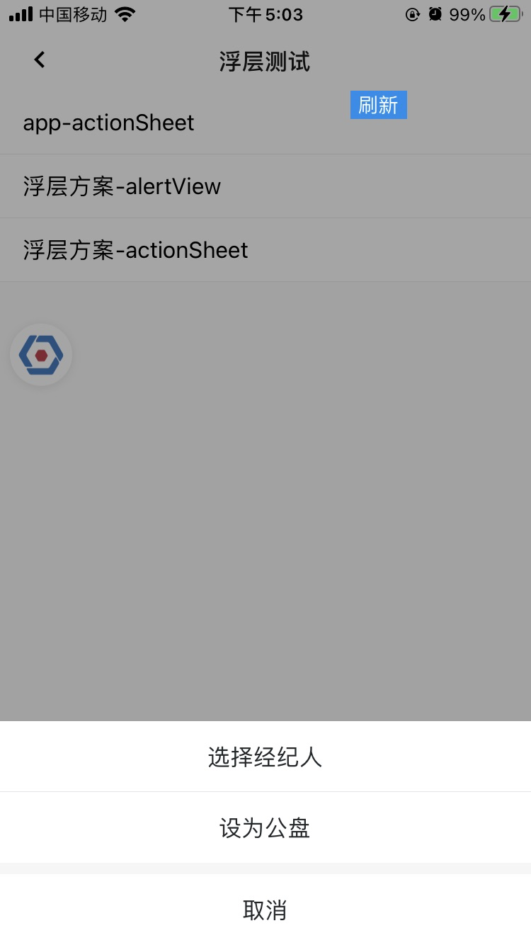
const actionSheetData = [
  {
    name: '选择经纪人',
    key: 1,
  },
  {
    name: '设为公盘',
    key: 2,
  },
]

// 方法一: 只需要操作项
//modalService.showActionSheet(actionSheetData)

// 方法二: 需要展示title及操作项
modalService.showActionSheet('修改维护人', actionSheetData)
  .then((res) => {
    console.log('res = ', JSON.stringify(res))
  })
  .finally(() => {

  })
appActionSheet
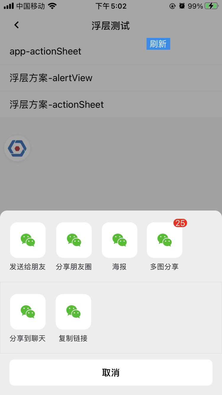
modalService.showModalPage('FGAppActionSheet', {
  // title: '我是标题',
  // subTitle: '我是副标题',
  topActionList: [
    {
      icon: require('@/images/icon-actionsheet-wechat-message.png'),
      text: '发送给朋友',
      name: 'send-friend',
    },
    {
      icon: require('@/images/icon-actionsheet-wechat-message.png'),
      text: '分享朋友圈',
      name: 'send-friend',
    },
    {
      icon: require('@/images/icon-actionsheet-wechat-message.png'),
      text: '海报',
      name: 'send-friend',
    },
    {
      icon: require('@/images/icon-actionsheet-wechat-message.png'),
      text: '多图分享',
      name: 'send-friend',
      count: '25',
    },
  ],
  bottomActionList: [
    {
      icon: require('@/images/icon-actionsheet-wechat-message.png'),
      text: '分享到聊天',
      name: 'send-friend',
      count: '',
    },
    {
      icon: require('@/images/icon-actionsheet-wechat-message.png'),
      text: '复制链接',
      name: 'send-friend',
      count: '',
    },
  ],
}, 'slider')
  .then((res) => {
    console.log('res = ', JSON.stringify(res))
  })
},
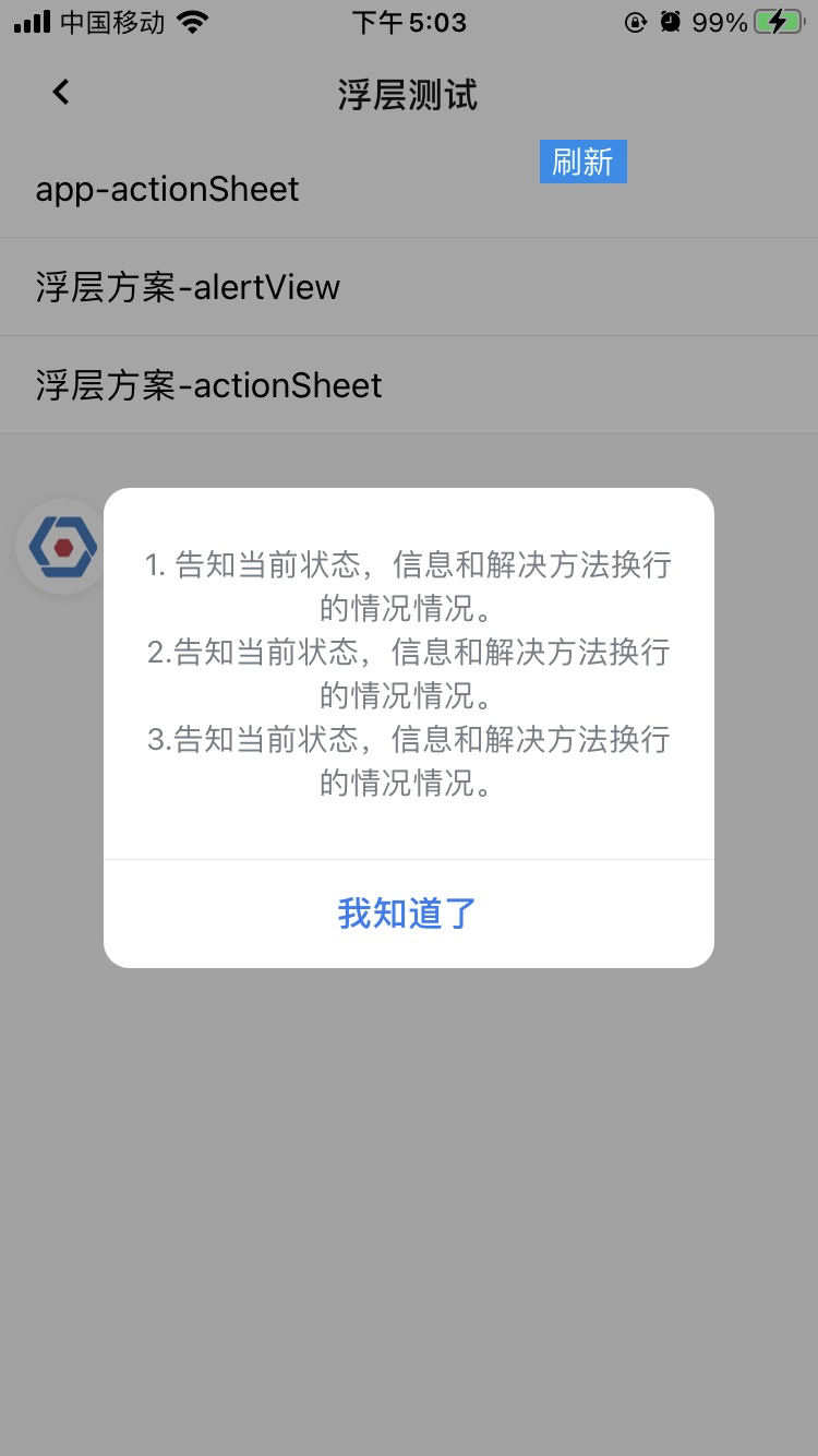
alertView
// 用法一.1:只需要展示标题
// modalService.showAlertView('很长很长的标题很长很长的标题很长很长的标题')

// 用法一.2:需要展示标题&定制按钮
// modalService.showAlertView('很长很长的标题很长很长的标题很长很长的标题', [
//   {
//     name: '辅助操作',
//   },
//   {
//     name: '主操作',
//     color: '#257BF4',
//     hightLight: 1,
//   },
// ])

// 用法一.3:需要定制标题、内容、按钮
// modalService.showAlertView('很长很长的标题很长很长的标题很长很长的标题', '1. 告知当前状态,信息和解决方法换行的情况情况。\n2.告知当前状态,信息和解决方法换行的情况情况。\n3.告知当前状态,信息和解决方法换行的情况情况。', [
//   {
//     name: '辅助操作',
//   },
//   {
//     name: '主操作',
//     color: '#257BF4',
//     hightLight: 1,
//   },
// ])

// 用法二-1:只需展示内容
modalService.showMessageAlert('1. 告知当前状态,信息和解决方法换行的情况情况。\n2.告知当前状态,信息和解决方法换行的情况情况。\n3.告知当前状态,信息和解决方法换行的情况情况。')

// 用法二-2:只需展示内容&自定按钮
// modalService.showMessageAlert('1. 告知当前状态,信息和解决方法换行的情况情况。\n2.告知当前状态,信息和解决方法换行的情况情况。\n3.告知当前状态,信息和解决方法换行的情况情况。', [{ name: '按钮1' }, { name: '按钮2' }])

// 用法三:需要同时定制图片、标题、内容、按钮
// modalService.showCustomAlertView({
//   title: '很长很长的标题很长很长的标题很长很长的标题',
//   message: '1. 告知当前状态,信息和解决方法换行的情况情况。\n2.告知当前状态,信息和解决方法换行的情况情况。\n3.告知当前状态,信息和解决方法换行的情况情况。',
//   actionList: [
//     {
//       name: '辅助操作',
//     },
//     {
//       name: '主操作',
//       color: '#257BF4',
//       hightLight: 1,
//     },
//   ],
//   tipsImage: require('@/images/icon-tip-error.png'),
// })
  .then((res) => {
    console.log('res = ', JSON.stringify(res))
  })

若有收获,就点个赞吧
0 人点赞
