一.给父元素flex之后,子元素它会并排显示。

<style>/* 1.给父元素flex之后,子元素它会并排显示 */.parent{display: flex;}.parent>div{width: 100px;height: 40px;border: 1px solid #333;}</style></head><body><div class="parent"><div class="one"></div><div class="two"></div><div class="three"></div></div></body>
二.给子元素设置一样的flex值,他们会将父元素的width等分

<style>
        .container{
            width: 1240px;
            height: 400px;
            border: 1px solid #333;
            margin: 100px auto;
            display: flex;
        }
        .container>div{
            height: 400px;
        }
        /* 给子元素设置一样的flex值,他们会将父元素的width等分 */
        .one{
            flex: 1;
            background: red;
        }
        .two{
            flex: 2;
            background: yellow;
        }
        .three{
            flex: 3;
            background-color: green;
        }
        .four{
            flex: 4;
            background-color: pink;
        }
    </style>
</head>
<body>
    <div class="container">
        <div class="one"></div>
        <div class="two"></div>
        <div class="three"></div>
        <div class="four"></div>
    </div>
</body>
</html>
三.等分框框并排显示(flex-border)

<style>
        div{
            box-sizing: border-box;
        }
        .container{
            width: 1240px;
            height: 400px;
            margin-left: auto;
            margin-right: auto;
            display: flex;
        }
        .container>div{
            flex: 1;
            height: 400px;
            border: 1px solid #333;
            margin-left: -1px;
        }
    </style>
</head>
<body>
    <div class="container">
        <div class="one"></div>
        <div class="two"></div>
        <div class="three"></div>
        <div class="four"></div>
    </div>
</body>
</html>
四.flex居中
1.justify-content: 设置子元素的水平方向的对齐。
2.alig-items:设置子元素垂直方向。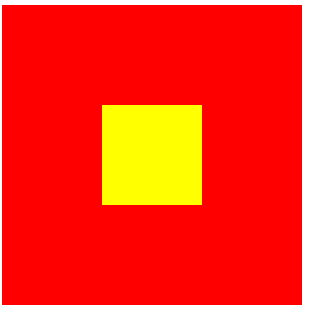
<style>
        .parent{
            width: 300px;
            height: 300px;
            background: red;
            display: flex;
            justify-content: center;
            /* justify-content: 设置子元素的水平方向的对齐 */
            align-items: center;
            /* alig-items:设置子元素垂直方向 */
        }
        .child{
            width: 100px;
            height: 100px;
            background: yellow;
        }
    </style>
</head>
<body>
    <div class="parent">
        <div class="child">

        </div>
    </div>
</body>
</html>
五.flex的布局方向
1.flex-direction:
如果flex布局的方向设置为column
justify-content:设置垂直方向
align-items:设置水平方向
<style>
        .parent{
            display: flex;
            width: 400px;
            height: 400px;
            background: red;
            flex-direction: column;
            /* flex-direction:
            如果flex布局的方向设置为column
            justify-content:设置垂直方向
            align-items:设置水平方向 */
            justify-content: center;
            align-items: center;
        }
        .parent>div{
            width: 100px;
            height: 40px;
            border: 1px solid #333;
        }
    </style>
</head>
<body>
    <div class="parent">
        <div></div>
        <div></div>
        <div></div>
    </div>
</body>
</html>
六.等分边框布局 等距
justify-content:space-around
/ space-between
/ space-evenly

/ center
<style>
        .parent{
            width:400px;
            height: 400px;
            background: red;
            display: flex;
            /* justify-content:space-around / space-between / space-evenly / center
               */
               justify-content: space-evenly;
        }
        .parent>div{
            width: 100px;
            height: 40px;
            border: 1px solid #333;
        }
    </style>
</head>
<body>
    <div class="parent">
        <div></div>
        <div></div>
        <div></div>
    </div>
</body>
</html>
七.flex换行
1.设置子元素是否换行
flex-wrap: wrap;
<style>
            .parent{
                width:400px;
                background: red;
                display: flex;
                /* 设置子元素是否换行 */
                flex-wrap: wrap;
                justify-content: space-evenly;
            }
            .parent>div{
                width: 100px;
                height: 40px;
                background: yellow;
                border: 1px solid #333;
            }
        </style>
    </head>
    <body>
        <div class="parent">
            <div></div>
            <div></div>
            <div></div>
            <div></div>
            <div></div>
            <div></div>
        </div>
    </body>
    </html>

若有收获,就点个赞吧
0 人点赞
