折线图
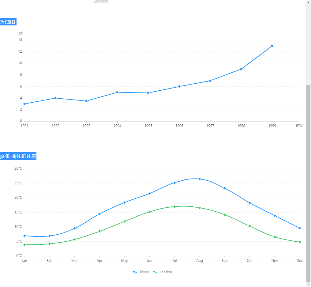
import React,{useState} from 'react'import { Chart, Geom, Axis, Tooltip, Legend, Coord,Guide,Line } from 'bizcharts';const XianB = (props)=>{const [data, setData] = useState([{year: "1991",value: 3},{year: "1992",value: 4},{year: "1993",value: 3.5},{year: "1994",value: 5},{year: "1995",value: 4.9},{year: "1996",value: 6},{year: "1997",value: 7},{year: "1998",value: 9},{year: "1999",value: 13}])const [cols, setCols] = useState( {value: {min: 0,range:[0,0.93],alias:'次'},year: {range: [0, 0.9],alias:'时间'}})return <div><h3> 折线图 </h3><Chart height={400} data={data} scale={cols} forceFit><Axis name="year" title={{position:'end',offset:15,textStyle: {fontSize: '12',textAlign: 'center',fill: '#999',fontWeight: 'bold',rotate: 0,autoRotate:true}}} /><Axis name="value" title={{position:'end',offset:5.5,textStyle: {fontSize: '12',textAlign: 'right',fill: '#999',fontWeight: 'bold',rotate: 0}}}/><Tooltipcrosshairs={{type: "y"}}/><Geom type="line" position="year*value" size={2}tooltip={['year*value',(year,value)=>{return {name:'数值', // 要显示的名字value:value,title:year}}]} /><Geomtype="point"position="year*value"size={4}shape={"circle"}style={{stroke: "#fff",lineWidth: 1}}tooltip={['year*value',(year,value)=>{return {name:'数值', // 要显示的名字value:value,title:year}}]}/></Chart></div>}const XinaC = (props) =>{const [data,setData] = useState([{month: "Jan",city: "Tokyo",temperature: 7},{month: "Jan",city: "London",temperature: 3.9},{month: "Feb",city: "Tokyo",temperature: 6.9},{month: "Feb",city: "London",temperature: 4.2},{month: "Mar",city: "Tokyo",temperature: 9.5},{month: "Mar",city: "London",temperature: 5.7},{month: "Apr",city: "Tokyo",temperature: 14.5},{month: "Apr",city: "London",temperature: 8.5},{month: "May",city: "Tokyo",temperature: 18.4},{month: "May",city: "London",temperature: 11.9},{month: "Jun",city: "Tokyo",temperature: 21.5},{month: "Jun",city: "London",temperature: 15.2},{month: "Jul",city: "Tokyo",temperature: 25.2},{month: "Jul",city: "London",temperature: 17},{month: "Aug",city: "Tokyo",temperature: 26.5},{month: "Aug",city: "London",temperature: 16.6},{month: "Sep",city: "Tokyo",temperature: 23.3},{month: "Sep",city: "London",temperature: 14.2},{month: "Oct",city: "Tokyo",temperature: 18.3},{month: "Oct",city: "London",temperature: 10.3},{month: "Nov",city: "Tokyo",temperature: 13.9},{month: "Nov",city: "London",temperature: 6.6},{month: "Dec",city: "Tokyo",temperature: 9.6},{month: "Dec",city: "London",temperature: 4.8}])const [cols,setCols] = useState({month: {range: [0, 1]}})return <div><h3> 多条 曲线折线图 </h3><Chart height={400} data={data} scale={cols} forceFit><Legend /><Axis name="month" /><Axisname="temperature"label={{formatter: val => `${val}°C`}}/><Tooltipcrosshairs={{type: "y"}}/><Geomtype="line"position="month*temperature"size={2}color={"city"}shape={"smooth"}/><Geomtype="point"position="month*temperature"size={4}shape={"circle"}color={"city"}style={{stroke: "#fff",lineWidth: 1}}/></Chart></div>}
柱状图
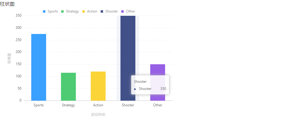
const XianA = (props)=>{
    // 数据源
    const [data,setData] = useState([
        { genre: 'Sports', sold: 275, income: 2300 },
        { genre: 'Strategy', sold: 115, income: 667 },
        { genre: 'Action', sold: 120, income: 982 },
        { genre: 'Shooter', sold: 350, income: 5271 },
        { genre: 'Other', sold: 150, income: 3710 }
    ])

    // 定义度量
    const [cols,setCols] = useState({
            sold: { alias: '销售量' },
            genre: { alias: '游戏种类' }
        })

    return <div>
        <h3>柱状图</h3>
        <Chart width={600} height={400} data={data} scale={cols}>
            <Axis name="genre" title/>
            <Axis name="sold" title/>
            <Legend position="top" dy={-20} />
            <Tooltip />
            <Geom type="interval" position="genre*sold" color="genre" />
        </Chart>
    </div>
}

若有收获,就点个赞吧
0 人点赞
